• INTERESTED IN VINTAGE POSTCARDS?

    Join us as a guest at one of our ZOOM meetings. Here’s our schedule of UPCOMING  MEETINGS which are monthly except for the summer.  Or, become a TPC Facebook friend to stay connected!

POSTCARDS FEATURED AT CHARLOTTETOWN GALLERY EXHIBITION

The postcard photographs of William S. Louson are the subject of a new exhibit at the Confederation Centre Art Gallery in Charlottetown. Louson was the leading amateur photographer of Prince Edward Island in the pre-WWI period and is one of the few identified postcard photographers in Canada. The exhibition, curated by Harry Holman (TPC#1534), features photographic images produced by Louson including images from his original negatives, copies of views which were featured in a range of local and national magazines, and a large collection of postcards, most of which were published by the Toronto firm of Warwick Bros. & Rutter. The exhibition also includes Louson photos which were used by other publishers without credit to Louson.
 

Sydmount Avenue, Charlottetown, P.E.I. (William S. Louson)

 According to Holman “Louson is without doubt the most important and interesting photographer in the history of early P.E.I. postcards. His black and white images were given a new dimension with the colours added by the postcard publishers.  This served to make Louson’s view of the province as a gentle rural landscape the dominant perception of the Island in the pre-war period.”
 
The exhibition continues at the Gallery until April 21, 2018.

SPOT THE DIFFERENCE: A VALENTINE & SONS POSTCARD MYSTERY

I’ll be the first to admit that this one is probably just for the geekiest of deltiologists. It has to do with a duplicate Valentine & Sons card in my collection — number 102,198, entitled “G.T.R. Double Track through the Garden of Canada” in one example, while the second version spells out the name of the railway in full, as “Grand Trunk Railway”. Valentine & Sons captions often changed between printings of the same card, so the name variation isn’t especially interesting. To see what was interesting, let’s have a look at the cards:

Spot the Differences.

The back types are identical. “Grand Trunk Railway” appears (on the basis of a pretty murky postmark) to have been posted on 19 February 1907, while “G.T.R.” was posted on 3 May 1908. But that’s neither here nor there. The odd thing is that the cards are different in a second way that is harder to spot at first. It’s the images: they are identical EXCEPT for the sky. The clouds on version 1 are completely different from the clouds on version 2! Of course, the skies on these early lithographs were entirely fake to begin with, because they usually reproduced as completely blank areas, necessitating the subterfuge of “hand colouring” in which clouds were added to the artist’s taste. But that doesn’t explain why the skies would be different between two printings, when everything else in the image, including all the rest of the applied colouring, is identical.

Or does it? Is there a reason that the sky would have been coloured separately on the occasions of each printing?

In case you can’t make out the differences, here is another version with added contrast (click to enlarge):

Any thoughts? Anyone have similar examples of Valentine & Sons cards — or cards by anyone, really — that are the same except for the sky (setting aside variations in the caption)?

— Andrew Cunningham

FIRESIDE READING – CARD TALK’S WINTER EDITION

Our annual Seasonal Party this past week was a great success. In addition to delicious food, the TPC served up the latest edition of Card Talk to all attendees, thus saving some postage costs. Retrieved from the printers only hours earlier, the Winter edition of our flagship (well … only) publication contains its usual 24 pages of deltiological news and analysis.

Following up on an article in the Fall edition, TPC member Lorne Smith contributed additional information on the use of Esperanto in postcards, including an account of his visit to the Esperanto Museum in Vienna. Among the postcards in Lorne’s collection is one of Prague’s Old Town Bridge Tower (Figure 1), with a message in esperanto and an Esperanto sticker on the front. The postcard’s caption has also been translated by the sender. 

Figure 1. “Malnova Ponta Turo”, according to the sender.

We had a response to our call for early Canadian RPPCs (real photo post cards) — “early” being 1904 or prior. Member Rick Parama submitted a photo card of a cow and calf from Bowden, Alberta, N.W.T. (as it then was) from the summer of 1904. Generally speaking, RPPC production in Canada seems to have gone from almost nil in the spring of 1904 to a significant trickle in the later months of 1904. By mid-1905, it was a veritable torrent that did not die down for several years thereafter. Real photo cards from 1904 and earlier are rare in Canada and we continue to solicit members and the general public for examples to illustrate the early days of this important photographic genre.

Another of our members, Joe Rozdzilski, contributed some examples from his collection of west-end Toronto postcards, focusing on the life and times of Sunnyside Beach and its amusement park and bathing pavilion, the latter of which could accommodate 2,000 swimmers and was, on opening in 1922 (Figure 2), the largest heated outdoor pool in the British Empire. The amusement park was a wonderland of food and attractions that are brought vividly to life in Joe’s story.

Figure 2. Sunnyside Beach Bathing Pavilion on Opening Day.

In 2016, we discussed the postcard photographer Lewis Rice, who worked first in his native Nova Scotia but more famously, after around 1907, in Saskatchewan, where he carried on business in the boom town of Moose Jaw. In this issue of Card Talk, the TPC’s Barb Henderson and Vancouver Postcard Club’s Gray Scrimgeour recount the events of June 1, 1912, which was declared to be “Postcard Day” in Moose Jaw. This was a Board of Trade effort to promote the new city by having its citizens send out Lewis Rice postcards with pre-printed boasts on the back. Through years of diligent searching, and with the help of fellow collector Don Kaye, Gray has found cards bearing nine different slogans, such as:

  • FIFTY THOUSAND more CITIZENS WANTED who are law abiding and can stand prosperity for it’s sure to get you if you come to MOOSE JAW. 
  • Some towns are afraid to see new people come in, fearing that there will not be enough for all. That’s not Moose Jaw.
  • Welcome Nobles [i.e. the Duke of Connaught and his family] to Moose Jaw — the Minneapolis of Canada.

This edition’s cover story shows some of the many ways in which postcards take us inside Canadian buildings of the early 20th century. From the old Centre Block of Parliament  (Figure 3) to the elegant Vice-Royal Suite of Winnipeg’s Royal Alexandra Hotel (Figure 4) to the interior of the ill-fated Great Lakes passenger vessel Noronic (Figure 5), postcards offer views of interiors that are invaluable to our understanding of the history of everyday life as experienced in ordinary houses, grocery stores, hotels, restaurants and factories.

Figure 3. Entrance to Houses of Parliament, Ottawa

Figure 4. Empire Room, Vice-Royal Suite, Royal Alexandra Hotel, Winnipeg

Figure 5. The Noronic

An item of special interest in this issue is a checklist of Halifax Explosion postcards, compiled by our member Terry Robbins and included in Card Talk in commemoration of the 100th anniversary of that tragic event — the most devastating man-made explosion in history prior to the atom bomb. Lithographic cards by Cox Bros., H. H. Marshall and Novelty Manufacturing & Art Co. are included in the listing. In addition, Barb Henderson has contributed articles on an amazing postcard relating to the aviation pioneer Glenn Curtiss and on pyrography, the art by which leather postcards — including the example shown in Figure 6 — were created.

Figure 6. An attractive leather postcard

In addition, there are the usual features: a message from our President, reminiscences about Card Talks past (1982 this time), advertisements from our advertisers, our TPC meeting schedule and the round-up of upcoming postcard sales and shows. If you’re not already a member of the TPC, join our coast-to-coast (and U.S. and overseas!) membership and receive the whole Card Talk story three times annually, attend our informative (yet fun!) meetings and get special deals on our show admission and our exclusive members-only auctions.

(Andrew Cunningham, editor)


Card Talk, Winter 2017-18.


WINTER FUN IN AMHERST, N.S. (AND SOME DELTIOLOGICAL FUN FOR US!)

Here’s an interesting winter-themed card, showing women skate-sailing on Blair’s Lake, a small lake on the outskirts of Amherst, Nova Scotia (it looks like they could use a bit more wind!) As we quickly learn from Edwardian postcards, Canadians of the time — men and women alike — were up for just about any sort of sporting activity in wintertime, no matter how absurd!

Amherst, Nova Scotia postcard

Skate Sailing at Blair’s Lake, dated March 20, 1906.

Reverse of the Blair’s Lake “Private Mailing Card”, printed by Black Printing Co., Ltd., of Amherst.

The interest of the card extends beyond the image. For one thing, the card stock is coloured on the reverse but plain on the picture side, an unusual and (one imagines) costly effect that definitely lends the card a touch of class — offsetting the limitations of the half-tone image.

As noted, the printer was Black Printing Co., Ltd., of Amherst. Postcard aficionados will also note the non-compliant “PRIVATE MAILING CARD” title, a designation that was required under U.S. law between 1899 and 1901 but wholly improper under Canadian postal regulations. I have seen U.S. wording on Canadian postcards before, but not, to the best of my recollection, on a back that was clearly printed in Canada rather than having been imported from the U.S. Other examples of this kind would be interesting to see.

“PRIVATE POST CARD” was the Canadian standard established (as Steinhart tells us) in the Official Postal Guide as of December 29, 1894. The card itself was posted in 1906, long after plain old “POST CARD” had become the norm in both countries.

[Andrew Cunningham]

ADDENDUM: 

As per the comments below, Harry Holman sends us this PEI card, produced by P. D. Ayer of Moncton, N.B., that also has a “Private Mailing Card” back:

Welcome to Prince Edward Island”

Reverse of the card, with the PRIVATE MAILING CARD design from P. D. Ayer & Co.

STRANGE GOINGS-ON AT SUSSEX AND BOND (A BELATED HALLOWE’EN POSTCARD TALE)

Sometimes, a postcard showing the plainest of scenes can be made magical by some small element in it — e.g. an odd effect of light, a chance expression on a face. This uncredited collotype of a street corner in Lindsay, Ontario is just such a card. While the scene is of a residential street dominated by a line of trees that obscures any view of houses or gardens, the odd poses of the children draw one’s attention. They appear to be almost mesmerized by something unseen, off-camera to the left.

Life in small-town Ontario is quiet and peaceful (until the paranormal happens)

Unfortunately, we don’t have an image of what it was that so transfixed these children … unless, that is, we imagine them looking through a “worm-hole” in the space-time continuum, across about 106 years, at the scene in that exact spot on Google Earth (as of October 2014):

Click the link to see what the children saw … across time

There is more going on in the world — and in postcards — than we realize!

[Andrew Cunningham]

CARD TALK CELEBRATES “CANADA 150”

Corner King & Yonge Sts., Toronto, Canada (Nerlich & Co.)

Harbor, Toronto, Canada (Nerlich & Co.)

The Fall 2017 edition of the TPC magazine Card Talk is now out: our members should be receiving their copies in the next day or two. Because July 1st represented the 150th anniversary of Confederation (“Canada 150”), the issue has several articles of a “patriotic” nature, beginning with some reflections by veteran member Joe Rozdzilski on what Canada means to him as a son of immigrants who came to Toronto in the 1930s. Joe provided us with some illustrations, including a couple of lovely patriotic cards from Nerlich & Co. This design, which is embossed and beautifully printed, must surely be the single most elegant of the large and common series of lithographed Canadian cards published by the major manufacturers after the turn of the century. These Nerlich cards recall familiar Toronto scenes of the early 20th century — the corner of King and Yonge streets downtown and the busy (and very industrial) harbour. 

Shields and Arms

The provincial shields on these cards are of some interest. Nova Scotia’s, at the extreme right, isn’t the familiar blue cross of St. Andrew on a white background, but the province’s older design centered – understandably enough – on a fish (salmon?). Also, because they are post-1905 (likely not by much), the cards show Alberta and Saskatchewan as provinces, but at this point Alberta was still using the shield of its predecessor – the North West Territory – which featured a polar bear (rare in Alberta!) over four sheaves of wheat. Saskatchewan was apparently more on the ball, as it had already come up with its own exclusive design, featuring a more modest three sheaves of wheat. 

Curiously, the coat of arms depicted at lower left is not that of Canada but rather the United Kingdom’s coat of arms (which was of course that of King Edward VII, who was also King of Canada – so not at all inappropriate). 

Granary of the World

Also (partly) on a Canada-Britain theme, Barb Henderson has contributed an article on postcards with the theme “Granary of the World”, “Britain’s Granary” or the “Granary of the Empire” … that sort of thing. Among these are several of the ceremonial arch that the Dominion government erected in London in 1902 at the time of Edward VII’s coronation. There is also a fine example (see below) from the well-known series of twelve postcards issued (seemingly) by the federal government around 1906 to encourage immigration from the U.S. The illustrations on these cards originally appeared in a pamphlet published in 1903 by the Interior ministry of Sir Clifford Sifton.

The Granary of the World. (Government of Canada, c. 1906)

Repatriation of Lost Treasures

In another article, long-time member Bob Atkinson writes of his latest travels to postcard shows far and wide. This time his journeys took him to Vancouver and Nottingham, where he met organizer Brian Lund, for many years publisher (with his wife Mary) of the British periodical Picture Postcard Monthly and still at work on the Picture Postcard Annual. As usual, Bob was on the lookout for hidden Canadian treasures and (having forewarned dealers to his visit) came back with quite a handful. Below is a photo of Bob (at right) with his English cousin Malcolm Henderson and Mr. Lund in the middle. 

Malcolm Henderson, Brian Lund and Bob Atkinson at the Nottingham (U.K.) show. (courtesy R. Atkinson)

 Theatre Cards from New York City

In not-specifically-Canadian news, we have accounts of some of our club talks, including Kyle Jolliffe’s “Broadway Ballyhoo”, an examination of New York City theatre postcards from 1900 to 1916. Kyle’s many postcards include the Korean comic opera “The Sho-Gun”. Many of the cards were produced by the Rotograph Co. as publicity for upcoming shows. Kyle, who focuses on New York postcards, also highlighted rarely-seen sets of Canadian cards by Warwick Bros. & Rutter – the “Celebrated Actor” series, which featured 36 or 37 cards – and by W. G. MacFarlane, who used Rotograph images in another hard-to-find series of cards.

And Much More…

Other articles recount a talk by Ralph Beaumont – author of Heckman’s Canadian Pacific, an outstanding volume of early 20th century railway images not no Canadian history buff (or railway buff) should be without – and our own Mike Smith’s talk on his (and Larry Mohring’s) equally fascinating volume on the Canadian photographer Reuben Sallows, whose photographs were used on hundreds of Canadian postcards illustrating “scenes from ordinary life” in the young country of 1900-1910, in addition to numerous covers of the Canadian magazine Rod & Gun and illustrations in many U.S. periodicals of the day as well. Mike’s book may be ordered here

John Sayers contributed articles on the ongoing TPC auction and the Canadian National Exhibition, while Andrew Cunningham added an article about the use of Esperanto in postcards and postcard exchanges. 

 Join Us!

As always, we conclude by noting that Card Talk is not available on newsstands – it’s only to be had by joining our Club (or, I suppose, by craftily befriending someone who already is … but in that case why not join anyway and stop being such a mooch?!) Sign-up details are available here. We hope everyone had a happy “Canada 150”!

(By Andrew Cunningham)

L. B. FOOTE’S POSTCARDS

By Andrew Cunningham

Approaching early twentieth century photography from the (oblique) angle of postcards can sometimes twist the established hierarchy of photographers out of its usual shape. Many of the top photographers of the era did not sell much (or any) of their work in the form of postcards — while, conversely, the leading lights of postcard photography are often barely acknowledged outside postcard-collecting circles. So it was in the city of Winnipeg, where the iconic public photographer of the first half of the 20th century, Lewis B. Foote (1873-1957), would definitely be quite far down on anyone’s list of memorable postcard photographers. Indeed, the books that have been written on Foote’s work — including the most recent, Imagining Winnipeg (University of Manitoba Press, 2012) — mention Foote’s postcards only in passing, if at all. 

As a Manitoba-focused collector, I have nonetheless discovered Foote postcards here and there, every so often, unexpectedly and always with great excitement. For perspective, there might be two or three Foote postcards for every hundred published by his equally talented Winnipeg contemporary Maurice Lyall (1887-1966), who is unknown except to a few postcard collectors and about whom no books have been published. This blog post looks at some of the Foote cards in my collection — a bit of a ragtag and random set, with the important exception of the 1919 General Strike examples.

Lewis Foote

By way of biography, L. B. Foote was a native of Foote’s Cove, a tiny outport on an island off the Burin Peninsula of Newfoundland. The standard biographical story is that he discovered a talent for photography in the 1890s, whilst on the staff of the Summerside (P.E.I.) Journal. By 1902, Foote had established himself in Winnipeg, where he was one of the busiest and best-known local photographers for nearly half a century. As noted above, he died in 1957.

Pre-Strike Postcards

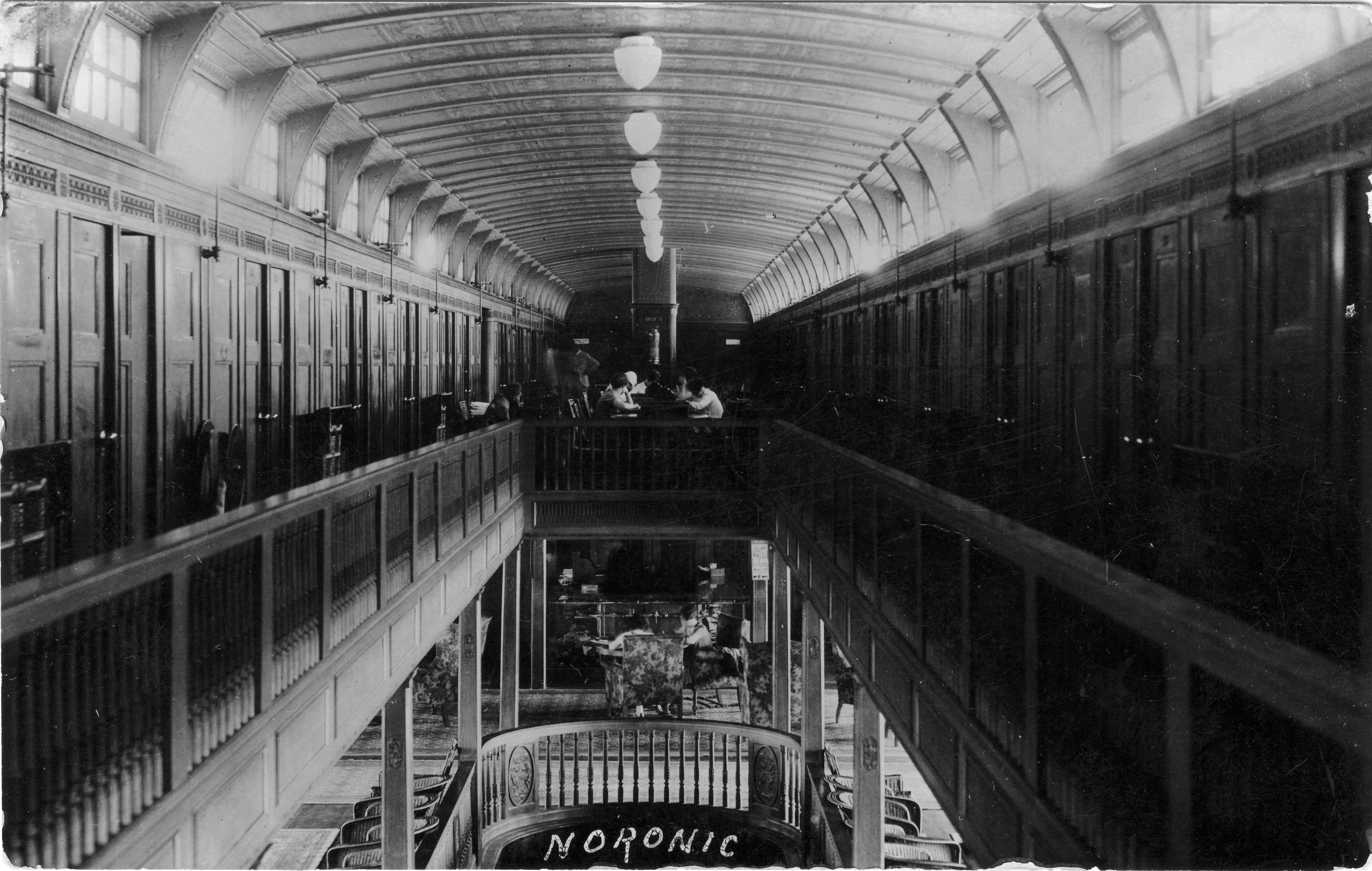
Most of Foote’s postcards are real photos (RPPCs). One exception, shown in Figure 1 below, is a promotional card (one of several, I am sure) that depicts the Winnitoba. The Winnitoba was the grandest excursion vessel on the Red River between its launching in 1909 (which is possibly when this card would have been produced) and its demise in a fire at the docks of its owner, the Hyland Navigation Co., in the autumn of 1912. Its sister ship, the Bonnitoba, which one sees much less frequently in postcards, is said to have been crushed by the river ice the following season. Hyland Park, the company-owned destination of the ships, still exists as a small public park just off Henderson Highway a little to the north of Winnipeg.

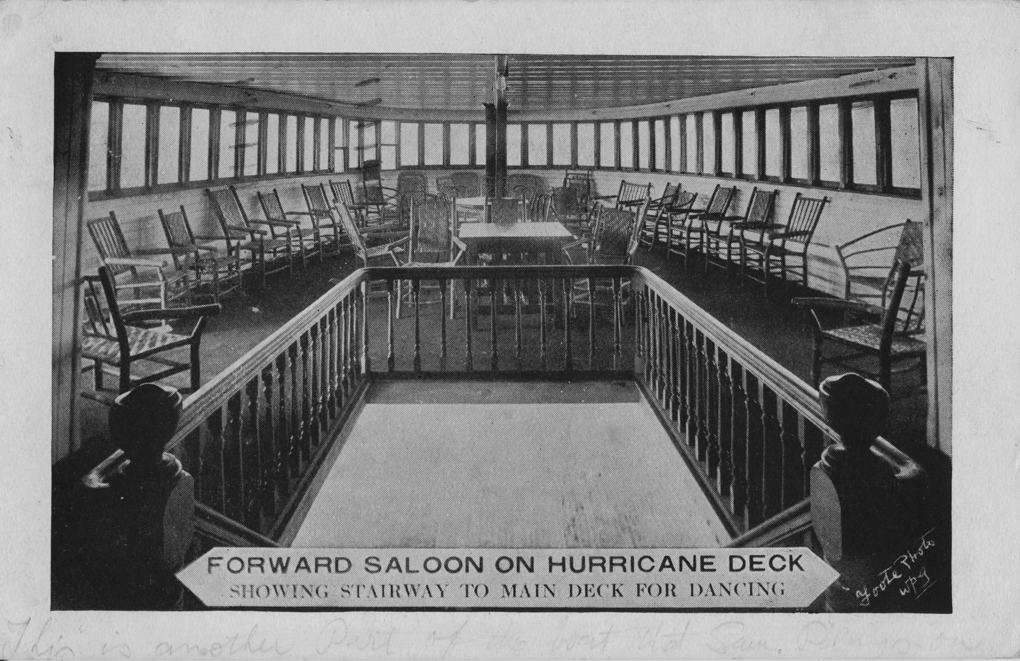
Figure 1. Forward Saloon on Hurricane Deck (Lewis B. Foote photo, published by the Hyland Navigation Co., Winnipeg, c. 1909)

While undated, Figure 2 most likely also comes from the earliest stage of Foote’s career in Winnipeg. This rather curious image of an anonymous farm family posing in the midst of a row of tall cornstalks hints at some of the whimsicality that characterized Foote’s photography throughout his career. The farmer’s fist is raised in what one imagines to have been mock triumph. Why? Was the corn perhaps the product of a good deal more effort than it was worth? Was it the farm’s first success after a string of failures? Who can say — other than that the photo illustrates, in a small way, how Foote’s images, even when they were of conventional or hackneyed subjects, often departed in small details from what convention dictated.


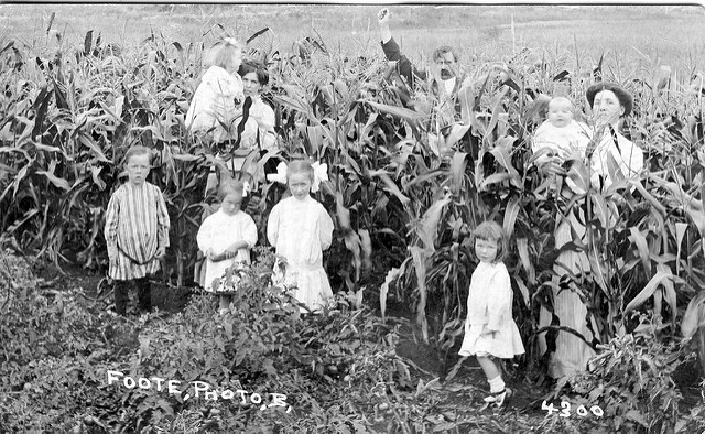
Figure 2. Unknown Farm Family (Lewis B. Foote, no. 4300, n.d.)


Figure 3, a rather poorly focused but nonetheless interesting image of the 1913 Labour Day parade in the town of Stonewall, Man., is an early example of Foote as recorder of labour history, an interest which (as we will see below) would just a few years later generate perhaps his greatest legacy. The sender of the Stonewall card notes the “New Town Hall” — the building built from the limestone that gave the quarrying town its name. At left, townsfolk in search of the best view stand behind a rooftop sign for “C. M. Brown – Hardware, Tinware and Stoves”.

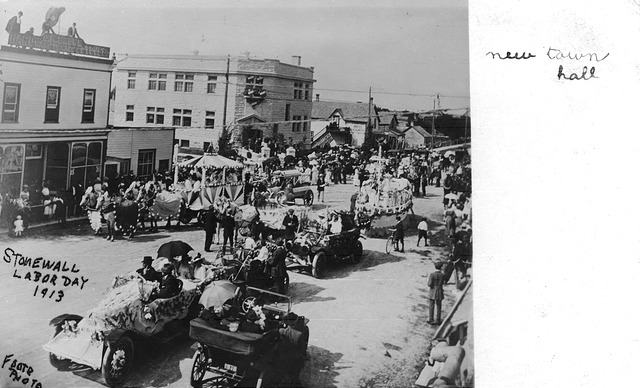
Figure 3. Stonewall Labor Day 1913 (Lewis B. Foote, 1913)

Continuing with the theme of labour, Figure 4 shows the early stages of construction of a building near St. Mary’s Academy, the Roman Catholic girls’  school that is visible in the background. It has been suggested that the building under construction might be the H. W. Hutchinson House, 603 Wellington Crescent, now First Unitarian Universalist Church. As construction on the Hutchinson House apparently began in 1912, that thesis fits with what would superficially appear to be the age of the image on the postcard. But, having said that, many other large houses in this elegant neighbourhood would also have been under construction at roughly the same time.

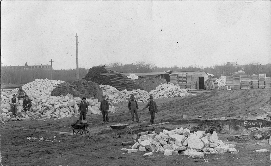
Figure 4. Construction in Crescentwood (Lewis B. Foote, no. 4482, n.d.)

In Figure 5, we have a personal postcard of two soldiers — to all appearances not young men so perhaps veterans of the Boer War or another earlier conflict. The studio blindstamp, “Foote & James”, provides a clue to the date, as Foote entered into his long-lasting partnership with George James only in 1914. So perhaps these men, despite being a little older than average, were on their way to the First World War. Their uniforms appear to this highly untrained eye to be rather distinctive — perhaps someone familiar with military uniforms of the period will be able to tell us more.

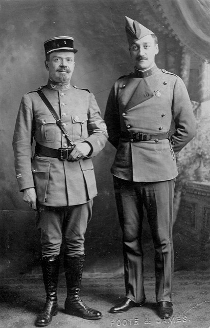
Figure 5. Two Soldiers (Foote & James studio, after 1913)


General Strike Postcards

Finally, just as the soldiers were returning from the War — and definitely not unconnected with that fact — Winnipeg began to experience labour unrest. In the spring of 1919, that unrest blew up into a full-scale and at times violent General Strike. The General Strike is still arguably the most significant event in the history of Canadian labour, making headlines around the world (including the New York Times‘ famous “Bolshevism Invades Canada”) and shaped Winnipeg’s local politics for at least half a century. Foote produced photographs throughout the Strike, which lasted for a full month until called off on June 25, 1919, but the surviving photo postcards that I have seen seem to date exclusively from just two dates: June 10th and June 21st. The images below are all from the more commonly-found of the two, the 10th.

Figure 6 is one of the clearest and most interesting photo postcards of the strike, showing a large crowd at Portage & Main, with Portage Avenue East at right (in front of what is now the site of the Richardson Building). In Figure 7, a clipping from the evening edition of the Winnipeg Tribune, we learn that this melee took place at two in the afternoon — even the plight of the delivery vans that we see trapped in the crowd (including one belonging to Ringer’s, long a prominent pharmacy in the city) is noted! The timing is confirmed by Figure 8, which shows the mounted policemen in front of the McArthur Building (later the Childs Building) on the northwest corner, with a Dingwall’s Jewellers clock obligingly revealing the time to be 2:41 p.m. Between the two images, the photographer’s vantage point has shifted from an elevated position on the southwest corner to street level on Portage Avenue. If the activities in Figures 7 and 8 appear to be at least under a modicum of control, the final image (Figure 9) — taken from an elevated position above the crowd in Figure 8 — provides dramatic proof that “charge” really did mean “charge”.

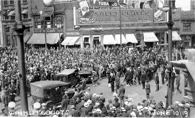
Figure 6. Winnipeg Riots, June 10/19 (Lewis B. Foote, 1919)

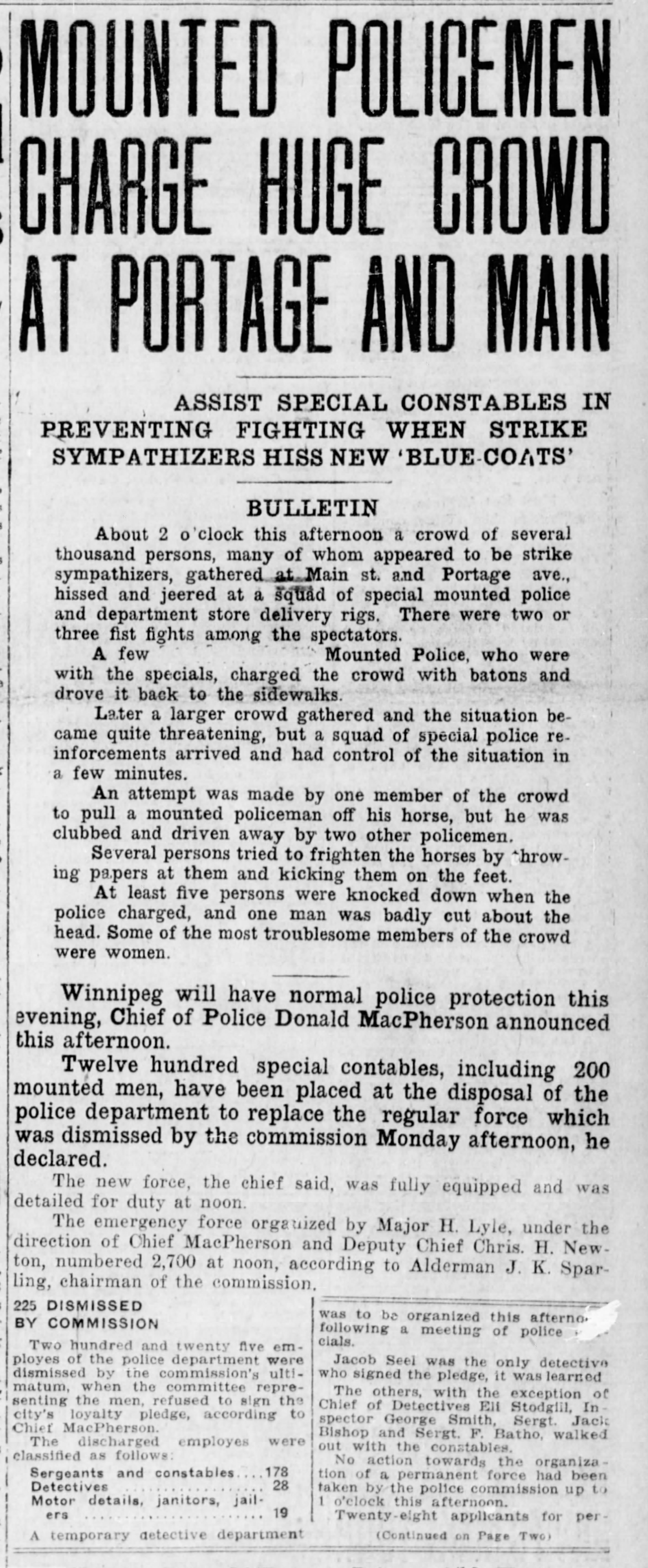
Figure 7. “Mounted Policemen Charge Huge Crowd”, Winnipeg Tribune, p. 1 (June 10, 1919) CLICK TO ENLARGE

Why so rare?

Few of the Foote postcards in my collection — and none of the General Strike postcards — were postally used or written on in any way, indicating that they were probably purchased for personal albums (and as souvenirs, in the case of the strike cards). This fact may also suggest that Foote was not sufficiently invested in the postcard market to have created the necessary distribution channels for his “product” — relationships with shops, druggists and others would generally have been needed to get one’s photocards in front of the buying public. Even though more and more of the cards turn up with time, indicating that there must have been a fair number of them, I have not yet seen any single example — other than the General Strike cards and the Hyland Navigation Co. lithographs — on sale more than once. This might indicate that they were usually produced in small quantities, perhaps only at the request of individual customers for whom Foote had produced larger images. Any other examples in the collections of our members or visitors — particularly of subjects other than the General Strike — would definitely be of interest.

The only L. B. Foote postcard in the Peel Prairie Provinces collection, a group shot of the Salvation Army Citadel Silver Band, quite possibly c. 1910 as noted, may be seen here.


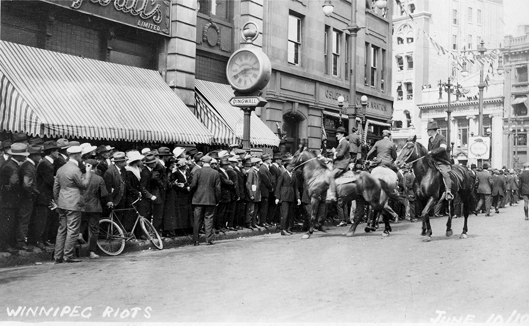
Figure 8. Winnipeg Riots, June 10/19 (Lewis B. Foote, 1919) Mounted policemen inspect onlookers outside the McArthur and Nanton Buildings.


Figure 9. Winnipeg Riots (Special “Mounties”) June 10/19 (Lewis B. Foote, 1919).


CAUGHT IN THE ACT?

By Andrew Cunningham

Collectors often speculate about the re-use of images in postcards — whether this was done with permission or not, or with due attention to the copyright of the photographer or original publisher. In the advertisement below, which appeared in a Canadian trade publication in 1907, the Barnes-Crosby Co. of Chicago offered, among other things, to make postcards from “other post cards”! That is rather bold and may not have endeared it to others in the industry.

Interestingly, while the company claimed to be the “largest concern of the kind in the world”, it doesn’t appear to have left much of a legacy. A recent search of “Barnes-Crosby” on eBay turned up only two postcards, both publisher’s samples! Nor is the company included in the publisher index of the Metropolitan Postcard Club of New York.

Any other thoughts or information on this issue would be appreciated!

Barnes-Crosby Co. postcard advertisement

Barnes-Crosby Co. advertisement published in Canadian Druggist, 1907.

CARD TALK – SPRING 2017 HIGHLIGHTS

By Andrew Cunningham

TPC members should have received the newest Card Talk this past week, a wee bit behind schedule but hopefully worth the wait. Articles this time around include John Sayers on the Halifax Explosion, particularly the cards published by Novelty Manufacturing & Art Co. of Montreal with images that were credited to Underwood & Underwood of New York, the famous stereo view publishers. The article identifies seven Novelty Manufacturing & Art Co. cards between the numbers 523 and 536 that feature Halifax explosion images — 523, 525, 528 and 533-536. Presumably the others in that range, and likely many other Novelty Manufacturing cards, also have views of the disaster. One of the cards, no. 525, “Beautiful Halifax Church, Mile and a Half Away, Wrecked by Explosion”, is seen in Figure 1.

Figure 1. Beautiful Halifax Church, Mile and a Half Away, Wrecked by Explosion [no. 525]

A second series of Halifax Explosion cards identified by John was published by Cox Bros. Co. of Halifax. This series, which appears to be somewhat less common than the Novelty Manufacturing cards, is represented by ten cards in John’s collection, mostly numbered between 629 and 704, although there is also a “999” in the set. These images are very interesting and include a close-up view of the Imo — the ship that started the catastrophe by colliding with the Mont Blanc –, an image entitled “Kaye Street Methodist Church” in which there is no church other than what looks like a small pile of lumber in the midst of some broken trees, and (most interestingly, perhaps) the Cox Bros. studio itself, which was very badly damaged (there’s actually a bit of a story there, as John points out, but it’s a bit too involved to get into in a short summary like this).

A second feature article in this issue is Canadian Banks on Postcards. The author looks at banks in the early twentieth-century, from provisional structures built in brand-new Prairie towns to “skyscrapers” in Winnipeg and Toronto that, in their day, were the tallest commercial buildings in the country. The cover of this issue features a Canadian Bank of Commerce branch at Granum, Alberta (Figure 2) that may look familiar to western Canadians — not because they have all been to Granum, but rather because the Bank of Commerce used the same “kit” branch — manufactured by the B.C. Mills, Timber & Trading Co. — in small towns across the West. 

Figure 2. Canadian Bank of Commerce, Granum, Alberta.

We also look at interesting postcard find by our member Harry Holman, whose Straitpost website (incidentally) is full of interesting thoughts on Prince Edward Island postcards. Harry recently discovered a Warwick Bros. & Rutter postcard of Prince of Wales College, Charlottetown, the reverse of which contained an interesting letter from English-born  flier Harry Bingham Brown (1883-1954), one of the pioneer aviators in the United States.

As was not uncommon in the years leading up to the Great War, Brown was doing the summer fair circuit and had arrived in Charlottetown in late September of 1913 to work the P.E.I. Provincial Exhibition. After a successful run at Halifax, the Charlottetown engagement was something of a disappointment (as Harry Holman notes) — Brown’s aircraft drifted away from the fairground on both of his flight attempts, disappearing quickly from the view of the eager crowds and not returning (not crashing either, but forced to land quite a distance away). Anyway, Brown wrote back to a friend in Massachusetts about how the trip was going — we won’t spill the beans on the contents of the note here, but the short message is an interesting artefact of the golden age of daredevil aviation and the sort of thing that, as a collector, is a great reward for the assiduous inspection of even the most nondescript postcards at sales and online.

This edition of Card Talk contains a lot more, including more 40th Anniversary “TPC Memories” photos, letters and observations from readers, Barb Henderson’s account of our meetings in the fall and winter of 2016-17 and our usual calendar of future meetings and postcard events across Canada and the northern U.S. If you’re not one of the in crowd that can proudly display this marvel of deltiology on your very own coffee table, then we strongly suggest that you sign up today for a TPC membership (if you act soon, we won’t send you a ginsu knife, or even two ginsu knives, but you will be able to participate in the latest instalment of our fabulous members-only online auction, which raises funds for the Club and begins in June 2017).


AN UPDATE ON “GOVERNMENT AGENT” POSTCARDS

By Andrew Cunningham

In a post from July 2016 concerning “Government Agent” cards, I had noted that, thanks to the efforts of TPC members Wayne Curtis and Philip Francis, we knew of a total of 35 Government Agent postcards. To back up a bit, “Government Agent” cards are the western settlement promotional postcards, aimed primarily at English farmers, that sported the distinctive back design depicted below. In that July post, I referred to a short note in the Winnipeg Tribune for July 24, 1905 (also below) that was quite clearly referring to the publication of the postcards. The Tribune happened to describe the images on four of the cards, three of which are on Wayne and Philip’s lists, but the fourth of which — a Calgary bird’s-eye view — didn’t seem to be.

Well, in researching the publisher history of the Calgary-based H. Enida Olive Co., what should turn up among the images I found but a card (not by H. Enida Olive) entitled A Great Cattle Market, Calgary, Alberta, Canada, Centre of Ranching Industry, number 6058 in the Images section of the University of Alberta’s Peel Prairie Provinces Collection. That is clearly the card in question. However, rather than being a new, 36th card, it turns out to be one from Wayne and Philip’s list. The title of the card, which I hadn’t seen until now, just didn’t suggest that the view was a bird’s eye. So we’re still stuck at 35 cards!

Here’s a look at this very rare Calgary view … 

A Great Cattle Market and a Great Postcard (PEEL COLLECTION, U OF ALBERTA)