One of the great challenges that comes with collecting postcards, particularly the often uncaptioned “real photo” type, is figuring out what exactly you’ve got a postcard of. Like personal photos from family albums, postcards of unidentified people, places and events are common, but inherently less interesting than similar cards whose contexts are known. At the same time, a lot of the fun of collecting — particularly in this information-rich Internet age — lies in solving such mysteries for fun and profit (realistically, 99% for fun).
Of the journalist’s “five W’s” (who, what, when, where, why) the “where” is most often the key that unlocks a postcard’s mysteries. When there is no caption or postmark to tell us anything at all about the location of the image, the first and best clue is often the postcard itself, as a physical object. Is it a Canadian, a U.S. or an English card (or is it from somewhere even farther afield)? With experience, we can learn to tell when a postcard back is Canadian … most of the time. Knowing the country of origin definitely helps.
Another clue that is often lost before we think to take advantage of it is other cards that were associated in some way with the one we’re looking at. Often the seller will have taken our card out of an estate-sale album with similar cards that are captioned — sometimes a helpful dealer will even note likely locations on postcards that, while not identified, are clearly from the same place as others in his or her stock. But it’s pretty rare that we as buyers think to examine (let alone have the time to examine) a dealer’s other cards for clues about one we’re intending to buy. There can also be hints about locations in the card’s message, if there is one. But more often than not, we are reduced to staring, wistfully, into the world of the image itself, hoping that something will tell us where-oh-where this wonderful scene from a hundred-odd years ago could have been.
As an example, take this excellent real photo postcard (RPPC).
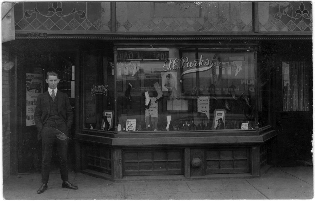
S. C. Parks Fine Shoes, 1224 1/2 Something Street, Somewhere
Here we have no problem with country — it is a “MADE IN CANADA” real photo card of a design that tends to date from about 1915-20. But Canada is a big country, and there is no message, no postmark and no caption to help us. The shot is close-in, so all we get is one shop with one generic name, “S.C. Parks Fine Shoes”. We could try Googling it, but — realistically — the right “Parks” is going to be hard to find, given the inevitable proliferation of “Park” street names, let alone all the “Park” park names. The initials “S.C.” are another blow to our hopes — a given name would have been so much easier to find.
So what else do we have to work with? The products in the window display, for one. On several occasions, the brands of goods in a shop have helped me narrow down a location. For example, the card below, which could in theory have been anywhere in Canada or the U.S., was definitively placed on this side of the border because of the distinctively Canadian brands on offer, e.g. Royal Crown Oatmeal Soap and Squirrel Peanut Butter. A closer consideration of where these products were produced led to the tentative conclusion that the card came from Western Canada, possibly Vancouver (that’s as far as I ever got: if anyone has any thoughts, please tell me — one of the best ways to figure these things out is to join your local postcard club and let your knowledgeable colleagues do the work!)
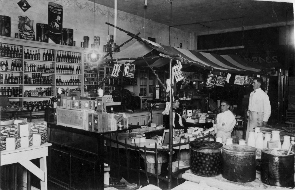
Squirrel Peanut Butter (remember the peanut on top?) in the big tub at lower right … only in Canada.
However, in the case of the shoe store, the products don’t get us beyond what we already knew — that this is somewhere in Canada. What else do we have? A house number — 1224 1/2 — that could really be just about anywhere, although the “1/2” may come in handy down the road, since there will have been far fewer 1224 1/2’s in Canada than 1224s.
But here’s where not losing patience, and owning a magnifying glass, can come in handy. One thing about shops is that they had plate-glass windows. And one thing that plate glass does is reflect. More than once, I’ve found an answer, or at least a clue, in the form of something across the street that is faintly reflected (in reverse, of course!) in a shop window. And exactly that turned out to be true of the S.C. Parks Fine Shoes postcard. At the very top of the window, on the left side, is a dark patch which turns out to be the reflection of a sign across the street. With some squinting, we can make out what it says … R-O-S-E-D-A-L-E (space) G-A-R-…! A likely answer is now clear. This has to be Toronto — not all that far from me, in fact. Surely (fingers crossed) it can be nowhere else than the commercial strip of Yonge Street, where that famous road runs past Toronto’s wealthy Rosedale neighbourhood.
With the tentative address “1224 1/2 Yonge Street, Toronto” in hand, we head to the deltiological Batcave and call up the Toronto city directory (known as Might’s). But wait … which year should we start with? Well, we’ve already noted that the card itself is of a type common from 1915-20. But even if we didn’t know that, we have a clue to a second “W” (when?) in the form of the poster at the far left. While partly blocked by the gentleman, enough of it is visible to see that it is advertising a contest sponsored by a shoe manufacturer. Looking more closely and reading what can be read, we can conclude that the contest, whatever exactly it was, had to do with the First World War. So we can surmise that a good year to try would be 1918. Looking at the Might’s Directory for that year, we find 1224 1/2 Yonge, just north of the Summerhill train station on the west side of Yonge (a couple doors up from Alcorn Avenue). And, sure enough, the occupant of that address was one Charles S. Parks, although (unusually) the nature of his business is not identified (it is mentioned in the personal directory listing for his nearby home at 32 Summerhill Avenue). Further investigation shows that Parks was Ontario-born, was 41 in 1918 (and thus is almost certainly the man in the photo), was married to Bertha, with whom he had one child, George, born 1908. The shoe store seems to have been in business from 1914 until about 1920, after which Charles appears in the directory as an insurance agent. Further investigation showed that the Rosedale Hotel stood across the street from the shop at 1145-1151 Yonge. What the G-A-R stood for — “Garden”? “Garage”? — can safely be left for someone fussier about completeness than I am.
So there you have it. A postcard that seemed to show only one small business with a frustratingly generic and hard-to-search name actually turned out to show more than that when we looked hard enough. Incidentally, the shop at 1224 1/2 Yonge is still standing today, albeit in somewhat altered form and under the new identity of “1224A”. It houses a vintage furniture store — which would probably have seemed like a futuristic furniture store to Charles — called Decorum.
Andrew Cunningham (TPC #1424)