Join us as a guest at one of our ZOOM meetings. Here’s our schedule of UPCOMING MEETINGS which are monthly except for the summer. Or, become a TPC Facebook friend to stay connected!
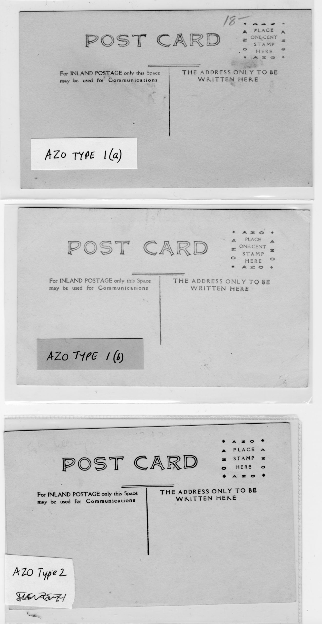
This is not a post so much as a proposal to begin the long-needed effort to catalogue the real photo postcard backs used in Canada. While most “Canadian” postcard blanks were manufactured by U.S. manufacturers, their inscriptions were often modified to suit Canadian tastes and postal regulations. Today, most people rely on Playle’s, a U.S. site, for information about dating RPPCs without recognizing that what that (excellent) site says might not apply to Canada. Also, it is much more useful to catalogue the entire back rather than just the stamp box — as Playle’s does –, since backs often differ even when the stamp box doesn’t (not to mention that the stamp box on many cards is covered up with a stamp).
With this in mind, and as a starting-point and/or place-holder, I’m uploading a Word copy (link below) of a classification system that I’ve used in cataloguing RPPCs from one company, the Winnipeg Photo Co. of Napinka, Manitoba, which produced RPPCs across southern Manitoba and Saskatchewan (as well as Alberta’s “Western Canada Ranching Series”) under a number of names from about 1905-1912. There are many other backs, of course, but this is at least a beginning.
My medium-term intention is to turn this lowly blog post into a page on the TPC website, complete with illustrations of the back types. But for the moment, this will need to do (and may generate some discussion).
Many books on postcard themes have titles that include the phrase “Wishing You Were Here”, undoubtedly chosen because those four words evoke postcards as much or more than any others. And yet, as other collectors may also have noticed, the classic clichéd postcard message — which in its fullest form runs, “Having a good time. Wish you were here”– is actually not found with any frequency on old postcards. Truth to tell, I’ve never seen those exact words, even once, among the thousands and thousands of postcard messages that I’ve seen. That’s not to say that I don’t have a few postcards with variations on the “Wish you were here” part, but I’ve never seen anything approaching the whole thing.
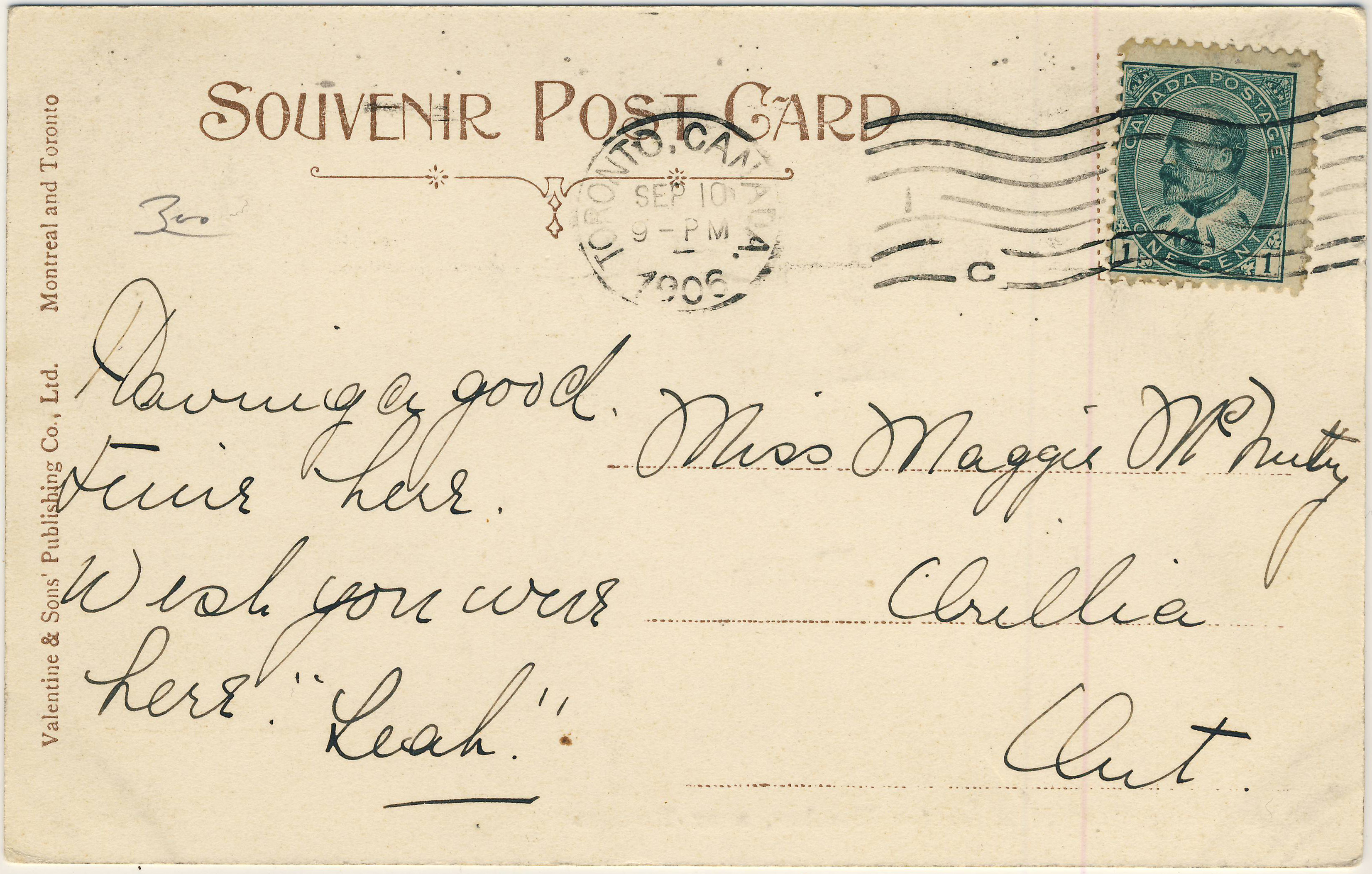
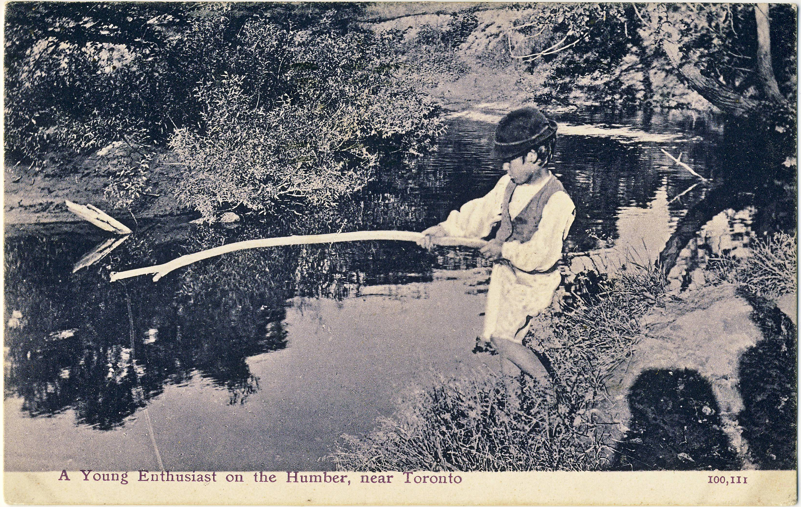
My longstanding conclusion, so far as I’d given the matter any thought, had been that “Having a good time. Wish you were here” must have become a go-to message for hurried postcardists well after the Golden Age (pre-1920) period that is the focus of my and many other collections. Well, I’m pleased to be able to say that that analysis might not be entirely true — it appears that I gave up too soon. On the reverse of a recently acquired (and very early) Canadian Valentine & Sons card — “A Young Enthusiast on the Humber, near Toronto” (no. 100,111) — there is, lo and behold, this simple message from “Leah”, written in the late summer of the year 1906:
Having a good time here. Wish you were here.
But for the first “here”, my prayers would have been entirely and perfectly answered, but (not being a fussy type) I think I can still declare victory. The greatest cliché in postcard history can in fact be traced to the earliest years of the fad. The mysterious “Leah”, who tantalizingly enveloped her own uncommon name in mysterious quotation marks, thus enters the ranks of the deltiological immortals.
The elusive message, finally found (almost!). Did Miss Maggie McNulty appreciate the significance of what she’d received? Did Leah’s sentiment sound fresh and clever to her, rather than hackneyed? Wish we were there to find out!
The postcard image is worth noting in its own right. It’s a charming example of an uncommon early style of Valentine & Sons postcards — a simple, uncoloured collotype.
Early 20th century writing styles and conventions, as commonly seen on postcards
That brings to mind a question about what we learn from the letters on early twentieth century postcards, in general — not from the content of the messages themselves, but from the handwriting, spelling, grammar, forms of address and so on. Here are a few examples that I’ve noticed over the years:
The very common use of the colon-dash (or maybe colon-hyphen) after the salutation, as “Dear Maggie :-” — this has totally disappeared but must have been a staple of children’s lessons around the turn of the 20th century;
The tendency to omit punctuation almost entirely from brief messages. This is not simply a function of being poorly educated: punctuation is often lacking even in notes penned by writers who spelled well and were clearly men or women of some sophistication. Commas were barely used and anything more esoteric than that — even a question mark — was quite unusual (as was the use of paragraphs);
It’s unusual for there to be even a P.O. box number in small-town addresses until around 1910 or after – almost always did the name of the town suffice;
On the odd occasion that we still write letters, and also in emails, we often write “Dear Mom” and “Dear Dad” — but in the Golden Age days it was equally common to include lateral relationships like “Sister” or “Aunt” in the salutation in exactly the same way, without appending the addressee’s given name. Other than for direct forebears (parents and grandparents), we have lost that reluctance to “first-name” people;
Grown children sometimes signed letters to their parents in a rather formal fashion, using their full first and last names, which would seem odd to us today.
What other bygone conventions have you noticed in postcard letters? We’d be glad to get your examples and/or to hear about any other early examples of postcard messages that say “Having a good time; wish you were here”, or something close to it.
As the hundredth anniversary of 11 November 1918 — the end of the Great War — approaches, we will take a look back at what postcards of the time tell us about the four long years that took such a toll on the people of Canada, Newfoundland and many other countries. Coincidentally, the war years brought down the curtain on the “Golden Age of Postcards”; while the medium continued to be popular, the postcard industry as a whole no longer exhibited the vitality and variety of its pre-war heyday.
Keeping the old flag flying
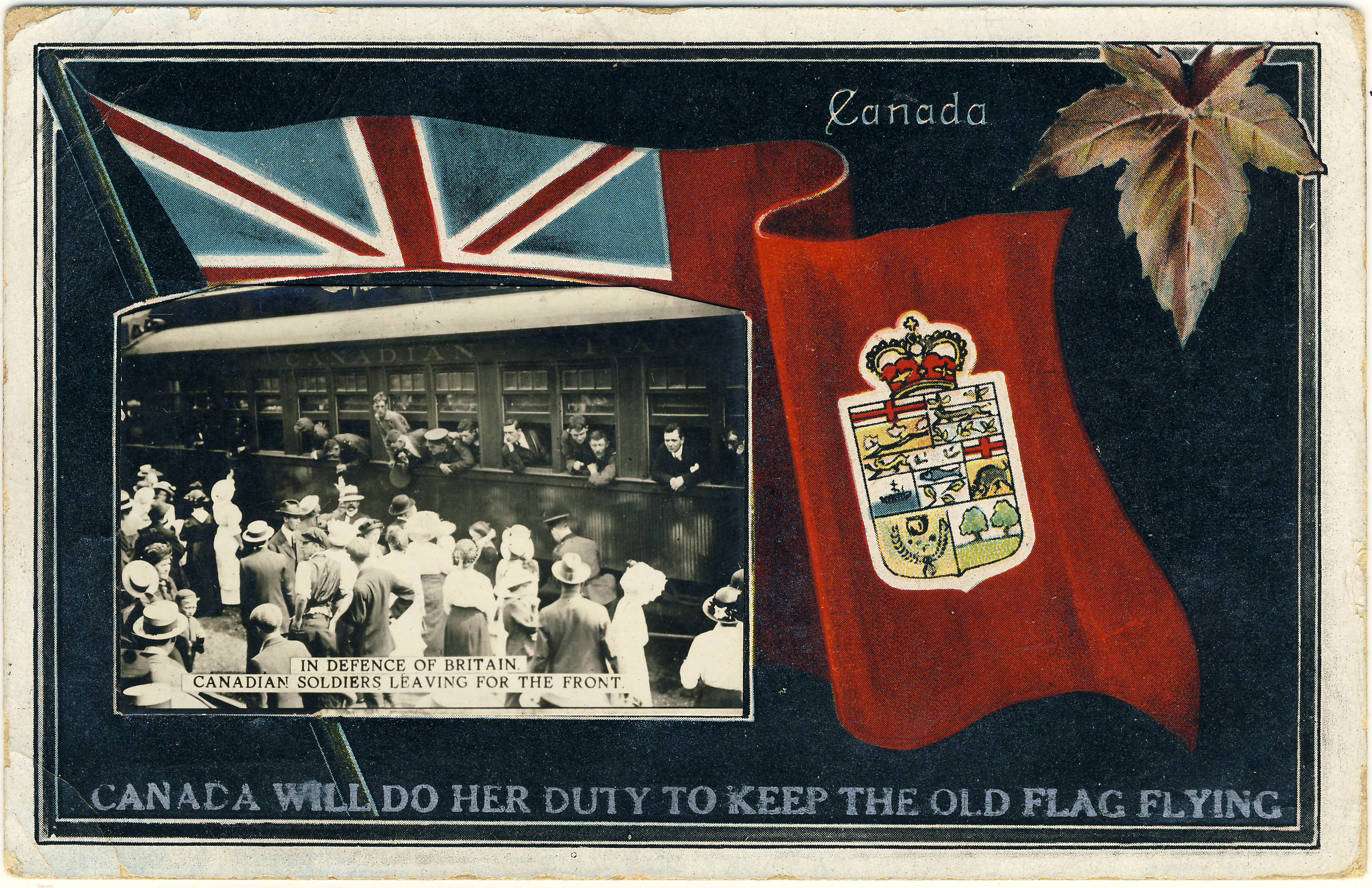
Postcards mailed in the summer of 1914 can provide us with insights into how ordinary people in the sedate turn-of-the-century world responded to the sudden intrusion of war into every aspect of life. Exhibit 1 is the Stedman Bros. “patriotic” shown below, which depicts departing Canadian soldiers while assertively proclaiming: “Canada Will Do Her Duty To Keep The Old Flag Flying”.
Stedman Bros. no. 2539, with an added photographic image.
On turning the postcard over, we find that it was posted at Toronto on 13 September 1914, barely a month after the state of war officially began. In fact, things had unravelled so quickly that the Canadian National Exhibition had no opportunity to re-think its 1914 theme of “PEACE YEAR”, neatly incorporated into the special CNE “slogan cancel” that we see here.
Verso image of the card as posted to Wimbledon, Surrey on 13 September 1914.
One might wonder how Stedman Bros. managed to print up World War I cards such as this so quickly. The answer is that they didn’t, really — this example, numbered S.B. 2539, was in fact an old Stedman card on which the small photograph of the departing soldiers was pasted (the card originally featured a coloured illustration of an R&O ship). To complete the metamorphosis, the caption about “doing her duty” was overprinted on the image in silver lettering. (Indeed, since Stedman Bros. are thought to have exited the postcard trade in 1914, it is possible that the refurbishment of these cards as World War I souvenirs was someone else’s handiwork.)
The message itself is, of course, another place where we might hope to find reference to the big news from Europe. However, even though her words were destined for England, the writer didn’t acknowledge that anything out of the ordinary was going on. By the end of her note she had apparently run out of things to say — or so we might surmise, given that she filled the rest of her space in the time-honoured way, with bland observations about the weather!
The 79th Cameron Highlanders
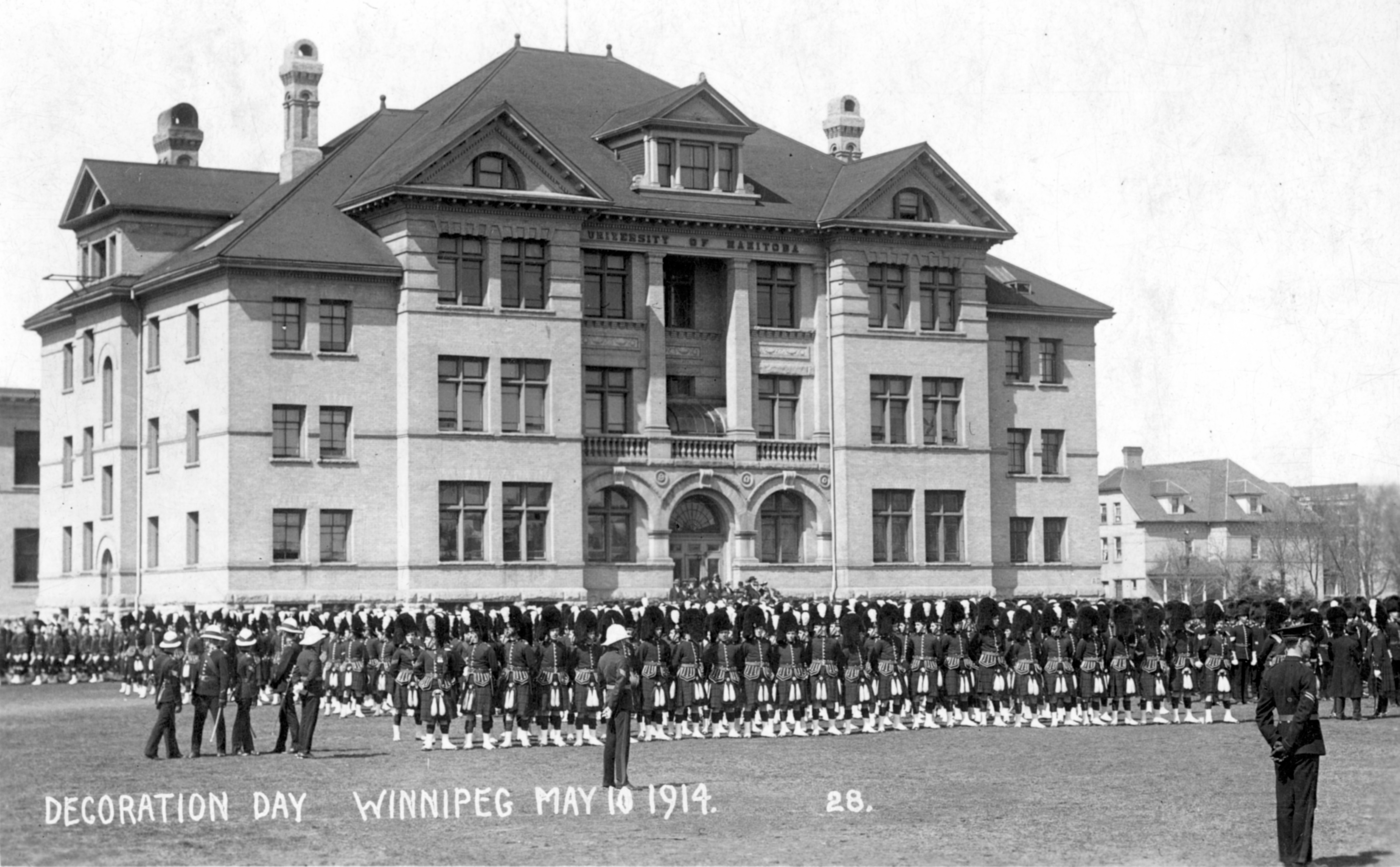
The story of the Queen’s Own Cameron Highlanders of Canada is well told on the regiment’s own website. The Camerons, from Winnipeg, were the first Highland regiment in the West, having been founded on 1 February 1910. It is unlikely that the original members would have anticipated the sacrifices that they and their mates would be required to make within just a few short years. Even at the Decoration Day festivities on 10 May 1914, as depicted in the Maurice Lyall real photo postcard below, it is unlikely that the kilted marchers imagined that before the summer was out, some of them would be halfway across the country, and then halfway around the world, fighting for real.
10 May 1914. The building in the background was the University of Manitoba. The Broadway Armoury stood directly across the street, on the site of what is now the Manitoba Legislature.
We encounter the Camerons again on the Valentine & Sons postcard below (106,330), which may well have based on a photograph taken the same day (and perhaps by the same photographer) as the postcard above. Posted on 22 September 1914 by a Royal Bank of Canada employee to a colleague who had evidently been transferred to the Bank’s Vancouver branch, its message does refer, indirectly, to the War:
To Mr. J. A. Noonan, Royal Bank, Campbell Ave., Vancouver, B.C.:
“Hello Mr. Noonan, Just to remind you we have not quite forgotten you in the exciting times we have been having. Glad to hear you have not much to do but don’t get too fond of doing nothing and forget all about Winnipeg. Every body happy in the R. B. of C.”
Valentine & Sons card showing the soldiers standing on Broadway, looking out from the Drill Hall.
The 79th trained first at Camp Sewell, near Brandon, and were then sent out to Valcartier, Quebec, just outside the city of Quebec. The following “John E. Walsh” postcard was acquired simply as a handsome Quebec “patriotic” but turned out to have some interesting Cameron Highlanders content on the reverse:
Grande Allée, Quebec City. Patriotic postcard published by John E. Walsh, a Quebec stationer.
The first thing to note about the back of the Grande Allée card is that it is cancelled with a slogan cancel for the Quebec Provincial Exhibition (31 August – 5 September 1914). Unlike Toronto’s Canadian National Exhibition, the 1914 theme in Quebec was not “peace” but “health” (“l’année de la santé”).
Back of the card, with a message from “R. M.”, then in training at Valcartier. The message is transcribed below.
As the Camerons’ website notes, only a limited number of the 79th’s members were sent to Valcartier and then on to England in the summer of 1914. At Valcartier, the Camerons were merged with others from across the country as the 16th Battalion of the Canadian Expeditionary Force. While it is brief, the card’s message provides at least some information about the Highlanders’ life at Quebec:
Having a good time down here up at 5:30 in morning. Drill all day. Getting quite thin. Remember me to Overseas bunch if you see them on Tuesday. R.M.”
As the sender is identified by initials (“R. M.”) only, the only significant clue is the recipient, J[ohn] France Hughes of the Great-West Life Assurance Co. of Winnipeg, who turns out to have been an actuary with Great-West. Hughes was born in England around 1885, had emigrated around the turn of the century, and by the time of the postcard was married and living at 609 Spence Street, a house that still stands at (what is now) the corner of Cumberland Avenue. The “Overseas bunch” sounds as though it might have been an informal weekly gathering of British immigrants — as R. M. probably was (although, given his regimental affiliation, he may have been a Scot rather than an Englishman like Hughes). From the handwriting and the fact that his social circles included a well-paid insurance professional, one might also conclude that R. M. was likely well educated.
In any event, this is a good example of what we can learn from postcard messages about the very earliest days of the Great War.
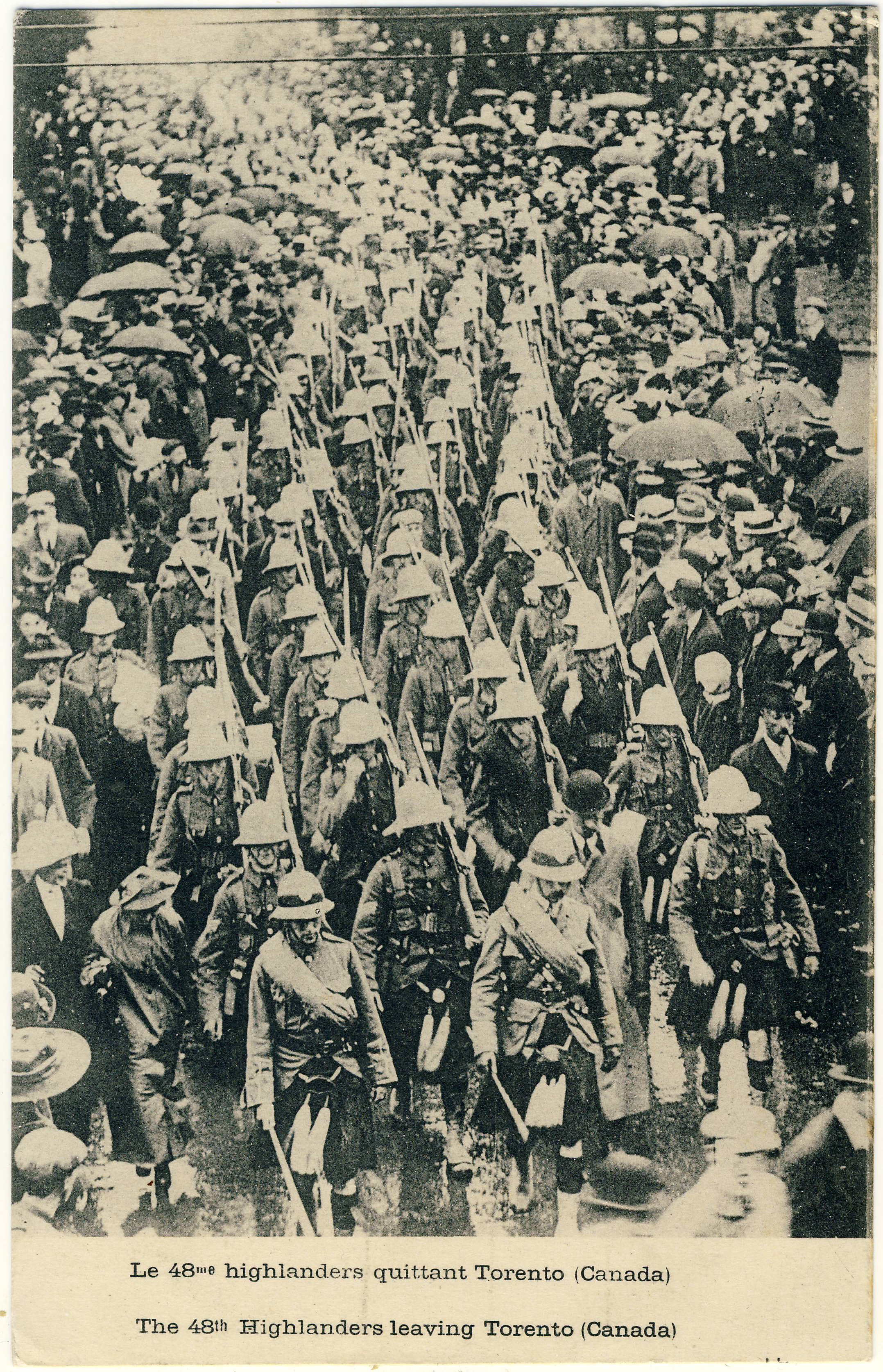
Canadian soldiers in other countries’ cards
Canadian First World War collections often include postcards from other countries that depict the Canadian war effort. One scarce example is this collotype showing the 48th Highlanders — cousins of Winnipeg’s 79th — as they leave “Torento (Canada)”. One supposes this scene to be somewhere in the vicinity of Union Station, with the departing men parading in the pouring rain. Produced by Le Deley, imprimeur et éditeur (printer and publisher) at 127, boul. Sébastopol in Paris, this particular example was not used.
A rainy day in Torento.“And very good reason to be” … indeed!
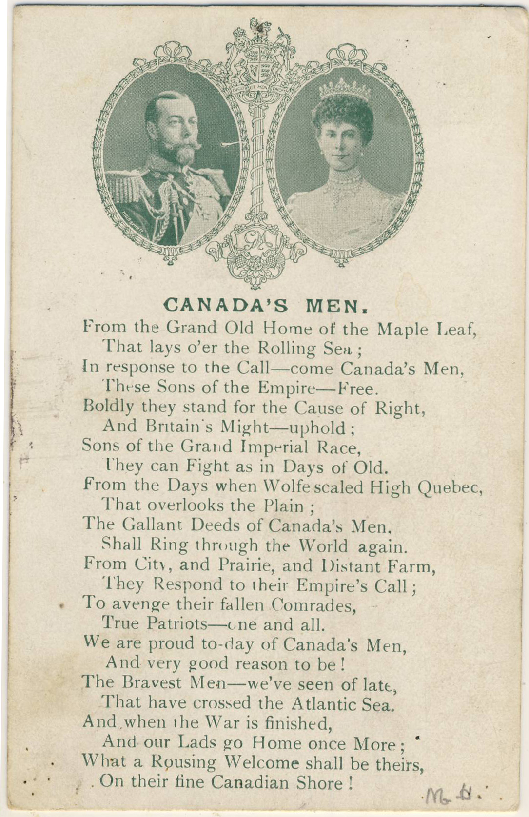
Our final example is a British card celebrating “Canada’s Men”, poetically, as “the Bravest Men — we’ve seen of late / That have crossed the Atlantic Sea”. The quality of some of the verse suggests that the poet may have been working to deadline, but overall the expression of Britain’s appreciation comes through clearly enough and, I’m sure, was much appreciated by its recipients. The card — the British publisher of which is not identified — was posted within the U.K. on 26 December 1916.
Future posts
We’ll try to post some other World War I postcards over the next few weeks, as the hundredth anniversary nears.
Here’s an interesting winter-themed card, showing women skate-sailing on Blair’s Lake, a small lake on the outskirts of Amherst, Nova Scotia (it looks like they could use a bit more wind!) As we quickly learn from Edwardian postcards, Canadians of the time — men and women alike — were up for just about any sort of sporting activity in wintertime, no matter how absurd!
Skate Sailing at Blair’s Lake, dated March 20, 1906.
Reverse of the Blair’s Lake “Private Mailing Card”, printed by Black Printing Co., Ltd., of Amherst.
The interest of the card extends beyond the image. For one thing, the card stock is coloured on the reverse but plain on the picture side, an unusual and (one imagines) costly effect that definitely lends the card a touch of class — offsetting the limitations of the half-tone image.
As noted, the printer was Black Printing Co., Ltd., of Amherst. Postcard aficionados will also note the non-compliant “PRIVATE MAILING CARD” title, a designation that was required under U.S. law between 1899 and 1901 but wholly improper under Canadian postal regulations. I have seen U.S. wording on Canadian postcards before, but not, to the best of my recollection, on a back that was clearly printed in Canada rather than having been imported from the U.S. Other examples of this kind would be interesting to see.
“PRIVATE POST CARD” was the Canadian standard established (as Steinhart tells us) in the Official Postal Guide as of December 29, 1894. The card itself was posted in 1906, long after plain old “POST CARD” had become the norm in both countries.
[Andrew Cunningham]
ADDENDUM:
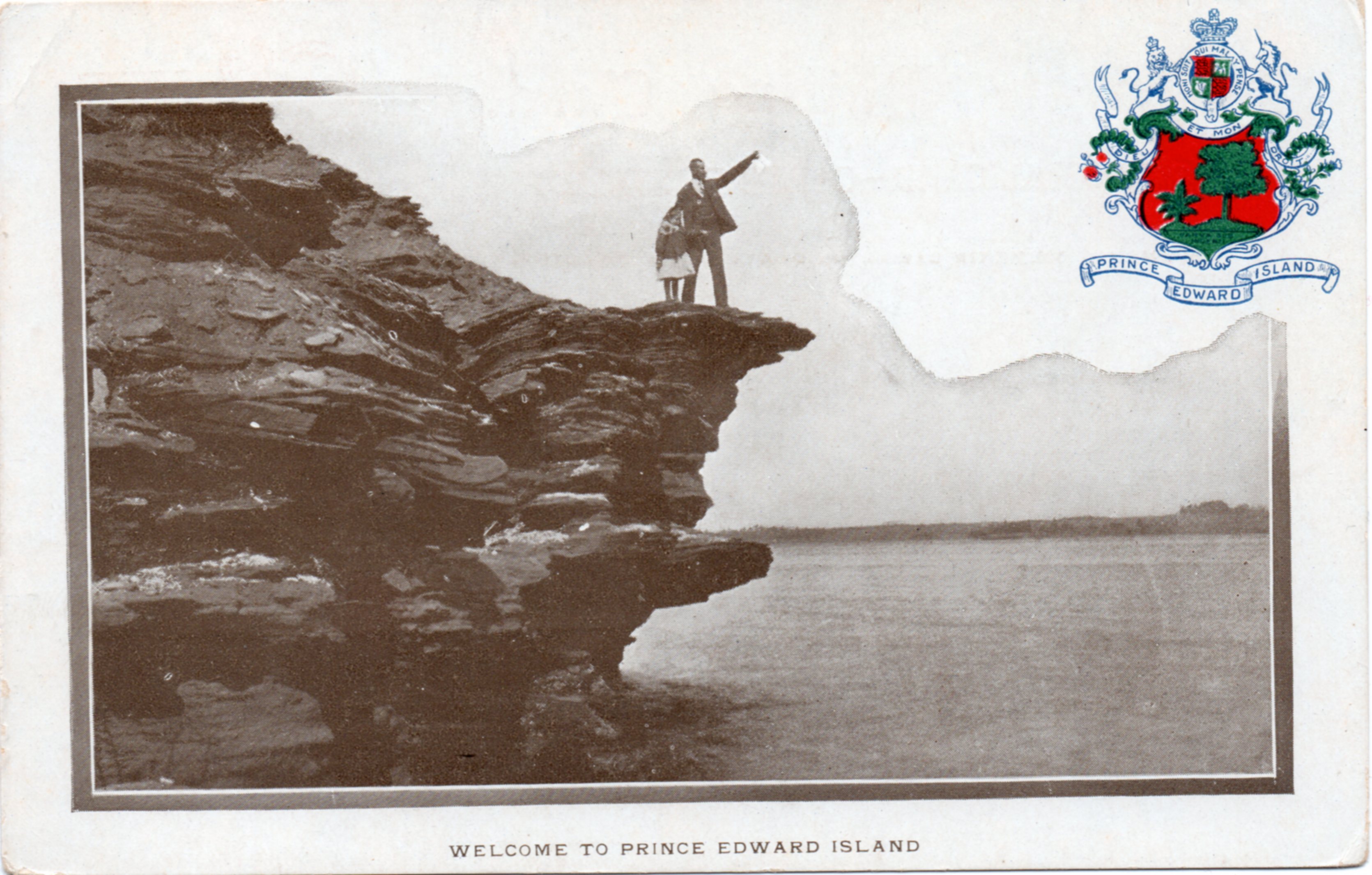
As per the comments below, Harry Holman sends us this PEI card, produced by P. D. Ayer of Moncton, N.B., that also has a “Private Mailing Card” back:
“Welcome to Prince Edward Island”
Reverse of the card, with the PRIVATE MAILING CARD design from P. D. Ayer & Co.