
I’ll be the first to admit that this one is probably just for the geekiest of deltiologists. It has to do with a duplicate Valentine & Sons card in my collection — number 102,198, entitled “G.T.R. Double Track through the Garden of Canada” in one example, while the second version spells out the name of the railway in full, as “Grand Trunk Railway”. Valentine & Sons captions often changed between printings of the same card, so the name variation isn’t especially interesting. To see what was interesting, let’s have a look at the cards:
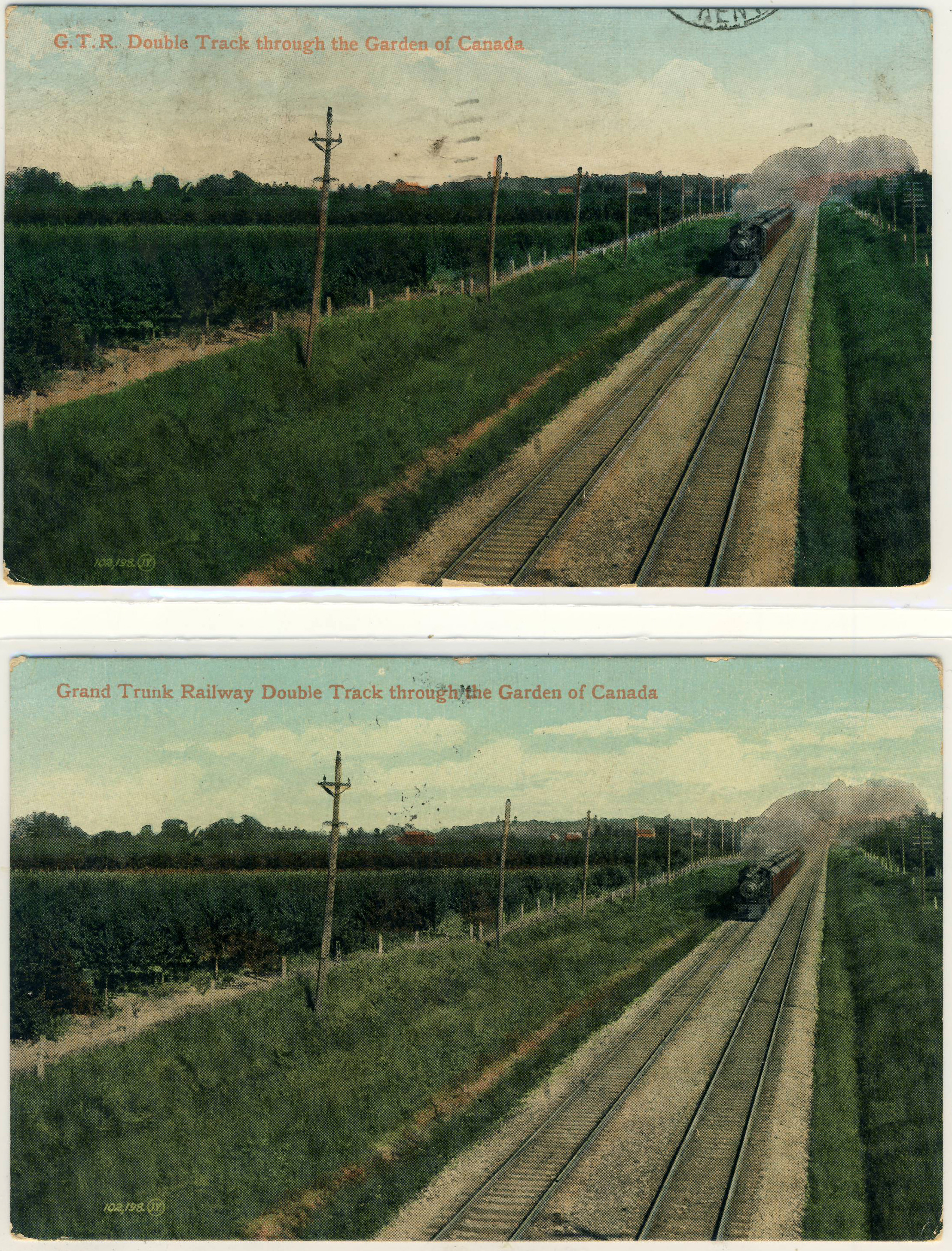
Spot the Differences.
The back types are identical. “Grand Trunk Railway” appears (on the basis of a pretty murky postmark) to have been posted on 19 February 1907, while “G.T.R.” was posted on 3 May 1908. But that’s neither here nor there. The odd thing is that the cards are different in a second way that is harder to spot at first. It’s the images: they are identical EXCEPT for the sky. The clouds on version 1 are completely different from the clouds on version 2! Of course, the skies on these early lithographs were entirely fake to begin with, because they usually reproduced as completely blank areas, necessitating the subterfuge of “hand colouring” in which clouds were added to the artist’s taste. But that doesn’t explain why the skies would be different between two printings, when everything else in the image, including all the rest of the applied colouring, is identical.
Or does it? Is there a reason that the sky would have been coloured separately on the occasions of each printing?
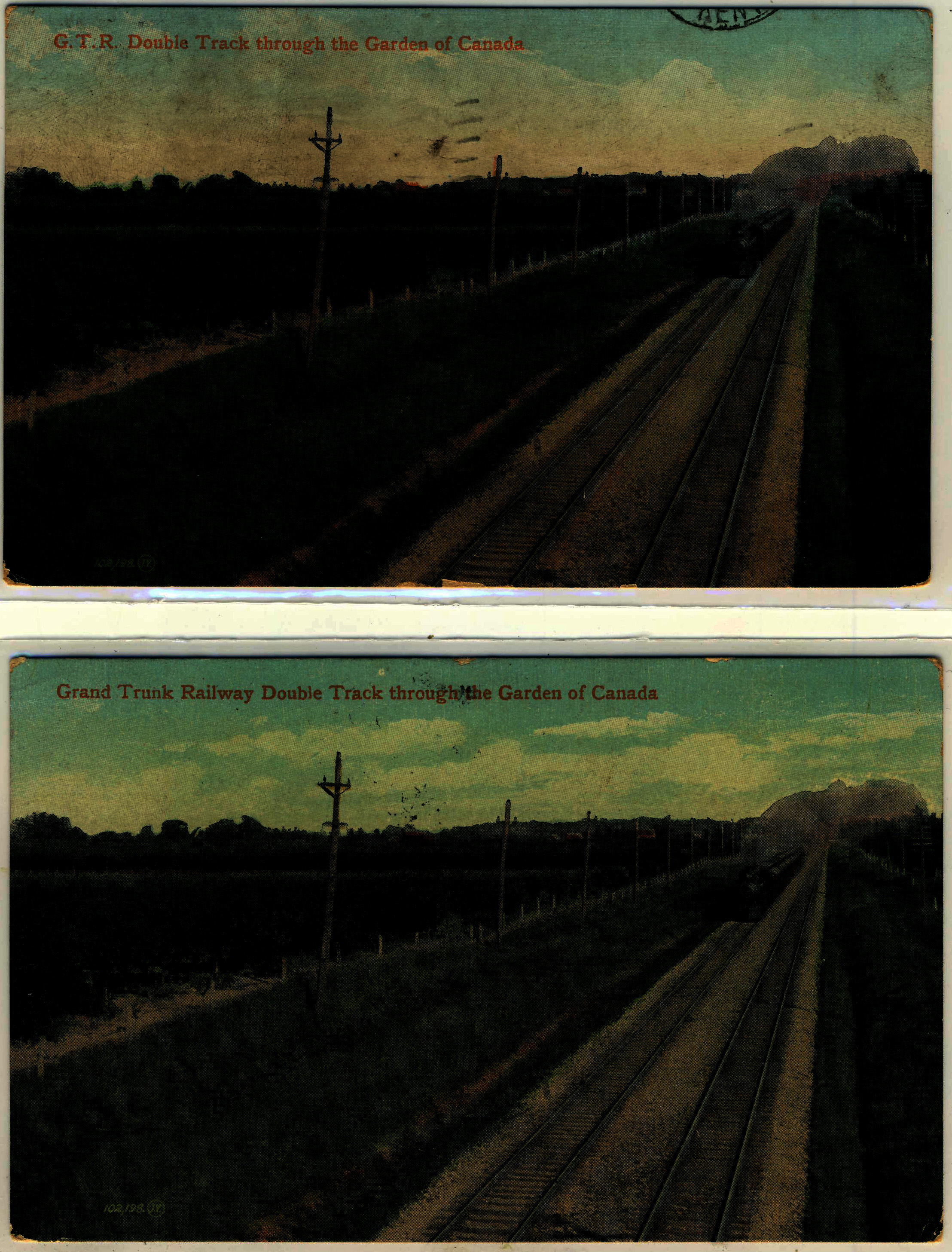
In case you can’t make out the differences, here is another version with added contrast (click to enlarge):
Any thoughts? Anyone have similar examples of Valentine & Sons cards — or cards by anyone, really — that are the same except for the sky (setting aside variations in the caption)?
— Andrew Cunningham

I’ve found the same thing in my St. Andrews, NB collection of Valentine cards. Now I find I am checking all cards for sale for such differences in sky and text in what otherwise appears to be same photo.
A really interesting observation. I went through just a couple categories and found the same thing, but many of my duplicates are “sky only” and “sky with clouds”. The clouds are clearly “painted” in – in one card the clouds look like they’ve been painted by Gaugin. Valentine has a ton of variations (and I just collect Toronto!) – I’ve counted 45 of them just on the face of cards – black and white, sepia etc. I’ve never counted the different backs of the cards, nor, until now, the clouds.
I think “geeky” and “deltiologist” are a bit redundant, don’t you?
It’s not just Valentine & Sons that have this variety of skyline change, but many other publishers do the same. I often thought it was perhaps due to the cost of the stencils. They were expensive to cut, as was the material used to make them and they would have different dye cutters producing the stencils, thus the difference. It would be more cost effective to have a variety of skylines to fit many types/style of cards.
What Carl said. In my PEI collection, there are often 3+ different skies for the same scene – I had presumed this artistic license was national in nature.
The shadow of the X shaped crossing sign in the centre foreground is partial in the upper image and more complete in the lower image, suggesting a subtly different cropping of the image as well.
Thanks! I hadn’t noticed that. The “cropping” might just be an artifact of how the sheets of cards were cut after printing. I’m not 100% sure, though.
It does sometimes seem that no two postcards, like no two snowflakes, are alike!
Hi Andrew,
Very common in the Maritime’s versions of Valentines cards.
In my Halifax collection, many identical scenes can have 3-4 different ‘skies.’
Interesting! I will have to look into this more closely.