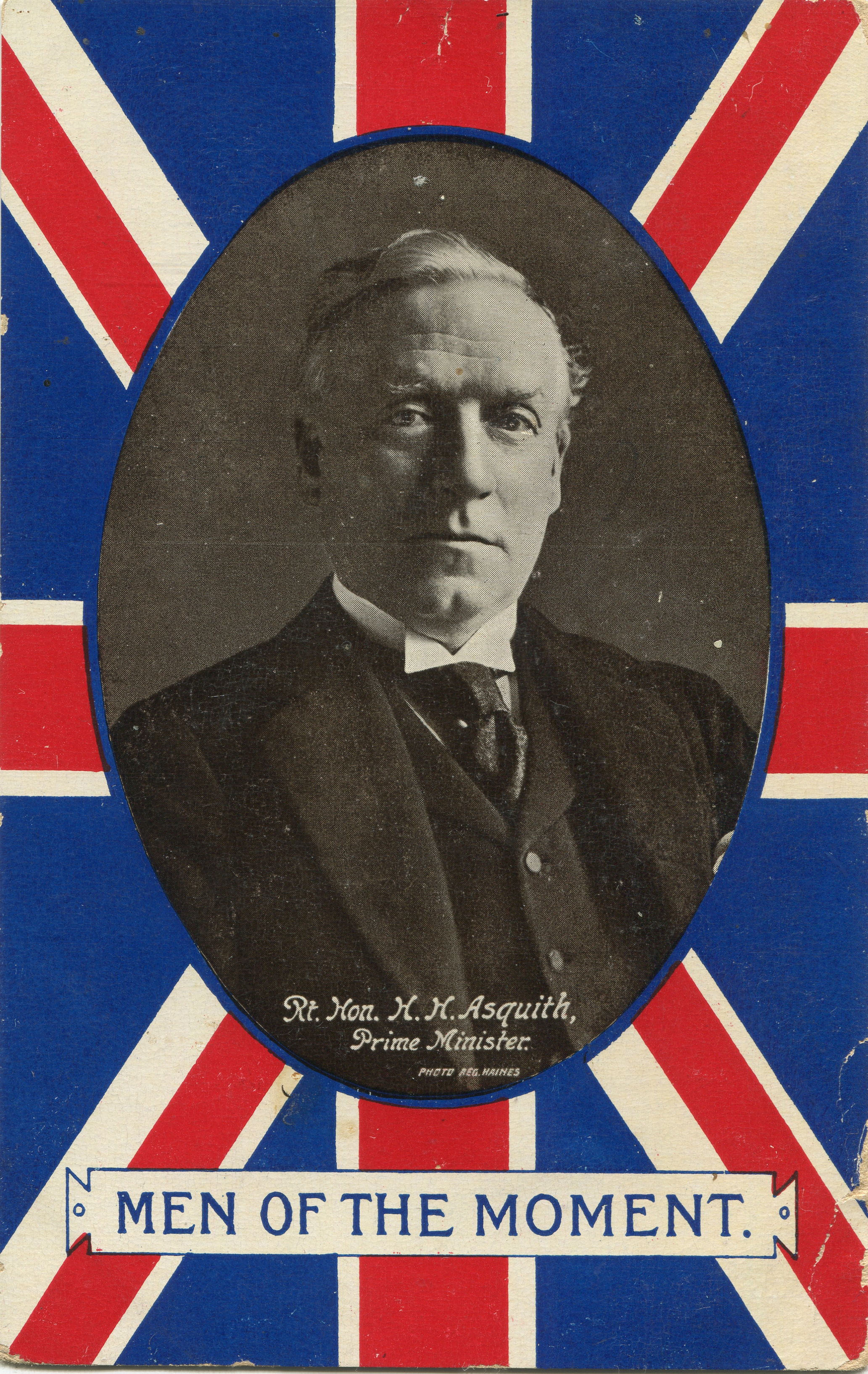
(1) Rt. Hon. H. H. Asquith, Prime Minister of Great Britain (1908-1916) in a Valentine & Sons card posted at Pakenham, Ontario on 6 November 1914.
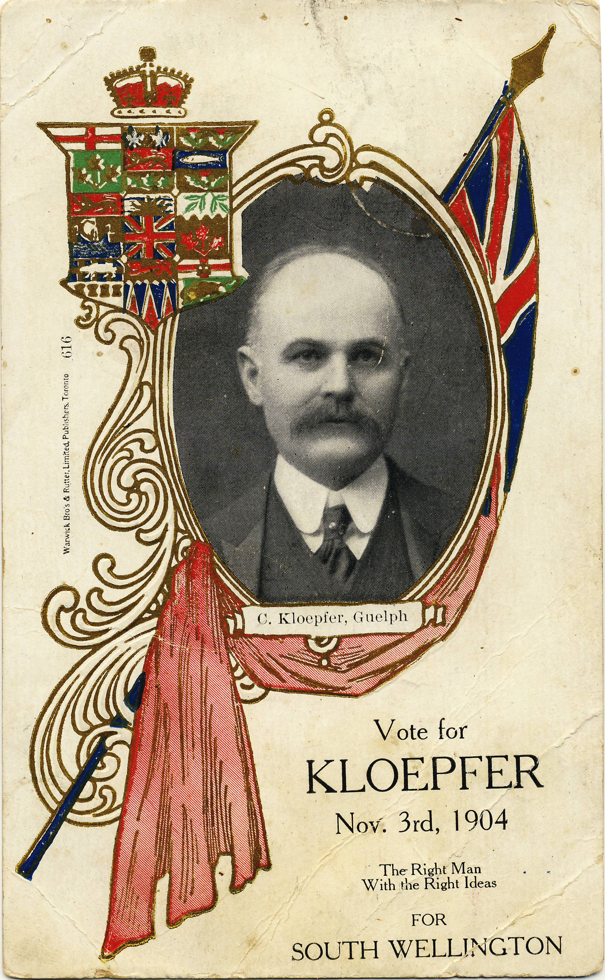
(2) Christian Kloepfer of Guelph, Conservative candidate for South Wellington, 1904. Warwick Bros. & Rutter card no. 616.
Don’t know why, but now seems like a good time to talk about political postcards. Canadian postcards promoting candidates for office can be found from the early 1900s right through the 1950s and 60s — indeed, some candidates may still be using them today. Many postcards also featured leading political figures of the time, whether in a reverent tone or in a negative one.
Reflecting the fact that the postcard’s Golden Age roughly coincided with the Edwardian era (1901-1910), the use of political postcards seems to have peaked around the time of the 1908 federal election. A majority of early election cards date to that campaign; cards from the preceding (1904) and subsequent (1911) elections are significantly less common. I have never seen a postcard from the 1900 federal election, although there must surely have been some.
For an example of a political postcard, we can look to the U.K. as well as Canada – Figure (1) shows British Prime Minister H.H. Asquith (1852-1928) in a patriotic “Men of the Moment” series. In those days it was still something of a novelty to be able to see what the leaders of one’s country looked like, and postcard collectors of the time collected series showing public figures. Some series of images would focus on leaders of one party while others were more inclusive.
Canadian Campaign Postcards
In a Canadian context, Warwick Bros. & Rutter produced many cards of this type. Whether the company decided which politicians would appear, or whether it was more of a “pay to play” arrangement, is not known. There is certainly a fascinating mixture of well-known politicians of the time and men who are now extremely obscure figures — learning the stories of the latter is definitely one of the most interesting side-benefits of this type of collecting.
The election of 1904
In Figure (2), we have an early Canadian example. Dating from the federal campaign of 1904, this Warwick Bros. & Rutter postcard depicts Christian Kloepfer (1847-1913), “The Right Man With The Right Ideas” for the riding of South Wellington. Kloepfer, a Conservative, had been elected MP for the riding in 1896 but was edged out in 1900 by Liberal Hugh Guthrie (1866-1939), who narrowly defeated him again in the 1904 rematch (despite the appealing postcard).
The election of 1908
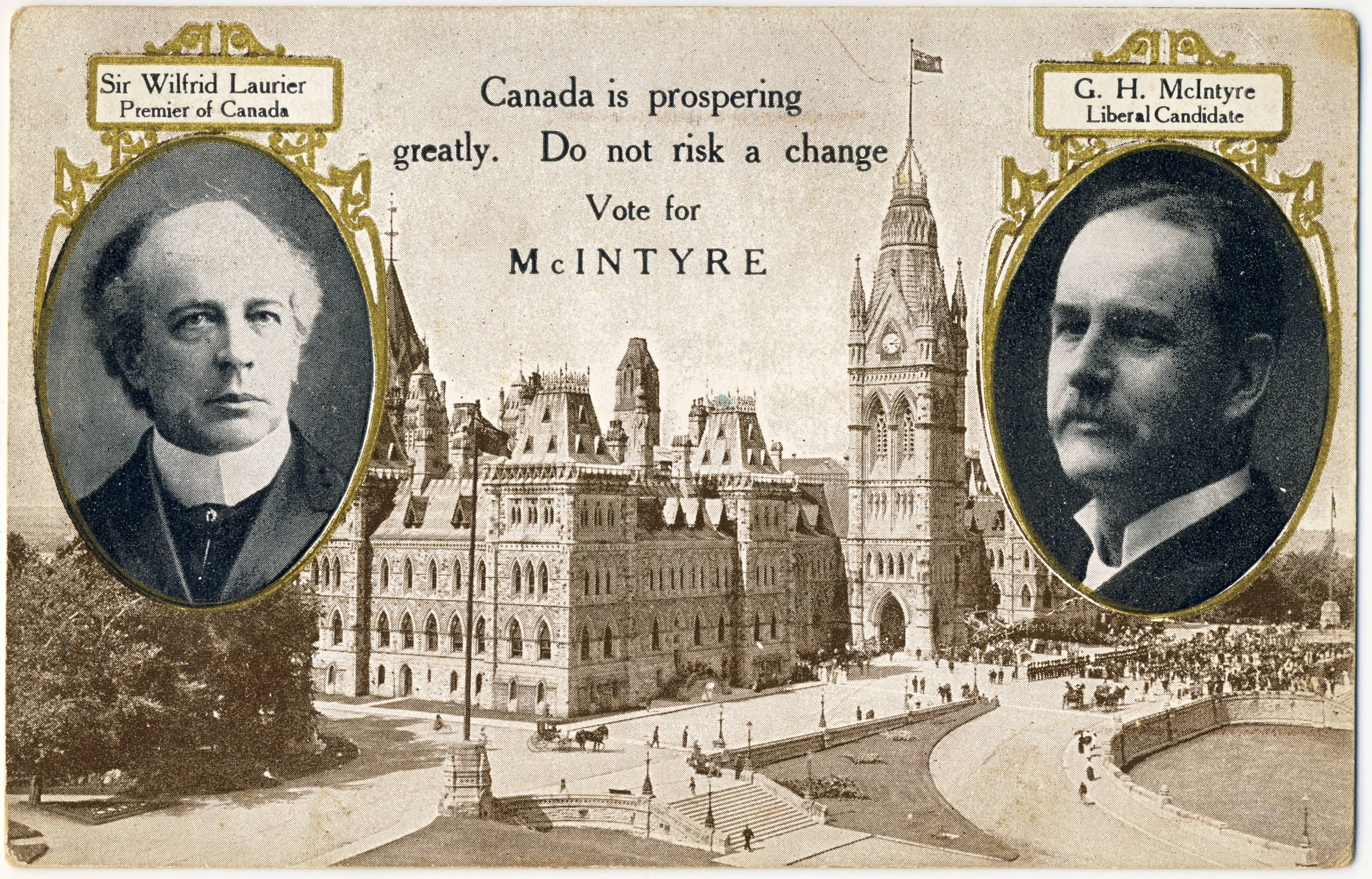
(3) The Laurier-McIntyre postcard, with vignettes of the Liberal leader and the local MP printed on a pre-printed image of the original Centre Block.
As noted above, 1908 was the peak year for Canadian political postcards. Warwick Bros. & Rutter came out with a design in a popular format that featured headshots of a party’s national leader and a local candidate. Not a firm to play favourites, Warwick created election postcards in this format for both the Liberals and the Conservatives. Figure (3) shows a Liberal example, with Prime Minister Sir Wilfrid Laurier (1841-1919) featured alongside Gilbert H. McIntyre (1852-1913), MP for the Ontario riding of South Perth.
The prosperity that the Laurier Liberals wished to uphold as they sought a fourth term in office in 1908 was the theme of a series of anti-Conservative postcards featuring illustrations by popular cartoonist Lou Skuce (1886-1951), then of The Ottawa Journal. Skuce’s characteristic style, familiar from his many hockey-related illustrations, was the opposite of minimalist — highly detailed and witty.
In Figure (4), Jack Canuck — the personification of Canada — chooses the company of the dapper and dignified Laurier, who appears as the very picture of calm assurance alongside an image his signature project, the Grand Trunk Pacific Railway. Far behind, the Conservative leader Robert Borden (1854-1937) struggles to catch up, dragged along by Tory stalwart George Foster (1847-1931) invariably depicted in these cartoon images as the power behind the throne of a hapless Borden (replete with Mephistophelean beard).
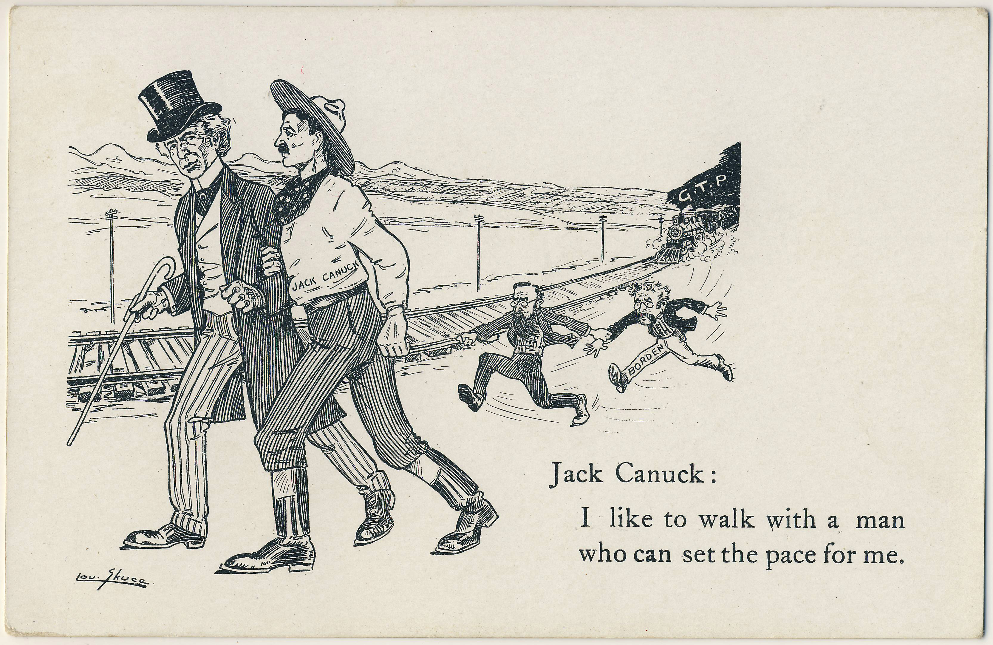
(4) The steady leadership of Sir Wilfrid Laurier resulted in an uninterrupted tenure of 15 years as Prime Minister of Canada, a record unequalled before or since. However, the Grand Trunk Pacific, enthusiastically promoted by his government, ultimately proved to be one railway too many for western Canada.
Thematic Political Postcards
In addition to political parties and candidates, political subjects were frequently the subject of postcards. Laurier’s promotion of Reciprocity (free trade) with the U.S. was the dominant political issue of the era. A series of cards issued in the 1911 campaign, in which Laurier was finally defeated by Borden’s Tories, featured illustrations by Newton McConnell (1877-1940) of The Toronto Daily News. Figure (5) is a typical example, playing to longstanding Canadian suspicion of American motivations.
The reciprocity debate
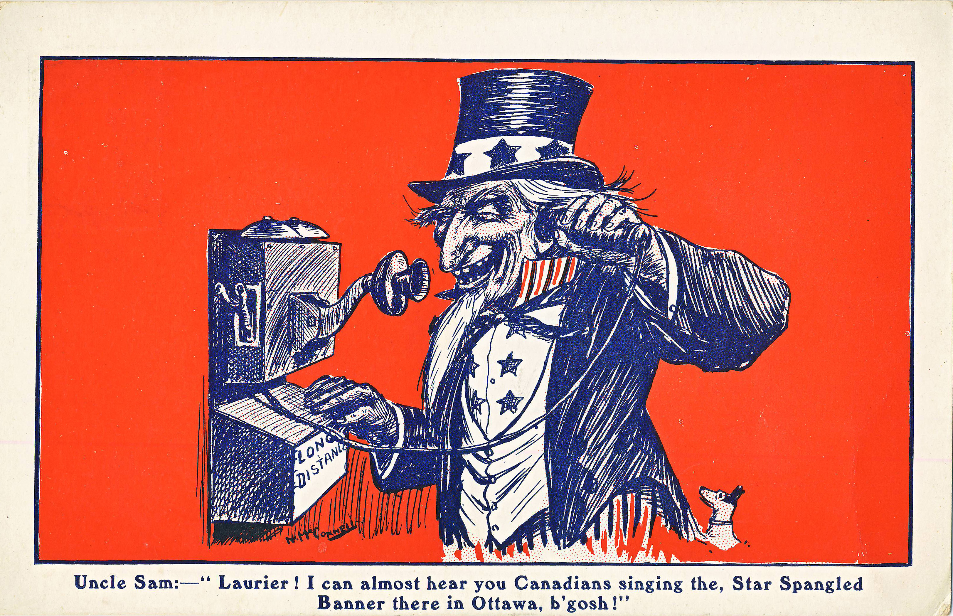
(5) This anti-reciprocity cartoon by Newton McConnell, likely produced around the time of the election of 1911, also features the latest in technology, the long-distance telephone call.
Another reciprocity postcard is shown in Figure (6), where the western provinces are depicted as showing leading Manitoba Liberal Clifford Sifton the door. Distributed by The Montreal Witness, the card is referring to Sifton’s break with the Liberals over the reciprocity issue in 1911. While he retired from politics at that point, he provided a vital endorsement to Borden’s successful Conservatives. The cartoon is signed by “Phil Drew”, a name (perhaps a pen-name) that appears to have been associated with editorial cartoons in other Canadian papers around 1912.
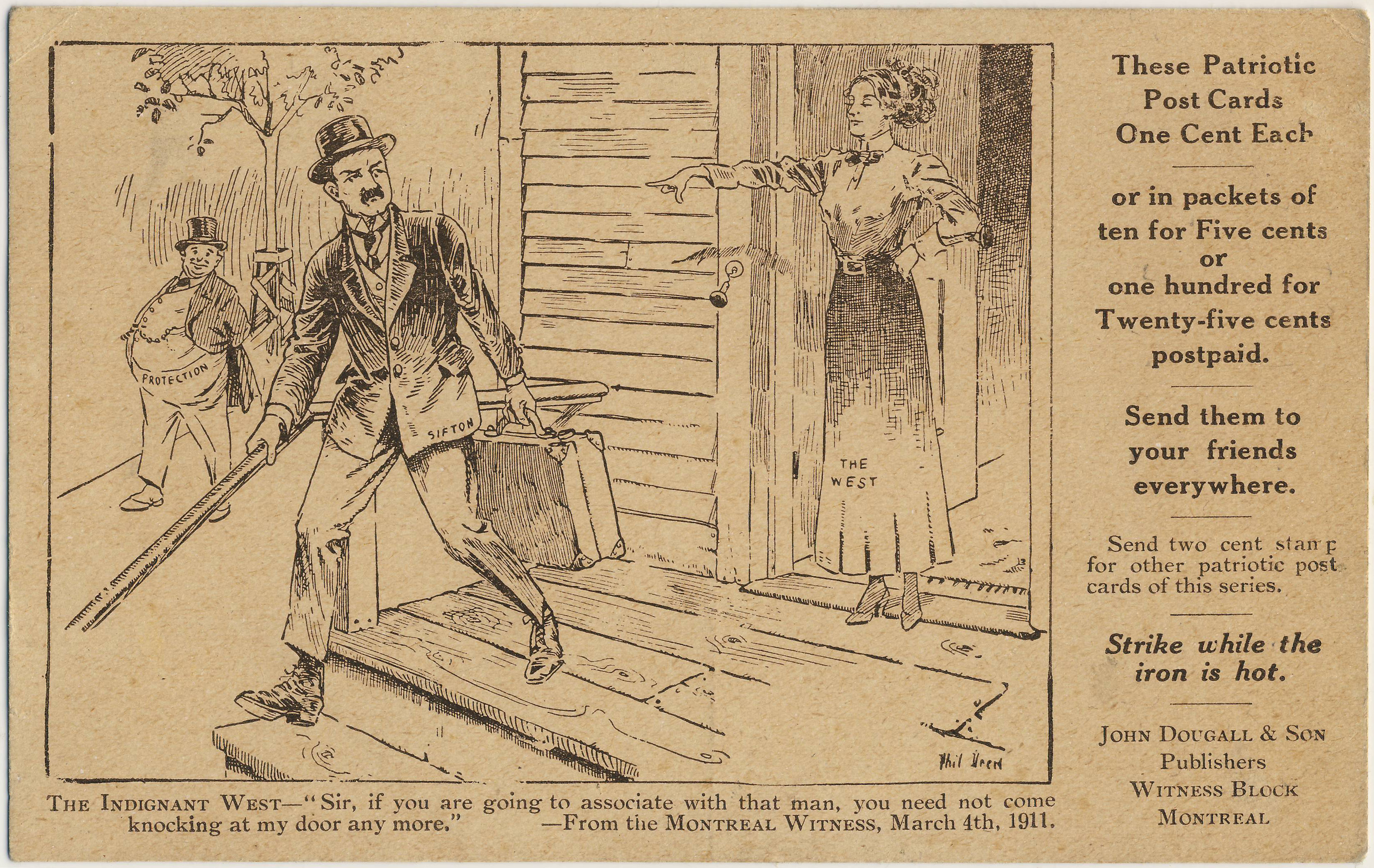
(6) Phil Drew cartoon from The Montreal Witness, 4 March 1911. Three postcards are known in this series, which appear to have been marketed by Witness publisher John Dougall to be sent out en masse in hopes of influencing political discourse.
Prohibition (“Banish the Bar”)
Other issues of the day were also dealt with extensively, including the women’s suffrage movement, which appears primarily in English and American cards, and the related temperance movement, which is better represented in Canada. The Warwick Bros. & Rutter card illustrated in Figures (7a-b), which features the Canadian “Banish the Bar” slogan, concludes our brief excursion into the political realm. We’ve only scratched the surface, however; a much wider range of political postcards may be found in the two volumes of Mike Smith’s The Canadian Patriotic & Heraldic Postcard Handbook 1897-1945 (2013-14).
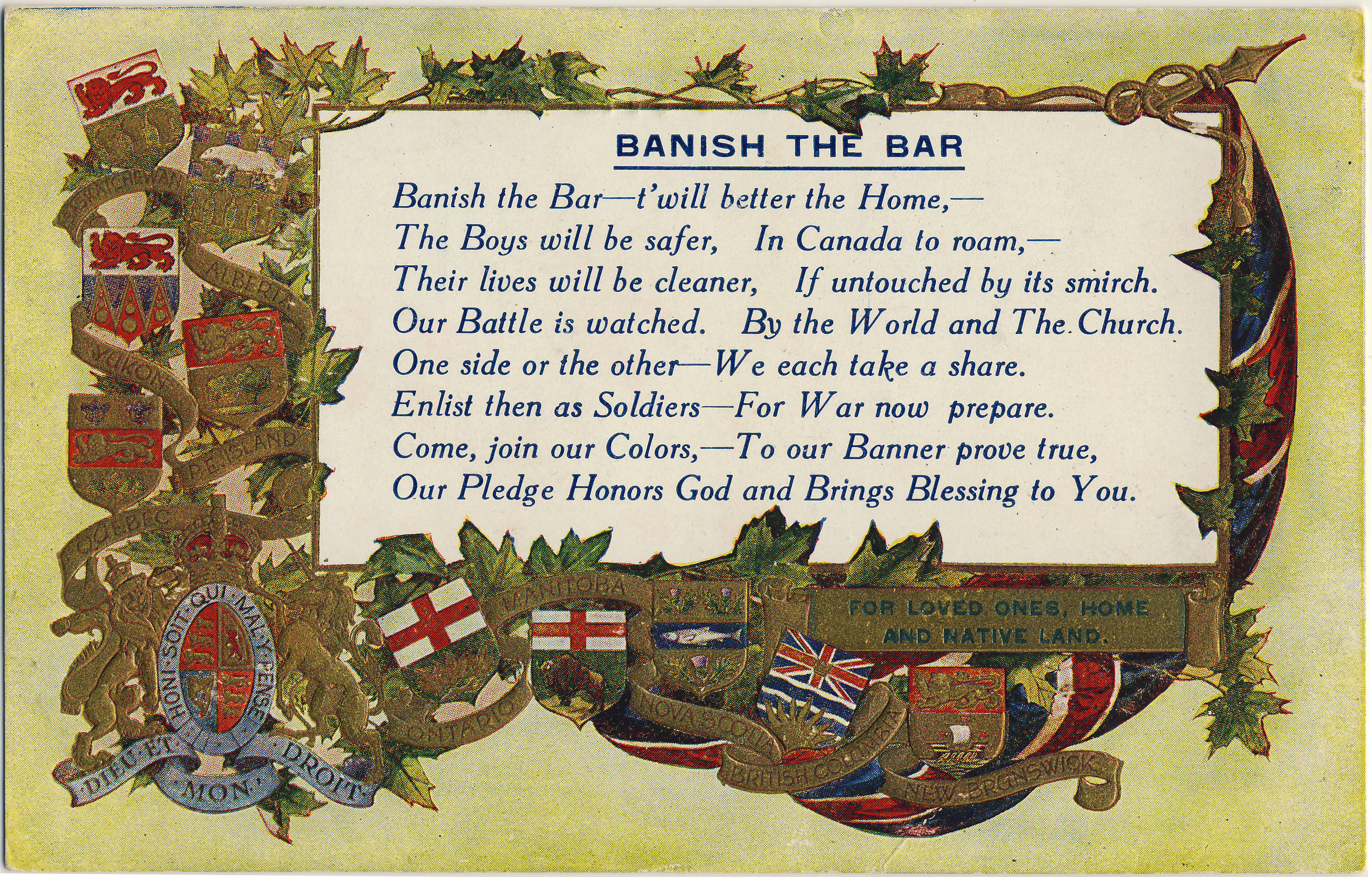
(7a) Warwick Bros. & Rutter printed this “Banish the Bar” message on one of their standard “patriotic” card blanks (normally a photo would have been printed into the rectangular area). The “Banish the Bar” slogan was also overprinted on the back of the card, in order that there could be no mistaking the message.
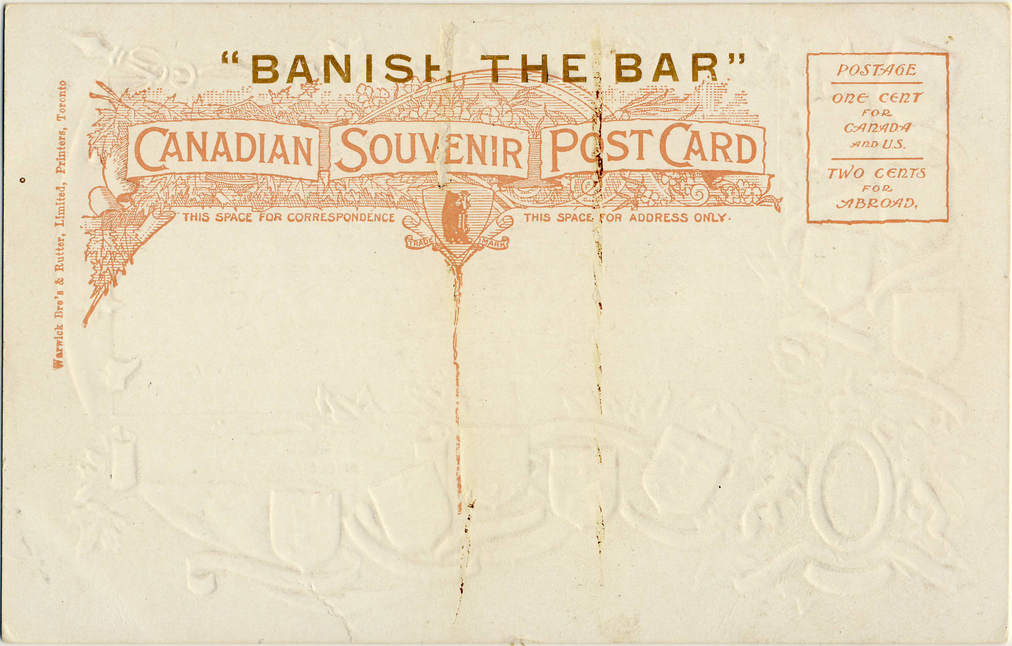
(7b) The back of the Warwick card, with the BANISH THE BAR overprint. Likely circa 1905.