You can join us as a guest at one of our monthly, except for the summer. ZOOM meetings. The schedule is here. UPCOMING MEETINGS Or, become a TPC Facebook friend to stay connected!
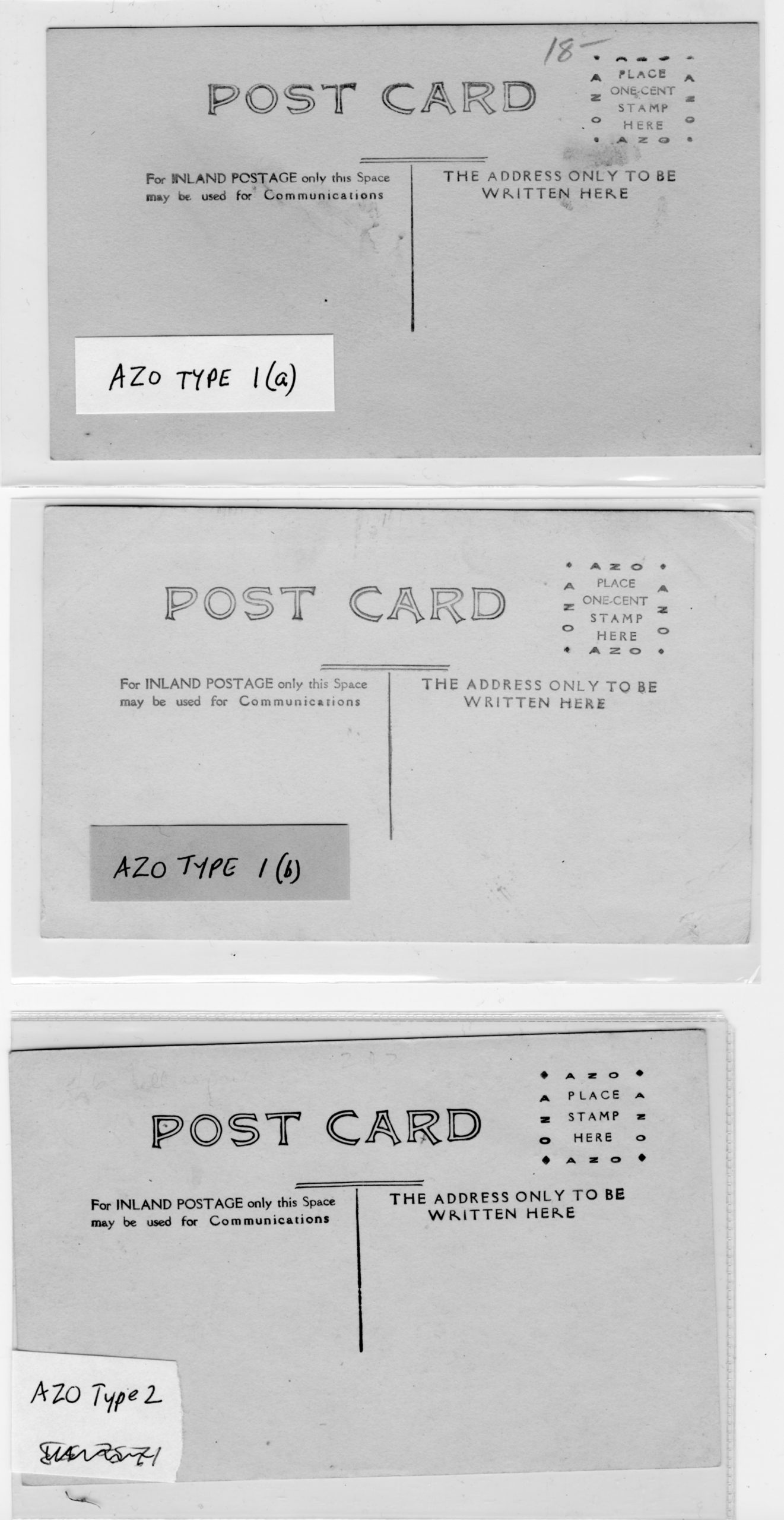
This is not a post so much as a proposal to begin the long-needed effort to catalogue the real photo postcard backs used in Canada. While most “Canadian” postcard blanks were manufactured by U.S. manufacturers, their inscriptions were often modified to suit Canadian tastes and postal regulations. Today, most people rely on Playle’s, a U.S. site, for information about dating RPPCs without recognizing that what that (excellent) site says might not apply to Canada. Also, it is much more useful to catalogue the entire back rather than just the stamp box — as Playle’s does –, since backs often differ even when the stamp box doesn’t (not to mention that the stamp box on many cards is covered up with a stamp).
With this in mind, and as a starting-point and/or place-holder, I’m uploading a Word copy (link below) of a classification system that I’ve used in cataloguing RPPCs from one company, the Winnipeg Photo Co. of Napinka, Manitoba, which produced RPPCs across southern Manitoba and Saskatchewan (as well as Alberta’s “Western Canada Ranching Series”) under a number of names from about 1905-1912. There are many other backs, of course, but this is at least a beginning.
My medium-term intention is to turn this lowly blog post into a page on the TPC website, complete with illustrations of the back types. But for the moment, this will need to do (and may generate some discussion).
As the hundredth anniversary of 11 November 1918 — the end of the Great War — approaches, we will take a look back at what postcards of the time tell us about the four long years that took such a toll on the people of Canada, Newfoundland and many other countries. Coincidentally, the war years brought down the curtain on the “Golden Age of Postcards”; while the medium continued to be popular, the postcard industry as a whole no longer exhibited the vitality and variety of its pre-war heyday.
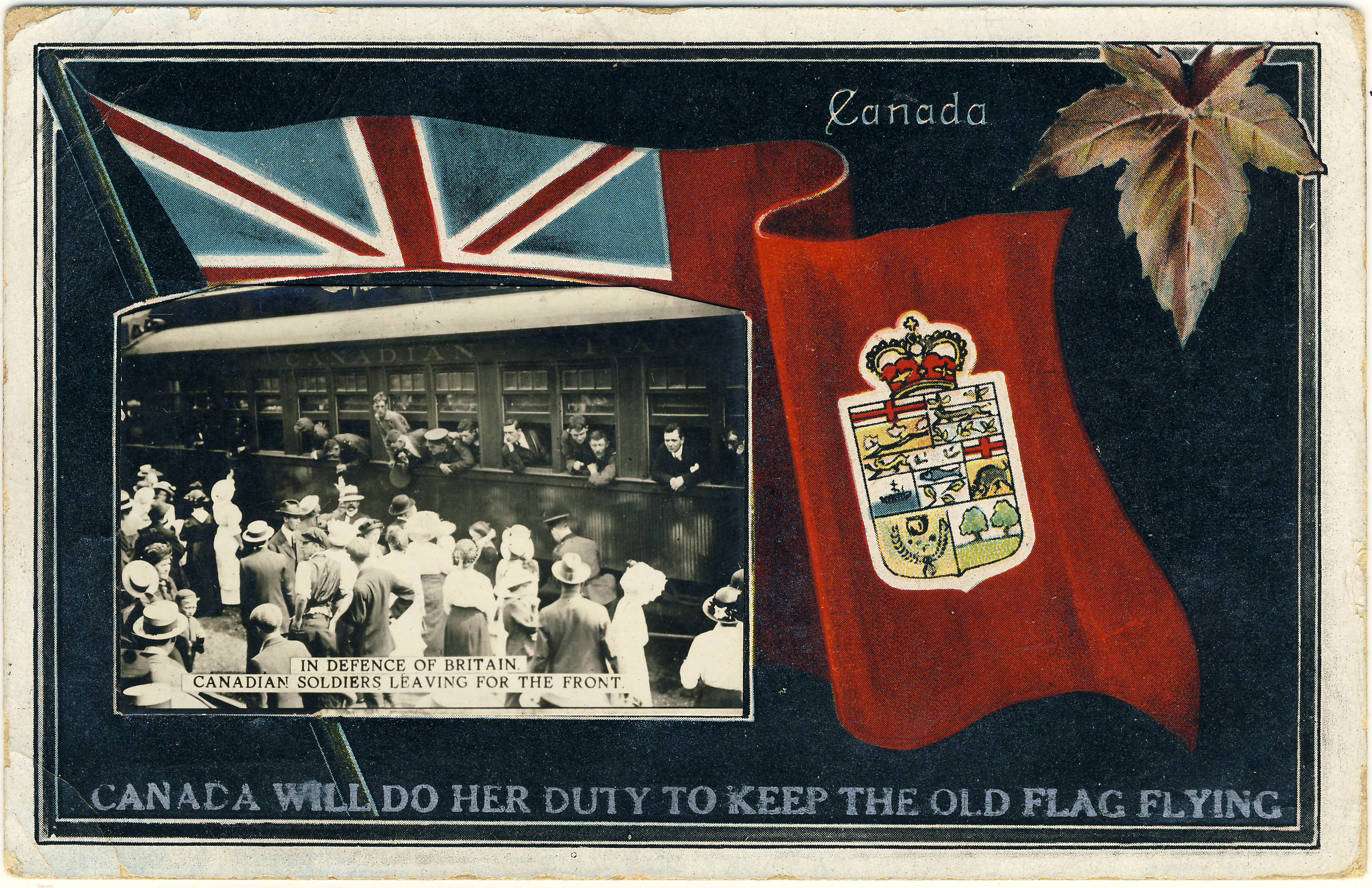
Keeping the old flag flying
Postcards mailed in the summer of 1914 can provide us with insights into how ordinary people in the sedate turn-of-the-century world responded to the sudden intrusion of war into every aspect of life. Exhibit 1 is the Stedman Bros. “patriotic” shown below, which depicts departing Canadian soldiers while assertively proclaiming: “Canada Will Do Her Duty To Keep The Old Flag Flying”.
Stedman Bros. no. 2539, with an added photographic image.
On turning the postcard over, we find that it was posted at Toronto on 13 September 1914, barely a month after the state of war officially began. In fact, things had unravelled so quickly that the Canadian National Exhibition had no opportunity to re-think its 1914 theme of “PEACE YEAR”, neatly incorporated into the special CNE “slogan cancel” that we see here.
Verso image of the card as posted to Wimbledon, Surrey on 13 September 1914.
One might wonder how Stedman Bros. managed to print up World War I cards such as this so quickly. The answer is that they didn’t, really — this example, numbered S.B. 2539, was in fact an old Stedman card on which the small photograph of the departing soldiers was pasted (the card originally featured a coloured illustration of an R&O ship). To complete the metamorphosis, the caption about “doing her duty” was overprinted on the image in silver lettering. (Indeed, since Stedman Bros. are thought to have exited the postcard trade in 1914, it is possible that the refurbishment of these cards as World War I souvenirs was someone else’s handiwork.)
The message itself is, of course, another place where we might hope to find reference to the big news from Europe. However, even though her words were destined for England, the writer didn’t acknowledge that anything out of the ordinary was going on. By the end of her note she had apparently run out of things to say — or so we might surmise, given that she filled the rest of her space in the time-honoured way, with bland observations about the weather!
The 79th Cameron Highlanders
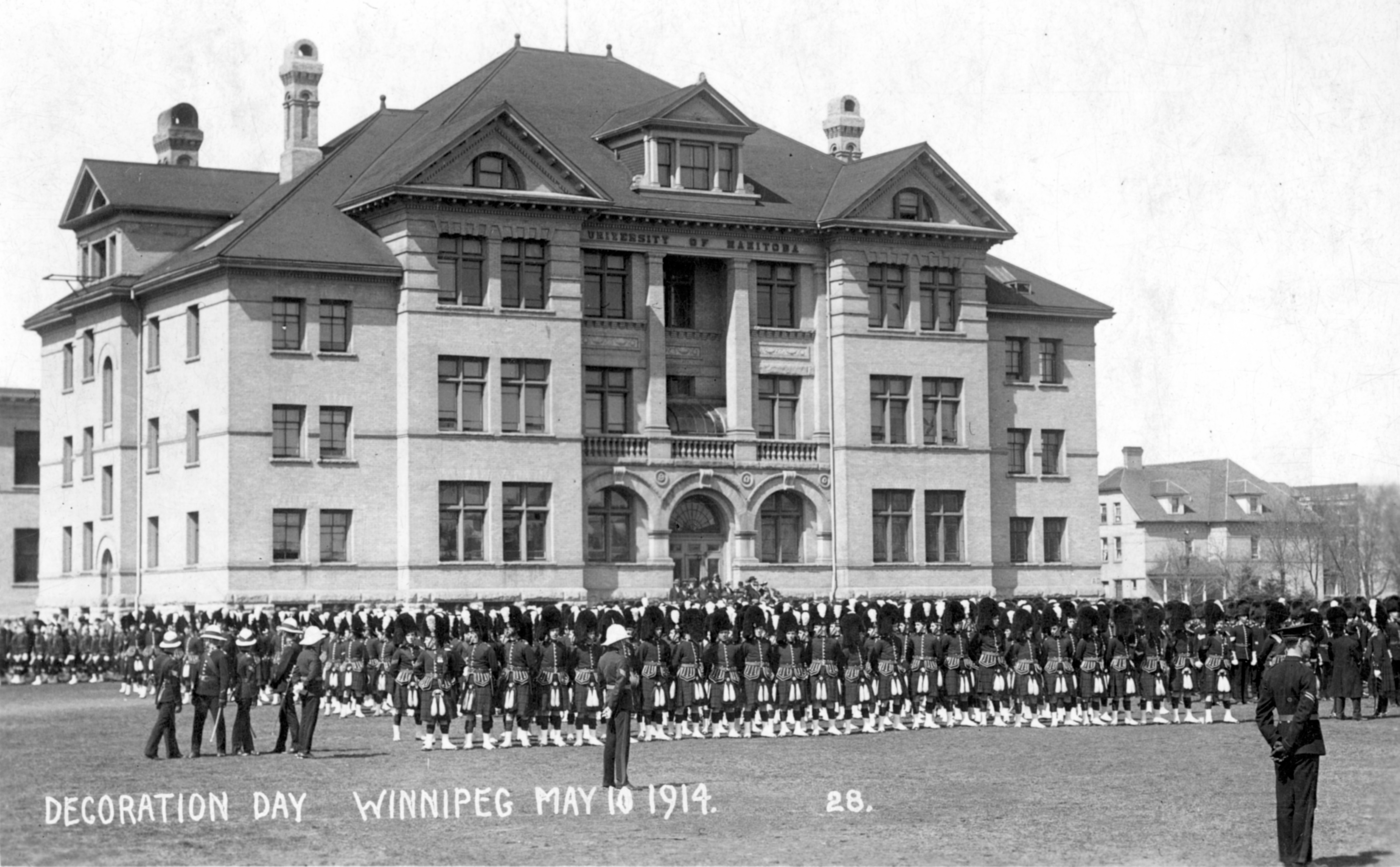
The story of the Queen’s Own Cameron Highlanders of Canada is well told on the regiment’s own website. The Camerons, from Winnipeg, were the first Highland regiment in the West, having been founded on 1 February 1910. It is unlikely that the original members would have anticipated the sacrifices that they and their mates would be required to make within just a few short years. Even at the Decoration Day festivities on 10 May 1914, as depicted in the Maurice Lyall real photo postcard below, it is unlikely that the kilted marchers imagined that before the summer was out, some of them would be halfway across the country, and then halfway around the world, fighting for real.
10 May 1914. The building in the background was the University of Manitoba. The Broadway Armoury stood directly across the street, on the site of what is now the Manitoba Legislature.
We encounter the Camerons again on the Valentine & Sons postcard below (106,330), which may well have based on a photograph taken the same day (and perhaps by the same photographer) as the postcard above. Posted on 22 September 1914 by a Royal Bank of Canada employee to a colleague who had evidently been transferred to the Bank’s Vancouver branch, its message does refer, indirectly, to the War:
To Mr. J. A. Noonan, Royal Bank, Campbell Ave., Vancouver, B.C.:
“Hello Mr. Noonan, Just to remind you we have not quite forgotten you in the exciting times we have been having. Glad to hear you have not much to do but don’t get too fond of doing nothing and forget all about Winnipeg. Every body happy in the R. B. of C.”
Valentine & Sons card showing the soldiers standing on Broadway, looking out from the Drill Hall.
The 79th trained first at Camp Sewell, near Brandon, and were then sent out to Valcartier, Quebec, just outside the city of Quebec. The following “John E. Walsh” postcard was acquired simply as a handsome Quebec “patriotic” but turned out to have some interesting Cameron Highlanders content on the reverse:
Grande Allée, Quebec City. Patriotic postcard published by John E. Walsh, a Quebec stationer.
The first thing to note about the back of the Grande Allée card is that it is cancelled with a slogan cancel for the Quebec Provincial Exhibition (31 August – 5 September 1914). Unlike Toronto’s Canadian National Exhibition, the 1914 theme in Quebec was not “peace” but “health” (“l’année de la santé”).
Back of the card, with a message from “R. M.”, then in training at Valcartier. The message is transcribed below.
As the Camerons’ website notes, only a limited number of the 79th’s members were sent to Valcartier and then on to England in the summer of 1914. At Valcartier, the Camerons were merged with others from across the country as the 16th Battalion of the Canadian Expeditionary Force. While it is brief, the card’s message provides at least some information about the Highlanders’ life at Quebec:
Having a good time down here up at 5:30 in morning. Drill all day. Getting quite thin. Remember me to Overseas bunch if you see them on Tuesday. R.M.”
As the sender is identified by initials (“R. M.”) only, the only significant clue is the recipient, J[ohn] France Hughes of the Great-West Life Assurance Co. of Winnipeg, who turns out to have been an actuary with Great-West. Hughes was born in England around 1885, had emigrated around the turn of the century, and by the time of the postcard was married and living at 609 Spence Street, a house that still stands at (what is now) the corner of Cumberland Avenue. The “Overseas bunch” sounds as though it might have been an informal weekly gathering of British immigrants — as R. M. probably was (although, given his regimental affiliation, he may have been a Scot rather than an Englishman like Hughes). From the handwriting and the fact that his social circles included a well-paid insurance professional, one might also conclude that R. M. was likely well educated.
In any event, this is a good example of what we can learn from postcard messages about the very earliest days of the Great War.
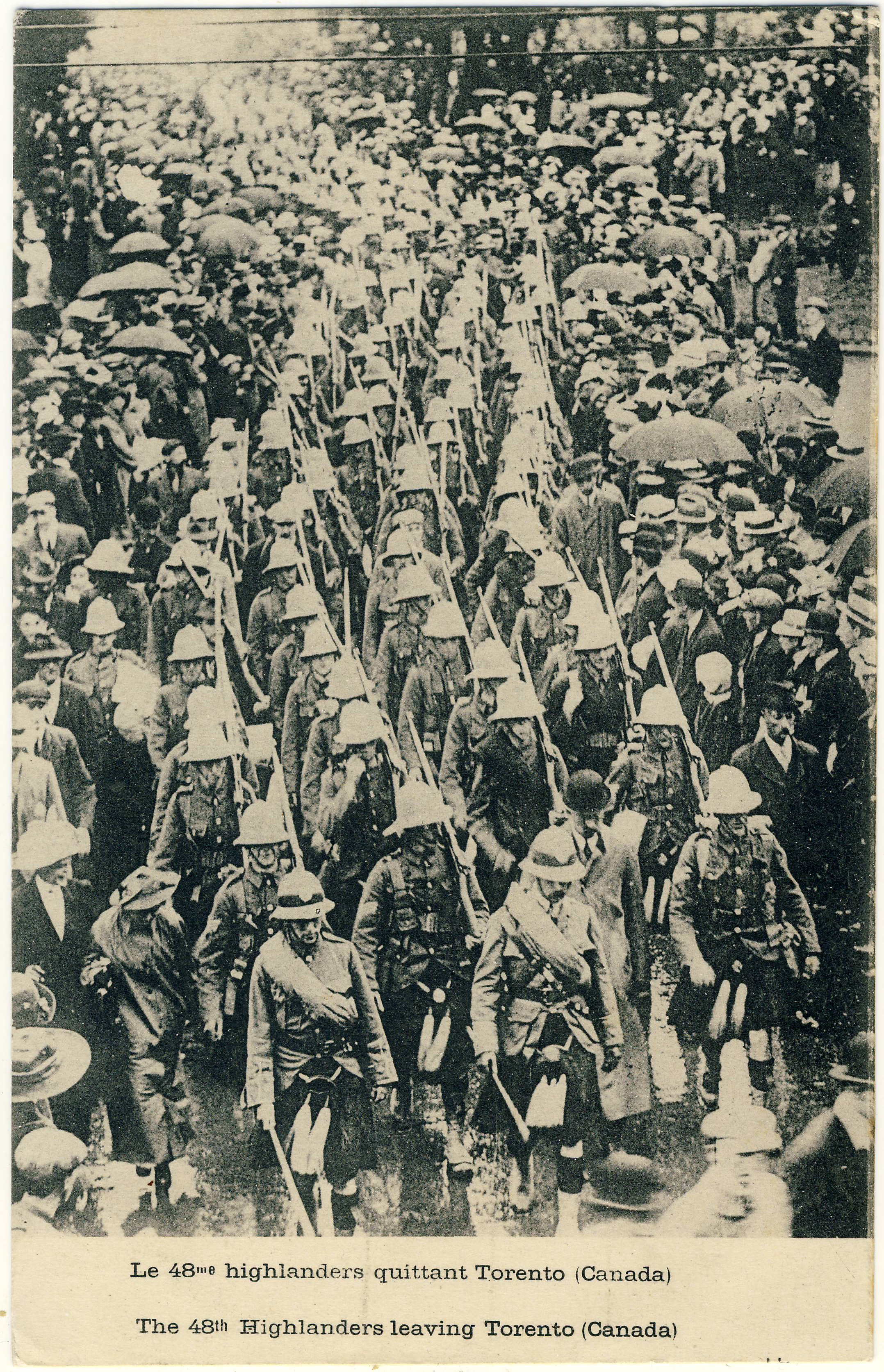
Canadian soldiers in other countries’ cards
Canadian First World War collections often include postcards from other countries that depict the Canadian war effort. One scarce example is this collotype showing the 48th Highlanders — cousins of Winnipeg’s 79th — as they leave “Torento (Canada)”. One supposes this scene to be somewhere in the vicinity of Union Station, with the departing men parading in the pouring rain. Produced by Le Deley, imprimeur et éditeur (printer and publisher) at 127, boul. Sébastopol in Paris, this particular example was not used.
A rainy day in Torento.“And very good reason to be” … indeed!
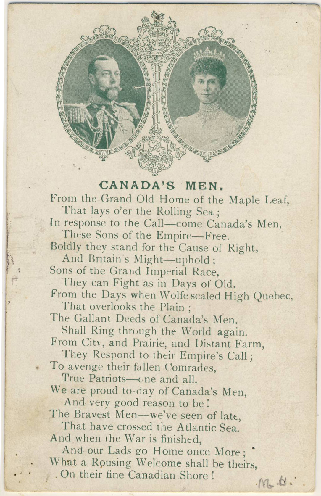
Our final example is a British card celebrating “Canada’s Men”, poetically, as “the Bravest Men — we’ve seen of late / That have crossed the Atlantic Sea”. The quality of some of the verse suggests that the poet may have been working to deadline, but overall the expression of Britain’s appreciation comes through clearly enough and, I’m sure, was much appreciated by its recipients. The card — the British publisher of which is not identified — was posted within the U.K. on 26 December 1916.
Future posts
We’ll try to post some other World War I postcards over the next few weeks, as the hundredth anniversary nears.
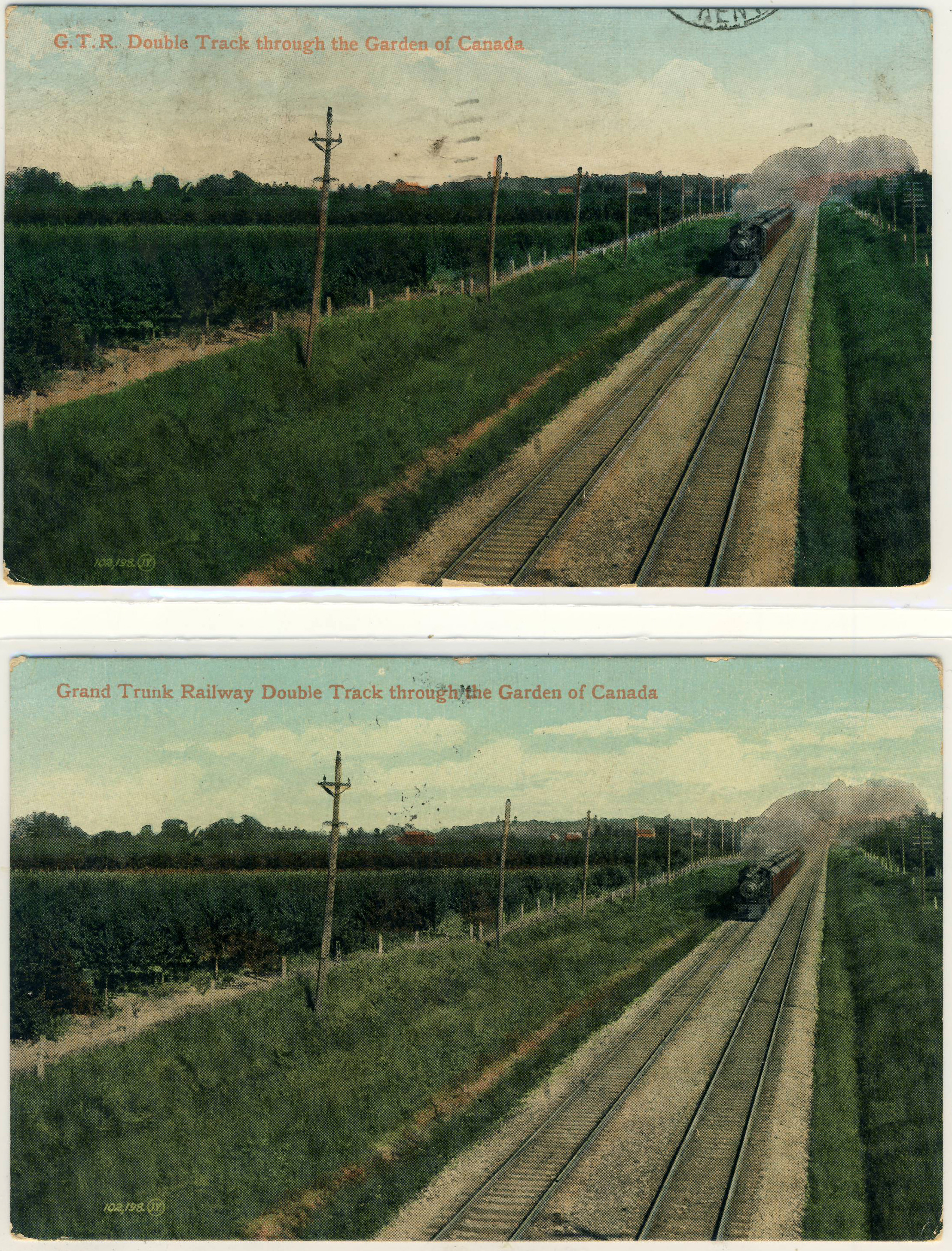
I’ll be the first to admit that this one is probably just for the geekiest of deltiologists. It has to do with a duplicate Valentine & Sons card in my collection — number 102,198, entitled “G.T.R. Double Track through the Garden of Canada” in one example, while the second version spells out the name of the railway in full, as “Grand Trunk Railway”. Valentine & Sons captions often changed between printings of the same card, so the name variation isn’t especially interesting. To see what was interesting, let’s have a look at the cards:
Spot the Differences.
The back types are identical. “Grand Trunk Railway” appears (on the basis of a pretty murky postmark) to have been posted on 19 February 1907, while “G.T.R.” was posted on 3 May 1908. But that’s neither here nor there. The odd thing is that the cards are different in a second way that is harder to spot at first. It’s the images: they are identical EXCEPT for the sky. The clouds on version 1 are completely different from the clouds on version 2! Of course, the skies on these early lithographs were entirely fake to begin with, because they usually reproduced as completely blank areas, necessitating the subterfuge of “hand colouring” in which clouds were added to the artist’s taste. But that doesn’t explain why the skies would be different between two printings, when everything else in the image, including all the rest of the applied colouring, is identical.
Or does it? Is there a reason that the sky would have been coloured separately on the occasions of each printing?
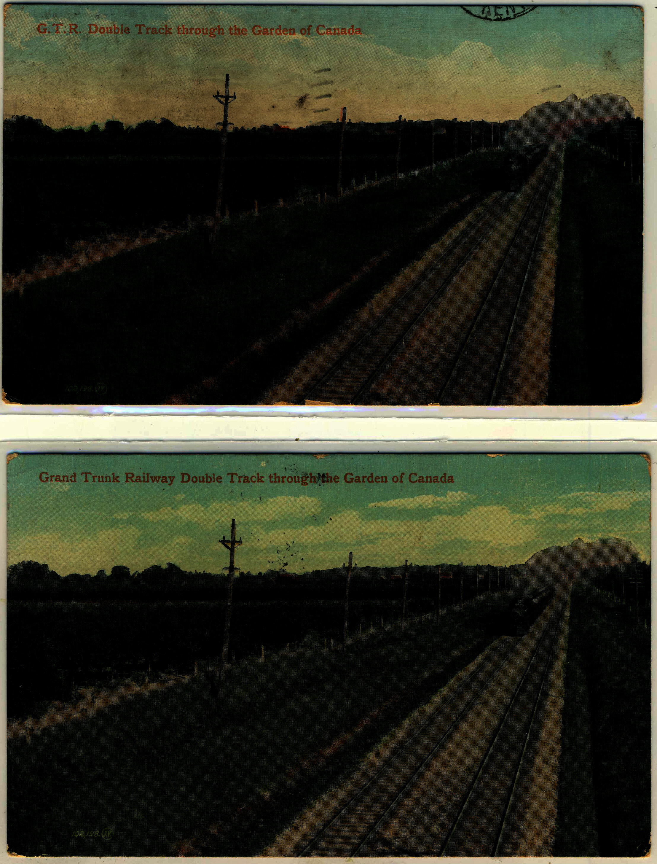
In case you can’t make out the differences, here is another version with added contrast (click to enlarge):
Any thoughts? Anyone have similar examples of Valentine & Sons cards — or cards by anyone, really — that are the same except for the sky (setting aside variations in the caption)?