• INTERESTED IN VINTAGE POSTCARDS?

    Join us as a guest at one of our ZOOM meetings. Here’s our schedule of UPCOMING  MEETINGS which are monthly except for the summer.  Or, become a TPC Facebook friend to stay connected!

Birth Of A Cliché, and Reflections on Postcard Writing Styles

Many books on postcard themes have titles that include the phrase “Wishing You Were Here”, undoubtedly chosen because those four words evoke postcards as much or more than any others. And yet, as other collectors may also have noticed, the classic clichéd postcard message — which in its fullest form runs, “Having a good time. Wish you were here”– is actually not found with any frequency on old postcards. Truth to tell, I’ve never seen those exact words, even once, among the thousands and thousands of postcard messages that I’ve seen. That’s not to say that I don’t have a few postcards with variations on the “Wish you were here” part, but I’ve never seen anything approaching the whole thing.

My longstanding conclusion, so far as I’d given the matter any thought, had been that “Having a good time. Wish you were here” must have become a go-to message for hurried postcardists well after the Golden Age (pre-1920) period that is the focus of my and many other collections. Well, I’m pleased to be able to say that that analysis might not be entirely true — it appears that I gave up too soon. On the reverse of a recently acquired (and very early) Canadian Valentine & Sons card — “A Young Enthusiast on the Humber, near Toronto”  (no. 100,111) — there is, lo and behold, this simple message from “Leah”, written in the late summer of the year 1906:

Having a good time here. Wish you were here.

But for the first “here”, my prayers would have been entirely and perfectly answered, but (not being a fussy type) I think I can still declare victory. The greatest cliché in postcard history can in fact be traced to the earliest years of the fad. The mysterious “Leah”, who tantalizingly enveloped her own uncommon name in mysterious quotation marks, thus enters the ranks of the deltiological immortals.
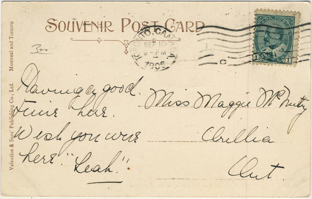
The elusive message, finally found (almost!). Did Miss Maggie McNulty appreciate the significance of what she’d received? Did Leah’s sentiment sound fresh and clever to her, rather than hackneyed? Wish we were there to find out!
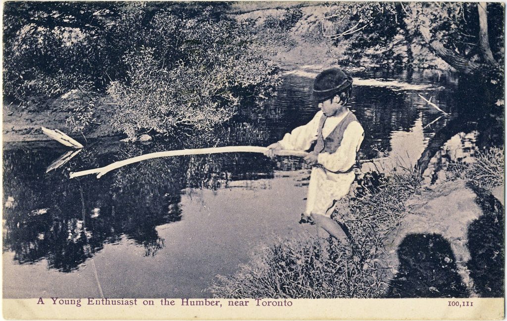
 

The postcard image is worth noting in its own right. It’s a charming example of an uncommon early style of Valentine & Sons postcards — a simple, uncoloured collotype.

Early 20th century writing styles and conventions, as commonly seen on postcards

That brings to mind a question about what we learn from the letters on early twentieth century postcards, in general — not from the content of the messages themselves, but from the handwriting, spelling, grammar, forms of address and so on. Here are a few examples that I’ve noticed over the years:

  • The very common use of the colon-dash (or maybe colon-hyphen) after the salutation, as “Dear Maggie :-” — this has totally disappeared but must have been a staple of children’s lessons around the turn of the 20th century;
  • The tendency to omit punctuation almost entirely from brief messages. This is not simply a function of being poorly educated: punctuation is often lacking even in notes penned by writers who spelled well and were clearly men or women of some sophistication. Commas were barely used and anything more esoteric than that — even a question mark — was quite unusual (as was the use of paragraphs);
  • It’s unusual for there to be even a P.O. box number in small-town addresses until around 1910 or after – almost always did the name of the town suffice;
  • On the odd occasion that we still write letters, and also in emails, we often write “Dear Mom” and “Dear Dad” — but in the Golden Age days it was equally common to include lateral relationships like “Sister” or “Aunt” in the salutation in exactly the same way, without appending the addressee’s given name. Other than for direct forebears (parents and grandparents), we have lost that reluctance to “first-name” people;
  • Grown children sometimes signed letters to their parents in a rather formal fashion, using their full first and last names, which would seem odd to us today. 

What other bygone conventions have you noticed in postcard letters? We’d be glad to get your examples and/or to hear about any other early examples of postcard messages that say “Having a good time; wish you were here”, or something close to it.  

(Andrew Cunningham)

REFLECTIONS ON POSTCARDS: CLUES TO LOCATIONS

One of the great challenges that comes with collecting postcards, particularly the often uncaptioned “real photo” type, is figuring out what exactly you’ve got a postcard of. Like personal photos from family albums, postcards of unidentified people, places and events are common, but inherently less interesting than similar cards whose contexts are known. At the same time, a lot of the fun of collecting — particularly in this information-rich Internet age — lies in solving such mysteries for fun and profit (realistically, 99% for fun).

Of the journalist’s “five W’s” (who, what, when, where, why) the “where” is most often the key that unlocks a postcard’s mysteries. When there is no caption or postmark to tell us anything at all about the location of the image, the first and best clue is often the postcard itself, as a physical object. Is it a Canadian, a U.S. or an English card (or is it from somewhere even farther afield)? With experience, we can learn to tell when a postcard back is Canadian … most of the time. Knowing the country of origin definitely helps.

Another clue that is often lost before we think to take advantage of it is other cards that were associated in some way with the one we’re looking at. Often the seller will have taken our card out of an estate-sale album with similar cards that are captioned — sometimes a helpful dealer will even note likely locations on postcards that, while not identified, are clearly from the same place as others in his or her stock. But it’s pretty rare that we as buyers think to examine (let alone have the time to examine) a dealer’s other cards for clues about one we’re intending to buy. There can also be hints about locations in the card’s message, if there is one. But more often than not, we are reduced to staring, wistfully, into the world of the image itself, hoping that something will tell us where-oh-where this wonderful scene from a hundred-odd years ago could have been.

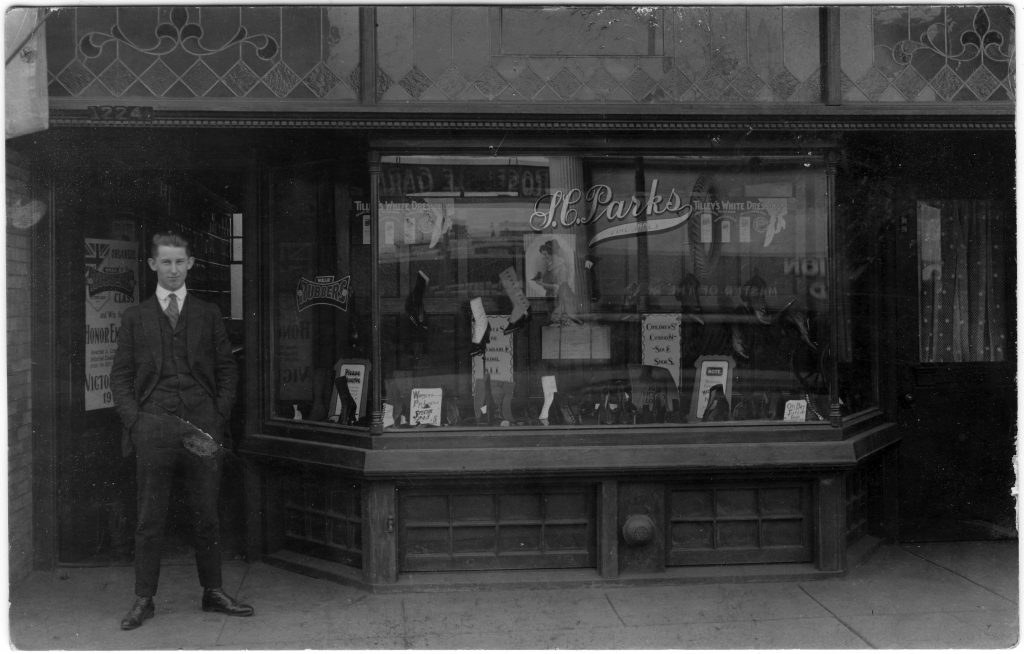
As an example, take this excellent real photo postcard (RPPC).  

S. C. Parks Fine Shoes, 1224 1/2 Something Street, Somewhere

Here we have no problem with country — it is a “MADE IN CANADA” real photo card of a design that tends to date from about 1915-20. But Canada is a big country, and there is no message, no postmark and no caption to help us. The shot is close-in, so all we get is one shop with one generic name, “S.C. Parks Fine Shoes”. We could try Googling it, but — realistically — the right “Parks” is going to be hard to find, given the inevitable proliferation of “Park” street names, let alone all the “Park” park names. The initials “S.C.” are another blow to our hopes — a given name would have been so much easier to find.

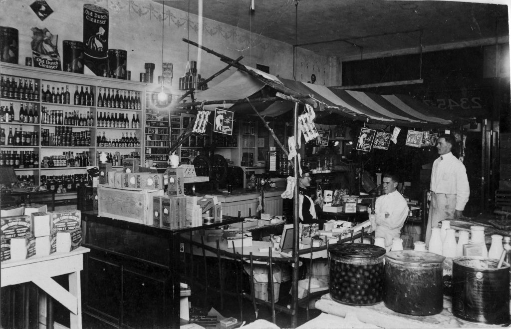
So what else do we have to work with? The products in the window display, for one. On several occasions, the brands of goods in a shop have helped me narrow down a location. For example, the card below, which could in theory have been anywhere in Canada or the U.S., was definitively placed on this side of the border because of the distinctively Canadian brands on offer, e.g. Royal Crown Oatmeal Soap and Squirrel Peanut Butter. A closer consideration of where these products were produced led to the tentative conclusion that the card came from Western Canada, possibly Vancouver (that’s as far as I ever got: if anyone has any thoughts, please tell me — one of the best ways to figure these things out is to join your local postcard club and let your knowledgeable colleagues do the work!)

Squirrel Peanut Butter (remember the peanut on top?) in the big tub at lower right … only in Canada.

However, in the case of the shoe store, the products don’t get us beyond what we already knew — that this is somewhere in Canada. What else do we have? A house number — 1224 1/2 — that could really be just about anywhere, although the “1/2” may come in handy down the road, since there will have been far fewer 1224 1/2’s in Canada than 1224s. 

But here’s where not losing patience, and owning a magnifying glass, can come in handy. One thing about shops is that they had plate-glass windows. And one thing that plate glass does is reflect. More than once, I’ve found an answer, or at least a clue, in the form of something across the street that is faintly reflected (in reverse, of course!) in a shop window. And exactly that turned out to be true of the S.C. Parks Fine Shoes postcard. At the very top of the window, on the left side, is a dark patch which turns out to be the reflection of a sign across the street. With some squinting, we can make out what it says … R-O-S-E-D-A-L-E (space) G-A-R-…! A likely answer is now clear. This has to be Toronto — not all that far from me, in fact. Surely (fingers crossed) it can be nowhere else than the commercial strip of Yonge Street, where that famous road runs past Toronto’s wealthy Rosedale neighbourhood.

With the tentative address “1224 1/2 Yonge Street, Toronto” in hand, we head to the deltiological Batcave and call up the Toronto city directory (known as Might’s). But wait … which year should we start with? Well, we’ve already noted that the card itself is of a type common from 1915-20. But even if we didn’t know that, we have a clue to a second “W” (when?) in the form of the poster at the far left. While partly blocked by the gentleman, enough of it is visible to see that it is advertising a contest sponsored by a shoe manufacturer. Looking more closely and reading what can be read, we can conclude that the contest, whatever exactly it was, had to do with the First World War. So we can surmise that a good year to try would be 1918. Looking at the Might’s Directory for that year, we find 1224 1/2 Yonge, just north of the Summerhill train station on the west side of Yonge (a couple doors up from Alcorn Avenue). And, sure enough, the occupant of that address was one Charles S. Parks, although (unusually) the nature of his business is not identified (it is mentioned in the personal directory listing for his nearby home at 32 Summerhill Avenue). Further investigation shows that Parks was Ontario-born, was 41 in 1918 (and thus is almost certainly the man in the photo), was married to Bertha, with whom he had one child, George, born 1908. The shoe store seems to have been in business from 1914 until about 1920, after which Charles appears in the directory as an insurance agent. Further investigation showed that the Rosedale Hotel stood across the street from the shop at 1145-1151 Yonge. What the G-A-R stood for — “Garden”? “Garage”? — can safely be left for someone fussier about completeness than I am.  

So there you have it. A postcard that seemed to show only one small business with a frustratingly generic and hard-to-search name actually turned out to show more than that when we looked hard enough. Incidentally, the shop at 1224 1/2 Yonge is still standing today, albeit in somewhat altered form and under the new identity of “1224A”. It houses a vintage furniture store — which would probably have seemed like a futuristic furniture store to Charles — called Decorum.

Andrew Cunningham (TPC #1424)

SPOT THE DIFFERENCE: A VALENTINE & SONS POSTCARD MYSTERY

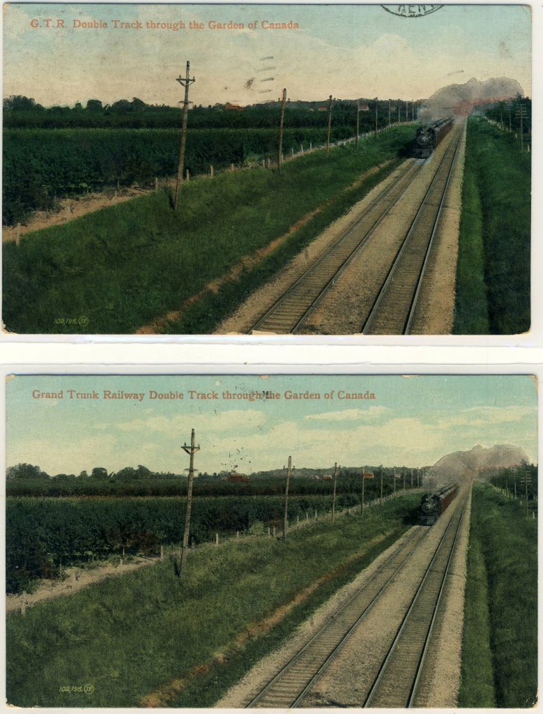
I’ll be the first to admit that this one is probably just for the geekiest of deltiologists. It has to do with a duplicate Valentine & Sons card in my collection — number 102,198, entitled “G.T.R. Double Track through the Garden of Canada” in one example, while the second version spells out the name of the railway in full, as “Grand Trunk Railway”. Valentine & Sons captions often changed between printings of the same card, so the name variation isn’t especially interesting. To see what was interesting, let’s have a look at the cards:

Spot the Differences.

The back types are identical. “Grand Trunk Railway” appears (on the basis of a pretty murky postmark) to have been posted on 19 February 1907, while “G.T.R.” was posted on 3 May 1908. But that’s neither here nor there. The odd thing is that the cards are different in a second way that is harder to spot at first. It’s the images: they are identical EXCEPT for the sky. The clouds on version 1 are completely different from the clouds on version 2! Of course, the skies on these early lithographs were entirely fake to begin with, because they usually reproduced as completely blank areas, necessitating the subterfuge of “hand colouring” in which clouds were added to the artist’s taste. But that doesn’t explain why the skies would be different between two printings, when everything else in the image, including all the rest of the applied colouring, is identical.

Or does it? Is there a reason that the sky would have been coloured separately on the occasions of each printing?

In case you can’t make out the differences, here is another version with added contrast (click to enlarge):

Any thoughts? Anyone have similar examples of Valentine & Sons cards — or cards by anyone, really — that are the same except for the sky (setting aside variations in the caption)?

— Andrew Cunningham

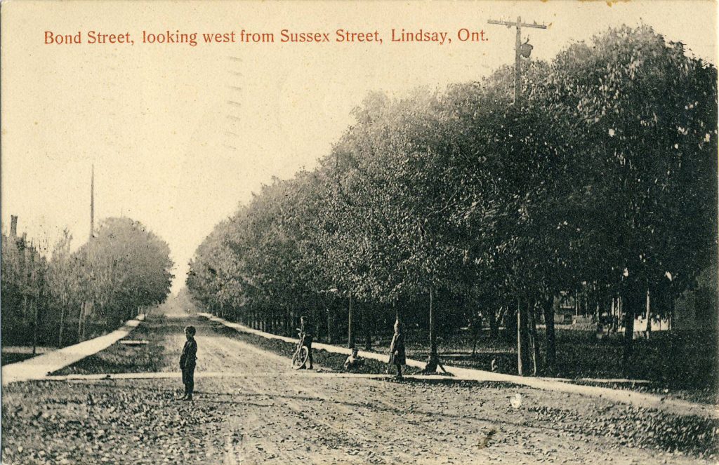
STRANGE GOINGS-ON AT SUSSEX AND BOND (A BELATED HALLOWE’EN POSTCARD TALE)

Sometimes, a postcard showing the plainest of scenes can be made magical by some small element in it — e.g. an odd effect of light, a chance expression on a face. This uncredited collotype of a street corner in Lindsay, Ontario is just such a card. While the scene is of a residential street dominated by a line of trees that obscures any view of houses or gardens, the odd poses of the children draw one’s attention. They appear to be almost mesmerized by something unseen, off-camera to the left.

Life in small-town Ontario is quiet and peaceful (until the paranormal happens)

Unfortunately, we don’t have an image of what it was that so transfixed these children … unless, that is, we imagine them looking through a “worm-hole” in the space-time continuum, across about 106 years, at the scene in that exact spot on Google Earth (as of October 2014):

Click the link to see what the children saw … across time

There is more going on in the world — and in postcards — than we realize!

[Andrew Cunningham]

CAUGHT IN THE ACT?

By Andrew Cunningham

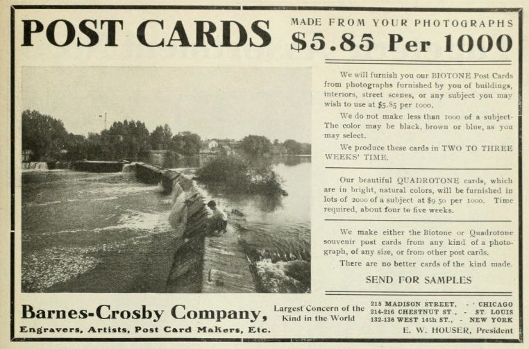
Collectors often speculate about the re-use of images in postcards — whether this was done with permission or not, or with due attention to the copyright of the photographer or original publisher. In the advertisement below, which appeared in a Canadian trade publication in 1907, the Barnes-Crosby Co. of Chicago offered, among other things, to make postcards from “other post cards”! That is rather bold and may not have endeared it to others in the industry.

Interestingly, while the company claimed to be the “largest concern of the kind in the world”, it doesn’t appear to have left much of a legacy. A recent search of “Barnes-Crosby” on eBay turned up only two postcards, both publisher’s samples! Nor is the company included in the publisher index of the Metropolitan Postcard Club of New York.

Any other thoughts or information on this issue would be appreciated!

Barnes-Crosby Co. postcard advertisement

Barnes-Crosby Co. advertisement published in Canadian Druggist, 1907.

AN UPDATE ON “GOVERNMENT AGENT” POSTCARDS

By Andrew Cunningham

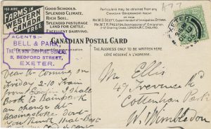
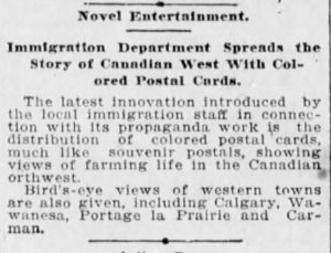
In a post from July 2016 concerning “Government Agent” cards, I had noted that, thanks to the efforts of TPC members Wayne Curtis and Philip Francis, we knew of a total of 35 Government Agent postcards. To back up a bit, “Government Agent” cards are the western settlement promotional postcards, aimed primarily at English farmers, that sported the distinctive back design depicted below. In that July post, I referred to a short note in the Winnipeg Tribune for July 24, 1905 (also below) that was quite clearly referring to the publication of the postcards. The Tribune happened to describe the images on four of the cards, three of which are on Wayne and Philip’s lists, but the fourth of which — a Calgary bird’s-eye view — didn’t seem to be.

Well, in researching the publisher history of the Calgary-based H. Enida Olive Co., what should turn up among the images I found but a card (not by H. Enida Olive) entitled A Great Cattle Market, Calgary, Alberta, Canada, Centre of Ranching Industry, number 6058 in the Images section of the University of Alberta’s Peel Prairie Provinces Collection. That is clearly the card in question. However, rather than being a new, 36th card, it turns out to be one from Wayne and Philip’s list. The title of the card, which I hadn’t seen until now, just didn’t suggest that the view was a bird’s eye. So we’re still stuck at 35 cards!

Here’s a look at this very rare Calgary view … 

A Great Cattle Market and a Great Postcard (PEEL COLLECTION, U OF ALBERTA)

THE SPIRIT OF CHILDHOOD: A CANADIAN POSTCARD (AND AVIATION) MYSTERY

By Andrew Cunningham

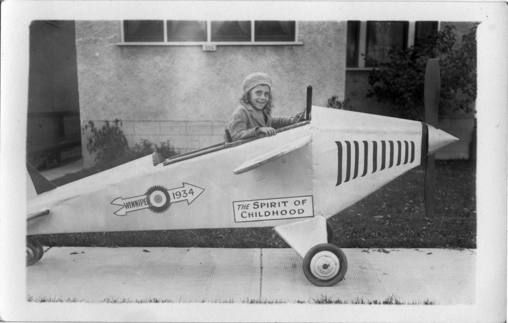
Postcard collecting can take you to unexpected destinations. This post is about how postcards dragged me off into suburban Canada of the 1930s. A few years ago, as part of my collecting focus on my hometown of Winnipeg, I picked up an unused real photo postcard that seemed, initially, to be of rather minor interest. It depicted a little girl seated in a replica airplane, evidently designed for children. The craft was emblazoned with the words “The Spirit of Childhood” and “Winnipeg 1934”. The setting was the public sidewalk out front of a house of an exceedingly common local style: 934 something street; or maybe 334. Unidentifiable, in other words.

the-spirit-of-childhood-winnipeg-1934

The Spirit of Childhood, taking off from a Winnipeg sidewalk circa 1934.

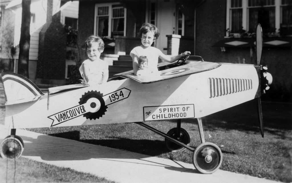
I filed it away and, I will admit, soon forgot all about The Spirit of Childhood. That is, until a few months ago, when to my surprise I came upon a second similar postcard. This one featured two girls in another replica airplane, which again proclaimed “The Spirit of Childhood”. But this time it wasn’t Winnipeg. It was “Vancouver 1934”.

spirit-of-childhood-vancouver-1934

Vancouver’s Spirit of Childhood has managed to attract a passenger and a co-pilot.

How odd. What was going on? Were these planes constructed from a kit ordered from (say) Eaton’s or the Bay? Not likely, it seemed — their construction and painted lettering were similar but not by any means identical. And yet it certainly appeared that they had been designed with reference to a common model and, one would presume, owed their name ultimately to Lindbergh’s Spirit of St. Louis.

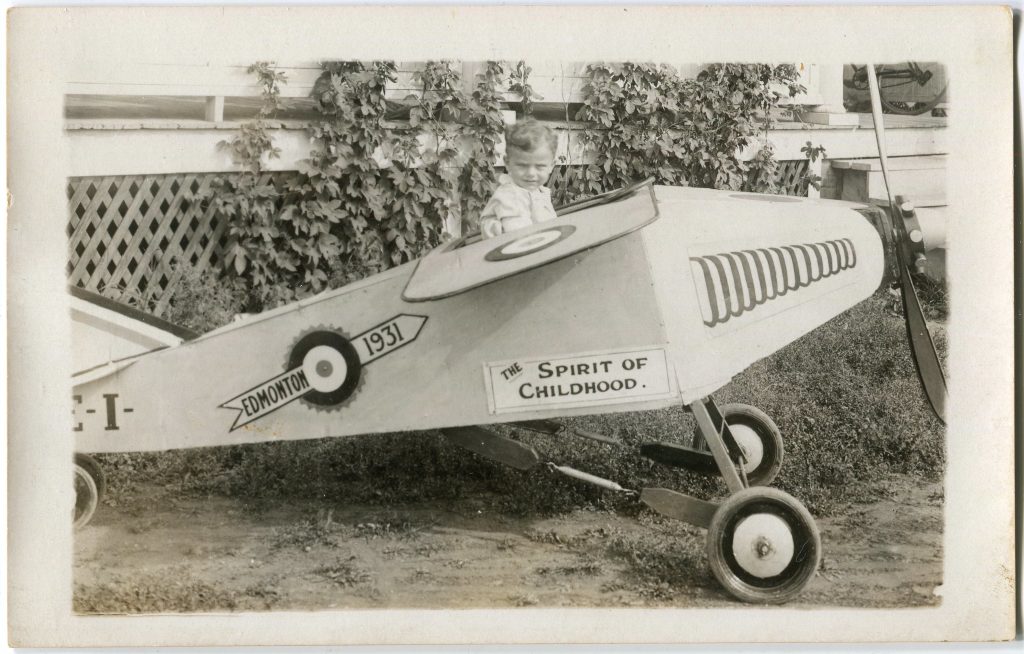
Since then, I’ve discovered several more examples of The Spirit of Childhood online. The Peel Collection at the University of Alberta shows four postcards of this genre (for a genre it appears to be). One card is emblazoned with “Edmonton 1931” and there are also three Calgary examples, one whose date is not captured in the photo and two that respectively represent the years 1936 and 1937. The last image that my Googling uncovered shows a similar scene of a plane that doesn’t have a painted reference to a city or a year, but which apparently came from the Yukon Territory.

A new example of Edmonton 1931, from my own collection (added to the post in February 2023).

One useful result of this search was the revelation that the difference between “my” two planes does not, after all, mean that the designs were one-offs. In fact, if you look closely at the images linked above (plus my pair), it appears that there were two models of these planes. The “Vancouver” model appears virtually identical to Edmonton 1931, Calgary 1937, Calgary 193? and the Yukon plane, while the “Winnipeg” model looks the same as Calgary 1936. So now we are left with seven planes in two designs, dating from 1931 to 1937 and each being the subject of photographic postcards in a similar style. By that I mean that every single one of the photos has been taken on a sidewalk in front of a house — a natural place for the plane to be, I suppose, but you’d think that the odds would be that at least one out of seven photographers would have decided on some other equally good location. To speculate: could the photos have been intended for submission to an organization — to the manufacturer or a retailer, for example — as part of a contest the rules of which specified how the required photo was to look? Frankly, I haven’t a clue.

Another thing to note is that — going by what shows up in the first few results returned by Google — there don’t seem to be any U.S. examples, or examples from eastern Canada. Surely that must mean something….

But all I have at this point is that these planes were made from some sort of plan or kit, that there were at least two designs in use, and that these were distributed across Western Canada in the 1930s. They may have been intended to represent something about Canadian aviation, but — if that’s the case — I’m not sure what.

Anyone who might be able to shed some light on this aviation mystery is welcome to submit a comment!

Editor’s note: As a look at the comments below will quickly reveal, we soon received an answer — that these planes were props pulled by itinerant photographers around the residential districts of many western Canadian cities, with a fee being charged to the parents of children who wished to have photos like these postcards made of themselves. (16 February 2023)


POSTCARD DIGITIZATION (AND SOME STARS OF YESTERYEAR!)

By Andrew Cunningham

The Winnipeg Public Library is engaged in a major postcard digitization project, based (thus far) on the collections of two TPC members – Rob McInnes and the late Martin Berman. The postcard images that have been uploaded so far are available on the Library’s impressive Past Forward website. In the course of working on the collection, one of the librarians, Christy, unearthed a great story after finding a postcard written from Winnipeg by an early twentieth-century actress who went by the stage name Ruth Maycliffe. Ruth’s story, together with some context from Christy about to the Library’s impressive project, is recounted in this post on the Library’s “Readers’ Salon” blog. It’s well worth reading.

Postcards of popular stage personalities were collected with great enthusiasm at the height of the postcard craze (roughly 1905-1910). However, because the names are rarely recognizable to us, today’s collectors often don’t show much interest in the cards that depict them. That’s unfortunate, because with a little online research performers’ publicity postcards often yield up interesting stories. Not infrequently, the careers of the vaudeville-era actors who appeared on early 20th century postcards carried on right into the television era. As a random example, one very Edwardian-looking music-hall actress whose postcard somehow ended up in my collection turned out, on further investigation, to have been a guest star in several episodes of Rod Serling’s The Twilight Zone (playing a very old lady, of course!)

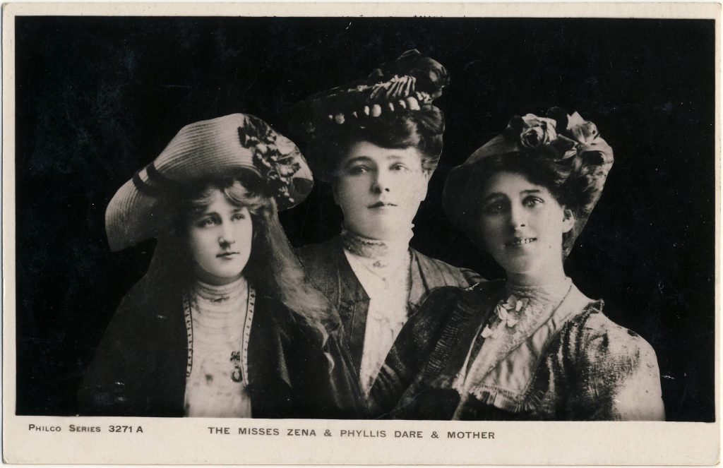
Below is a typical card of this genre, a “Philco” effort showing the (once) famous Dare sisters — Phyllis (1887-1975) and Zena (1890-1975) — together with their mother, Harriette Dones. These cards were especially popular in England, with major publishers constantly issuing new series featuring West End actors, sometimes (as below) in the fashions of the day and sometimes as they had appeared in their most recent or most famous roles:

the-misses-zena-phyllis-dare-mother

By the way, we’re always interested to hear about postcard digitization projects from anywhere in Canada (or anywhere else if the subject-matter would interest our members). Please send us a note if you know of any that aren’t mentioned on our site.

HOCKEY-PLAYING FELLERS…

By Andrew Cunningham

Just to follow up on John Sayers’ baseball mystery, I thought I’d tell a tale of my own that shows how much fun it can be to solve a postcard puzzle of just that sort.


Mine is about the boys of winter, not the boys of summer, though. A few months back, I acquired a rather ragtag group of ice hockey postcards, most of which seemed to date from 1910-1940. They weren’t early NHL or Stanley Cup treasures or anything as desirable as that. Instead, they mostly seemed to depict school and local players (or entire teams) from Quebec and New Brunswick. A smaller number were from Ontario and a scattering of U.S. border states, and still others were simply unidentified and, so far at least, unidentifiable. (Actually, I should add — if only by way of warning — that many of them had been misidentified, possibly deliberately, by a past seller who seemed to have decided to “identify” the cards with the name of a randomly-chosen school or town whose first letter conveniently matched with the letter in the monogram on the team’s sweater. Hockey sweaters in those days almost always featured either a large plain letter or an artistic “monogram” design made up of a letter or letters — think the “CH” of the Montreal Canadiens or the Boston Bruins’ spoked-“B” — both are survivors from that period.)

This particular card was one of several teams whose identities I was able to pinpoint, eventually, and (in this case) after having learned a lot about a little known corner of Canadian history.

[Baptist hockey team]

The card shows what is clearly a high school team, with its gentlemanly teacher-coach. A noteworthy feature of the card, which would have required a bit of photographic expertise and effort to achieve, is that one player is shown in an inset photo. There is nothing to say which team it is and the monogram visible on the team’s sweaters is one of those that isn’t easy for the modern eye to interpret.

But … there was a big clue. The names of the players — all but one — had dutifully been recorded on the reverse:

Back Row:

Hamilton
C. Cook
Nel. Auclair
Mr. Massé, pastor
M. Larivière
L. Brouillet
E. Jones

Front Row:

Groundwater
B. McCann
J. Derrick
[not named]
J. Hughes

The boy in the inset photo — who proved to be the key to solving the mystery — was named in full: Leslie Isaacks. 

A search on Ancestry.ca quickly revealed the sad news that a Leslie Raymond Isaacks, schoolboy, had died at Kingston, Ontario on 16 June 1931 at the age of 16. Leslie was a son of Charles and Sophie Isaacks, English immigrants who were Baptists — an important detail, as it turned out.

The information about Leslie Isaacks was interesting, but something didn’t fit. If this was a high school in Kingston, why were so many of the surnames French-Canadian? Another curious fact struck me: “Mr. Massé” is described as “pastor”. Not a priest but a pastor. It sounded as though, very unusually for someone who was (presumably) French-Canadian, he might have been a Protestant … and quite possibly a nonconformist Protestant, such as a Baptist (Leslie Isaacks’ religion, as I’d just discovered).

Hmm… I checked online for the next most complete and distinctive name: Nelson Auclair. Ancestry.ca yielded up the lad’s birth registration, which was in Marieville near St-Hyacinthe, Quebec. Sure enough, young Nelson was also a Baptist. Moreover, he had been baptized in 1913 by none other than G. N. Massé, pasteur.

Searching for G. N. Massé on Google brought to light the interesting history of French-Canadian Baptists in Quebec and particularly of the Feller Institute (or College), established in the 1840s in what was then Canada East by Baptist missionaries from Switzerland. An old history of Quebec’s French-speaking Baptists found online (in a very poorly OCR’d version) tells the interesting story of the Swiss Baptists’ arrival in Lower Canada and the not always welcoming response of local Catholics. It also makes reference to G. N. Massé and his brother, Arthur Massé. Wikipedia recounts the later history of Feller College, which was located in the village of Grande-Ligne south of Montreal (since renamed St-Blaise-sur-Richelieu), down to 1967, when it closed for good.

So, the pastor in the photo is one of the Massés, or perhaps a son who followed them in a life of service to the church. And that hard-to-interpret monogram is an “F”, for “Feller”.

Why then is Leslie in an inset? Well, it appears from his death certificate that he had been undergoing treatment in Kingston, his hometown, for two months prior to his death in June. So perhaps he had had to leave his mates behind in Quebec before the team photo could be taken and, not wishing to forget him, they had the photographer insert a photo that had previously been taken of him in a track or basketball uniform. If so, that would plausibly date this image to the winter or spring of 1931.

Another mystery solved. And here’s to Leslie and his friends, the Feller College hockey team. They’d have to be at least 100 years old to be alive today, but I’d be willing to bet that for as long as they may each have lived, not one of them ever forgot their lost teammate.

BALLPARK MYSTERY

By John Sayers

We love baseball. We love our home team (except occasionally when they blow it in the 9th inning!). We have friends that have travelled to every ball park in the majors – plus a half a dozen that are no longer being used! They have even been to some of the Double A and Triple A ballparks.

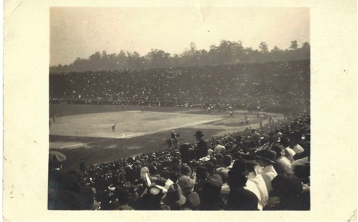
Even though we don’t collect that subject ourselves, we get entranced when we find an image like the one shown here. It looks like a ball park, but there doesn’t seem to be a backstop behind home plate. There is a player in a white shirt who seems to be hitting practice balls to the infield – and maybe the outfield that we can’t see. There is a film camera behind home plate. And there’s a police officer on horseback, and other officers on foot for ‘crowd control’.

Ballpark Mystery (Sayers)

There is a big crowd. It looks like 1920s – or maybe 1930s. The few women spectators are wearing hats. The men spectators are wearing an assortment of hats – including fedoras, caps, and ‘pork pie’ hats. Are the men on the field playing ball – or making a baseball film?

This was a very good sized stadium for its day, and so must have been in a major American city. But which one was it?

O.K. you ball fans out there. Where the heck is this?