• INTERESTED IN VINTAGE POSTCARDS?

    Join us as a guest at one of our ZOOM meetings. Here’s our schedule of UPCOMING  MEETINGS which are monthly except for the summer.  Or, become a TPC Facebook friend to stay connected!

CARD TALK CELEBRATES “CANADA 150”

Corner King & Yonge Sts., Toronto, Canada (Nerlich & Co.)

Harbor, Toronto, Canada (Nerlich & Co.)

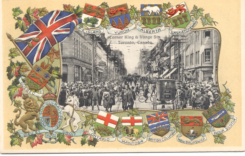
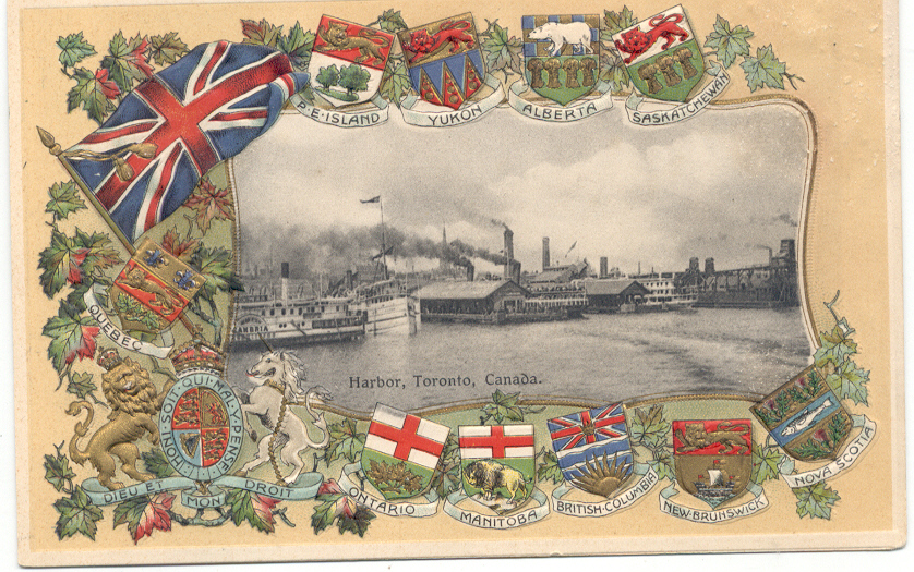
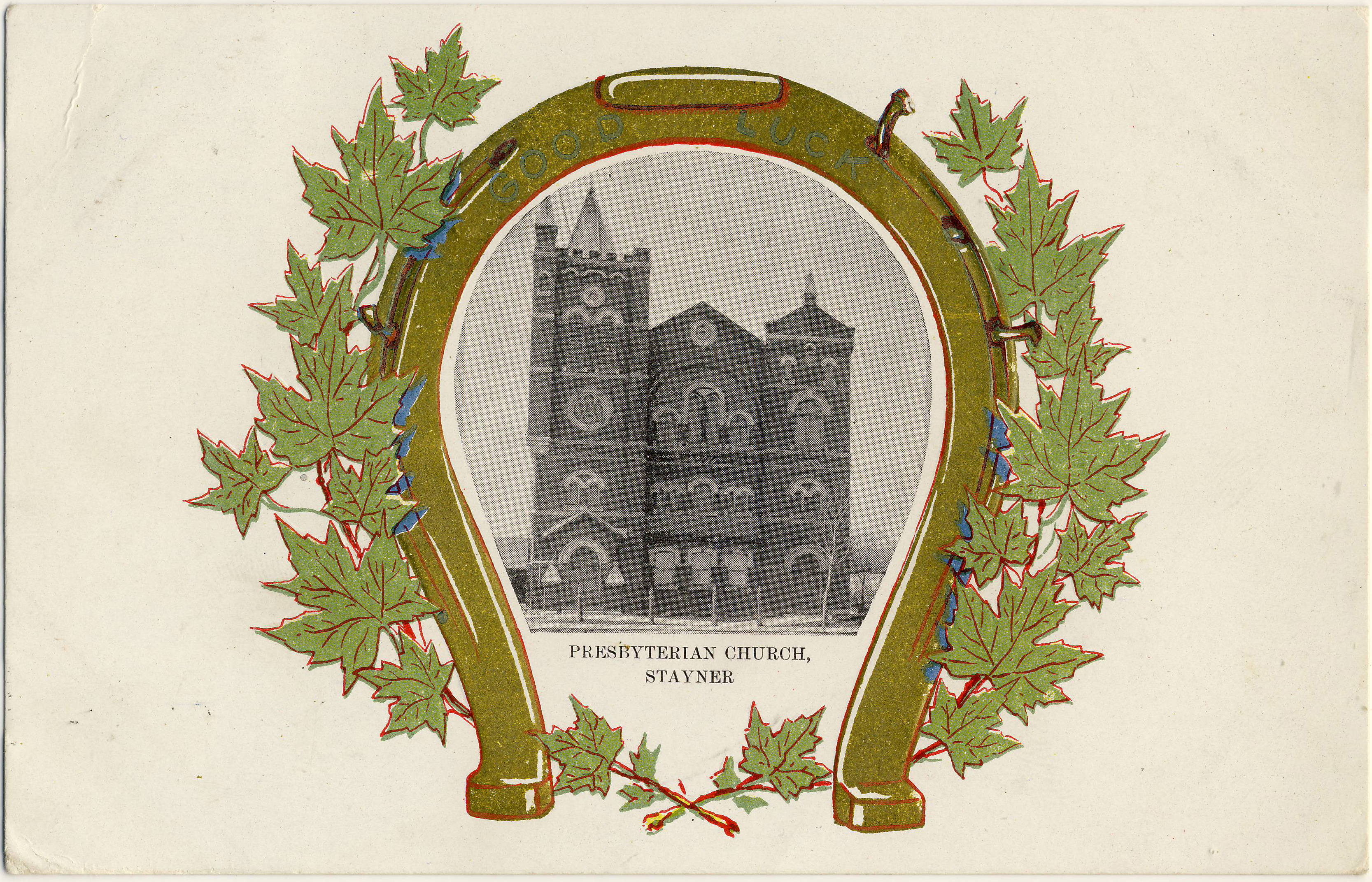
The Fall 2017 edition of the TPC magazine Card Talk is now out: our members should be receiving their copies in the next day or two. Because July 1st represented the 150th anniversary of Confederation (“Canada 150”), the issue has several articles of a “patriotic” nature, beginning with some reflections by veteran member Joe Rozdzilski on what Canada means to him as a son of immigrants who came to Toronto in the 1930s. Joe provided us with some illustrations, including a couple of lovely patriotic cards from Nerlich & Co. This design, which is embossed and beautifully printed, must surely be the single most elegant of the large and common series of lithographed Canadian cards published by the major manufacturers after the turn of the century. These Nerlich cards recall familiar Toronto scenes of the early 20th century — the corner of King and Yonge streets downtown and the busy (and very industrial) harbour. 

Shields and Arms

The provincial shields on these cards are of some interest. Nova Scotia’s, at the extreme right, isn’t the familiar blue cross of St. Andrew on a white background, but the province’s older design centered – understandably enough – on a fish (salmon?). Also, because they are post-1905 (likely not by much), the cards show Alberta and Saskatchewan as provinces, but at this point Alberta was still using the shield of its predecessor – the North West Territory – which featured a polar bear (rare in Alberta!) over four sheaves of wheat. Saskatchewan was apparently more on the ball, as it had already come up with its own exclusive design, featuring a more modest three sheaves of wheat. 

Curiously, the coat of arms depicted at lower left is not that of Canada but rather the United Kingdom’s coat of arms (which was of course that of King Edward VII, who was also King of Canada – so not at all inappropriate). 

Granary of the World

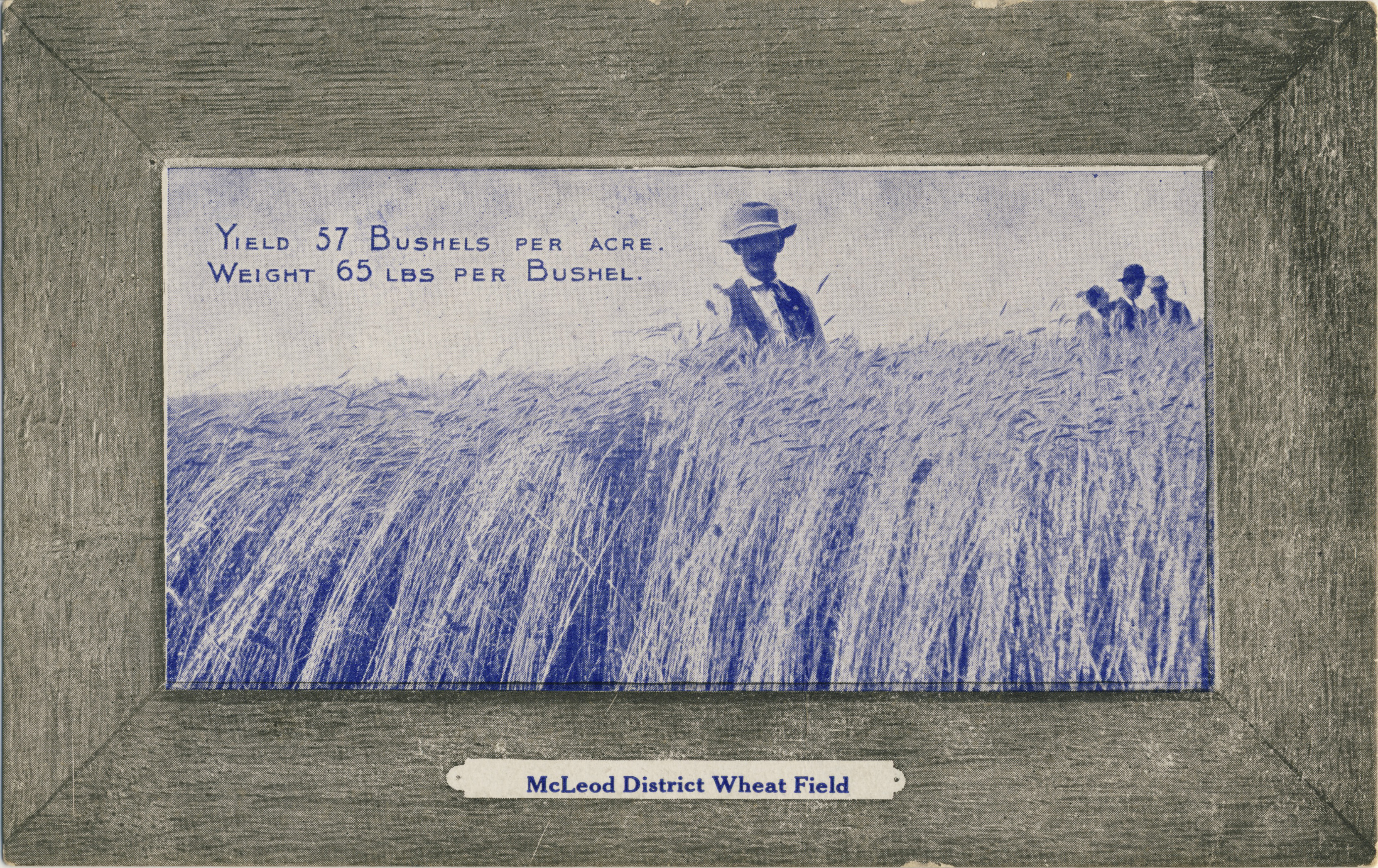
Also (partly) on a Canada-Britain theme, Barb Henderson has contributed an article on postcards with the theme “Granary of the World”, “Britain’s Granary” or the “Granary of the Empire” … that sort of thing. Among these are several of the ceremonial arch that the Dominion government erected in London in 1902 at the time of Edward VII’s coronation. There is also a fine example (see below) from the well-known series of twelve postcards issued (seemingly) by the federal government around 1906 to encourage immigration from the U.S. The illustrations on these cards originally appeared in a pamphlet published in 1903 by the Interior ministry of Sir Clifford Sifton.

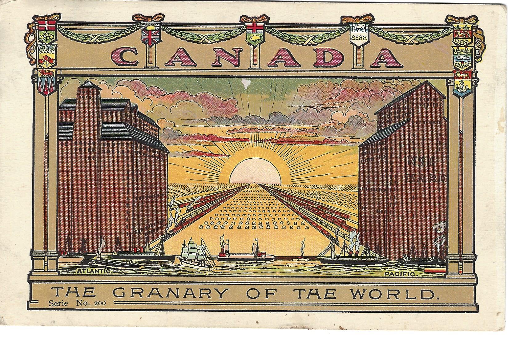
The Granary of the World. (Government of Canada, c. 1906)

Repatriation of Lost Treasures

In another article, long-time member Bob Atkinson writes of his latest travels to postcard shows far and wide. This time his journeys took him to Vancouver and Nottingham, where he met organizer Brian Lund, for many years publisher (with his wife Mary) of the British periodical Picture Postcard Monthly and still at work on the Picture Postcard Annual. As usual, Bob was on the lookout for hidden Canadian treasures and (having forewarned dealers to his visit) came back with quite a handful. Below is a photo of Bob (at right) with his English cousin Malcolm Henderson and Mr. Lund in the middle. 

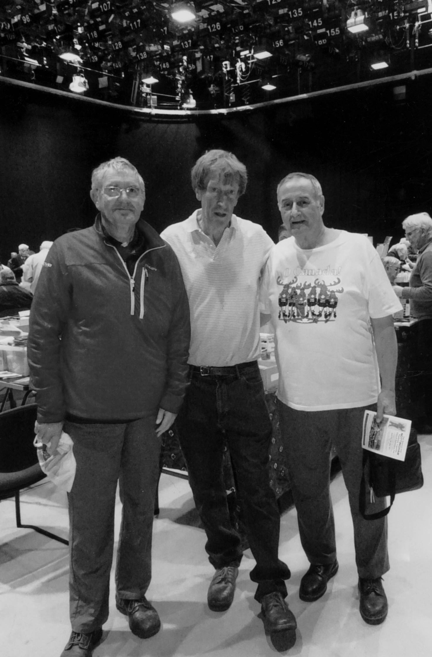
Malcolm Henderson, Brian Lund and Bob Atkinson at the Nottingham (U.K.) show. (courtesy R. Atkinson)

 Theatre Cards from New York City

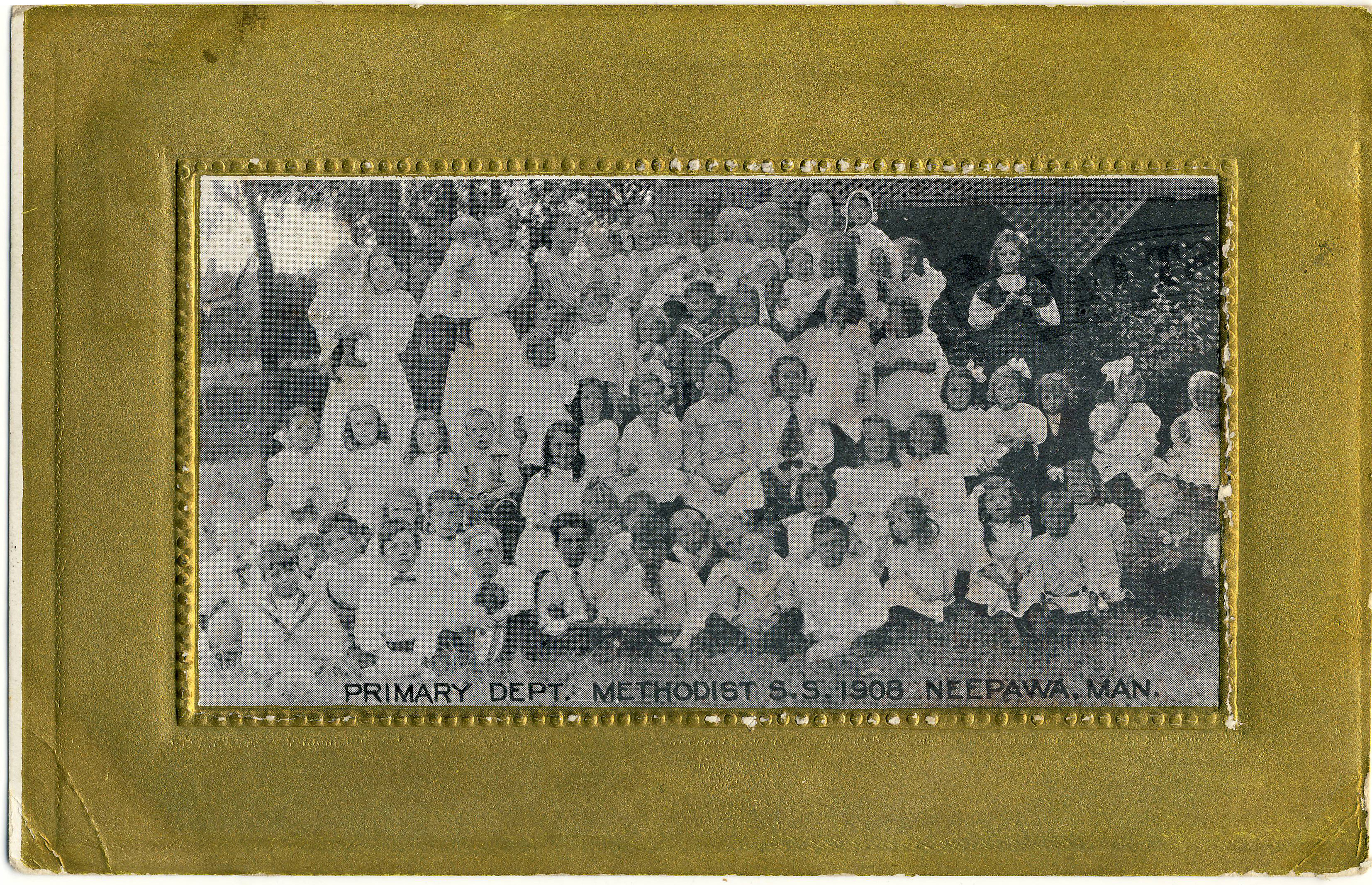
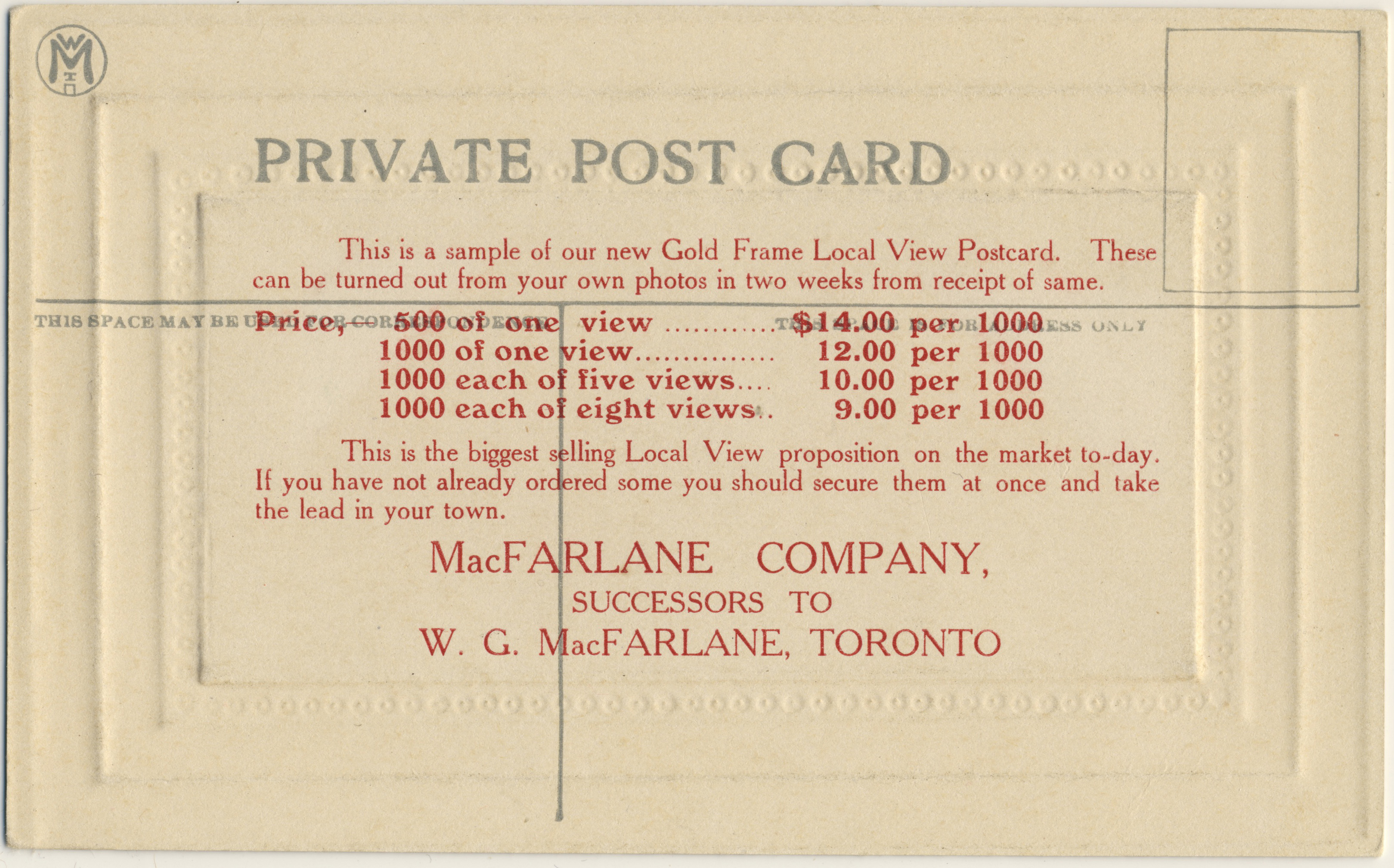
In not-specifically-Canadian news, we have accounts of some of our club talks, including Kyle Jolliffe’s “Broadway Ballyhoo”, an examination of New York City theatre postcards from 1900 to 1916. Kyle’s many postcards include the Korean comic opera “The Sho-Gun”. Many of the cards were produced by the Rotograph Co. as publicity for upcoming shows. Kyle, who focuses on New York postcards, also highlighted rarely-seen sets of Canadian cards by Warwick Bros. & Rutter – the “Celebrated Actor” series, which featured 36 or 37 cards – and by W. G. MacFarlane, who used Rotograph images in another hard-to-find series of cards.

And Much More…

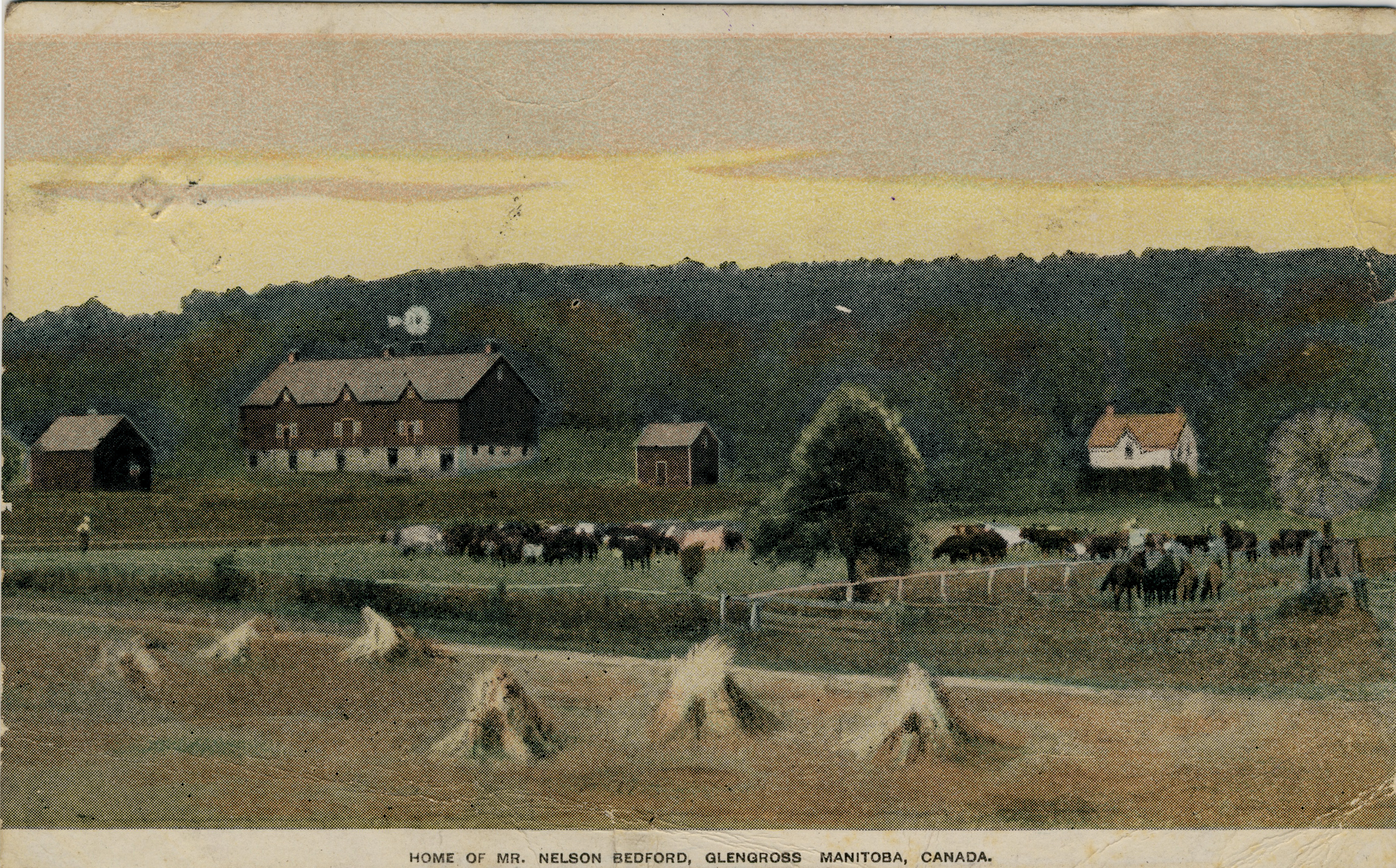
Other articles recount a talk by Ralph Beaumont – author of Heckman’s Canadian Pacific, an outstanding volume of early 20th century railway images not no Canadian history buff (or railway buff) should be without – and our own Mike Smith’s talk on his (and Larry Mohring’s) equally fascinating volume on the Canadian photographer Reuben Sallows, whose photographs were used on hundreds of Canadian postcards illustrating “scenes from ordinary life” in the young country of 1900-1910, in addition to numerous covers of the Canadian magazine Rod & Gun and illustrations in many U.S. periodicals of the day as well. Mike’s book may be ordered here

John Sayers contributed articles on the ongoing TPC auction and the Canadian National Exhibition, while Andrew Cunningham added an article about the use of Esperanto in postcards and postcard exchanges. 

 Join Us!

As always, we conclude by noting that Card Talk is not available on newsstands – it’s only to be had by joining our Club (or, I suppose, by craftily befriending someone who already is … but in that case why not join anyway and stop being such a mooch?!) Sign-up details are available here. We hope everyone had a happy “Canada 150”!

(By Andrew Cunningham)

L. B. FOOTE’S POSTCARDS

By Andrew Cunningham

Approaching early twentieth century photography from the (oblique) angle of postcards can sometimes twist the established hierarchy of photographers out of its usual shape. Many of the top photographers of the era did not sell much (or any) of their work in the form of postcards — while, conversely, the leading lights of postcard photography are often barely acknowledged outside postcard-collecting circles. So it was in the city of Winnipeg, where the iconic public photographer of the first half of the 20th century, Lewis B. Foote (1873-1957), would definitely be quite far down on anyone’s list of memorable postcard photographers. Indeed, the books that have been written on Foote’s work — including the most recent, Imagining Winnipeg (University of Manitoba Press, 2012) — mention Foote’s postcards only in passing, if at all. 

As a Manitoba-focused collector, I have nonetheless discovered Foote postcards here and there, every so often, unexpectedly and always with great excitement. For perspective, there might be two or three Foote postcards for every hundred published by his equally talented Winnipeg contemporary Maurice Lyall (1887-1966), who is unknown except to a few postcard collectors and about whom no books have been published. This blog post looks at some of the Foote cards in my collection — a bit of a ragtag and random set, with the important exception of the 1919 General Strike examples.

Lewis Foote

By way of biography, L. B. Foote was a native of Foote’s Cove, a tiny outport on an island off the Burin Peninsula of Newfoundland. The standard biographical story is that he discovered a talent for photography in the 1890s, whilst on the staff of the Summerside (P.E.I.) Journal. By 1902, Foote had established himself in Winnipeg, where he was one of the busiest and best-known local photographers for nearly half a century. As noted above, he died in 1957.

Pre-Strike Postcards

Most of Foote’s postcards are real photos (RPPCs). One exception, shown in Figure 1 below, is a promotional card (one of several, I am sure) that depicts the Winnitoba. The Winnitoba was the grandest excursion vessel on the Red River between its launching in 1909 (which is possibly when this card would have been produced) and its demise in a fire at the docks of its owner, the Hyland Navigation Co., in the autumn of 1912. Its sister ship, the Bonnitoba, which one sees much less frequently in postcards, is said to have been crushed by the river ice the following season. Hyland Park, the company-owned destination of the ships, still exists as a small public park just off Henderson Highway a little to the north of Winnipeg.

Figure 1. Forward Saloon on Hurricane Deck (Lewis B. Foote photo, published by the Hyland Navigation Co., Winnipeg, c. 1909)

While undated, Figure 2 most likely also comes from the earliest stage of Foote’s career in Winnipeg. This rather curious image of an anonymous farm family posing in the midst of a row of tall cornstalks hints at some of the whimsicality that characterized Foote’s photography throughout his career. The farmer’s fist is raised in what one imagines to have been mock triumph. Why? Was the corn perhaps the product of a good deal more effort than it was worth? Was it the farm’s first success after a string of failures? Who can say — other than that the photo illustrates, in a small way, how Foote’s images, even when they were of conventional or hackneyed subjects, often departed in small details from what convention dictated.


Figure 2. Unknown Farm Family (Lewis B. Foote, no. 4300, n.d.)


Figure 3, a rather poorly focused but nonetheless interesting image of the 1913 Labour Day parade in the town of Stonewall, Man., is an early example of Foote as recorder of labour history, an interest which (as we will see below) would just a few years later generate perhaps his greatest legacy. The sender of the Stonewall card notes the “New Town Hall” — the building built from the limestone that gave the quarrying town its name. At left, townsfolk in search of the best view stand behind a rooftop sign for “C. M. Brown – Hardware, Tinware and Stoves”.

Figure 3. Stonewall Labor Day 1913 (Lewis B. Foote, 1913)

Continuing with the theme of labour, Figure 4 shows the early stages of construction of a building near St. Mary’s Academy, the Roman Catholic girls’  school that is visible in the background. It has been suggested that the building under construction might be the H. W. Hutchinson House, 603 Wellington Crescent, now First Unitarian Universalist Church. As construction on the Hutchinson House apparently began in 1912, that thesis fits with what would superficially appear to be the age of the image on the postcard. But, having said that, many other large houses in this elegant neighbourhood would also have been under construction at roughly the same time.

Figure 4. Construction in Crescentwood (Lewis B. Foote, no. 4482, n.d.)

In Figure 5, we have a personal postcard of two soldiers — to all appearances not young men so perhaps veterans of the Boer War or another earlier conflict. The studio blindstamp, “Foote & James”, provides a clue to the date, as Foote entered into his long-lasting partnership with George James only in 1914. So perhaps these men, despite being a little older than average, were on their way to the First World War. Their uniforms appear to this highly untrained eye to be rather distinctive — perhaps someone familiar with military uniforms of the period will be able to tell us more.

Figure 5. Two Soldiers (Foote & James studio, after 1913)


General Strike Postcards

Finally, just as the soldiers were returning from the War — and definitely not unconnected with that fact — Winnipeg began to experience labour unrest. In the spring of 1919, that unrest blew up into a full-scale and at times violent General Strike. The General Strike is still arguably the most significant event in the history of Canadian labour, making headlines around the world (including the New York Times‘ famous “Bolshevism Invades Canada”) and shaped Winnipeg’s local politics for at least half a century. Foote produced photographs throughout the Strike, which lasted for a full month until called off on June 25, 1919, but the surviving photo postcards that I have seen seem to date exclusively from just two dates: June 10th and June 21st. The images below are all from the more commonly-found of the two, the 10th.

Figure 6 is one of the clearest and most interesting photo postcards of the strike, showing a large crowd at Portage & Main, with Portage Avenue East at right (in front of what is now the site of the Richardson Building). In Figure 7, a clipping from the evening edition of the Winnipeg Tribune, we learn that this melee took place at two in the afternoon — even the plight of the delivery vans that we see trapped in the crowd (including one belonging to Ringer’s, long a prominent pharmacy in the city) is noted! The timing is confirmed by Figure 8, which shows the mounted policemen in front of the McArthur Building (later the Childs Building) on the northwest corner, with a Dingwall’s Jewellers clock obligingly revealing the time to be 2:41 p.m. Between the two images, the photographer’s vantage point has shifted from an elevated position on the southwest corner to street level on Portage Avenue. If the activities in Figures 7 and 8 appear to be at least under a modicum of control, the final image (Figure 9) — taken from an elevated position above the crowd in Figure 8 — provides dramatic proof that “charge” really did mean “charge”.

Figure 6. Winnipeg Riots, June 10/19 (Lewis B. Foote, 1919)

Figure 7. “Mounted Policemen Charge Huge Crowd”, Winnipeg Tribune, p. 1 (June 10, 1919) CLICK TO ENLARGE

Why so rare?

Few of the Foote postcards in my collection — and none of the General Strike postcards — were postally used or written on in any way, indicating that they were probably purchased for personal albums (and as souvenirs, in the case of the strike cards). This fact may also suggest that Foote was not sufficiently invested in the postcard market to have created the necessary distribution channels for his “product” — relationships with shops, druggists and others would generally have been needed to get one’s photocards in front of the buying public. Even though more and more of the cards turn up with time, indicating that there must have been a fair number of them, I have not yet seen any single example — other than the General Strike cards and the Hyland Navigation Co. lithographs — on sale more than once. This might indicate that they were usually produced in small quantities, perhaps only at the request of individual customers for whom Foote had produced larger images. Any other examples in the collections of our members or visitors — particularly of subjects other than the General Strike — would definitely be of interest.

The only L. B. Foote postcard in the Peel Prairie Provinces collection, a group shot of the Salvation Army Citadel Silver Band, quite possibly c. 1910 as noted, may be seen here.


Figure 8. Winnipeg Riots, June 10/19 (Lewis B. Foote, 1919) Mounted policemen inspect onlookers outside the McArthur and Nanton Buildings.


Figure 9. Winnipeg Riots (Special “Mounties”) June 10/19 (Lewis B. Foote, 1919).


CAUGHT IN THE ACT?

By Andrew Cunningham

Collectors often speculate about the re-use of images in postcards — whether this was done with permission or not, or with due attention to the copyright of the photographer or original publisher. In the advertisement below, which appeared in a Canadian trade publication in 1907, the Barnes-Crosby Co. of Chicago offered, among other things, to make postcards from “other post cards”! That is rather bold and may not have endeared it to others in the industry.

Interestingly, while the company claimed to be the “largest concern of the kind in the world”, it doesn’t appear to have left much of a legacy. A recent search of “Barnes-Crosby” on eBay turned up only two postcards, both publisher’s samples! Nor is the company included in the publisher index of the Metropolitan Postcard Club of New York.

Any other thoughts or information on this issue would be appreciated!

Barnes-Crosby Co. postcard advertisement

Barnes-Crosby Co. advertisement published in Canadian Druggist, 1907.

AN UPDATE ON “GOVERNMENT AGENT” POSTCARDS

By Andrew Cunningham

In a post from July 2016 concerning “Government Agent” cards, I had noted that, thanks to the efforts of TPC members Wayne Curtis and Philip Francis, we knew of a total of 35 Government Agent postcards. To back up a bit, “Government Agent” cards are the western settlement promotional postcards, aimed primarily at English farmers, that sported the distinctive back design depicted below. In that July post, I referred to a short note in the Winnipeg Tribune for July 24, 1905 (also below) that was quite clearly referring to the publication of the postcards. The Tribune happened to describe the images on four of the cards, three of which are on Wayne and Philip’s lists, but the fourth of which — a Calgary bird’s-eye view — didn’t seem to be.

Well, in researching the publisher history of the Calgary-based H. Enida Olive Co., what should turn up among the images I found but a card (not by H. Enida Olive) entitled A Great Cattle Market, Calgary, Alberta, Canada, Centre of Ranching Industry, number 6058 in the Images section of the University of Alberta’s Peel Prairie Provinces Collection. That is clearly the card in question. However, rather than being a new, 36th card, it turns out to be one from Wayne and Philip’s list. The title of the card, which I hadn’t seen until now, just didn’t suggest that the view was a bird’s eye. So we’re still stuck at 35 cards!

Here’s a look at this very rare Calgary view … 

A Great Cattle Market and a Great Postcard (PEEL COLLECTION, U OF ALBERTA)

LEPORELLO POSTCARDS OF PRINCE EDWARD ISLAND

By H. T. Holman

Editor’s note: TPC member Harry Holman of Charlottetown, P.E.I. has started a blog — Straitpost — that focuses on the early postcards of the Island. He recently wrote this article about Leporello cards, which (for reasons that he relates) are the kind of card that contains a long strip of printed images of the place the postcard is about. The beginning his article is below, after which you can continue to Harry’s site for more. Like Prince Edward Island itself, “Straitpost” is well worth a visit.

Unless you are a Mozart aficionado or a well-educated and avid post card collector the title of this posting probably will mean absolutely nothing.  Since I am neither, the term “leporello” sent me scurrying to Wikipedia where after some research the mystery was unravelled. Let’s start with the Mozart because that holds the explanation for the name. Leporello is Don Giovanni’s manservant in Mozart’s 1787 opera Don Giovanni.  Don Giovanni, a young, arrogant, and sexually promiscuous nobleman, abuses and outrages everyone else in the cast until he encounters something he cannot kill, beat up, dodge, or outwit. Don Giovanni, is betrayed to a new conquest by his servant who tells her that he is unfaithful to everyone; his impressive list of seductions and conquests include 640 women and girls in Italy, 231 in Germany, 100 in France, 91 in Turkey and 1,003 in Spain. In displaying the conquests the manservant pulls the list out of the book in an accordion fold. The term leporello is applied to books and publications that use this endless page device. The leporello became quite common in the Victorian era. Panoramic scenes in travel accounts as well as images of culture and customs often used the device. After the development of photography it became an effective way to show very wide images, or a linked series of photographs.

In early postcards the leporello often takes the form of an album of mini images folded into the postcard itself. They were more commonly used in Europe but North American postcard publishers used the leporello as well although they are scarce if not rare. Because of the format the cards do not hold up well to handling. They have to have an inner pocket that protects the mini album and there is much folding and unfolding to see the images.

I hardly knew what to expect when I ordered the card from a German on-line dealer. The photos in the listing were not very good and it was obvious that the card was not in particularly good shape. The face image of the card was an uninspiring view of the winter steamer Stanley in ice but it was not one I had seen before. The photos on the sale site showed only two of the mini images and I would not have been surprised to see that any others had long since come loose and disappeared.  CONTINUE READING


Front of Harry’s “Leporello”. The latch pin can be seen holding the image pocket closed. To see what it contained, visit his blog.


POSTCARDS TO ORDER: THE WHOLE TRUTH ABOUT HALF-TONES

By Andrew Cunningham

Many of our members (like deltiologists everywhere) spend a lot of time trying to figure out who was behind the postcards we collect – printers, publishers, photographers, distributors and sellers. When it comes to photographers, for example, there were certainly some individuals who roamed the country taking photos for use on postcards. The brilliant new book on Reuben Sallows, written by TPC members Mike Smith and Larry Mohring, shows the incredible range of one gifted Canadian photographer who did just that.

[1] Rumsey & Co. sample card.

Just as often, however, the postcard views that we see were made from photos submitted to a publisher by a local seller, often the town’s pharmacist or general store owner. He (or, very occasionally, she) would order postcards in a certain style and price range from a publisher’s catalogue or from its travelling salesman when he passed through town. We know something about this process because a lot of “publisher’s sample” postcards are still around today. These cards help to give us an idea of the business side of the postcard industry. Sometimes, as in illustration [1], they include pricing (here, $7 for 1,000 copies of the card; $6.50 for customer-supplied photos). One of the problems with selling printed postcards (as opposed to “real photograph postcards (RPPCs)) was that you had to order a lot of them to make a print run economical. Here, Rumsey & Co. has tried to make the 1,000-card minimum order more appealing to its customer base of small-town retailers by agreeing to provide the minimum quantity into two colour tones: 500 green and 500 sepia (“almost as good as having two subjects to the 1000”). 

[2] Front of the Rumsey & Co. collotype sample postcard.

The quoted prices in this case were for collotype images. “Collotype” was a gelatine-based printing process used extensively in the late 19th and early 20th centuries to reproduce photographic images on a printing press. Used appropriately, it could create a pleasing result that in some cases is difficult to tell from a real photograph without a magnifying glass. The images were sometimes left as monochromes (black and white) or they could be “colourized” by the direct application of colour to appropriate objects and areas in the image (sort of like paint-by-numbers). A third alternative, used here, was to tint the cards, which required the application of a colour tint across the entire image – a far less time and labour intensive process than full-scale “colourization”. The front of this particular card, which shows a street scene in Fort Macleod, Alberta, is in the “green” tone mentioned in the advertisement (see illustration [2]).

If, as a retailer, you wanted something a little cheaper that could be purchased in smaller quantities, you could order a half-tone card rather than a collotype. Half-tone images (composed of ranges of little dots, as in a newspaper photograph) were easier to produce than collotypes. The down-side was that they tended to look less realistic and (truth be told) a bit dull. So, to gussy them up a bit, publishers often printed them on standard card blanks pre-printed with a “framing” image that supplied the colour and elegance that the inset half-tone images lacked. Illustration [3], “Presbyterian Church, Stayner” is an example of how a half-tone could be made more saleable by inserting it into one of these pre-printed frames – in this case the Toronto Lithographing Co.’s horseshoe design (which is classified as “patriotic” because the horseshoe is entwined with a garland of maple leaves).

[3] Presbyterian Church, Stayner [Ontario] (Toronto Lithographing Co.).

Some of the most popular postcard types in Canada were “frame view” cards. These were cards whose “frames” really were frames (pretend ones, at least). Frame-views were offered by a number of Canadian publishers, but are most commonly found under one of three imprints: Atkinson Bros., Stedman Bros. or Pugh Manufacturing Co. (based in Toronto, Brantford and Toronto, respectively). While the quality of the images is not especially high, these cards are often highly interesting because they tend to show events and views that would have been of interest only locally, and which are therefore of great interest now because of their rarity and (often) naive charm. In that sense, their content can resemble real photo postcards, which were expensive but which could be produced in very small quantities (even just one), and which are therefore prized because they tended to be used to show more personal or local scenes, or short-lived events and “news stories” (notably including fires, floods, tornadoes, train wrecks and other “disasters”). 

If we look at a frame view sample (illustration [4]) from Stedman Bros., who seem to have been the most prolific publisher of this type of card, we can see why these cards would have been popular for images with relatively limited (short-lived and/or merely local) appeal. The price of 1,000 Stedman frame-views was lower than Rumsey’s 1,000 collotypes ($5.50 vs. $6.50) and you could also order just 500 if that was all you wanted (albeit at a higher per-card price). For someone who couldn’t really hope to sell more than a few hundred of a given postcard, the Stedman frame-view might indeed have seemed “a good proposition”. The images would usually be tinted, most often blue. While not spectacular, the result was not without aesthetic appeal.

[4] Stedman Bros. frame view back (McLeod District Wheat Field).

In illustration [5], we see the front of the sample card; coincidentally also illustrating a scene from the Fort Macleod area. This one boasts of crop yields and may have been part of an advertising campaign sponsored by a local land company or chamber of commerce, such that only limited numbers and quality were required. Mike Smith’s guide to Stedman postcards lists about 140 postcards in the frame-view style, with many others having come to light since the book’s publication in 2011.

[5] McLeod District [Alberta] Wheat Field (Stedman Bros.).

Another series of frame views that can easily be confused with the Stedman versions was published by Atkinson Bros. The example in illustration [6], showing the asbestos mine in Thetford Mines, Quebec, is highly unusual in that it came with a piece of red cellophane (not shown) that fit into a slot in the frame to make a sort of “flap” that (for some unknown reason) covered up the image. The Atkinson frame views are recognizably different from their Stedman counterparts in virtue of their glossier appearance and the light effects on the frame. (I find the Stedman “look” more authentic myself!)

[6] Thetford Mines, Que. – Johnston’s Asbestos Co. (Atkinson Bros.).

Another variety of frame view is the “gold frame” of Pugh Manufacturing Co. These were also common in small-towns across Ontario and the West, with the example in illustration [7] being fairly typical. One can imagine that the Neepawa Methodist Sunday School produced just enough potential customers to make the production of the card economical. Examples such as this could also have been used for fund-raising.

[7] Primary Dept. Methodist S.S. 1908, Neepawa, Man. (Pugh Manufacturing Co.).

The W. G. MacFarlane Co., under its later name of (just) “MacFarlane Co.”, also got into the gold-frame game, but probably less successfully than Pugh, given the lack of examples in my own experience. Confirming this impression, Mike Smith’s MacFarlane guidebook (2010) lists only six examples. One reason that the MacFarlane gold-frame cards might not have succeeded is that they were very pricey for what you got … the sample back in illustration [8] shows that they cost much more ($12  per 1,000) than Stedman Bros. were charging for their two-tone collotypes (albeit perhaps not at exactly the same time). 

In conclusion:

  • Much of the fancy design that we see in Canadian patriotic cards, and even in the “frame views”, was an attempt to make up for the visual weakness of the half-tone images that they framed. The “frame view” cards were probably preferred for customer-supplied photographs because the rectangular space in them would “work” for just about any photo (while a more complex “frame”, such as Toronto Litho’s “horseshoe”, would require a photo of a particular shape and orientation to “fit” and thus was better suited to images that the company could choose itself).
  • The half-tones were economically desirable because they could be cranked out in large or small quantities and at relatively low cost. Those were their advantages over collotypes, which involved a fussier process that was not easy to use for either small or very large quantities and generally had to be outsourced to sophisticated German printers. However, the collotype process produced a more realistic reproduction of photography than did the half-tone process, and was therefore much preferred on “ordinary” view cards in which the image took up an entire side of the card and needed to stand on its own.

[8] MacFarlane Co.’s price list for its gold-frame halftone “local views”.


HALF A MILLION POSTCARDS

By H. T. Holman

Because almost no company records from postcard publishers have made it into archival collections, much information about the production process has been lost. The names of photographers, the nature of the contracts, wholesaling arrangements can be added to the loss of catalogues of images produced. One of the continuing questions is how many cards were produced. Historians have identified the collapse of interest following the card mania, and the subsequent withdrawal or failure of companies is attributed to over-supply but we don’t how many cards were being put into the marketplace.

For Prince Edward Island, there are a few tantalising clues. The province was certainly not immune from postcard fever and both local publishers and almost all of the national companies produced cards for the Island. The distributor for many of these companies, as well as the producer of cards under their own company name was Carter’s Bookstore (appearing as “Carter & Co.” or “C. & Co.” on later cards), who handled both retail and wholesale business in paper goods and souvenirs.

In 1904 they advertised a series of gummed stamps and souvenir photo books as well as a shipment of 5,500 postcards they had just received from their printer. However, three years later the newspaper advertising boasted that they had contracted with European manufacturers for half a million souvenir post cards “of the Beauty Spots of Prince Edward Island.” That represents more than five cards for every man, woman and child in the province. The number appears to include only view cards and does not include the many comic, holiday and topical postcards that would have rounded out their stock.

The number may be “mere puffery” but if accurate probably does not include postcards from Canadian printers such as Warwick Bros. & Rutter or McCoy Publishing in nearby Moncton and the numbers of cards could be much higher.
With numbers such as these, it is small wonder that a hundred years later there are so many surviving cards from the province.

While I am astounded by these overall numbers I still have no indication as the size of the press run of any individual card or set of cards and no idea if these numbers are reflected in other parts of the country. I would be interested in learning more about the numbers game. Perhaps TPC members could share their findings through the medium of this blog or Card Talk.

Editor’s note: We’d be interested to hear what other TPC members (and readers who are just stopping by) have learned about the volume of postcards produced and sold in their areas. To have hundreds of thousands of surviving manufactured articles from over a century ago, as anyone can see at our Club’s annual sale, one would have to think that the original “supply” must have been many, many multiples of that. But how many is a tough question to answer in the almost complete absence of records that Mr. Holman notes. You can read more of Mr. Holmes research on PEI vintage postcards in his blog “straitpost”

EMBROIDERED SILK POSTCARDS

By Andrew Cunningham

Among the most beautiful collectible postcards are embroidered “silk” cards, the vast majority of which were made in France and Belgium during the First World War and sold mainly to British Empire and U.S. troops. The cards featured colourful imagery, such as the butterfly in the example below. Most of the designs — although by no means all of them — incorporated militaristic or patriotic elements, such as the four national symbols embroidered into the butterfly’s wings in our example. Because so many “silks” were produced, and because they were usually retained as keepsakes, they are more common than one might expect (and not always quite as valuable as those who find one or two in “Grandma’s album” tend to hope).

As the website of the Imperial War Museum in London notes, the most sought-after cards tend to be rarities with imagery specific to particular regiments (including many Canadian examples, as TPC member Mike Smith recently discussed in the Wayback Times).  World War I silk postcards, including those with Canadian themes, are a terrific collecting area that, with a little time and effort, could produce a beautiful and historically informative collection at a relatively modest cost.

[WW I butterfly silk]

Butterflies were one common motif on World War I silk postcards, typically with flag elements worked into the stitching of the wings.

GOVERNMENT AGENT CARDS – A CLUE TO THEIR ORIGIN

By Andrew Cunningham

Twice in its illustrious history — in 1981 and 2013 — the TPC’s magazine Card Talk (free to Club members!) has featured an intriguing set of Prairie postcards known as “Government Agent Cards”. These postcards are so called because their distinctive backs reveal them to have been part of the Dominion Government’s effort to promote immigration to the newly opened farming districts of the Canadian West, with recipients of the cards being urged by the printed text to obtain more information “from any Canadian Government Agent”. Here are the front and back of one of the series of 35 known cards, entitled “Home of Mr. Nelson Bedford, Glengross Manitoba, Canada.”:

Home of Mr. Nelson Bedford, Glengross, Manitoba, Canada

Mr. Bedford’s well-established farm may have been in operation for 40 years by the time of this image, making it an attractive candidate for “immigration propaganda” use. This might have been one of the oldest farms on the Prairies outside the immediate vicinity of Winnipeg.

Home of Mr. Nelson Bedford, Glengross, Manitoba, Canada [back]

The postcard may have been handed out as a “freebie” by the Devon Shipping Bureau in an effort to drum up business.


As is still the case, giveaway postcards were often not valued by their recipients and would often end up being used for minor notes such as this. A distinguishing feature of most of the Government Agent cards, illustrated by the Nelson Bedford example, is that they depict specific farms and actually name the owners. In this case, Mr. Bedford turns out to have been one of the earliest (1870s-era) settlers in the Morden, Manitoba district, just a few miles up from the North Dakota line. The reference to “Glengross” should read “Glencross”, but even with that correction the name might not mean much to those in the area today as the Glencross P.O. closed for good in 1909 (by which time Mr. Bedford himself had been dead for two years, after a life that was apparently marked by tragedy).

In my experience, these cards tended to be collected rather than actually mailed, making the well-used example above somewhat uncommon. Of the 28 Government Agent cards in my collection, only 7 were posted — 5 in England and 2 in Canada. An eighth card was presented to a pupil at a school in Oxfordshire as a prize for composition. The predominance of English uses suggests that (as we might have expected) the cards were produced primarily for overseas distribution to potential emigrants.

But when were these cards actually produced, and for how long did the Government distribute them? The postmark dates in my collection suggest fairly specific (if tentative) answers to each of those questions:

Canadian uses

INDIAN HEAD, ASSA. – Sept. 12, 1905

WINNIPEG, MAN. – Nov. 18 [year not readable]

English uses

ROCHESTER, KENT – Oct. 30, 1905

DERBY – Nov. 14, 1905

MELTHAM – Nov. 25, 1905

BANBURY (Hornton National School, prize card) – Dec. 1, 1905 (ink-stamped date)

EXETER – Dec. 19, 1905 (the Nelson Bedford card)

OXFORD – May 9, 1906 (sent by someone actually departing for a 3 month tour of Canada)

Amazingly, all but one of the dated cards from the U.K. were used within a period of about 50 days in 1905. Assuming that the missing year on the Winnipeg card was 1905, the Sept. 12 and Nov. 18 dates of the two Canadian uses suggest the entirely unsurprising possibility that the series was distributed a little earlier in Canada. But it seems that we can date the production of the cards, if only tentatively, to the spring or summer of 1905.

Fortunately, a piece of corroborating evidence has emerged, in the form of a short item published in The Winnipeg Tribune on July 24, 1905. The note appears to refer to a set of cards that is surely these selfsame Government Agent Cards — if only because three of the bird’s-eye views mentioned match the three known examples of bird’s-eye images in the Government Agent set.

The article suggests that this “innovation” may have been the product of the Winnipeg branch of the Dominion immigration department:

Immigration Department cards WT 240705p12

Note that the Calgary bird’s eye view doesn’t appear in the list provided by Philip Francis and the late Wayne Curtis in the 2013 Card Talk article, so perhaps that is the 36th card in the series. [ed. Alas, no! See our update post!]

Besides the identity of the printers and the exact number of cards in the series, two great mysteries remain about the Government Agent set: who took the photos and why these particular farms? To these questions I have no answer, other than a very small piece of evidence that Alfred J. Sutton (later of the postcard publisher Gowen Sutton in Vancouver) might possibly have had some involvement. But — to look on the “glass half full” side — we now know that the cards were printed around June or July of 1905 and can further hypothesize (with some “poetic licence” and all due caution) that, after a few had leaked out around Manitoba and Saskatchewan, the bulk of them were shipped off to England for distribution mainly in relatively prosperous counties in the southern half of the country (perhaps with a view to attracting “the right kind” of farmer). Getting the cards into circulation in England must have involved a fairly intensive and concentrated effort by someone over a few weeks in late October and early November 1905.

If anyone can fill in more dates and more places in England and Canada (or elsewhere), we can test and, as warranted, correct the hypothesis! Please feel free to leave a comment if you can help.

Where do postcards come from, Mommy?

By John Sayers

Where do postcards come from, Mommy?

Hey, that’s just one of the delicate questions from their children that Mommy or Daddy has to answer! In this case, a picture is worth a thousand words – and a lot of embarrassed er…uh…mumbling.

They can tell Julie – or Johnny – that many, many years ago postcards came from shops like this one in Paris. See the youngster looking at the choices? Well, you will also note the serious woman watching him closely, in this era well before video surveillance! Video was not known, but theft was.

Postale Galérie

POSTALE GALERIE. 186, Rue de Rivoli.   “Paris, France – 1906”

How will he decide on which card to purchase? Well, it’s not unlike when you have to decide what you’re going to select from Netflix or other video providers. It isn’t easy.

Today’s postcards are fewer in number, but we still have the survivors of the billions of postcards printed in the era of this picture as well as today’s production. Great images. Great history. Great hobby!

P.S. In case the 1906 date on the postcard makes you think you’re a bit late to get your postcards, it appears that some may still be available! Click the link – 186, rue de Rivoli seems to be the address of the first two or three shops in the Streetview image.