• INTERESTED IN VINTAGE POSTCARDS?

    Join us as a guest at one of our ZOOM meetings. Here’s our schedule of UPCOMING  MEETINGS which are monthly except for the summer.  Or, become a TPC Facebook friend to stay connected!

FIRESIDE READING – CARD TALK’S WINTER EDITION

Our annual Seasonal Party this past week was a great success. In addition to delicious food, the TPC served up the latest edition of Card Talk to all attendees, thus saving some postage costs. Retrieved from the printers only hours earlier, the Winter edition of our flagship (well … only) publication contains its usual 24 pages of deltiological news and analysis.

Following up on an article in the Fall edition, TPC member Lorne Smith contributed additional information on the use of Esperanto in postcards, including an account of his visit to the Esperanto Museum in Vienna. Among the postcards in Lorne’s collection is one of Prague’s Old Town Bridge Tower (Figure 1), with a message in esperanto and an Esperanto sticker on the front. The postcard’s caption has also been translated by the sender. 

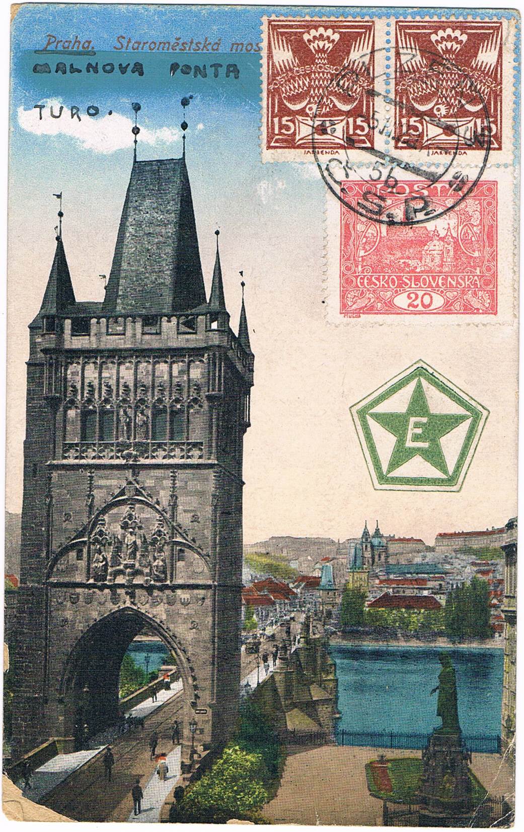
Figure 1. “Malnova Ponta Turo”, according to the sender.

We had a response to our call for early Canadian RPPCs (real photo post cards) — “early” being 1904 or prior. Member Rick Parama submitted a photo card of a cow and calf from Bowden, Alberta, N.W.T. (as it then was) from the summer of 1904. Generally speaking, RPPC production in Canada seems to have gone from almost nil in the spring of 1904 to a significant trickle in the later months of 1904. By mid-1905, it was a veritable torrent that did not die down for several years thereafter. Real photo cards from 1904 and earlier are rare in Canada and we continue to solicit members and the general public for examples to illustrate the early days of this important photographic genre.

Another of our members, Joe Rozdzilski, contributed some examples from his collection of west-end Toronto postcards, focusing on the life and times of Sunnyside Beach and its amusement park and bathing pavilion, the latter of which could accommodate 2,000 swimmers and was, on opening in 1922 (Figure 2), the largest heated outdoor pool in the British Empire. The amusement park was a wonderland of food and attractions that are brought vividly to life in Joe’s story.

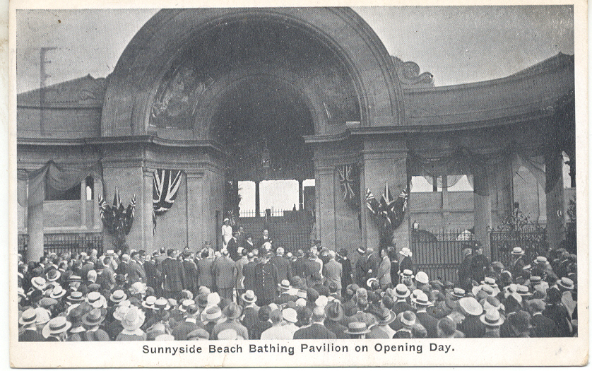
Figure 2. Sunnyside Beach Bathing Pavilion on Opening Day.

In 2016, we discussed the postcard photographer Lewis Rice, who worked first in his native Nova Scotia but more famously, after around 1907, in Saskatchewan, where he carried on business in the boom town of Moose Jaw. In this issue of Card Talk, the TPC’s Barb Henderson and Vancouver Postcard Club’s Gray Scrimgeour recount the events of June 1, 1912, which was declared to be “Postcard Day” in Moose Jaw. This was a Board of Trade effort to promote the new city by having its citizens send out Lewis Rice postcards with pre-printed boasts on the back. Through years of diligent searching, and with the help of fellow collector Don Kaye, Gray has found cards bearing nine different slogans, such as:

  • FIFTY THOUSAND more CITIZENS WANTED who are law abiding and can stand prosperity for it’s sure to get you if you come to MOOSE JAW. 
  • Some towns are afraid to see new people come in, fearing that there will not be enough for all. That’s not Moose Jaw.
  • Welcome Nobles [i.e. the Duke of Connaught and his family] to Moose Jaw — the Minneapolis of Canada.

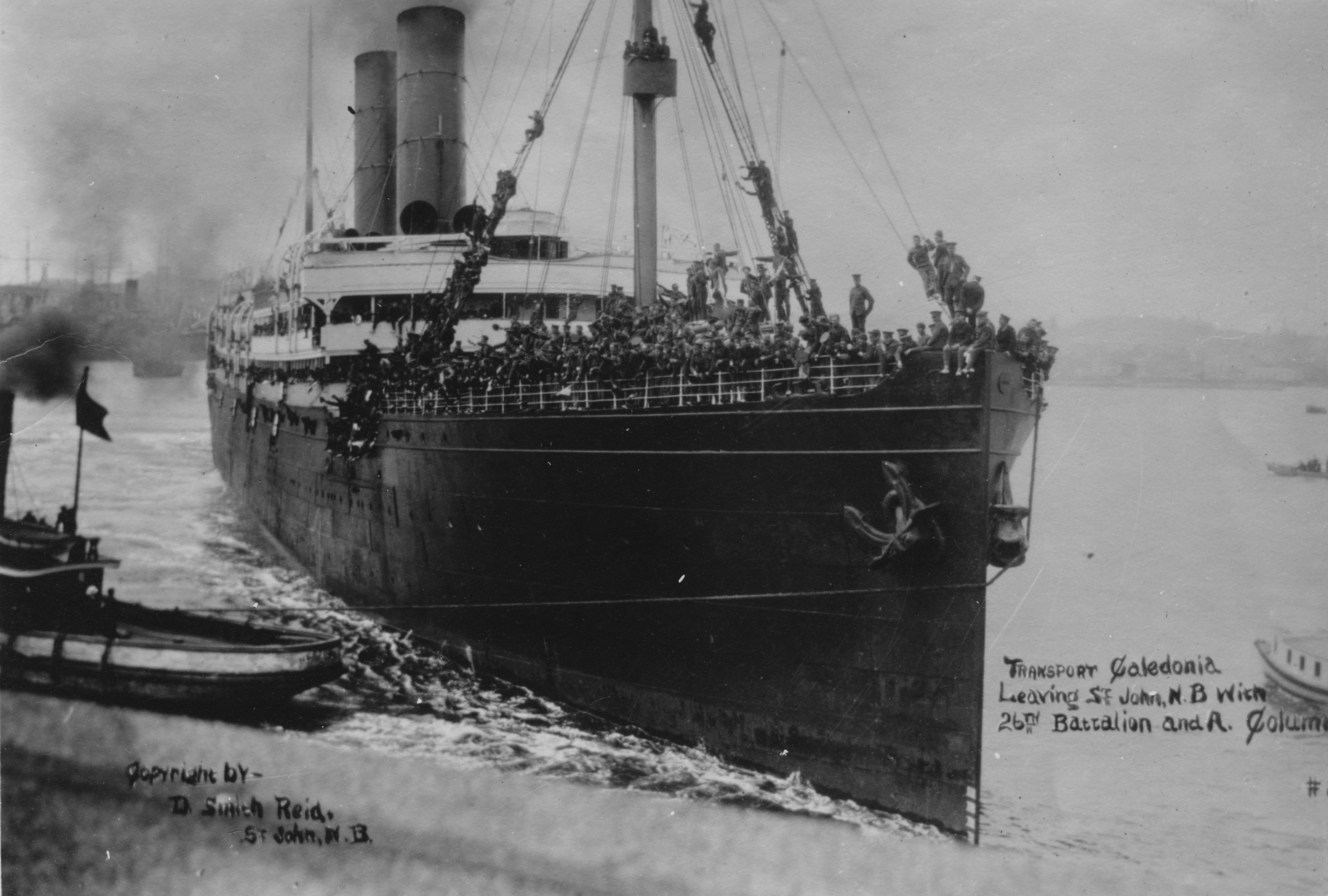
This edition’s cover story shows some of the many ways in which postcards take us inside Canadian buildings of the early 20th century. From the old Centre Block of Parliament  (Figure 3) to the elegant Vice-Royal Suite of Winnipeg’s Royal Alexandra Hotel (Figure 4) to the interior of the ill-fated Great Lakes passenger vessel Noronic (Figure 5), postcards offer views of interiors that are invaluable to our understanding of the history of everyday life as experienced in ordinary houses, grocery stores, hotels, restaurants and factories.

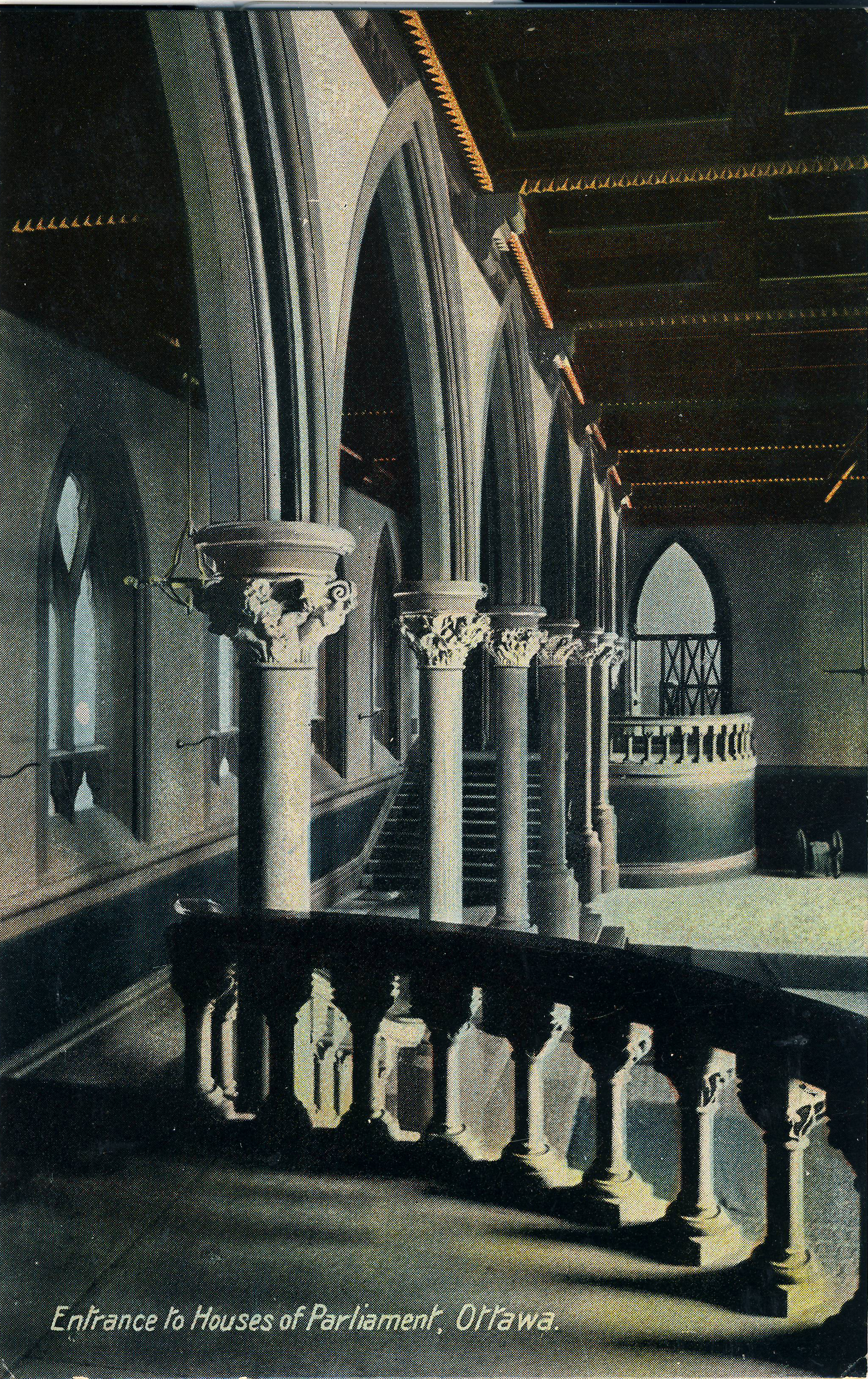
Figure 3. Entrance to Houses of Parliament, Ottawa

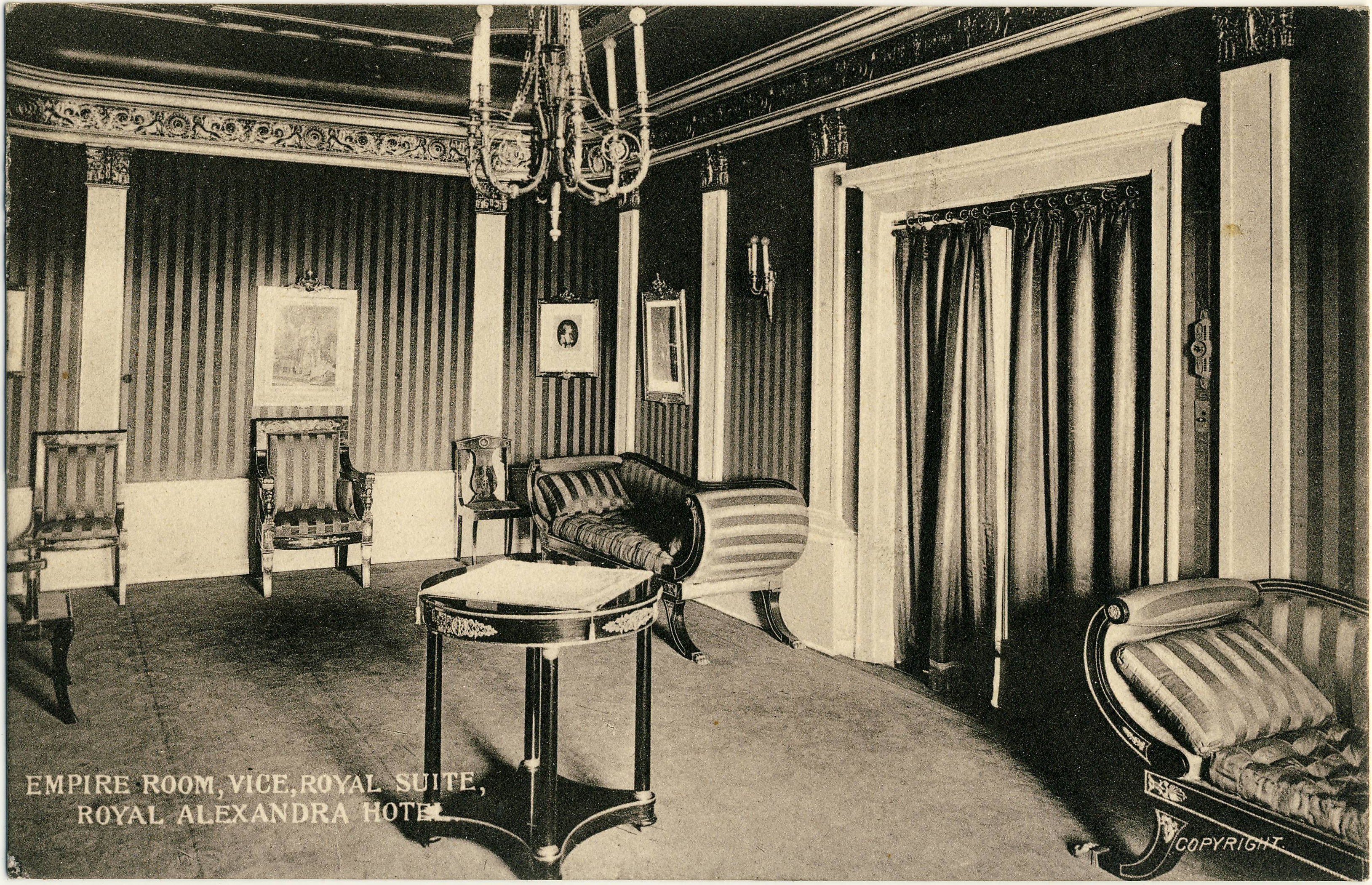
Figure 4. Empire Room, Vice-Royal Suite, Royal Alexandra Hotel, Winnipeg

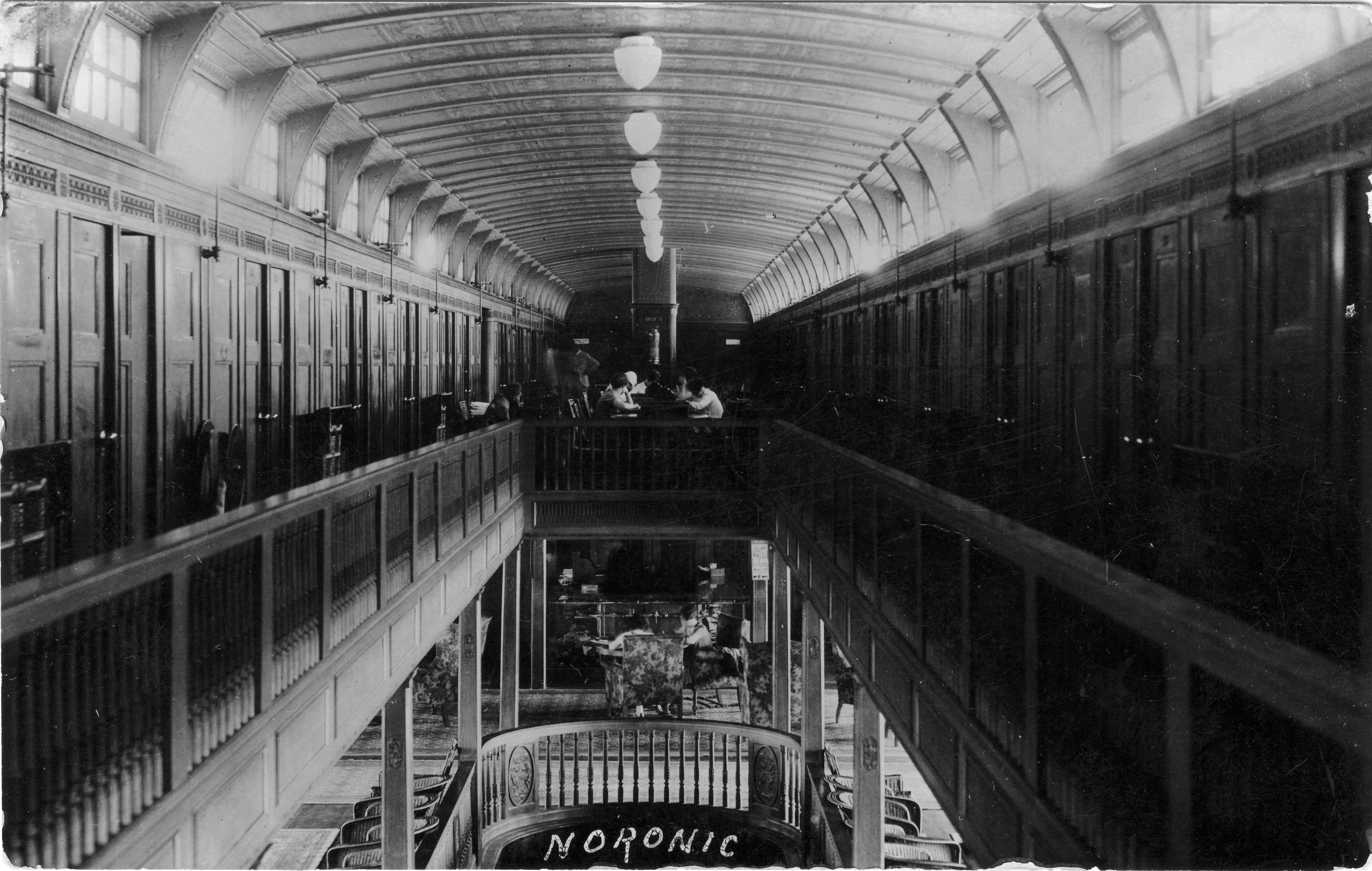
Figure 5. The Noronic

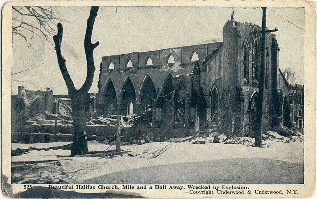
An item of special interest in this issue is a checklist of Halifax Explosion postcards, compiled by our member Terry Robbins and included in Card Talk in commemoration of the 100th anniversary of that tragic event — the most devastating man-made explosion in history prior to the atom bomb. Lithographic cards by Cox Bros., H. H. Marshall and Novelty Manufacturing & Art Co. are included in the listing. In addition, Barb Henderson has contributed articles on an amazing postcard relating to the aviation pioneer Glenn Curtiss and on pyrography, the art by which leather postcards — including the example shown in Figure 6 — were created.

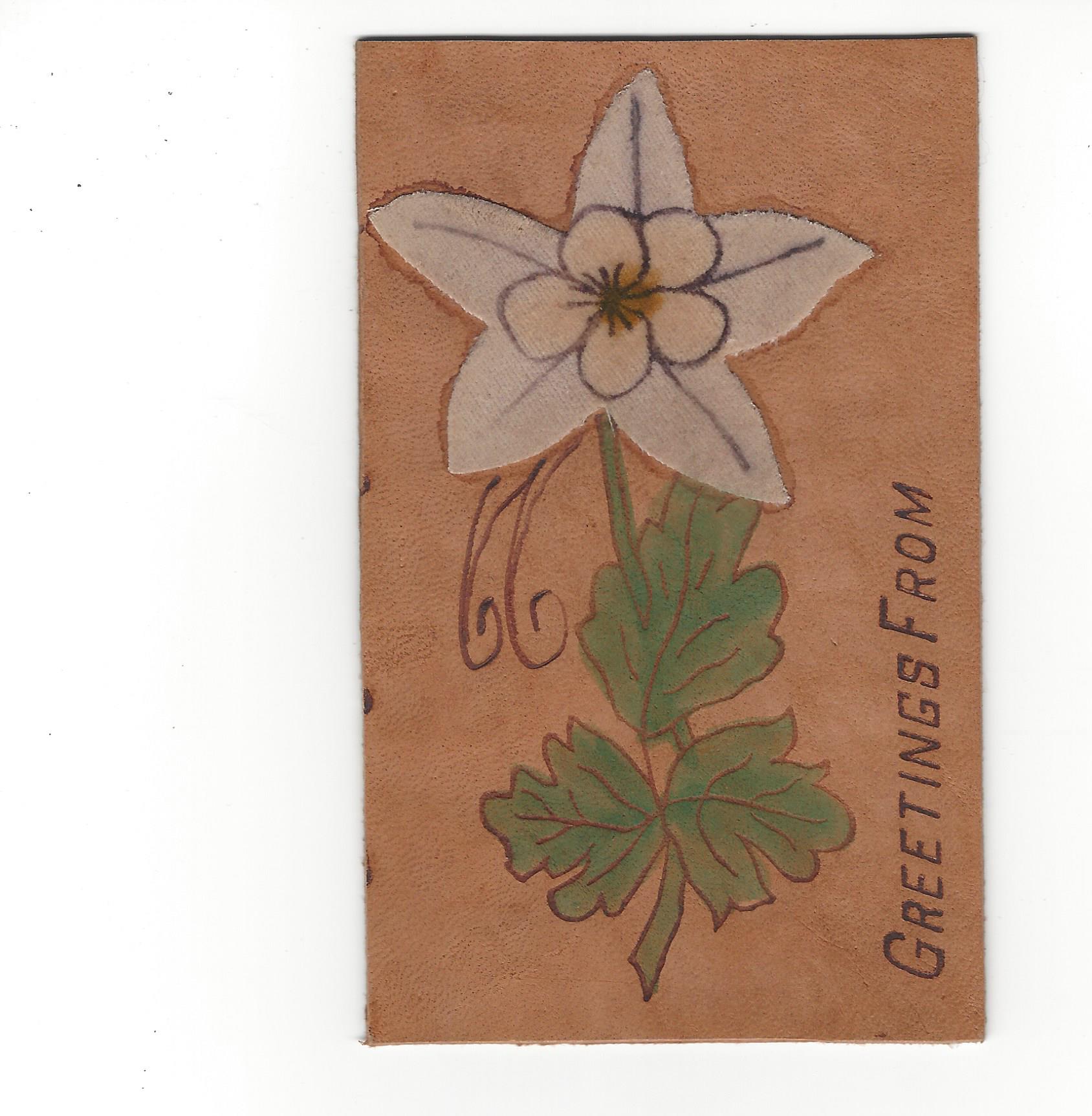
Figure 6. An attractive leather postcard

In addition, there are the usual features: a message from our President, reminiscences about Card Talks past (1982 this time), advertisements from our advertisers, our TPC meeting schedule and the round-up of upcoming postcard sales and shows. If you’re not already a member of the TPC, join our coast-to-coast (and U.S. and overseas!) membership and receive the whole Card Talk story three times annually, attend our informative (yet fun!) meetings and get special deals on our show admission and our exclusive members-only auctions.

(Andrew Cunningham, editor)


Card Talk, Winter 2017-18.


CARD TALK – SPRING 2017 HIGHLIGHTS

By Andrew Cunningham

TPC members should have received the newest Card Talk this past week, a wee bit behind schedule but hopefully worth the wait. Articles this time around include John Sayers on the Halifax Explosion, particularly the cards published by Novelty Manufacturing & Art Co. of Montreal with images that were credited to Underwood & Underwood of New York, the famous stereo view publishers. The article identifies seven Novelty Manufacturing & Art Co. cards between the numbers 523 and 536 that feature Halifax explosion images — 523, 525, 528 and 533-536. Presumably the others in that range, and likely many other Novelty Manufacturing cards, also have views of the disaster. One of the cards, no. 525, “Beautiful Halifax Church, Mile and a Half Away, Wrecked by Explosion”, is seen in Figure 1.

Figure 1. Beautiful Halifax Church, Mile and a Half Away, Wrecked by Explosion [no. 525]

A second series of Halifax Explosion cards identified by John was published by Cox Bros. Co. of Halifax. This series, which appears to be somewhat less common than the Novelty Manufacturing cards, is represented by ten cards in John’s collection, mostly numbered between 629 and 704, although there is also a “999” in the set. These images are very interesting and include a close-up view of the Imo — the ship that started the catastrophe by colliding with the Mont Blanc –, an image entitled “Kaye Street Methodist Church” in which there is no church other than what looks like a small pile of lumber in the midst of some broken trees, and (most interestingly, perhaps) the Cox Bros. studio itself, which was very badly damaged (there’s actually a bit of a story there, as John points out, but it’s a bit too involved to get into in a short summary like this).

A second feature article in this issue is Canadian Banks on Postcards. The author looks at banks in the early twentieth-century, from provisional structures built in brand-new Prairie towns to “skyscrapers” in Winnipeg and Toronto that, in their day, were the tallest commercial buildings in the country. The cover of this issue features a Canadian Bank of Commerce branch at Granum, Alberta (Figure 2) that may look familiar to western Canadians — not because they have all been to Granum, but rather because the Bank of Commerce used the same “kit” branch — manufactured by the B.C. Mills, Timber & Trading Co. — in small towns across the West. 

Figure 2. Canadian Bank of Commerce, Granum, Alberta.

We also look at interesting postcard find by our member Harry Holman, whose Straitpost website (incidentally) is full of interesting thoughts on Prince Edward Island postcards. Harry recently discovered a Warwick Bros. & Rutter postcard of Prince of Wales College, Charlottetown, the reverse of which contained an interesting letter from English-born  flier Harry Bingham Brown (1883-1954), one of the pioneer aviators in the United States.

As was not uncommon in the years leading up to the Great War, Brown was doing the summer fair circuit and had arrived in Charlottetown in late September of 1913 to work the P.E.I. Provincial Exhibition. After a successful run at Halifax, the Charlottetown engagement was something of a disappointment (as Harry Holman notes) — Brown’s aircraft drifted away from the fairground on both of his flight attempts, disappearing quickly from the view of the eager crowds and not returning (not crashing either, but forced to land quite a distance away). Anyway, Brown wrote back to a friend in Massachusetts about how the trip was going — we won’t spill the beans on the contents of the note here, but the short message is an interesting artefact of the golden age of daredevil aviation and the sort of thing that, as a collector, is a great reward for the assiduous inspection of even the most nondescript postcards at sales and online.

This edition of Card Talk contains a lot more, including more 40th Anniversary “TPC Memories” photos, letters and observations from readers, Barb Henderson’s account of our meetings in the fall and winter of 2016-17 and our usual calendar of future meetings and postcard events across Canada and the northern U.S. If you’re not one of the in crowd that can proudly display this marvel of deltiology on your very own coffee table, then we strongly suggest that you sign up today for a TPC membership (if you act soon, we won’t send you a ginsu knife, or even two ginsu knives, but you will be able to participate in the latest instalment of our fabulous members-only online auction, which raises funds for the Club and begins in June 2017).


POSTCARDS TO ORDER: THE WHOLE TRUTH ABOUT HALF-TONES

By Andrew Cunningham

Many of our members (like deltiologists everywhere) spend a lot of time trying to figure out who was behind the postcards we collect – printers, publishers, photographers, distributors and sellers. When it comes to photographers, for example, there were certainly some individuals who roamed the country taking photos for use on postcards. The brilliant new book on Reuben Sallows, written by TPC members Mike Smith and Larry Mohring, shows the incredible range of one gifted Canadian photographer who did just that.

[1] Rumsey & Co. sample card.

Just as often, however, the postcard views that we see were made from photos submitted to a publisher by a local seller, often the town’s pharmacist or general store owner. He (or, very occasionally, she) would order postcards in a certain style and price range from a publisher’s catalogue or from its travelling salesman when he passed through town. We know something about this process because a lot of “publisher’s sample” postcards are still around today. These cards help to give us an idea of the business side of the postcard industry. Sometimes, as in illustration [1], they include pricing (here, $7 for 1,000 copies of the card; $6.50 for customer-supplied photos). One of the problems with selling printed postcards (as opposed to “real photograph postcards (RPPCs)) was that you had to order a lot of them to make a print run economical. Here, Rumsey & Co. has tried to make the 1,000-card minimum order more appealing to its customer base of small-town retailers by agreeing to provide the minimum quantity into two colour tones: 500 green and 500 sepia (“almost as good as having two subjects to the 1000”). 

[2] Front of the Rumsey & Co. collotype sample postcard.

The quoted prices in this case were for collotype images. “Collotype” was a gelatine-based printing process used extensively in the late 19th and early 20th centuries to reproduce photographic images on a printing press. Used appropriately, it could create a pleasing result that in some cases is difficult to tell from a real photograph without a magnifying glass. The images were sometimes left as monochromes (black and white) or they could be “colourized” by the direct application of colour to appropriate objects and areas in the image (sort of like paint-by-numbers). A third alternative, used here, was to tint the cards, which required the application of a colour tint across the entire image – a far less time and labour intensive process than full-scale “colourization”. The front of this particular card, which shows a street scene in Fort Macleod, Alberta, is in the “green” tone mentioned in the advertisement (see illustration [2]).

If, as a retailer, you wanted something a little cheaper that could be purchased in smaller quantities, you could order a half-tone card rather than a collotype. Half-tone images (composed of ranges of little dots, as in a newspaper photograph) were easier to produce than collotypes. The down-side was that they tended to look less realistic and (truth be told) a bit dull. So, to gussy them up a bit, publishers often printed them on standard card blanks pre-printed with a “framing” image that supplied the colour and elegance that the inset half-tone images lacked. Illustration [3], “Presbyterian Church, Stayner” is an example of how a half-tone could be made more saleable by inserting it into one of these pre-printed frames – in this case the Toronto Lithographing Co.’s horseshoe design (which is classified as “patriotic” because the horseshoe is entwined with a garland of maple leaves).

[3] Presbyterian Church, Stayner [Ontario] (Toronto Lithographing Co.).

Some of the most popular postcard types in Canada were “frame view” cards. These were cards whose “frames” really were frames (pretend ones, at least). Frame-views were offered by a number of Canadian publishers, but are most commonly found under one of three imprints: Atkinson Bros., Stedman Bros. or Pugh Manufacturing Co. (based in Toronto, Brantford and Toronto, respectively). While the quality of the images is not especially high, these cards are often highly interesting because they tend to show events and views that would have been of interest only locally, and which are therefore of great interest now because of their rarity and (often) naive charm. In that sense, their content can resemble real photo postcards, which were expensive but which could be produced in very small quantities (even just one), and which are therefore prized because they tended to be used to show more personal or local scenes, or short-lived events and “news stories” (notably including fires, floods, tornadoes, train wrecks and other “disasters”). 

If we look at a frame view sample (illustration [4]) from Stedman Bros., who seem to have been the most prolific publisher of this type of card, we can see why these cards would have been popular for images with relatively limited (short-lived and/or merely local) appeal. The price of 1,000 Stedman frame-views was lower than Rumsey’s 1,000 collotypes ($5.50 vs. $6.50) and you could also order just 500 if that was all you wanted (albeit at a higher per-card price). For someone who couldn’t really hope to sell more than a few hundred of a given postcard, the Stedman frame-view might indeed have seemed “a good proposition”. The images would usually be tinted, most often blue. While not spectacular, the result was not without aesthetic appeal.

[4] Stedman Bros. frame view back (McLeod District Wheat Field).

In illustration [5], we see the front of the sample card; coincidentally also illustrating a scene from the Fort Macleod area. This one boasts of crop yields and may have been part of an advertising campaign sponsored by a local land company or chamber of commerce, such that only limited numbers and quality were required. Mike Smith’s guide to Stedman postcards lists about 140 postcards in the frame-view style, with many others having come to light since the book’s publication in 2011.

[5] McLeod District [Alberta] Wheat Field (Stedman Bros.).

Another series of frame views that can easily be confused with the Stedman versions was published by Atkinson Bros. The example in illustration [6], showing the asbestos mine in Thetford Mines, Quebec, is highly unusual in that it came with a piece of red cellophane (not shown) that fit into a slot in the frame to make a sort of “flap” that (for some unknown reason) covered up the image. The Atkinson frame views are recognizably different from their Stedman counterparts in virtue of their glossier appearance and the light effects on the frame. (I find the Stedman “look” more authentic myself!)

[6] Thetford Mines, Que. – Johnston’s Asbestos Co. (Atkinson Bros.).

Another variety of frame view is the “gold frame” of Pugh Manufacturing Co. These were also common in small-towns across Ontario and the West, with the example in illustration [7] being fairly typical. One can imagine that the Neepawa Methodist Sunday School produced just enough potential customers to make the production of the card economical. Examples such as this could also have been used for fund-raising.

[7] Primary Dept. Methodist S.S. 1908, Neepawa, Man. (Pugh Manufacturing Co.).

The W. G. MacFarlane Co., under its later name of (just) “MacFarlane Co.”, also got into the gold-frame game, but probably less successfully than Pugh, given the lack of examples in my own experience. Confirming this impression, Mike Smith’s MacFarlane guidebook (2010) lists only six examples. One reason that the MacFarlane gold-frame cards might not have succeeded is that they were very pricey for what you got … the sample back in illustration [8] shows that they cost much more ($12  per 1,000) than Stedman Bros. were charging for their two-tone collotypes (albeit perhaps not at exactly the same time). 

In conclusion:

  • Much of the fancy design that we see in Canadian patriotic cards, and even in the “frame views”, was an attempt to make up for the visual weakness of the half-tone images that they framed. The “frame view” cards were probably preferred for customer-supplied photographs because the rectangular space in them would “work” for just about any photo (while a more complex “frame”, such as Toronto Litho’s “horseshoe”, would require a photo of a particular shape and orientation to “fit” and thus was better suited to images that the company could choose itself).
  • The half-tones were economically desirable because they could be cranked out in large or small quantities and at relatively low cost. Those were their advantages over collotypes, which involved a fussier process that was not easy to use for either small or very large quantities and generally had to be outsourced to sophisticated German printers. However, the collotype process produced a more realistic reproduction of photography than did the half-tone process, and was therefore much preferred on “ordinary” view cards in which the image took up an entire side of the card and needed to stand on its own.

[8] MacFarlane Co.’s price list for its gold-frame halftone “local views”.


CANADIAN WORLD WAR I POSTCARDS

By Andrew Cunningham

The First World War, the “war to end all wars”, got underway just as the shine was coming off the Golden Age of postcards. While wartime demand extended the postcard’s lease on life, it also changed the nature of the medium. In Canada, at least, postcards after 1913 were less apt than previously to show off the growth of the country’s towns, infrastructure and agriculture. Instead, and not unexpectedly, they dwelt more frequently on the war and its associated sentiments. Those sentiments encompassed both the public emotions of patriotism and more private feelings of estrangement and sadness — in addition to simple curiosity about what the soldier’s lives looked like. Because Great War postcards were so popular, postcard collections are often significant repositories of images of the War, including many that are unusual or unique, as well as of accounts (brief ones, of course) of the experiences of soldiers, recruits, families and friends during and after the long conflict. We were recently contacted by a representative of the Imperial War Museum, the London-based institution, which is currently attempting to record accounts of the conflict that are found on postcards. TPC members and friends who wish to contribute should see their website for details. 

As Remembrance Day is approaching, I’ve assembled a number of postcards from my own collection. They reveal the war years as they appeared to the ordinary men and women of the time and cover some — but by no means all — of the range of what is available to today’s “Great War” collector:

field-ambulance-depot-lines-sewell-camp-1915

Field Ambulance Depot Lines, Sewell Camp, 1915. — Advance Photo Co.

There are countless Canadian postcards depicting life at the camps at which Canadian soldiers received their pre-departure training. Among the largest of these was Camp Sewell — renamed Camp Hughes in 1915. A century later, remnants of its trenches and fixtures are discernible in farmers’ fields along the Trans-Canada Highway east of Brandon, Manitoba. As thousands of recruits passed through Camp Sewell/Camp Hughes, the Advance Photo Co. of Winnipeg was on hand to produce and sell real photo postcards depicting camp life. The number of real photo postcards produced of the camp by Advance (and a handful of other photographers) is unknown, but it is likely in the many hundreds. Despite its momentary prominence in the field of Canadian military photography, almost nothing is known about the Advance Photo Co. It had a brief existence around 1915 and 1916 and produced dozens of real photo postcards of a major flood in Winnipeg in the spring of 1916, but otherwise (it seems) almost nothing else. The company’s unidentified principals are quite possibly the gentlemen in the image below, which (more generally) illustrates how postcard photographers would have operated in such a setting.

souvenir-of-sewell-camp-advance-photo-co-hq-and-staff

Advance Photo Co. office (or, more likely, darkroom) at the Sewell Camp (halftone image from a view book of Camp Hughes produced by the company)

Scenes of departure are another frequently encountered World War I genre. Such postcards are usually real photos, which could be produced virtually on the spot for sale to participants in the event. But they were sometimes considered of sufficiently enduring interest to warrant production as lithographed cards. The following example — depicting the soldiers’ send-off at the Intercolonial Railway station in Truro, Nova Scotia — is by Valentine & Sons, the most prolific producers of picture postcards in Canada (and likely worldwide as well).

troops-leaving-truro-n-s

Valentine & Sons card no. 111,920 adds colour to a scene that we normally see only in monochromatic real photo cards.

Postcards showing such scenes only occasionally include related messages. This, fortunately, is one of the minority that does. The card turns out to have been used by a departing soldier to thank a woman who had prepared a gift packet for him. As part of the war effort, ordinary people were asked to send “care packages” to soldiers, who would then be given their names and would write them to express their appreciation. The package in this case was received by Pte. R. Grant, “C” Company of the 40th Battalion, Valcartier, Quebec, who wrote his benefactor, Mrs. Appleton P. Anderson of Sydney, C.B., as follows: “Mrs. A. P. Anderson:- I, Pte. R. Grant was the recipient of your gift on Friday night to the 40th Battalion. The boys were pleased to see the interest the women of Sydney have taken in providing for their comfort. Yours truly, Pte. R. Grant.” The rather stilted first sentence was likely dictated but the second might represent more of a personal effort. 

The next thing you would have done as a soldier is to board a ship for England, and there are many postcards that depict such departures. Below is a particularly fine example – a real photo – showing soldiers waving goodbye at Saint John, N.B., as they begin the long voyage across the Atlantic. Many of them must have been imagining this moment as the beginning of a great adventure. Whether they continued to be of that view on their return (if they returned) is another matter. The ship is the Caledonia:

transport-caledonia-leaving-st-john-n-b-with-26th-battalion-and-r-column

Transport Caledonia, leaving Saint John with the 26th Battalion and “A” Column (undated) — photo by D. Smith Reid of Saint John.

While in England, solders of the Canadian Expeditionary Force underwent additional training. Postcards were naturally a hot seller; messages to friends and family in Canada were dispatched by the thousands each day. Many of Canada’s soldiers ended up at Shorncliffe Camp in Kent (a dangerous place in its own right as it predictably attracted enemy aircraft bombardment). The postcard below shows Canadian soldiers awaiting a visit from George V:

waiting-for-the-king-at-shorncliffe-c-e-f

“For Cecilie. Cecilie this is the camp where Frank Berry hung out all summer. This is the oldest camp in England. It’s the old original camp from the Beginning of history of war. The King’s favorite camp and where the burying ground [is] of all his fancy horses that die. DAD”

This was published by Upton Publishers of Folkestone, the town adjacent to Shorncliffe camp. “Dad” was correct about the historic nature of the location, as this recent BBC story about Shorncliffe’s uncertain future makes clear.

Once the soldiers had made their way across the channel, the most distinctive form of postcard they sent back was the “silk”, as we’ve recently discussed. This example, though showing signs of age now, is typical inasmuch as it incorporates flags and the current year into an attractive design:

1917-souvenir-from-france

These postcards, known as “silks”, were manufactured by the millions in France and Belgium for sale to soldiers.

This is only a sampling of the types of Great War postcards that can be collected — there are also countless examples associated with individual regiments, real photos of soldiers, images of postwar destruction, anti-Kaiser (and pro-German) propaganda cards and many other types. The final cards, chronologically at least, are those depicting the troops’ return home and the memorials that were erected to the dead. The example below, showing the interior of Montreal’s Windsor Station, nicely combines those two elements. We see a soldier in military dress, nearly alone in the cavernous hall, overwhelmed in the image by the names of the battles in which the C.E.F. fought. Those names were already etched in the country’s consciousness when the postcard was mailed on 24 July 1919 — even though many of those who had fought in the battles were only just then making their way home.

c-p-r-windsor-station-montreal

Ypres. Festubert. The Somme. Vimy. Hill 70. Passchendaele. Amiens. Cambrai. Drocourt-Quéant. Mons.

As the Great War is now passing out of the realm of direct human memory, postcards offer us a tangible connection to the people, events and ideas that defined it.


EMBROIDERED SILK POSTCARDS

By Andrew Cunningham

Among the most beautiful collectible postcards are embroidered “silk” cards, the vast majority of which were made in France and Belgium during the First World War and sold mainly to British Empire and U.S. troops. The cards featured colourful imagery, such as the butterfly in the example below. Most of the designs — although by no means all of them — incorporated militaristic or patriotic elements, such as the four national symbols embroidered into the butterfly’s wings in our example. Because so many “silks” were produced, and because they were usually retained as keepsakes, they are more common than one might expect (and not always quite as valuable as those who find one or two in “Grandma’s album” tend to hope).

As the website of the Imperial War Museum in London notes, the most sought-after cards tend to be rarities with imagery specific to particular regiments (including many Canadian examples, as TPC member Mike Smith recently discussed in the Wayback Times).  World War I silk postcards, including those with Canadian themes, are a terrific collecting area that, with a little time and effort, could produce a beautiful and historically informative collection at a relatively modest cost.

[WW I butterfly silk]

Butterflies were one common motif on World War I silk postcards, typically with flag elements worked into the stitching of the wings.