• INTERESTED IN VINTAGE POSTCARDS?

    Join us as a guest at one of our ZOOM meetings. Here’s our schedule of UPCOMING  MEETINGS which are monthly except for the summer.  Or, become a TPC Facebook friend to stay connected!

LEPORELLO POSTCARDS OF PRINCE EDWARD ISLAND

By H. T. Holman

Editor’s note: TPC member Harry Holman of Charlottetown, P.E.I. has started a blog — Straitpost — that focuses on the early postcards of the Island. He recently wrote this article about Leporello cards, which (for reasons that he relates) are the kind of card that contains a long strip of printed images of the place the postcard is about. The beginning his article is below, after which you can continue to Harry’s site for more. Like Prince Edward Island itself, “Straitpost” is well worth a visit.

Unless you are a Mozart aficionado or a well-educated and avid post card collector the title of this posting probably will mean absolutely nothing.  Since I am neither, the term “leporello” sent me scurrying to Wikipedia where after some research the mystery was unravelled. Let’s start with the Mozart because that holds the explanation for the name. Leporello is Don Giovanni’s manservant in Mozart’s 1787 opera Don Giovanni.  Don Giovanni, a young, arrogant, and sexually promiscuous nobleman, abuses and outrages everyone else in the cast until he encounters something he cannot kill, beat up, dodge, or outwit. Don Giovanni, is betrayed to a new conquest by his servant who tells her that he is unfaithful to everyone; his impressive list of seductions and conquests include 640 women and girls in Italy, 231 in Germany, 100 in France, 91 in Turkey and 1,003 in Spain. In displaying the conquests the manservant pulls the list out of the book in an accordion fold. The term leporello is applied to books and publications that use this endless page device. The leporello became quite common in the Victorian era. Panoramic scenes in travel accounts as well as images of culture and customs often used the device. After the development of photography it became an effective way to show very wide images, or a linked series of photographs.

In early postcards the leporello often takes the form of an album of mini images folded into the postcard itself. They were more commonly used in Europe but North American postcard publishers used the leporello as well although they are scarce if not rare. Because of the format the cards do not hold up well to handling. They have to have an inner pocket that protects the mini album and there is much folding and unfolding to see the images.

I hardly knew what to expect when I ordered the card from a German on-line dealer. The photos in the listing were not very good and it was obvious that the card was not in particularly good shape. The face image of the card was an uninspiring view of the winter steamer Stanley in ice but it was not one I had seen before. The photos on the sale site showed only two of the mini images and I would not have been surprised to see that any others had long since come loose and disappeared.  CONTINUE READING


Front of Harry’s “Leporello”. The latch pin can be seen holding the image pocket closed. To see what it contained, visit his blog.


POSTCARDS TO ORDER: THE WHOLE TRUTH ABOUT HALF-TONES

By Andrew Cunningham

Many of our members (like deltiologists everywhere) spend a lot of time trying to figure out who was behind the postcards we collect – printers, publishers, photographers, distributors and sellers. When it comes to photographers, for example, there were certainly some individuals who roamed the country taking photos for use on postcards. The brilliant new book on Reuben Sallows, written by TPC members Mike Smith and Larry Mohring, shows the incredible range of one gifted Canadian photographer who did just that.

[1] Rumsey & Co. sample card.

Just as often, however, the postcard views that we see were made from photos submitted to a publisher by a local seller, often the town’s pharmacist or general store owner. He (or, very occasionally, she) would order postcards in a certain style and price range from a publisher’s catalogue or from its travelling salesman when he passed through town. We know something about this process because a lot of “publisher’s sample” postcards are still around today. These cards help to give us an idea of the business side of the postcard industry. Sometimes, as in illustration [1], they include pricing (here, $7 for 1,000 copies of the card; $6.50 for customer-supplied photos). One of the problems with selling printed postcards (as opposed to “real photograph postcards (RPPCs)) was that you had to order a lot of them to make a print run economical. Here, Rumsey & Co. has tried to make the 1,000-card minimum order more appealing to its customer base of small-town retailers by agreeing to provide the minimum quantity into two colour tones: 500 green and 500 sepia (“almost as good as having two subjects to the 1000”). 

[2] Front of the Rumsey & Co. collotype sample postcard.

The quoted prices in this case were for collotype images. “Collotype” was a gelatine-based printing process used extensively in the late 19th and early 20th centuries to reproduce photographic images on a printing press. Used appropriately, it could create a pleasing result that in some cases is difficult to tell from a real photograph without a magnifying glass. The images were sometimes left as monochromes (black and white) or they could be “colourized” by the direct application of colour to appropriate objects and areas in the image (sort of like paint-by-numbers). A third alternative, used here, was to tint the cards, which required the application of a colour tint across the entire image – a far less time and labour intensive process than full-scale “colourization”. The front of this particular card, which shows a street scene in Fort Macleod, Alberta, is in the “green” tone mentioned in the advertisement (see illustration [2]).

If, as a retailer, you wanted something a little cheaper that could be purchased in smaller quantities, you could order a half-tone card rather than a collotype. Half-tone images (composed of ranges of little dots, as in a newspaper photograph) were easier to produce than collotypes. The down-side was that they tended to look less realistic and (truth be told) a bit dull. So, to gussy them up a bit, publishers often printed them on standard card blanks pre-printed with a “framing” image that supplied the colour and elegance that the inset half-tone images lacked. Illustration [3], “Presbyterian Church, Stayner” is an example of how a half-tone could be made more saleable by inserting it into one of these pre-printed frames – in this case the Toronto Lithographing Co.’s horseshoe design (which is classified as “patriotic” because the horseshoe is entwined with a garland of maple leaves).

[3] Presbyterian Church, Stayner [Ontario] (Toronto Lithographing Co.).

Some of the most popular postcard types in Canada were “frame view” cards. These were cards whose “frames” really were frames (pretend ones, at least). Frame-views were offered by a number of Canadian publishers, but are most commonly found under one of three imprints: Atkinson Bros., Stedman Bros. or Pugh Manufacturing Co. (based in Toronto, Brantford and Toronto, respectively). While the quality of the images is not especially high, these cards are often highly interesting because they tend to show events and views that would have been of interest only locally, and which are therefore of great interest now because of their rarity and (often) naive charm. In that sense, their content can resemble real photo postcards, which were expensive but which could be produced in very small quantities (even just one), and which are therefore prized because they tended to be used to show more personal or local scenes, or short-lived events and “news stories” (notably including fires, floods, tornadoes, train wrecks and other “disasters”). 

If we look at a frame view sample (illustration [4]) from Stedman Bros., who seem to have been the most prolific publisher of this type of card, we can see why these cards would have been popular for images with relatively limited (short-lived and/or merely local) appeal. The price of 1,000 Stedman frame-views was lower than Rumsey’s 1,000 collotypes ($5.50 vs. $6.50) and you could also order just 500 if that was all you wanted (albeit at a higher per-card price). For someone who couldn’t really hope to sell more than a few hundred of a given postcard, the Stedman frame-view might indeed have seemed “a good proposition”. The images would usually be tinted, most often blue. While not spectacular, the result was not without aesthetic appeal.

[4] Stedman Bros. frame view back (McLeod District Wheat Field).

In illustration [5], we see the front of the sample card; coincidentally also illustrating a scene from the Fort Macleod area. This one boasts of crop yields and may have been part of an advertising campaign sponsored by a local land company or chamber of commerce, such that only limited numbers and quality were required. Mike Smith’s guide to Stedman postcards lists about 140 postcards in the frame-view style, with many others having come to light since the book’s publication in 2011.

[5] McLeod District [Alberta] Wheat Field (Stedman Bros.).

Another series of frame views that can easily be confused with the Stedman versions was published by Atkinson Bros. The example in illustration [6], showing the asbestos mine in Thetford Mines, Quebec, is highly unusual in that it came with a piece of red cellophane (not shown) that fit into a slot in the frame to make a sort of “flap” that (for some unknown reason) covered up the image. The Atkinson frame views are recognizably different from their Stedman counterparts in virtue of their glossier appearance and the light effects on the frame. (I find the Stedman “look” more authentic myself!)

[6] Thetford Mines, Que. – Johnston’s Asbestos Co. (Atkinson Bros.).

Another variety of frame view is the “gold frame” of Pugh Manufacturing Co. These were also common in small-towns across Ontario and the West, with the example in illustration [7] being fairly typical. One can imagine that the Neepawa Methodist Sunday School produced just enough potential customers to make the production of the card economical. Examples such as this could also have been used for fund-raising.

[7] Primary Dept. Methodist S.S. 1908, Neepawa, Man. (Pugh Manufacturing Co.).

The W. G. MacFarlane Co., under its later name of (just) “MacFarlane Co.”, also got into the gold-frame game, but probably less successfully than Pugh, given the lack of examples in my own experience. Confirming this impression, Mike Smith’s MacFarlane guidebook (2010) lists only six examples. One reason that the MacFarlane gold-frame cards might not have succeeded is that they were very pricey for what you got … the sample back in illustration [8] shows that they cost much more ($12  per 1,000) than Stedman Bros. were charging for their two-tone collotypes (albeit perhaps not at exactly the same time). 

In conclusion:

  • Much of the fancy design that we see in Canadian patriotic cards, and even in the “frame views”, was an attempt to make up for the visual weakness of the half-tone images that they framed. The “frame view” cards were probably preferred for customer-supplied photographs because the rectangular space in them would “work” for just about any photo (while a more complex “frame”, such as Toronto Litho’s “horseshoe”, would require a photo of a particular shape and orientation to “fit” and thus was better suited to images that the company could choose itself).
  • The half-tones were economically desirable because they could be cranked out in large or small quantities and at relatively low cost. Those were their advantages over collotypes, which involved a fussier process that was not easy to use for either small or very large quantities and generally had to be outsourced to sophisticated German printers. However, the collotype process produced a more realistic reproduction of photography than did the half-tone process, and was therefore much preferred on “ordinary” view cards in which the image took up an entire side of the card and needed to stand on its own.

[8] MacFarlane Co.’s price list for its gold-frame halftone “local views”.


HALF A MILLION POSTCARDS

By H. T. Holman

Because almost no company records from postcard publishers have made it into archival collections, much information about the production process has been lost. The names of photographers, the nature of the contracts, wholesaling arrangements can be added to the loss of catalogues of images produced. One of the continuing questions is how many cards were produced. Historians have identified the collapse of interest following the card mania, and the subsequent withdrawal or failure of companies is attributed to over-supply but we don’t how many cards were being put into the marketplace.

For Prince Edward Island, there are a few tantalising clues. The province was certainly not immune from postcard fever and both local publishers and almost all of the national companies produced cards for the Island. The distributor for many of these companies, as well as the producer of cards under their own company name was Carter’s Bookstore (appearing as “Carter & Co.” or “C. & Co.” on later cards), who handled both retail and wholesale business in paper goods and souvenirs.

In 1904 they advertised a series of gummed stamps and souvenir photo books as well as a shipment of 5,500 postcards they had just received from their printer. However, three years later the newspaper advertising boasted that they had contracted with European manufacturers for half a million souvenir post cards “of the Beauty Spots of Prince Edward Island.” That represents more than five cards for every man, woman and child in the province. The number appears to include only view cards and does not include the many comic, holiday and topical postcards that would have rounded out their stock.

The number may be “mere puffery” but if accurate probably does not include postcards from Canadian printers such as Warwick Bros. & Rutter or McCoy Publishing in nearby Moncton and the numbers of cards could be much higher.
With numbers such as these, it is small wonder that a hundred years later there are so many surviving cards from the province.

While I am astounded by these overall numbers I still have no indication as the size of the press run of any individual card or set of cards and no idea if these numbers are reflected in other parts of the country. I would be interested in learning more about the numbers game. Perhaps TPC members could share their findings through the medium of this blog or Card Talk.

Editor’s note: We’d be interested to hear what other TPC members (and readers who are just stopping by) have learned about the volume of postcards produced and sold in their areas. To have hundreds of thousands of surviving manufactured articles from over a century ago, as anyone can see at our Club’s annual sale, one would have to think that the original “supply” must have been many, many multiples of that. But how many is a tough question to answer in the almost complete absence of records that Mr. Holman notes. You can read more of Mr. Holmes research on PEI vintage postcards in his blog “straitpost”

NEWS FROM AROUND THE POSTCARD WORLD

By Andrew Cunningham

The April-July 2016 newsletter of the San Francisco Bay Area Post Card Club is now online, with articles on subjects ranging from Ellen Clapsaddle to Lawrence Welk to (for a bit of Canadian content) the Gjoa, the first ship to navigate the Northwest Passage.

Portland, Oregon’s “Webfooters” postcard club posts a lot articles and presentations online, including this interesting article about U.S. glass factories that shows how postcards can be collected as a supplement to another collecting interest.

The Golden Horseshoe Postcard Club in Hamilton, Ontario, has published the second in its series of books on Hamilton-Wentworth postcards. We’ve seen these; the production quality is really great! Ordering information is here

Also in Hamilton, McMaster University’s crowdsourcing project has concluded, with 18,000 descriptions of postcards supplied by helpful Internet volunteers. This extensive digital archive is now available to view online. Thanks to the TPC members who contributed descriptions. The McMaster Library posted a note earlier this year about the many winter scenes in its postcard collection, which include some very nice RPPCs from all over Canada. 

Anyone with similar information for future postings is welcome to send it to editor@torontopostcardclub.com and we’ll do our best to include it.

CARD TALK – WINTER 2016-17 HIGHLIGHTS

By Andrew Cunningham

Winter is nearly here … the “Winter” edition of Card Talk, I mean. The Toronto Postcard Club’s 24-page magazine is currently in the mail to its millions, thousands, hundreds of eager readers from coast to coast and (in a few cases) beyond our coasts in faraway lands such as the U.S.A. As is customary, the blog will provide a short summary of this edition’s articles in order to alert the entire planet to our content and (hopefully) to entice one or two postcard enthusiasts to join our club

The cover story this issue is a tribute to elephants. Specifically, your editor has written an article based on postcards of elephants plying their trade (as circus entertainers) in Canada. While we think of ourselves as highly cosmopolitan today, the fact remains that, thanks to the circuses that criss-crossed the country every summer, our Edwardian ancestors were far more familiar than we are with the exotic pachyderm. In the article, there is naturally some discussion of circus history, which is illustrated by postcard examples such as the pre-performance parade by the Adam Forepaugh & Sells Bros. circus shown here [1]. The Forepaugh & Sells circus was visiting Portage la Prairie, Man., in the summer of 1911 (their last year in the business, it happens). Posters advertising the event (including a large one depicting the elephants) may be seen in the image, which is a small detail of a much larger real photo postcard.

pages-14-16-elephants-figure-02-plp-circus-billboard

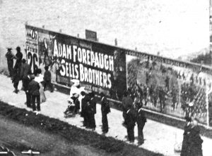
[1] Portage la Prairie townsfolk watch the Forepaugh & Sells circus parade, 1911 (RPPC detail)

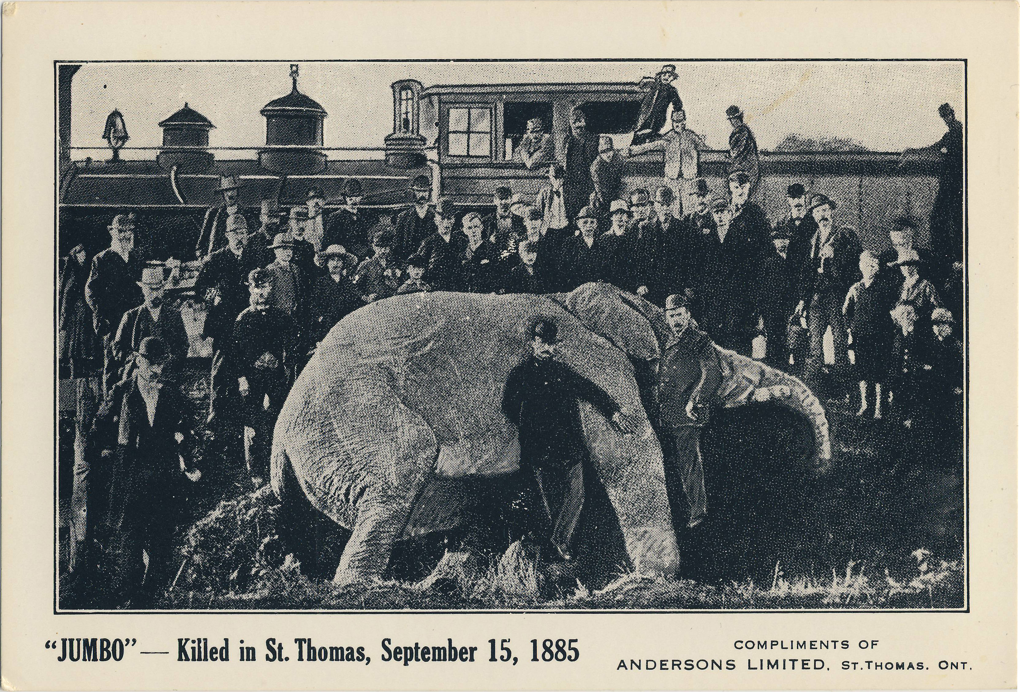
After traipsing through a whole lot of elephant lore, ringing with names like Barnum & Bailey, Ringling Bros., and Sells-Floto, the story concludes with an account of the most famous of all Canadian elephant events, the tragic death of Jumbo at St. Thomas, Ontario, in 1885. [2]

pages-14-16-elephants-figure-08-death-of-jumbo

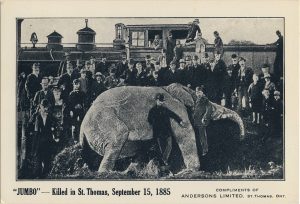
[2] Demise of Jumbo, 15 September 1885, commemorated in a postcard issued about 25 years after the fact

Having reflected on Jumbo’s tragic end, our readers may wish to move on to a fun story about the backs of postcards. Backs are a side of the postcard hobby that is all too often neglected. To tell the truth, an appreciation of the postcard back is an acquired taste. But once it has taken root, an interest in the reverse sides of our cards can lead the collector in new and exciting directions. In her article about the wide array of postcard backs we saw at a “show and tell” night at the Club, the TPC’s Barb Henderson tells a typical story, “I will confess that until recently I was mostly a view-side collector. When another TPC member brought a mirror (cursive) writing postcard to a meeting, I decided that my novelties collection needed one of those – and so I began looking at backs trying to find one.” One interesting thing about back collecting is that, more often than not, it’s the user of the card whose written additions to the manufactured artifact are responsible for the bulk of its current value. (TPC member 
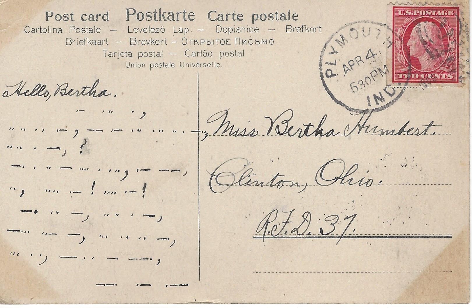
Dave Moore proves this point in a separate article in this issue.) One of Barb’s backs — with a message in Morse Code — is shown here. [3] Writing in code was both fun and a way to keep your message secure from the prying eyes of the Clinton, Ohio postmistress (in this case). The opportunity of discovering an interesting back like this is one reason not to neglect the “two dollar boxes” at shows. When you find a great back, you get more than two-dollars’ worth of fun before you’ve even seen the front. 

pages-12-13-back-story-figure-03-morse-code-2

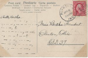
[3] Postcard back-talk — in Morse Code!

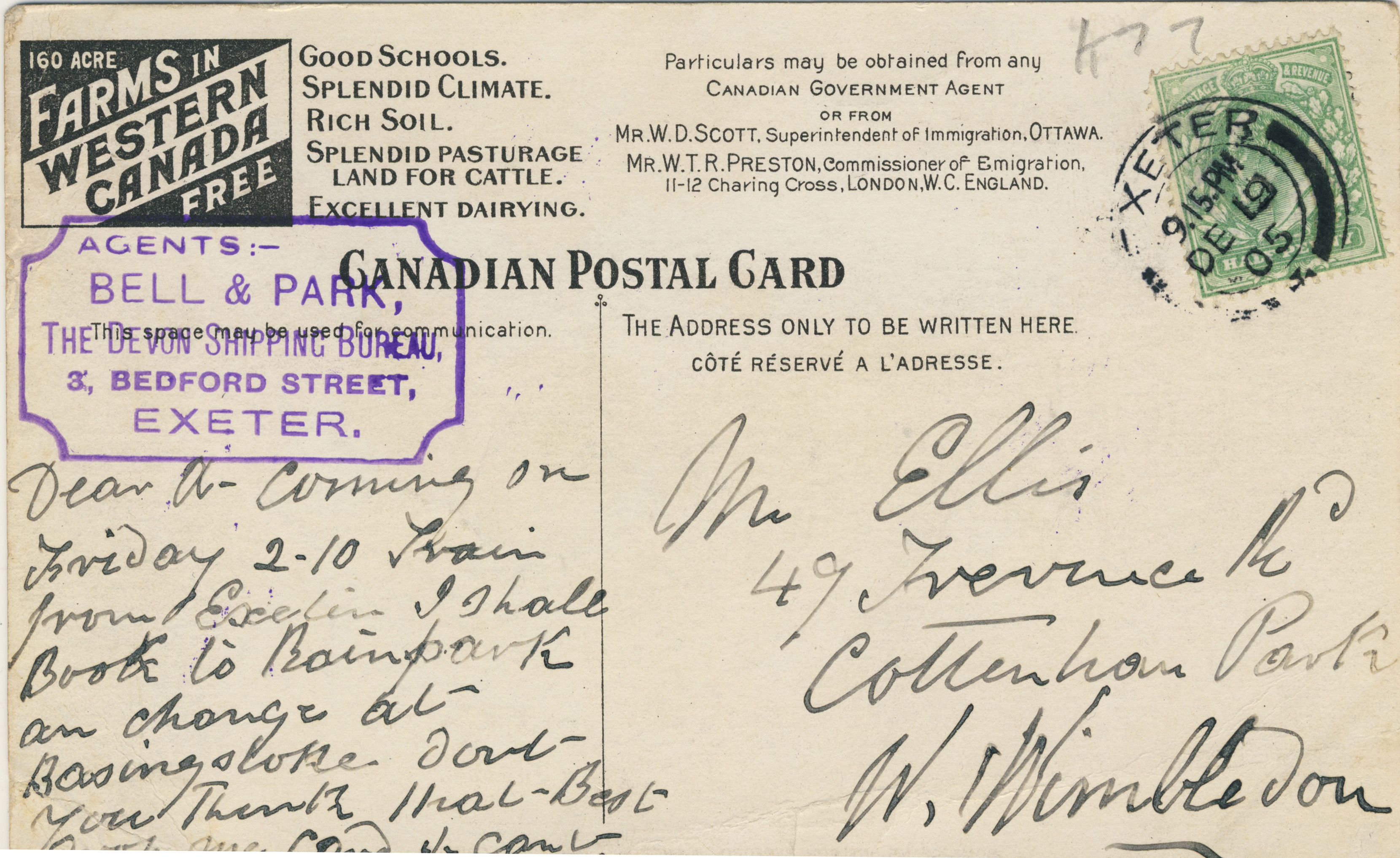
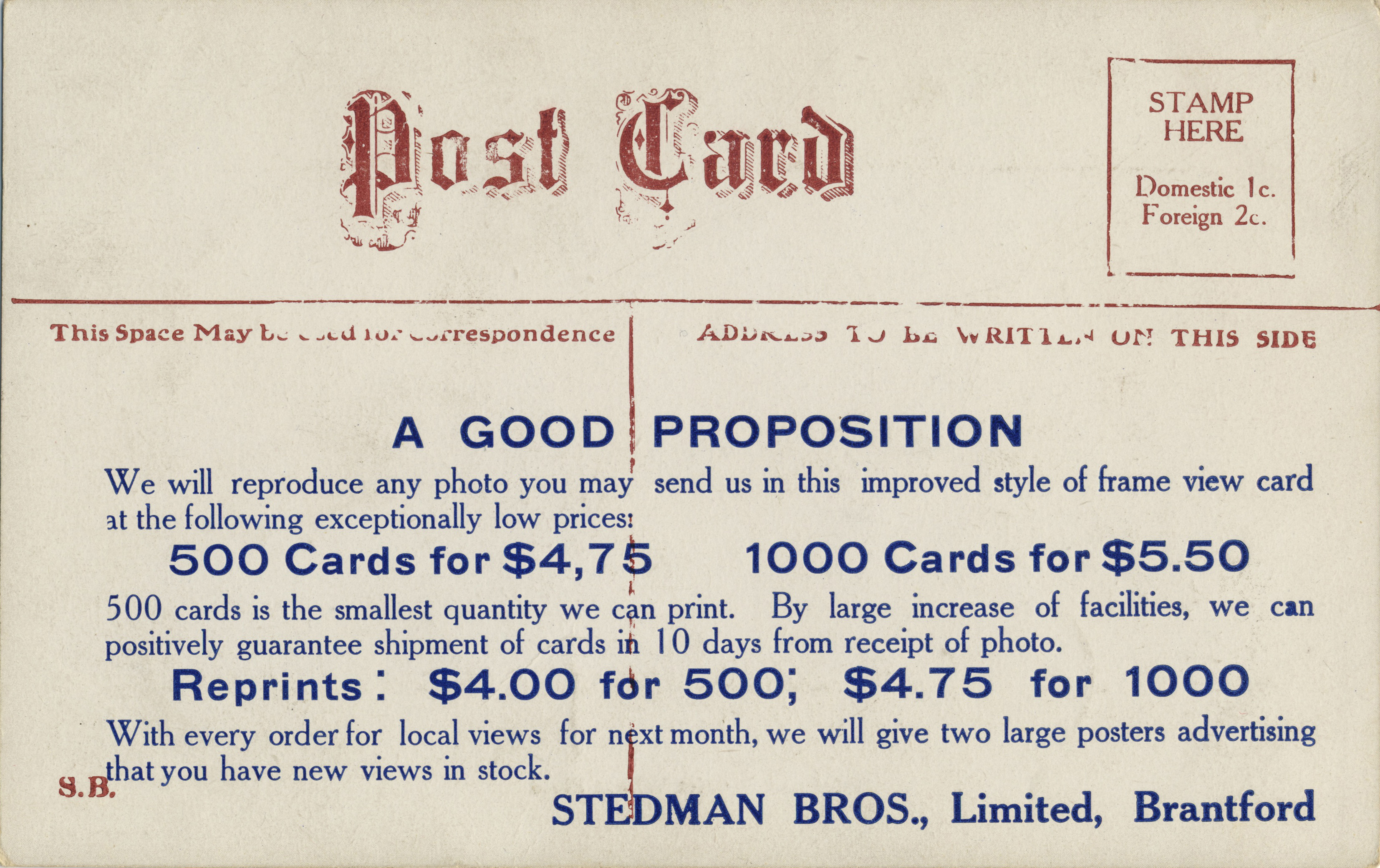
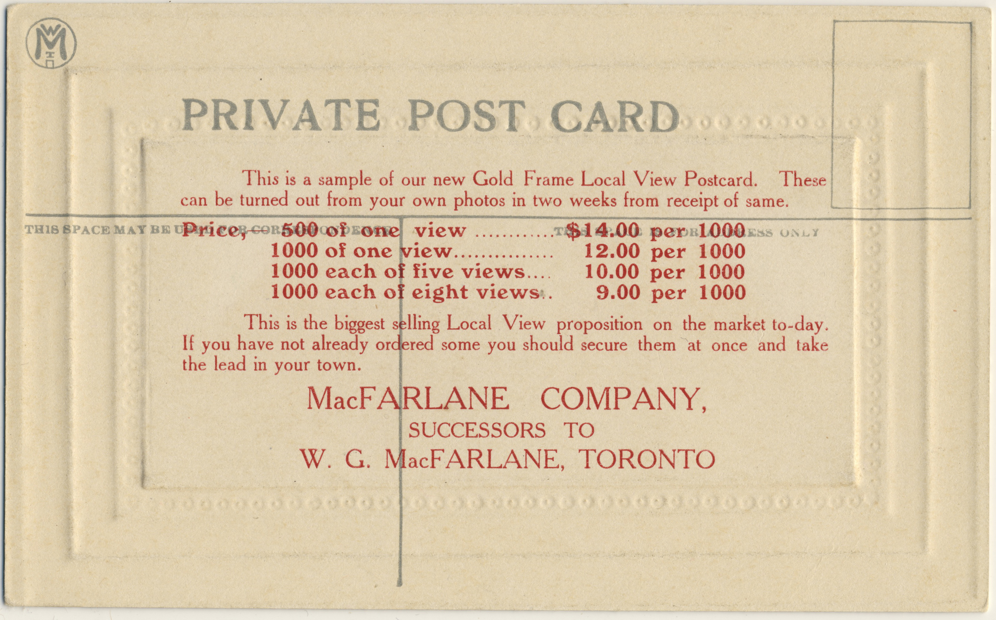
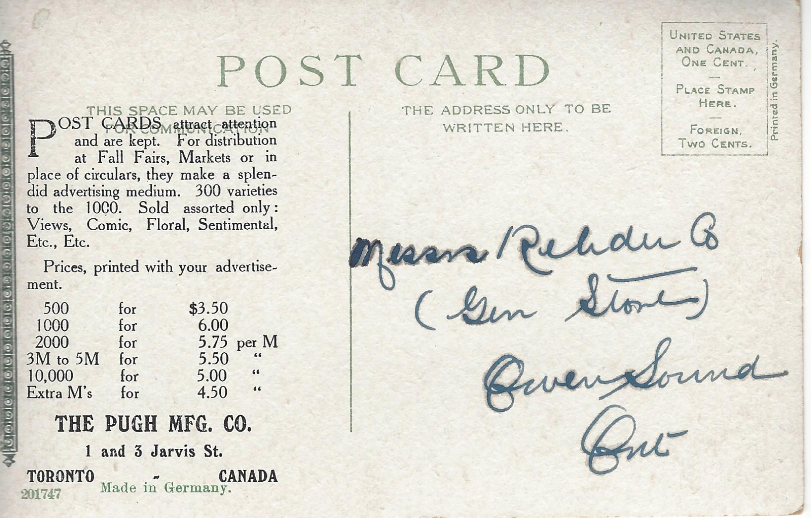
Another prized back-type (prized, at any rate, by historians of the postcard trade and its economics) is the “sample” back, which typically includes an over-printed price list intended for small-town shopkeepers and druggists who might be persuaded to supply photos that the publisher would turn into a finished set of saleable postcard views on the stated terms. If you don’t follow that, take a look at the sample card shown here, [4] which advertises postcards on behalf of Toronto’s Pugh Manufacturing Co., one of the second tier of Canadian postcard publishers (in terms of output). It’s a good example because it’s addressed to a general store (operated by the Rehder family of Owen Sound, Ont.), which would have been just the sort of customer that a postcard publisher was targetting. A good many Canadian sample cards exist, and the more of them that we can collectively assemble, the more we can learn about the commercial history of Canadian postcards. Be on the lookout!

pages-12-13-back-story-figure-04-pugh-advertising

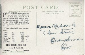
[4] Pugh Manufacturing Co. sample card

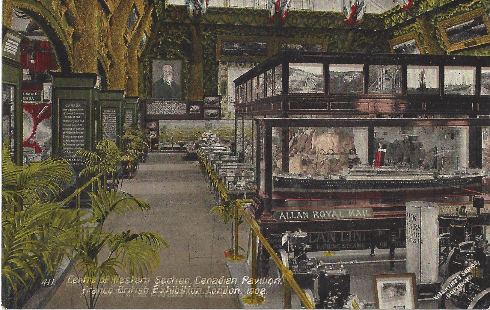
The “two dollar boxes” that were just mentioned bring us to our next Card Talk article. John Sayers of the TPC tells us in this issue about some of his “two dollar box” finds. For example, at a recent postcard sale, John found lots to interest him in the bargain bin, including a great addition to his maritime collection in the form of a Valentine & Sons (U.K.) card [5] depicting the Allan Line booth and display at the Franco-British Exhibition of 1908. This exemplifies one of the great advantages of postcards as a collectible, i.e. that there are just too many postcards, covering too many places and topics, for dealers to know infallibly what every specialist collector really values (the moral being that you can regularly leverage your specialist knowledge into great and satisfying buys).  Looking at John’s Allan Line card, it’s intriguing to notice, at left, some sort of display of Canadian rotary saw-blades. More value! 

pages-10-11-trolling-the-two-dollar-box-figure-01-allan-line-at-franco-british-exhibition-1908

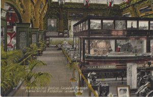
[5] Franco-British Exhibition, London — The Canadian Pavilion

pages-08-09-the-1936-berlin-olympics-figure-02-sports-field-9

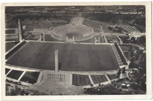
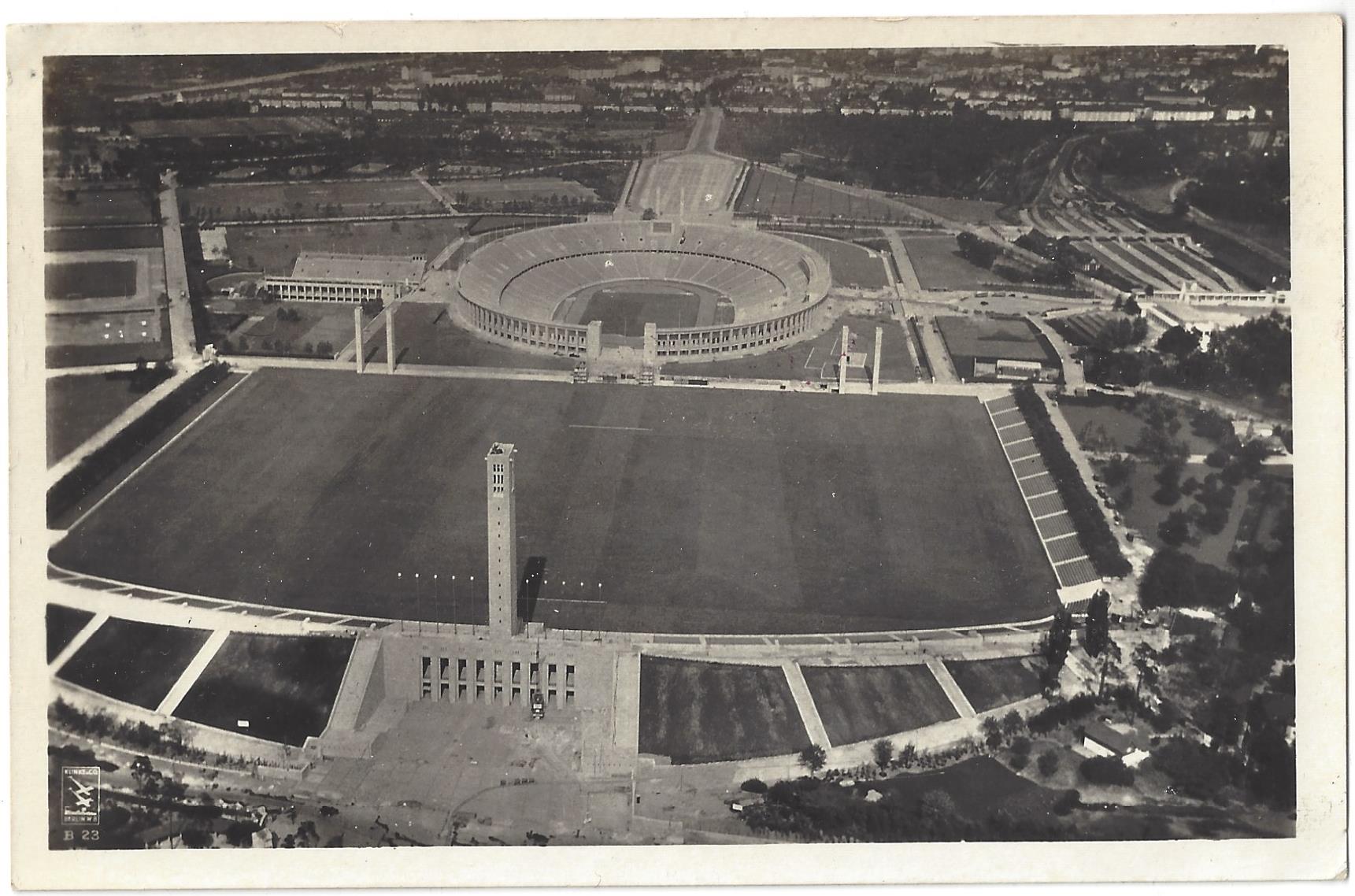
[6] Olympic Stadium, Berlin 1936

At another sale, the eagle-eyed John also found five cards from a series published at the 1936 Berlin Olympics. As he notes, while he doesn’t normally collect that type of thing, these came at a price that easily justified a deviation from the routine. The unused cards appear to have been part of an “official” series numbering over 100. The Olympic rings are on the reverse, along with a rubber-stamped “postmark”. One example [6] shows the stadium that is so familiar from films and which was the scene of Jesse Owens’ famous race. As always, information from those who are specialists in the areas we discuss — in this case, the Olympic Games — is welcomed. 

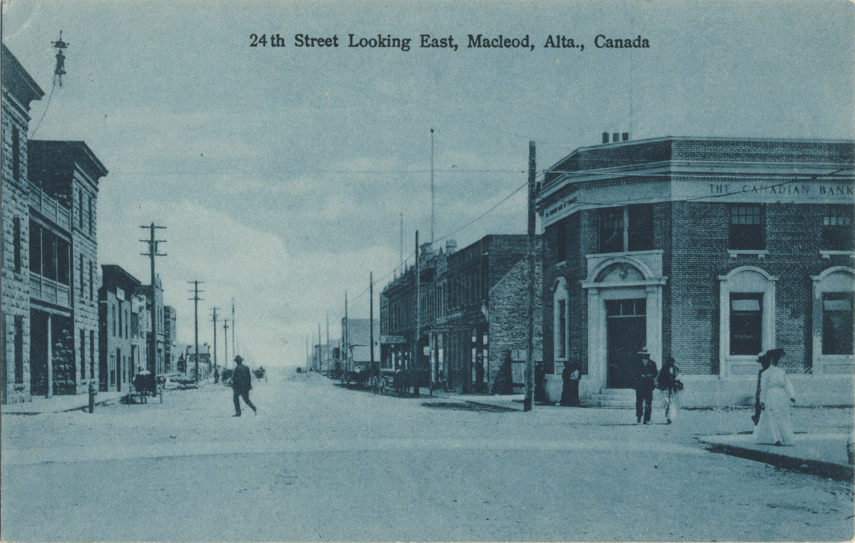
Assuming the role of postcard detective, I hunted down the story behind two fairly well-known postcards from what is now the city of Cambridge, Ontario. The cards memorably feature a hobo referred to in the cards’ captions as “the lost Charlie Ross” (see example [7]). It struck me that there just had to be an interesting story behind these deltiological oddities. My hunch was correct: the resulting article recounts the once notorious kidnapping of the four year old Charlie Ross from the front yard of his parents’  home in Germantown, Pa., on 1 July 1874. This audacious crime instantly became a cause célèbre and was followed by decades of speculation over the fate of the poor innocent lad. The number of wayward boys who were investigated as possible “Charlies” eventually climbed into the hundreds (if not thousands), with older pretenders to the throne coming forward right through the 1930s. The Cambridge “Charlie” cards are therefore examples of a North American popular culture phenomenon of the 19th and early 20th centuries. Interestingly, the well-publicized failure of Charlie’s kidnappers to recover a ransom — which happened because Charlie’s father disobeyed instructions and went to the police — was said to have brought an end to child kidnappings for ransom in the U.S. for several decades. The upshot of the story was a sad one; no trace of Charlie was ever found. While it’s unlikely that he survived for very long after the kidnapping, the whole truth about “the lost Charlie Ross” will probably never be known.

pages-17-18-lost-charlie-ross-figure-01-wreck-of-the-lost-charlie-ross

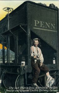
[7] The Lost Charlie Ross, a Wreck on the Galt, Preston and Hespeler Electric Railway, Canada

Finally, in the newest installment of our series “
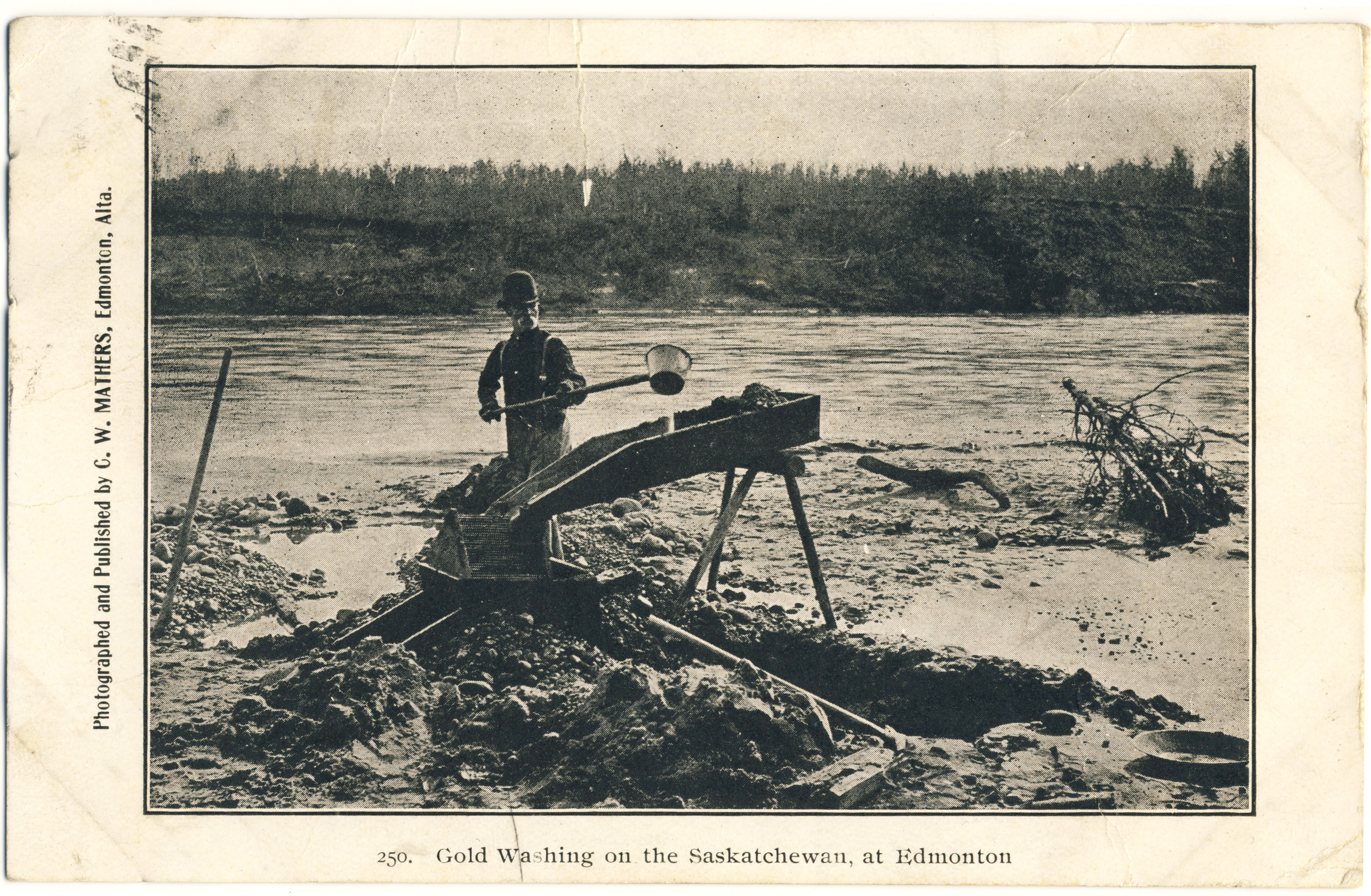
Canada’s Postcard Photographers“, we look at the short but interesting career of Edmonton’s Charles W. Mathers (1868-1950). In 1892, Mathers, a native of Lucknow, Ont., became the first professional photographer to install himself permanently in what was then Edmonton, N.W.T. More interested in public photography than studio portraiture, he devoted himself to recording the life and times of Edmonton, northern Alberta, western Saskatchewan and the Mackenzie district to the north (of which he was one of the best-known early photographers). Mathers produced many “stock images” of pioneer life for view books, settlement-promotion literature, and newspapers requiring illustrations for stories about the “Great North West”.

In the year 1904, as the postcard craze took off, Mathers published some of his images — it’s not clear how many — as postcards. A number of the scenes he chose were already a little dated, such as this 1893 image of a placer miner and his “grissely” (or sluice) in search of North Saskatchewan River gold [8]. While Mathers was in on the beginning of the postcard era in Edmonton, he did not stay to partake in its rapid development. Like many men of his day, Mathers was not inclined to stay long in one place, and by 1905 he had departed Edmonton for Vancouver (although he is said to have returned to photograph the celebration of Alberta’s entry into Confederation in September of that year). Shortly after the end of the First World War, Mathers and his family moved to California, where he continued his photography business, became a U.S. citizen and eventually retired in the Los Angeles area. There is no indication that he produced postcards or other “public” images at any other stage of his life, although his Edmonton and regional images continued to appear on cards produced by other publishers after he had left Alberta (whether with permission or not I do not know). As noted in the article, a number of Mathers’ postcards are included in the University of Alberta’s Peel’s Prairie Provinces website.

pages-04-05-c-w-mathers-figure-04-gold-washing-on-the-saskatchewan-at-edmonton

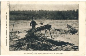
[8] C. W. Mathers photo (1893) published as postcard (c. 1904)

In addition to these articles, the new Card Talk takes a photographic look back at Toronto Postcard Club memories of the 1980s and offers our members an updated show calendar, advertisements, notes and announcements of upcoming meetings. Please consider joining the TPC so that you can read the whole postcard story in Card Talk and also — if you’re in the Toronto area — participate in our meetings and other activities. To top it all off, members will receive free admission to Canada’s pre-eminent annual postcard sale.


CANADIAN WORLD WAR I POSTCARDS

By Andrew Cunningham

The First World War, the “war to end all wars”, got underway just as the shine was coming off the Golden Age of postcards. While wartime demand extended the postcard’s lease on life, it also changed the nature of the medium. In Canada, at least, postcards after 1913 were less apt than previously to show off the growth of the country’s towns, infrastructure and agriculture. Instead, and not unexpectedly, they dwelt more frequently on the war and its associated sentiments. Those sentiments encompassed both the public emotions of patriotism and more private feelings of estrangement and sadness — in addition to simple curiosity about what the soldier’s lives looked like. Because Great War postcards were so popular, postcard collections are often significant repositories of images of the War, including many that are unusual or unique, as well as of accounts (brief ones, of course) of the experiences of soldiers, recruits, families and friends during and after the long conflict. We were recently contacted by a representative of the Imperial War Museum, the London-based institution, which is currently attempting to record accounts of the conflict that are found on postcards. TPC members and friends who wish to contribute should see their website for details. 

As Remembrance Day is approaching, I’ve assembled a number of postcards from my own collection. They reveal the war years as they appeared to the ordinary men and women of the time and cover some — but by no means all — of the range of what is available to today’s “Great War” collector:

field-ambulance-depot-lines-sewell-camp-1915

Field Ambulance Depot Lines, Sewell Camp, 1915. — Advance Photo Co.

There are countless Canadian postcards depicting life at the camps at which Canadian soldiers received their pre-departure training. Among the largest of these was Camp Sewell — renamed Camp Hughes in 1915. A century later, remnants of its trenches and fixtures are discernible in farmers’ fields along the Trans-Canada Highway east of Brandon, Manitoba. As thousands of recruits passed through Camp Sewell/Camp Hughes, the Advance Photo Co. of Winnipeg was on hand to produce and sell real photo postcards depicting camp life. The number of real photo postcards produced of the camp by Advance (and a handful of other photographers) is unknown, but it is likely in the many hundreds. Despite its momentary prominence in the field of Canadian military photography, almost nothing is known about the Advance Photo Co. It had a brief existence around 1915 and 1916 and produced dozens of real photo postcards of a major flood in Winnipeg in the spring of 1916, but otherwise (it seems) almost nothing else. The company’s unidentified principals are quite possibly the gentlemen in the image below, which (more generally) illustrates how postcard photographers would have operated in such a setting.

souvenir-of-sewell-camp-advance-photo-co-hq-and-staff

Advance Photo Co. office (or, more likely, darkroom) at the Sewell Camp (halftone image from a view book of Camp Hughes produced by the company)

Scenes of departure are another frequently encountered World War I genre. Such postcards are usually real photos, which could be produced virtually on the spot for sale to participants in the event. But they were sometimes considered of sufficiently enduring interest to warrant production as lithographed cards. The following example — depicting the soldiers’ send-off at the Intercolonial Railway station in Truro, Nova Scotia — is by Valentine & Sons, the most prolific producers of picture postcards in Canada (and likely worldwide as well).

troops-leaving-truro-n-s

Valentine & Sons card no. 111,920 adds colour to a scene that we normally see only in monochromatic real photo cards.

Postcards showing such scenes only occasionally include related messages. This, fortunately, is one of the minority that does. The card turns out to have been used by a departing soldier to thank a woman who had prepared a gift packet for him. As part of the war effort, ordinary people were asked to send “care packages” to soldiers, who would then be given their names and would write them to express their appreciation. The package in this case was received by Pte. R. Grant, “C” Company of the 40th Battalion, Valcartier, Quebec, who wrote his benefactor, Mrs. Appleton P. Anderson of Sydney, C.B., as follows: “Mrs. A. P. Anderson:- I, Pte. R. Grant was the recipient of your gift on Friday night to the 40th Battalion. The boys were pleased to see the interest the women of Sydney have taken in providing for their comfort. Yours truly, Pte. R. Grant.” The rather stilted first sentence was likely dictated but the second might represent more of a personal effort. 

The next thing you would have done as a soldier is to board a ship for England, and there are many postcards that depict such departures. Below is a particularly fine example – a real photo – showing soldiers waving goodbye at Saint John, N.B., as they begin the long voyage across the Atlantic. Many of them must have been imagining this moment as the beginning of a great adventure. Whether they continued to be of that view on their return (if they returned) is another matter. The ship is the Caledonia:

transport-caledonia-leaving-st-john-n-b-with-26th-battalion-and-r-column

Transport Caledonia, leaving Saint John with the 26th Battalion and “A” Column (undated) — photo by D. Smith Reid of Saint John.

While in England, solders of the Canadian Expeditionary Force underwent additional training. Postcards were naturally a hot seller; messages to friends and family in Canada were dispatched by the thousands each day. Many of Canada’s soldiers ended up at Shorncliffe Camp in Kent (a dangerous place in its own right as it predictably attracted enemy aircraft bombardment). The postcard below shows Canadian soldiers awaiting a visit from George V:

waiting-for-the-king-at-shorncliffe-c-e-f

“For Cecilie. Cecilie this is the camp where Frank Berry hung out all summer. This is the oldest camp in England. It’s the old original camp from the Beginning of history of war. The King’s favorite camp and where the burying ground [is] of all his fancy horses that die. DAD”

This was published by Upton Publishers of Folkestone, the town adjacent to Shorncliffe camp. “Dad” was correct about the historic nature of the location, as this recent BBC story about Shorncliffe’s uncertain future makes clear.

Once the soldiers had made their way across the channel, the most distinctive form of postcard they sent back was the “silk”, as we’ve recently discussed. This example, though showing signs of age now, is typical inasmuch as it incorporates flags and the current year into an attractive design:

1917-souvenir-from-france

These postcards, known as “silks”, were manufactured by the millions in France and Belgium for sale to soldiers.

This is only a sampling of the types of Great War postcards that can be collected — there are also countless examples associated with individual regiments, real photos of soldiers, images of postwar destruction, anti-Kaiser (and pro-German) propaganda cards and many other types. The final cards, chronologically at least, are those depicting the troops’ return home and the memorials that were erected to the dead. The example below, showing the interior of Montreal’s Windsor Station, nicely combines those two elements. We see a soldier in military dress, nearly alone in the cavernous hall, overwhelmed in the image by the names of the battles in which the C.E.F. fought. Those names were already etched in the country’s consciousness when the postcard was mailed on 24 July 1919 — even though many of those who had fought in the battles were only just then making their way home.

c-p-r-windsor-station-montreal

Ypres. Festubert. The Somme. Vimy. Hill 70. Passchendaele. Amiens. Cambrai. Drocourt-Quéant. Mons.

As the Great War is now passing out of the realm of direct human memory, postcards offer us a tangible connection to the people, events and ideas that defined it.


THE SPIRIT OF CHILDHOOD: A CANADIAN POSTCARD (AND AVIATION) MYSTERY

By Andrew Cunningham

Postcard collecting can take you to unexpected destinations. This post is about how postcards dragged me off into suburban Canada of the 1930s. A few years ago, as part of my collecting focus on my hometown of Winnipeg, I picked up an unused real photo postcard that seemed, initially, to be of rather minor interest. It depicted a little girl seated in a replica airplane, evidently designed for children. The craft was emblazoned with the words “The Spirit of Childhood” and “Winnipeg 1934”. The setting was the public sidewalk out front of a house of an exceedingly common local style: 934 something street; or maybe 334. Unidentifiable, in other words.

the-spirit-of-childhood-winnipeg-1934

The Spirit of Childhood, taking off from a Winnipeg sidewalk circa 1934.

I filed it away and, I will admit, soon forgot all about The Spirit of Childhood. That is, until a few months ago, when to my surprise I came upon a second similar postcard. This one featured two girls in another replica airplane, which again proclaimed “The Spirit of Childhood”. But this time it wasn’t Winnipeg. It was “Vancouver 1934”.

spirit-of-childhood-vancouver-1934

Vancouver’s Spirit of Childhood has managed to attract a passenger and a co-pilot.

How odd. What was going on? Were these planes constructed from a kit ordered from (say) Eaton’s or the Bay? Not likely, it seemed — their construction and painted lettering were similar but not by any means identical. And yet it certainly appeared that they had been designed with reference to a common model and, one would presume, owed their name ultimately to Lindbergh’s Spirit of St. Louis.

Since then, I’ve discovered several more examples of The Spirit of Childhood online. The Peel Collection at the University of Alberta shows four postcards of this genre (for a genre it appears to be). One card is emblazoned with “Edmonton 1931” and there are also three Calgary examples, one whose date is not captured in the photo and two that respectively represent the years 1936 and 1937. The last image that my Googling uncovered shows a similar scene of a plane that doesn’t have a painted reference to a city or a year, but which apparently came from the Yukon Territory.

A new example of Edmonton 1931, from my own collection (added to the post in February 2023).

One useful result of this search was the revelation that the difference between “my” two planes does not, after all, mean that the designs were one-offs. In fact, if you look closely at the images linked above (plus my pair), it appears that there were two models of these planes. The “Vancouver” model appears virtually identical to Edmonton 1931, Calgary 1937, Calgary 193? and the Yukon plane, while the “Winnipeg” model looks the same as Calgary 1936. So now we are left with seven planes in two designs, dating from 1931 to 1937 and each being the subject of photographic postcards in a similar style. By that I mean that every single one of the photos has been taken on a sidewalk in front of a house — a natural place for the plane to be, I suppose, but you’d think that the odds would be that at least one out of seven photographers would have decided on some other equally good location. To speculate: could the photos have been intended for submission to an organization — to the manufacturer or a retailer, for example — as part of a contest the rules of which specified how the required photo was to look? Frankly, I haven’t a clue.

Another thing to note is that — going by what shows up in the first few results returned by Google — there don’t seem to be any U.S. examples, or examples from eastern Canada. Surely that must mean something….

But all I have at this point is that these planes were made from some sort of plan or kit, that there were at least two designs in use, and that these were distributed across Western Canada in the 1930s. They may have been intended to represent something about Canadian aviation, but — if that’s the case — I’m not sure what.

Anyone who might be able to shed some light on this aviation mystery is welcome to submit a comment!

Editor’s note: As a look at the comments below will quickly reveal, we soon received an answer — that these planes were props pulled by itinerant photographers around the residential districts of many western Canadian cities, with a fee being charged to the parents of children who wished to have photos like these postcards made of themselves. (16 February 2023)


POSTCARD DIGITIZATION (AND SOME STARS OF YESTERYEAR!)

By Andrew Cunningham

The Winnipeg Public Library is engaged in a major postcard digitization project, based (thus far) on the collections of two TPC members – Rob McInnes and the late Martin Berman. The postcard images that have been uploaded so far are available on the Library’s impressive Past Forward website. In the course of working on the collection, one of the librarians, Christy, unearthed a great story after finding a postcard written from Winnipeg by an early twentieth-century actress who went by the stage name Ruth Maycliffe. Ruth’s story, together with some context from Christy about to the Library’s impressive project, is recounted in this post on the Library’s “Readers’ Salon” blog. It’s well worth reading.

Postcards of popular stage personalities were collected with great enthusiasm at the height of the postcard craze (roughly 1905-1910). However, because the names are rarely recognizable to us, today’s collectors often don’t show much interest in the cards that depict them. That’s unfortunate, because with a little online research performers’ publicity postcards often yield up interesting stories. Not infrequently, the careers of the vaudeville-era actors who appeared on early 20th century postcards carried on right into the television era. As a random example, one very Edwardian-looking music-hall actress whose postcard somehow ended up in my collection turned out, on further investigation, to have been a guest star in several episodes of Rod Serling’s The Twilight Zone (playing a very old lady, of course!)

Below is a typical card of this genre, a “Philco” effort showing the (once) famous Dare sisters — Phyllis (1887-1975) and Zena (1890-1975) — together with their mother, Harriette Dones. These cards were especially popular in England, with major publishers constantly issuing new series featuring West End actors, sometimes (as below) in the fashions of the day and sometimes as they had appeared in their most recent or most famous roles:

the-misses-zena-phyllis-dare-mother

By the way, we’re always interested to hear about postcard digitization projects from anywhere in Canada (or anywhere else if the subject-matter would interest our members). Please send us a note if you know of any that aren’t mentioned on our site.

CARD TALK – FALL 2016 HIGHLIGHTS

By Andrew Cunningham

The Toronto Postcard Club publishes a 24-page magazine, Card Talk, thrice annually. The latest issue, Fall 2016, is on newsstands now! Well, not exactly on newsstands, because the only way to get a copy — quite literally, as we can’t afford to print any extras — is to join the Club. Just to rub it in a bit for those of you who haven’t yet joined, here’s a little summary of what you could be reading right now if only you had! (Of course, there are more great issues to come, so all is not lost if you become a member today!) For current members, you’ll find some of the links mentioned in the articles in this edition here, so you don’t have to search for them or type them out yourselves.

Dominion Land Office, Moose Jaw, Canada

A Lewis Rice postcard from Moose Jaw, posted in the summer of 1911.

First up is an article written by your editor, the second in our series of short pieces about Canada’s local postcard photographers. Last issue we featured Donald Buchanan of Arcola, Saskatchewan. This time around, it’s Lewis Rice (1863-1913), one of Canada’s better known independent producers of lithographed postcards on account of his prodigious output of images of the Moose Jaw district of Saskatchewan (occasionally ranging as far away as southern Alberta). This article, however, focuses on his less well-known earlier career in Nova Scotia, where he produced view books and postcards in and of the Town of Truro and surrounding areas. Looking at Rice’s pre-Saskatchewan life, we find that he was from a Cape Breton family that had produced many professional photographers, including a brother George who gained fame — unfortunately posthumously — as photographer to the ill-fated Greely expedition to Canada’s Arctic in 1883-84.

The second article is an expanded account of our May 16, 2016 meeting on printing techniques. This was one of our best meetings ever, with a great talk by Stephen Sword on the history and technical details of the printing techniques that allowed our little treasures to exist. Beginning with the story of Alois Senefelder‘s invention of lithography in late 18th century Germany, Stephen proceeded to talk about the development of chromolithography and other processes such as the collotype (a gelatine-based process that gave us some of the most attractive monochrome postcards). The article summarizing his presentation, written by the TPC’s Barb Henderson, notes a number of sources for further information, such as Encyclopedia Britannica’s article on the halftone process and a website called “Legion of Andy”, which has a number of very useful posts (such as this https://legionofandy.com/2015/05/12/ben-day-dots-part-two/one) on halftone screens and “Ben Day dots” in the context of comic-book art.

After an account of recent postcard shows in Montreal and London (U.K.) by long-time TPC member Bob Atkinson, including a real photo postcard obtained by Bob showing a patriotic parade in an unknown Ontario city (below left — any guesses as to where this is?), this edition of Card Talk moved on to an article based on another excellent talk from earlier this year, member Ian Robertson’s carefully researched account of the history of the International Stationery Co., a prodigious postcard producer based in Picton, the historic seat of Prince Edward County in Ontario. Ian recounted the tale of his 35-year quest to find out everything there is to know about this well-known company and its founder, James Livingstone, who owned a chain of small department stores in Picton and other towns, each trading as “The Fair”.

PAGES 10-11 - Postcard Shows - Figure 8 (Celebration in unidentified city)

Which city is this? (Click to enlarge)

The quintessential International Stationery card, illustrated here (below, at right) by an example showing a scene in Windsor, Ontario, is a collotype on a sepia coloured card stock. While this would have been ordered from a manufacturer in Germany, as the majority of Canada’s printed postcards were before World War I, it is strongly associated with Livingstone’s International Stationery Co. because this design was rarely if ever used by other Canadian postcard producers. One of the strong points of Ian’s research is simply that he had the good sense to get started early. As a result, back in the 1980s, he was able to interview several people with first-person memories of how postcards were ordered and sold at “The Fair”. Sources who directly recollect that era have long since disappeared and it has sadly become impossible to do similar research on “Golden Age” postcard companies in the 2010s. But Ian’s discoveries, as set out in the article, include information about production and distribution that would likely apply to many other Canadian producers and sellers.

Ferry Landing, Windsor, Ont.

Ferry Landing, Windsor, Ont. (posted 1914). Its sepia-toned look is common to most postcards published by the International Stationery Co.

A couple of shorter pieces about the First World War are also to be found in this issue. One of them, written by TPC executive member John Sayers, brings to light the very interesting story of the False Armistice. While today we often think of November 11, 1918 as the day when a seemingly interminable war crashed to a sudden stop, in point of fact rumours of the impending end of hostilities had been rampant for quite some time. On November 7, it turns out, a false alarm went out to the whole world in the form of an erroneous United Press newswire story out of Paris. Newspapers around the world joyfully reported that the war had ended, in some cases issuing their already-printed “The War Is Over!” special editions — when in fact the war was still “on”. In the Ontario town of Niagara-on-the-Lake, the happy celebrations were recorded in real photo postcard form, four days early! John happened to see these postcards while visiting a local museum and has kindly shared them, and the story they represent, with us.

PAGES 17-19 - Border - Figure 02 (Treaty of 1818)

The Historical Calendar Advertising Co. of New York published a series of postcards featuring historical lessons for each day of the year. This card commemorates the Treaty of 1818 that established the 49th parallel as the U.S.-Canadian boundary west of the Lake of the Woods.

Finally, your editor contributed an article on postcards depicting the Canada-U.S. border. From cards showing border markers, to historical/educational cards commemorating the anniversary of the historic Treaty of 1818, to images of such “border oddities” as the split U.S./Canada post office in the Quebec/Vermont border town of Beebe Plain, to cards championing U.S. immigration into the Canadian prairie provinces, images of the border are plentiful in Canadian postcards, and collectively form a worthwhile area of sub-specialization.

In addition to these stories are smaller notes on postcard happenings and the usual calendars of events, advertisements and other regular features that make Card Talk such a great value.