
By Andrew Cunningham
The Toronto Postcard Club publishes a 24-page magazine, Card Talk, thrice annually. The latest issue, Fall 2016, is on newsstands now! Well, not exactly on newsstands, because the only way to get a copy — quite literally, as we can’t afford to print any extras — is to join the Club. Just to rub it in a bit for those of you who haven’t yet joined, here’s a little summary of what you could be reading right now if only you had! (Of course, there are more great issues to come, so all is not lost if you become a member today!) For current members, you’ll find some of the links mentioned in the articles in this edition here, so you don’t have to search for them or type them out yourselves.

A Lewis Rice postcard from Moose Jaw, posted in the summer of 1911.
First up is an article written by your editor, the second in our series of short pieces about Canada’s local postcard photographers. Last issue we featured Donald Buchanan of Arcola, Saskatchewan. This time around, it’s Lewis Rice (1863-1913), one of Canada’s better known independent producers of lithographed postcards on account of his prodigious output of images of the Moose Jaw district of Saskatchewan (occasionally ranging as far away as southern Alberta). This article, however, focuses on his less well-known earlier career in Nova Scotia, where he produced view books and postcards in and of the Town of Truro and surrounding areas. Looking at Rice’s pre-Saskatchewan life, we find that he was from a Cape Breton family that had produced many professional photographers, including a brother George who gained fame — unfortunately posthumously — as photographer to the ill-fated Greely expedition to Canada’s Arctic in 1883-84.
The second article is an expanded account of our May 16, 2016 meeting on printing techniques. This was one of our best meetings ever, with a great talk by Stephen Sword on the history and technical details of the printing techniques that allowed our little treasures to exist. Beginning with the story of Alois Senefelder‘s invention of lithography in late 18th century Germany, Stephen proceeded to talk about the development of chromolithography and other processes such as the collotype (a gelatine-based process that gave us some of the most attractive monochrome postcards). The article summarizing his presentation, written by the TPC’s Barb Henderson, notes a number of sources for further information, such as Encyclopedia Britannica’s article on the halftone process and a website called “Legion of Andy”, which has a number of very useful posts (such as this https://legionofandy.com/2015/05/12/ben-day-dots-part-two/one) on halftone screens and “Ben Day dots” in the context of comic-book art.
After an account of recent postcard shows in Montreal and London (U.K.) by long-time TPC member Bob Atkinson, including a real photo postcard obtained by Bob showing a patriotic parade in an unknown Ontario city (below left — any guesses as to where this is?), this edition of Card Talk moved on to an article based on another excellent talk from earlier this year, member Ian Robertson’s carefully researched account of the history of the International Stationery Co., a prodigious postcard producer based in Picton, the historic seat of Prince Edward County in Ontario. Ian recounted the tale of his 35-year quest to find out everything there is to know about this well-known company and its founder, James Livingstone, who owned a chain of small department stores in Picton and other towns, each trading as “The Fair”.
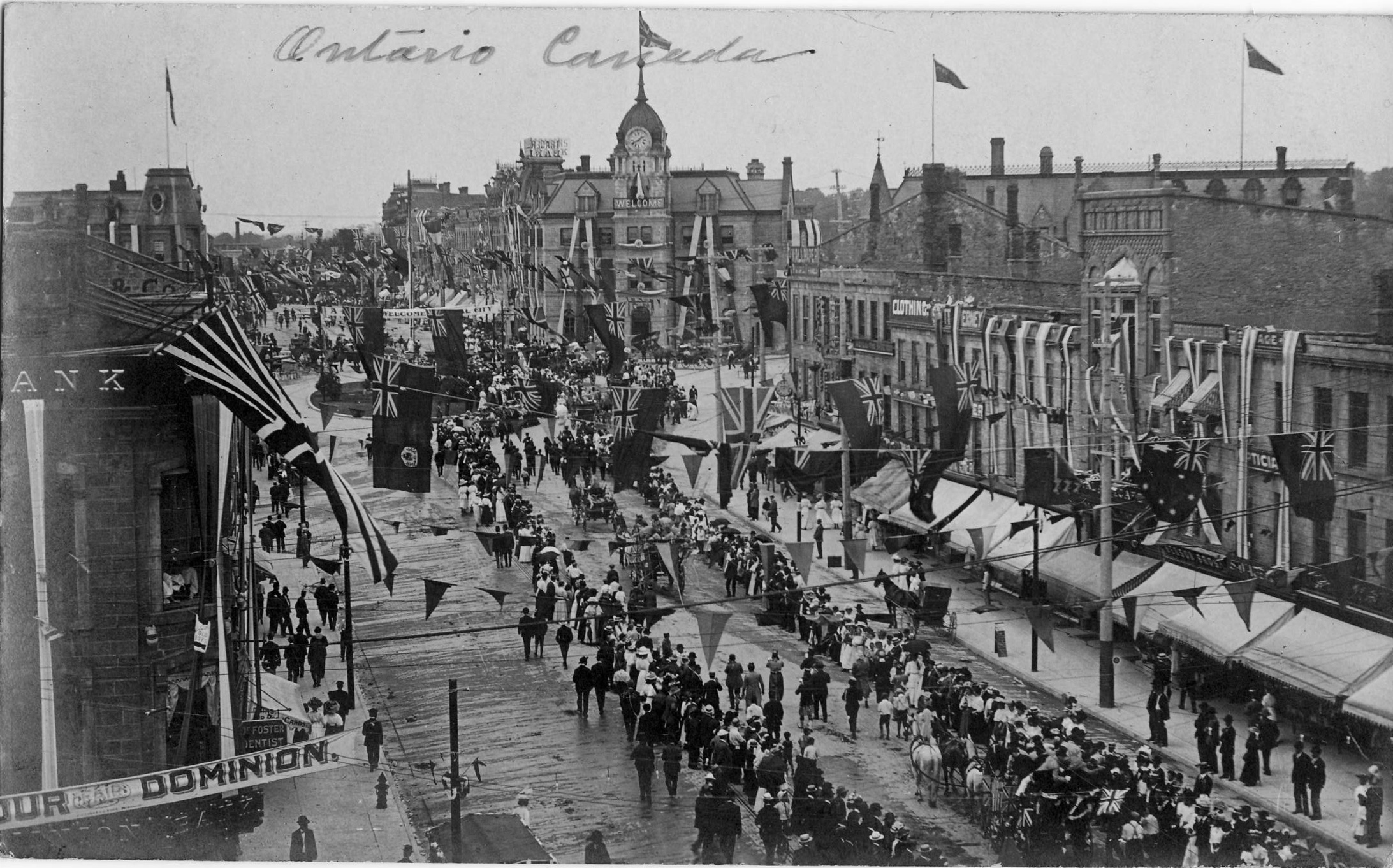
Which city is this? (Click to enlarge)
The quintessential International Stationery card, illustrated here (below, at right) by an example showing a scene in Windsor, Ontario, is a collotype on a sepia coloured card stock. While this would have been ordered from a manufacturer in Germany, as the majority of Canada’s printed postcards were before World War I, it is strongly associated with Livingstone’s International Stationery Co. because this design was rarely if ever used by other Canadian postcard producers. One of the strong points of Ian’s research is simply that he had the good sense to get started early. As a result, back in the 1980s, he was able to interview several people with first-person memories of how postcards were ordered and sold at “The Fair”. Sources who directly recollect that era have long since disappeared and it has sadly become impossible to do similar research on “Golden Age” postcard companies in the 2010s. But Ian’s discoveries, as set out in the article, include information about production and distribution that would likely apply to many other Canadian producers and sellers.
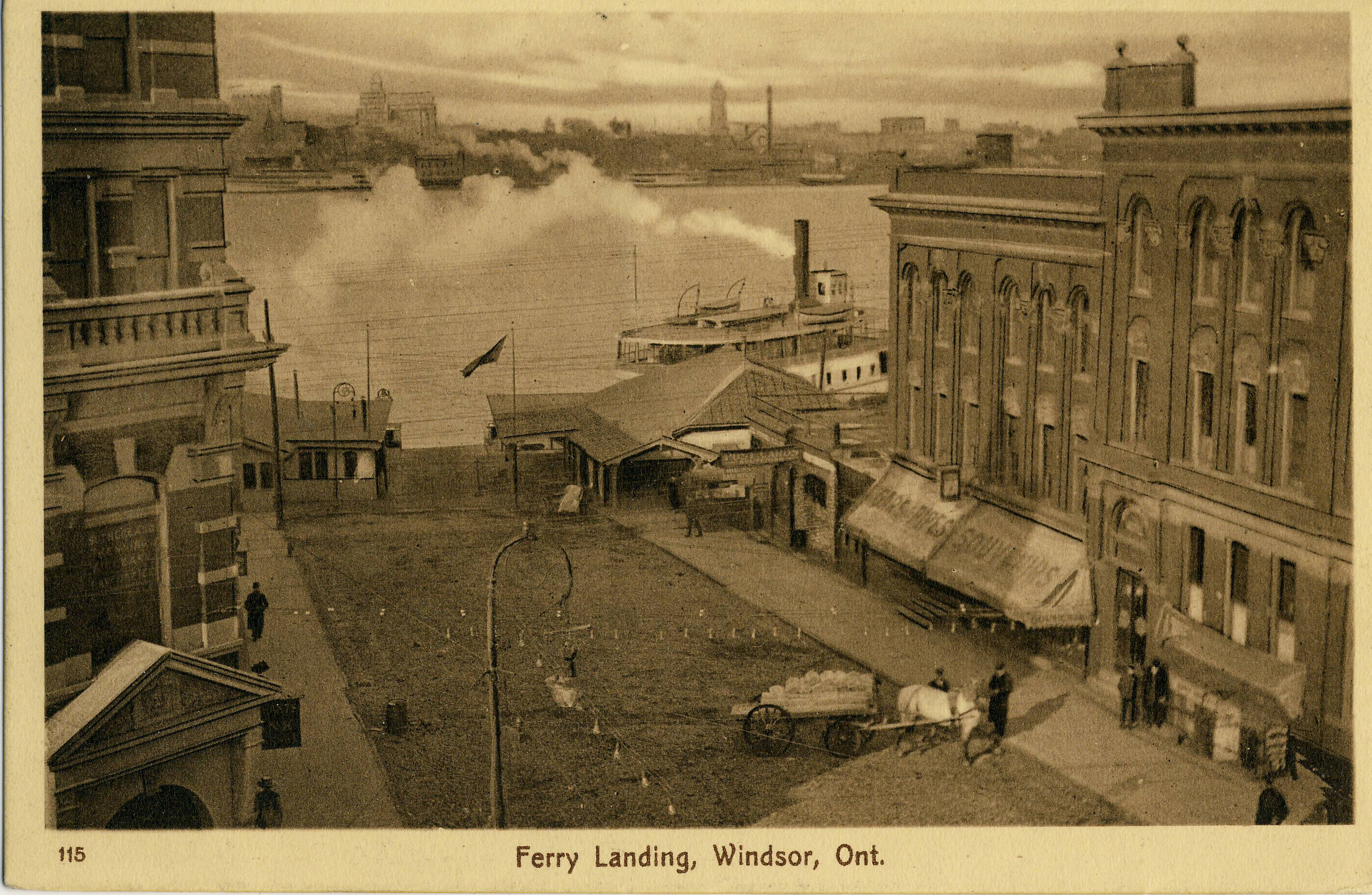
Ferry Landing, Windsor, Ont. (posted 1914). Its sepia-toned look is common to most postcards published by the International Stationery Co.
A couple of shorter pieces about the First World War are also to be found in this issue. One of them, written by TPC executive member John Sayers, brings to light the very interesting story of the False Armistice. While today we often think of November 11, 1918 as the day when a seemingly interminable war crashed to a sudden stop, in point of fact rumours of the impending end of hostilities had been rampant for quite some time. On November 7, it turns out, a false alarm went out to the whole world in the form of an erroneous United Press newswire story out of Paris. Newspapers around the world joyfully reported that the war had ended, in some cases issuing their already-printed “The War Is Over!” special editions — when in fact the war was still “on”. In the Ontario town of Niagara-on-the-Lake, the happy celebrations were recorded in real photo postcard form, four days early! John happened to see these postcards while visiting a local museum and has kindly shared them, and the story they represent, with us.
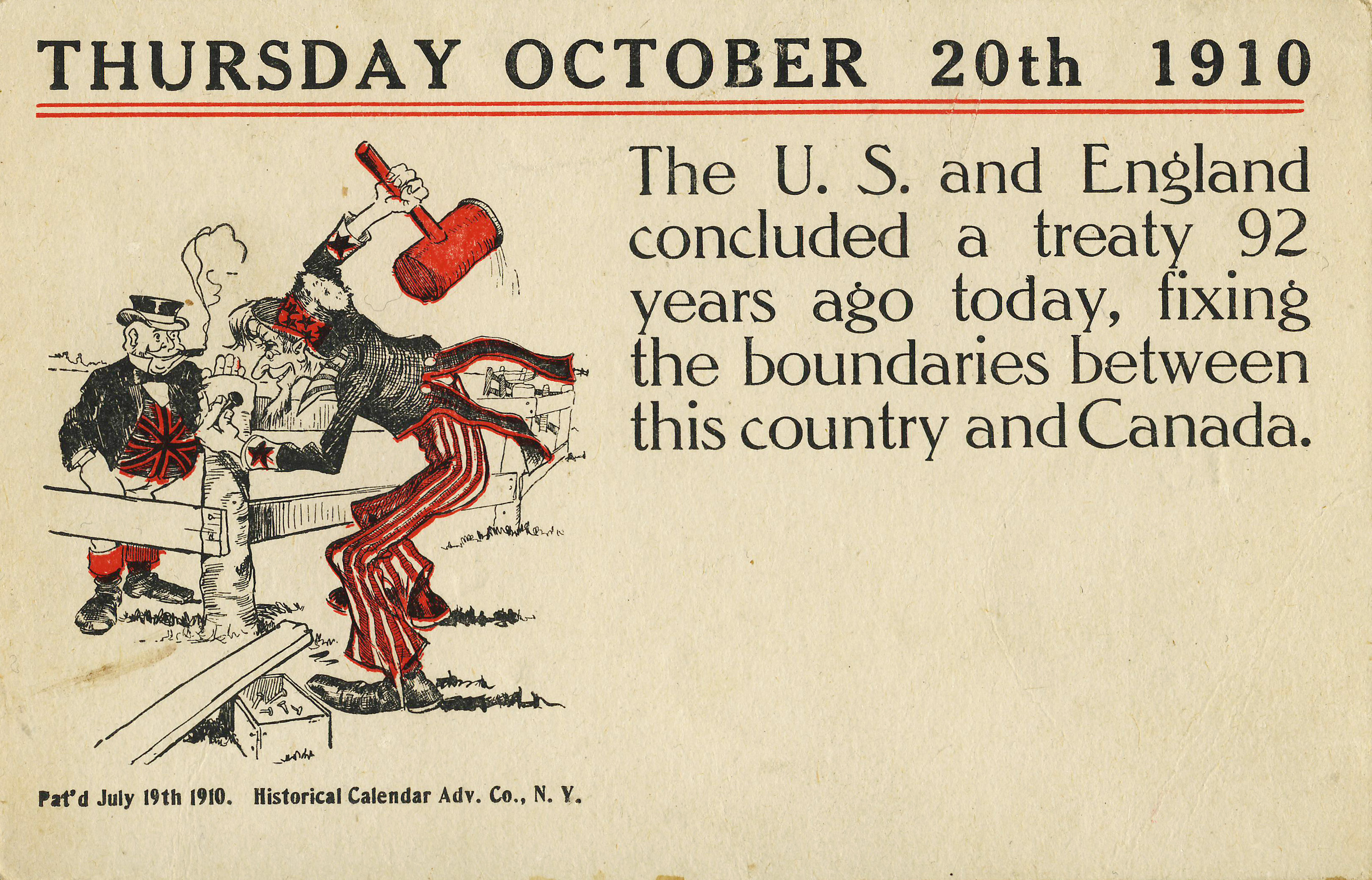
The Historical Calendar Advertising Co. of New York published a series of postcards featuring historical lessons for each day of the year. This card commemorates the Treaty of 1818 that established the 49th parallel as the U.S.-Canadian boundary west of the Lake of the Woods.
Finally, your editor contributed an article on postcards depicting the Canada-U.S. border. From cards showing border markers, to historical/educational cards commemorating the anniversary of the historic Treaty of 1818, to images of such “border oddities” as the split U.S./Canada post office in the Quebec/Vermont border town of Beebe Plain, to cards championing U.S. immigration into the Canadian prairie provinces, images of the border are plentiful in Canadian postcards, and collectively form a worthwhile area of sub-specialization.
In addition to these stories are smaller notes on postcard happenings and the usual calendars of events, advertisements and other regular features that make Card Talk such a great value.

Hi Andrew: The unknown city in the RPPC (“which city is this?”) is Guelph. The PC is a popular shot of the 1908 Old Home Week here.
Thanks for your help, Cameron. I’d since seen a reference to the image and its origin — on your blog? — but hadn’t yet updated the post. Guelph it is! — Andrew