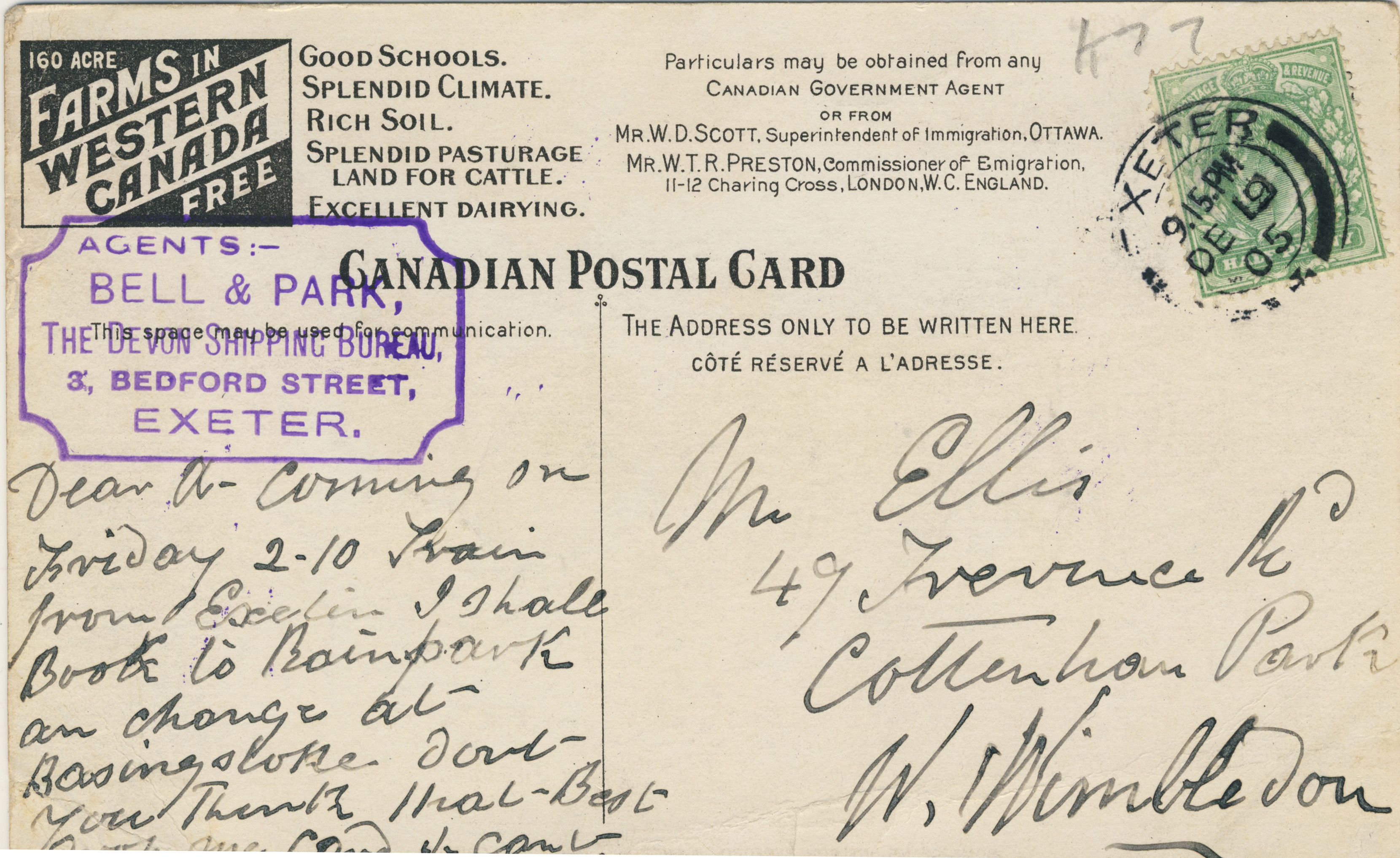
By Andrew Cunningham
Many of our members (like deltiologists everywhere) spend a lot of time trying to figure out who was behind the postcards we collect – printers, publishers, photographers, distributors and sellers. When it comes to photographers, for example, there were certainly some individuals who roamed the country taking photos for use on postcards. The brilliant new book on Reuben Sallows, written by TPC members Mike Smith and Larry Mohring, shows the incredible range of one gifted Canadian photographer who did just that.
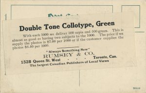
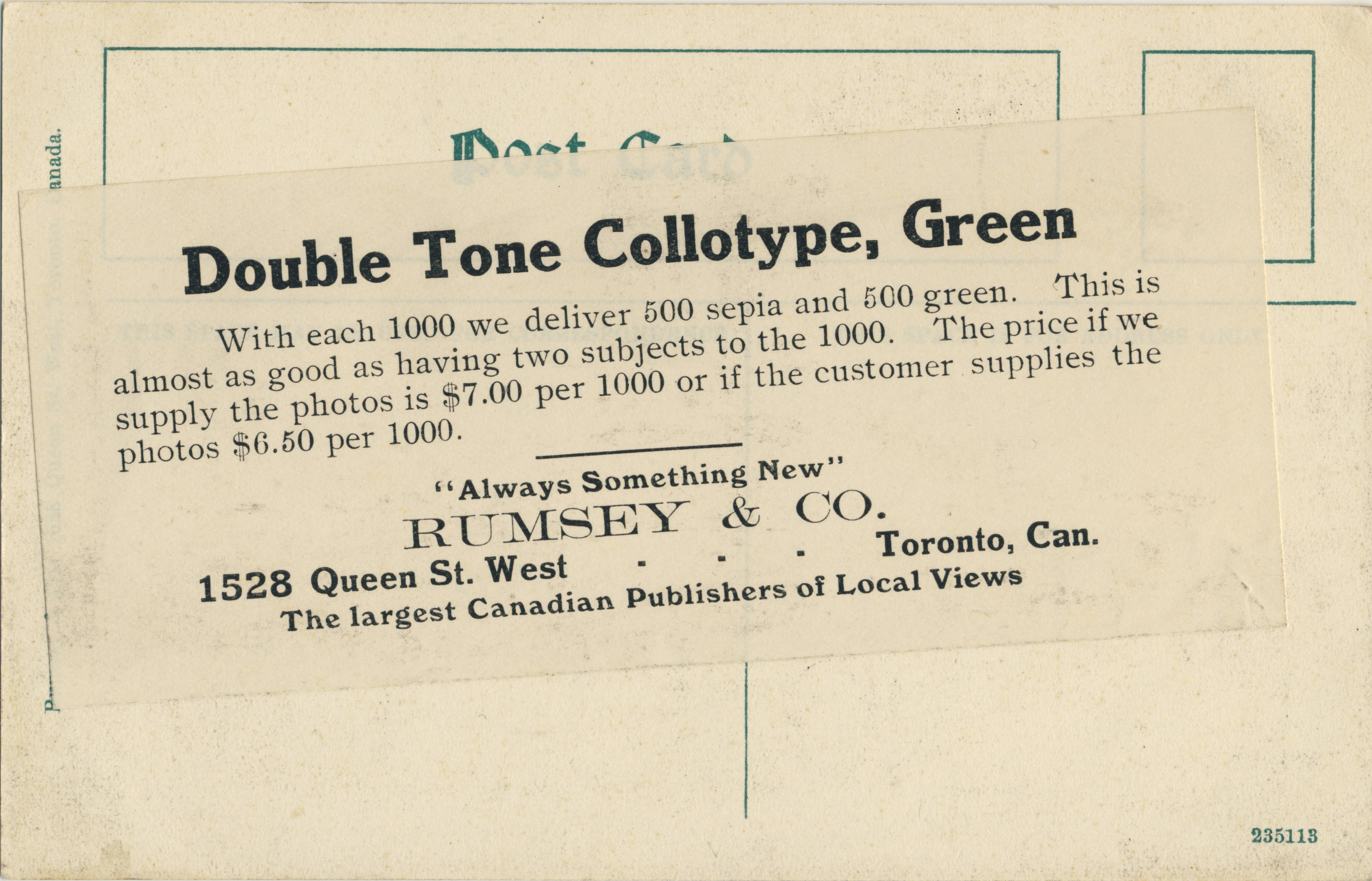
[1] Rumsey & Co. sample card.
Just as often, however, the postcard views that we see were made from photos submitted to a publisher by a local seller, often the town’s pharmacist or general store owner. He (or, very occasionally, she) would order postcards in a certain style and price range from a publisher’s catalogue or from its travelling salesman when he passed through town. We know something about this process because a lot of “publisher’s sample” postcards are still around today. These cards help to give us an idea of the business side of the postcard industry. Sometimes, as in illustration [1], they include pricing (here, $7 for 1,000 copies of the card; $6.50 for customer-supplied photos). One of the problems with selling printed postcards (as opposed to “real photograph postcards (RPPCs)) was that you had to order a lot of them to make a print run economical. Here, Rumsey & Co. has tried to make the 1,000-card minimum order more appealing to its customer base of small-town retailers by agreeing to provide the minimum quantity into two colour tones: 500 green and 500 sepia (“almost as good as having two subjects to the 1000”).
[2] Front of the Rumsey & Co. collotype sample postcard.
The quoted prices in this case were for
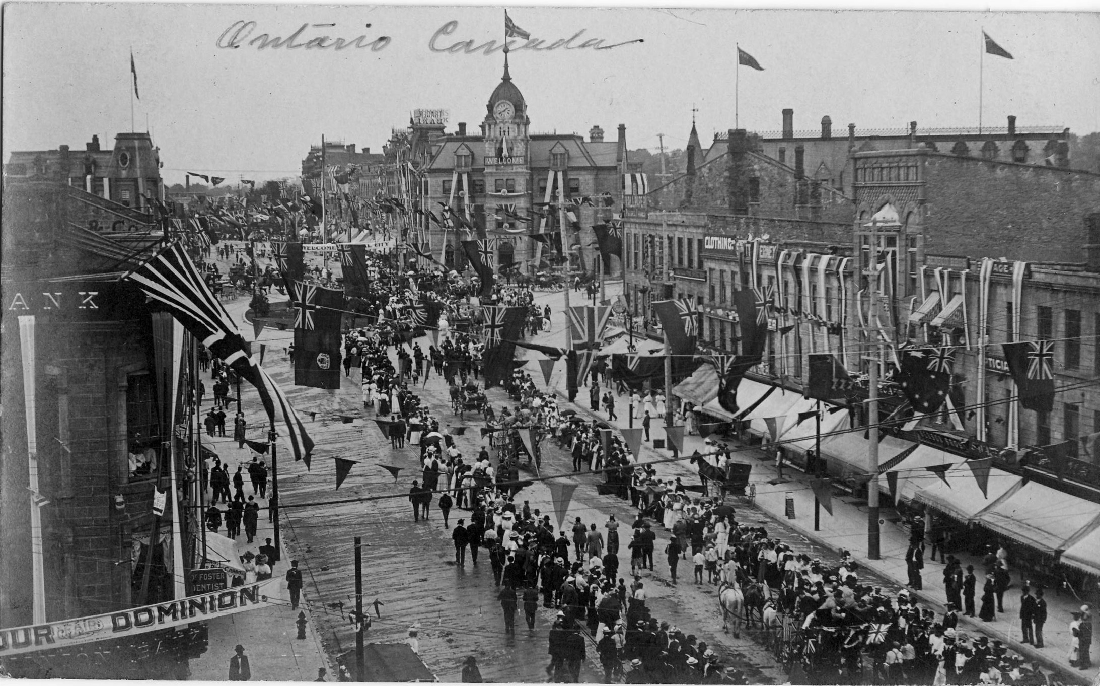
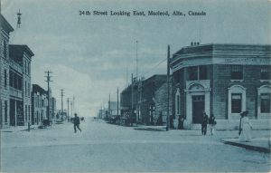
collotype images. “Collotype” was a gelatine-based printing process used extensively in the late 19th and early 20th centuries to reproduce photographic images on a printing press. Used appropriately, it could create a pleasing result that in some cases is difficult to tell from a real photograph without a magnifying glass. The images were sometimes left as monochromes (black and white) or they could be “colourized” by the direct application of colour to appropriate objects and areas in the image (sort of like paint-by-numbers). A third alternative, used here, was to tint the cards, which required the application of a colour tint across the entire image – a far less time and labour intensive process than full-scale “colourization”. The front of this particular card, which shows a street scene in Fort Macleod, Alberta, is in the “green” tone mentioned in the advertisement (see illustration [2]).
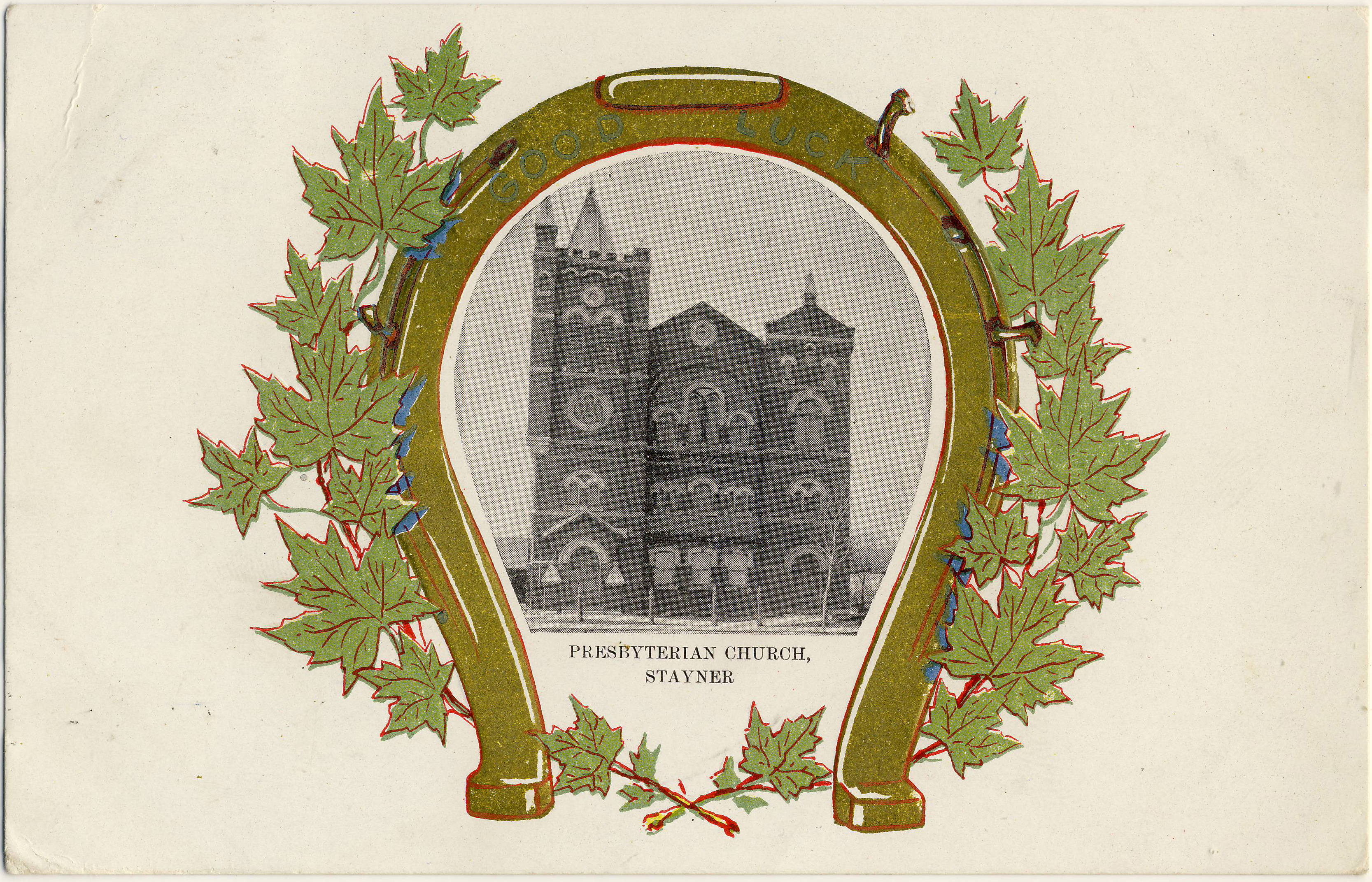
If, as a retailer, you wanted something a little cheaper that could be purchased in smaller quantities, you could order a half-tone card rather than a collotype. Half-tone images (composed of ranges of little dots, as in a newspaper photograph) were easier to produce than collotypes. The down-side was that they tended to look less realistic and (truth be told) a bit dull. So, to gussy them up a bit, publishers often printed them on standard card blanks pre-printed with a “framing” image that supplied the colour and elegance that the inset half-tone images lacked. Illustration [3], “Presbyterian Church, Stayner” is an example of how a half-tone could be made more saleable by inserting it into one of these pre-printed frames – in this case the Toronto Lithographing Co.’s horseshoe design (which is classified as “patriotic” because the horseshoe is entwined with a garland of maple leaves).
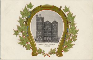
[3] Presbyterian Church, Stayner [Ontario] (Toronto Lithographing Co.).
Some of the most popular postcard types in Canada were
“frame view” cards. These were cards whose “frames” really were frames (pretend ones, at least). Frame-views were offered by a number of Canadian publishers, but are most commonly found under one of three imprints: Atkinson Bros., Stedman Bros. or Pugh Manufacturing Co. (based in Toronto, Brantford and Toronto, respectively). While the quality of the images is not especially high, these cards are often highly interesting because they tend to show events and views that would have been of interest only locally, and which are therefore of great interest now because of their rarity and (often) naive charm. In that sense, their content can resemble real photo postcards, which were expensive but which could be produced in very small quantities (even just one), and which are therefore prized because they tended to be used to show more personal or local scenes, or short-lived events and “news stories” (notably including fires, floods, tornadoes, train wrecks and other “disasters”).
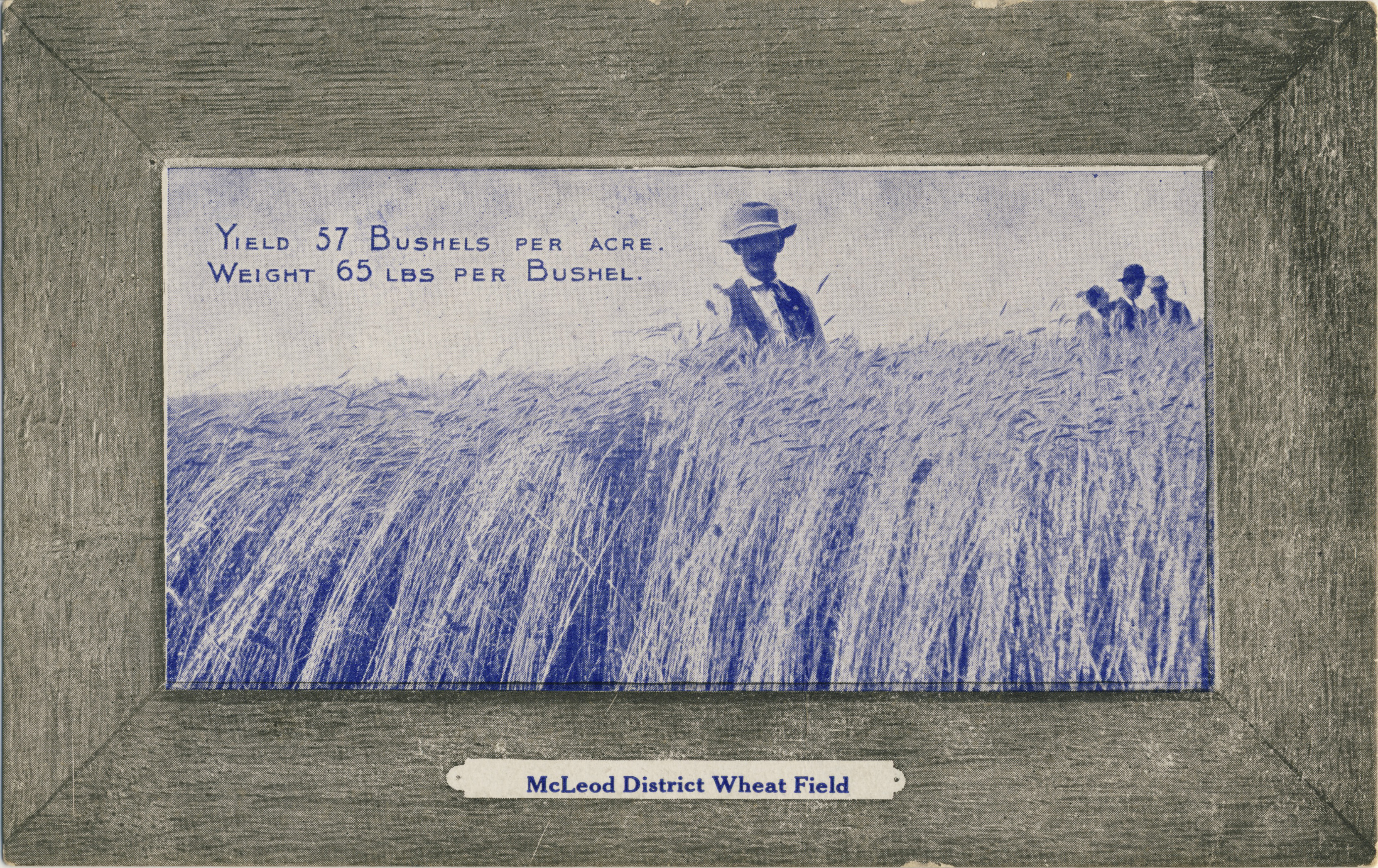
If we look at a frame view sample (illustration [4]) from Stedman Bros., who seem to have been the most prolific publisher of this type of card, we can see why these cards would have been popular for images with relatively limited (short-lived and/or merely local) appeal. The price of 1,000 Stedman frame-views was lower than Rumsey’s 1,000 collotypes ($5.50 vs. $6.50) and you could also order just 500 if that was all you wanted (albeit at a higher per-card price). For someone who couldn’t really hope to sell more than a few hundred of a given postcard, the Stedman frame-view might indeed have seemed “a good proposition”. The images would usually be tinted, most often blue. While not spectacular, the result was not without aesthetic appeal.
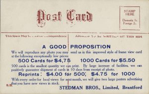
[4] Stedman Bros. frame view back (McLeod District Wheat Field).
In illustration [5], we see the front of the sample card; coincidentally also illustrating a scene from the Fort Macleod area. This one boasts of crop yields and may have been part of an advertising campaign sponsored by a local land company or chamber of commerce, such that only limited numbers and quality were required. Mike Smith’s guide to Stedman postcards lists about 140 postcards in the frame-view style, with many others having come to light since the book’s publication in 2011.
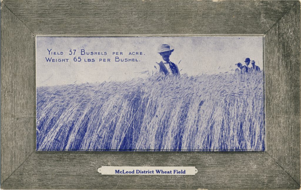
[5] McLeod District [Alberta] Wheat Field (Stedman Bros.).
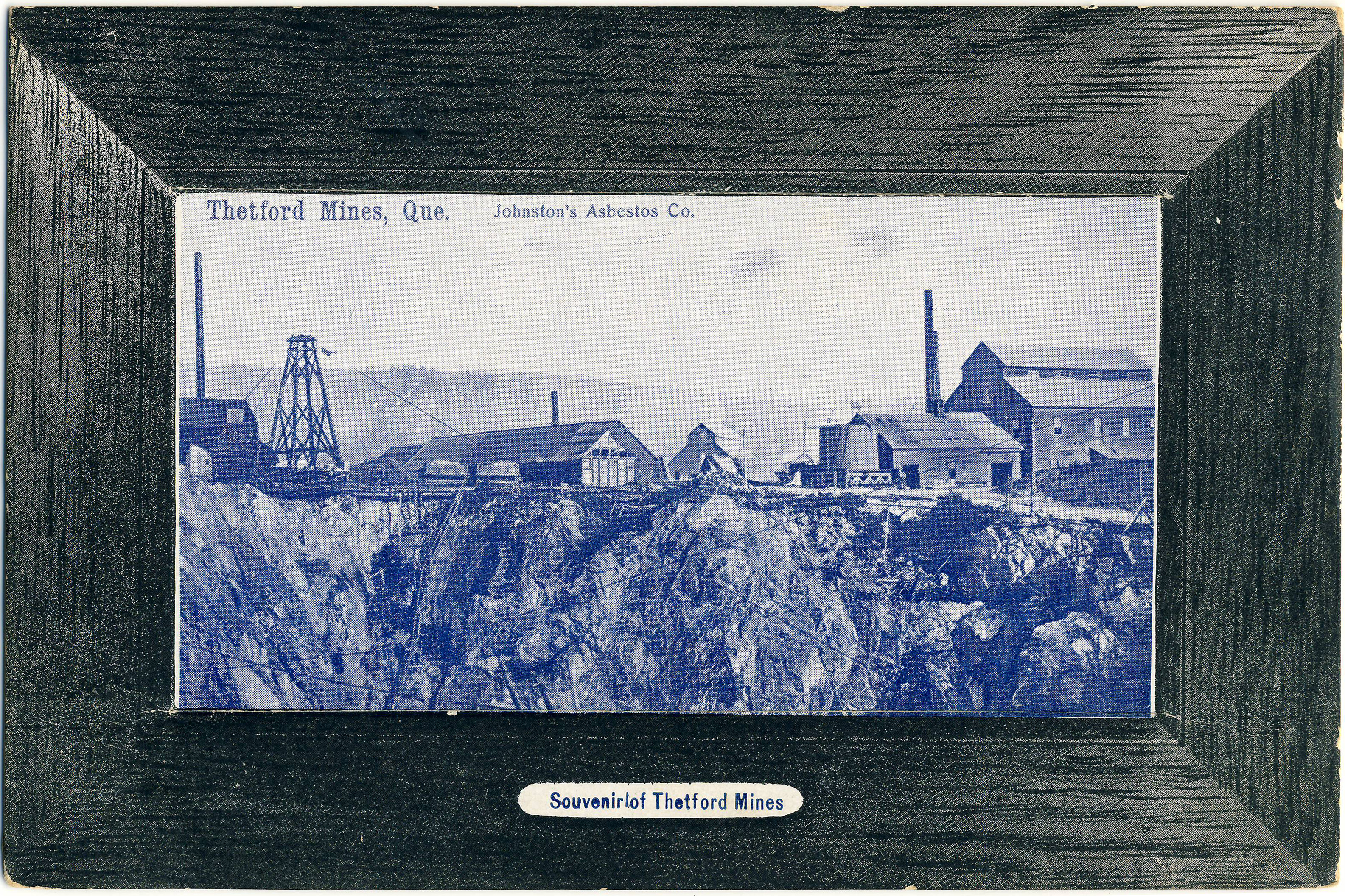
Another series of frame views that can easily be confused with the Stedman versions was published by Atkinson Bros. The example in illustration [6], showing the asbestos mine in Thetford Mines, Quebec, is highly unusual in that it came with a piece of red cellophane (not shown) that fit into a slot in the frame to make a sort of “flap” that (for some unknown reason) covered up the image. The Atkinson frame views are recognizably different from their Stedman counterparts in virtue of their glossier appearance and the light effects on the frame. (I find the Stedman “look” more authentic myself!)

[6] Thetford Mines, Que. – Johnston’s Asbestos Co. (Atkinson Bros.).
Another variety of frame view is the
“gold frame” of
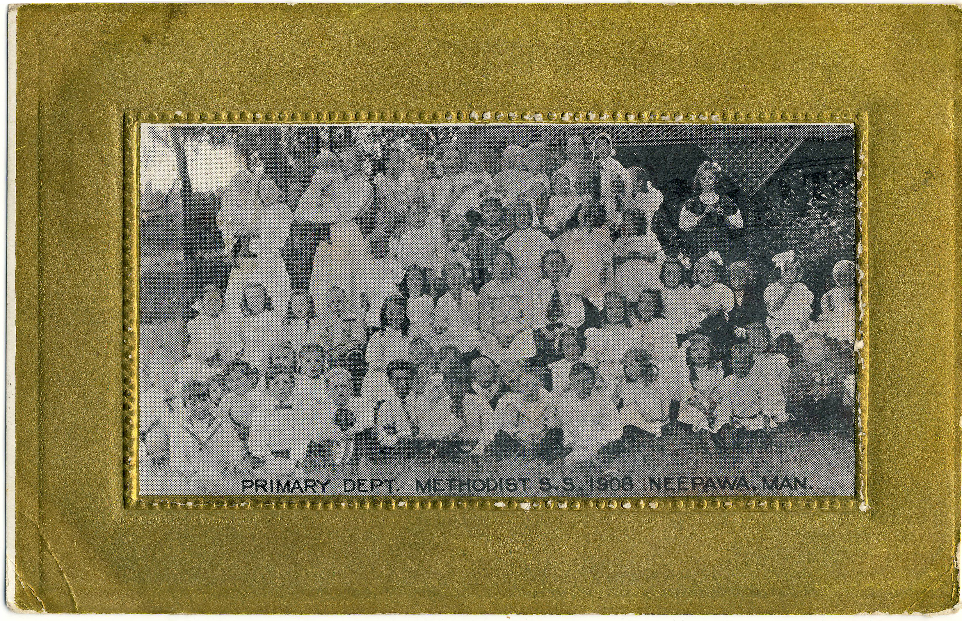
Pugh Manufacturing Co. These were also common in small-towns across Ontario and the West, with the example in illustration [7] being fairly typical. One can imagine that the Neepawa Methodist Sunday School produced just enough potential customers to make the production of the card economical. Examples such as this could also have been used for fund-raising.
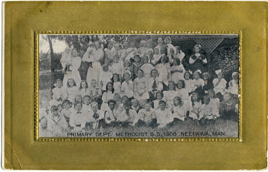
[7] Primary Dept. Methodist S.S. 1908, Neepawa, Man. (Pugh Manufacturing Co.).
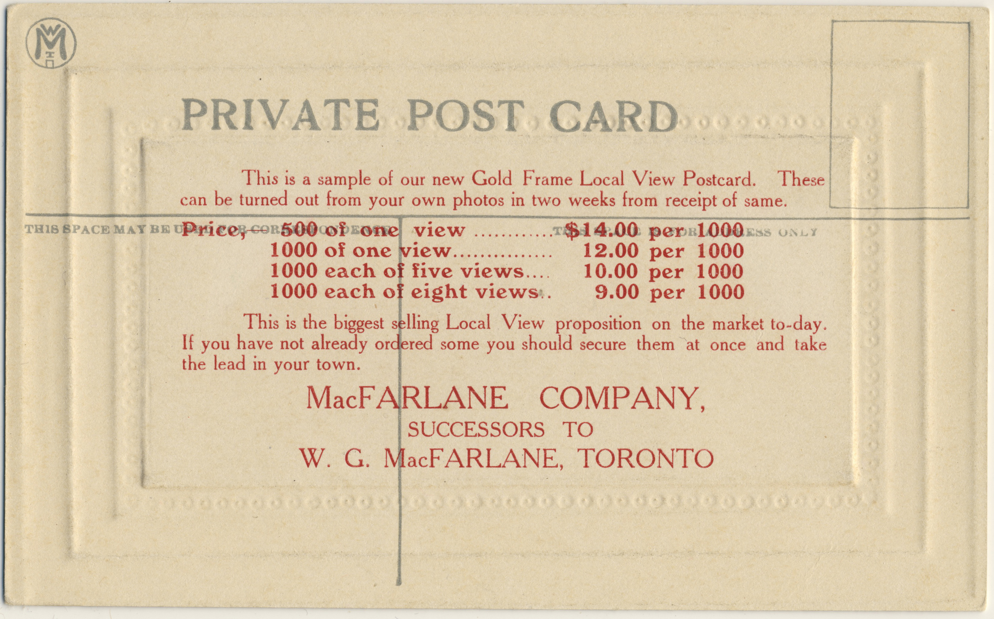
The W. G. MacFarlane Co., under its later name of (just) “MacFarlane Co.”, also got into the gold-frame game, but probably less successfully than Pugh, given the lack of examples in my own experience. Confirming this impression, Mike Smith’s MacFarlane guidebook (2010) lists only six examples. One reason that the MacFarlane gold-frame cards might not have succeeded is that they were very pricey for what you got … the sample back in illustration [8] shows that they cost much more ($12 per 1,000) than Stedman Bros. were charging for their two-tone collotypes (albeit perhaps not at exactly the same time).
In conclusion:
- Much of the fancy design that we see in Canadian patriotic cards, and even in the “frame views”, was an attempt to make up for the visual weakness of the half-tone images that they framed. The “frame view” cards were probably preferred for customer-supplied photographs because the rectangular space in them would “work” for just about any photo (while a more complex “frame”, such as Toronto Litho’s “horseshoe”, would require a photo of a particular shape and orientation to “fit” and thus was better suited to images that the company could choose itself).
- The half-tones were economically desirable because they could be cranked out in large or small quantities and at relatively low cost. Those were their advantages over collotypes, which involved a fussier process that was not easy to use for either small or very large quantities and generally had to be outsourced to sophisticated German printers. However, the collotype process produced a more realistic reproduction of photography than did the half-tone process, and was therefore much preferred on “ordinary” view cards in which the image took up an entire side of the card and needed to stand on its own.
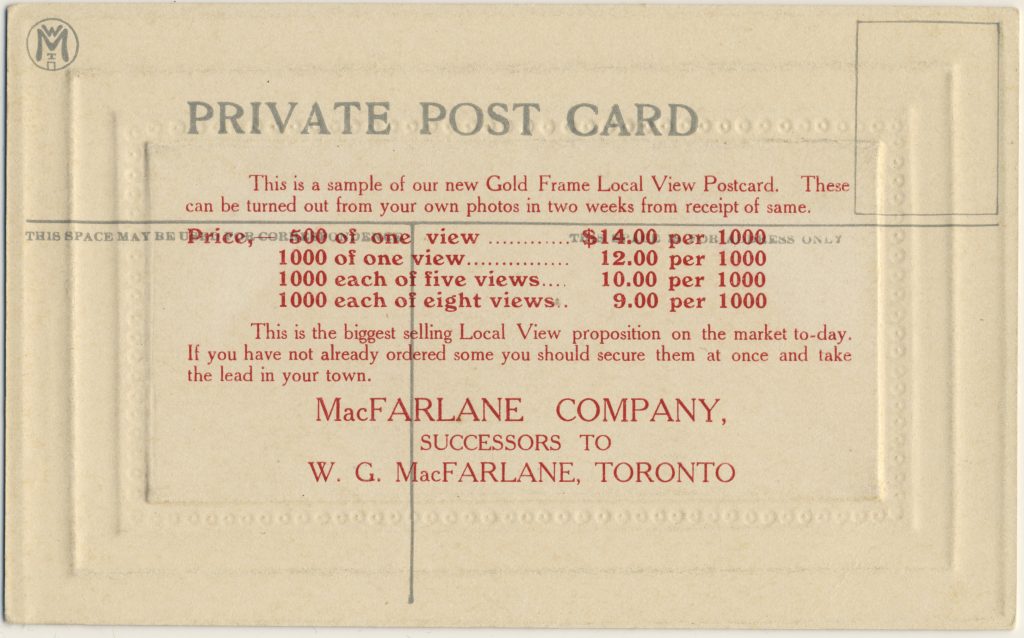
[8] MacFarlane Co.’s price list for its gold-frame halftone “local views”.