• INTERESTED IN VINTAGE POSTCARDS?

    Join us as a guest at one of our ZOOM meetings. Here’s our schedule of UPCOMING  MEETINGS which are monthly except for the summer.  Or, become a TPC Facebook friend to stay connected!

‘All About Postcards’ – in 1903.

Looking around the Internet, I came upon a brief review of one of the first postcard guides, published by Walter Scott in Leeds (England) in 1903. Appearing in The London Philatelist 12:140 (August 1903), the reviewer clearly draws the line at picture postcards. In his view, the study of government-issue postcards of the traditional picture-less type does constitute a branch of philately, but the collection of privately-produced picture postcards is something else — and, whatever it may be, it is not worthy of discussion in the august journal of the Philatelic Society, London! Alas — as with so many of the guides and magazines that accompanied the postcard boom of the early 1900s, no trace of All About Post Cards appears online. If anyone has seen the book, we would be interested in hearing about it.

The reviewer’s rather snide opening suggestion that the book might be considered more self-promotional than scholarly relates to the fact that its author, Scott, was himself a significant publisher of picture postcards, particularly of scenes from around Yorkshire. He does not appear to have been connected with the Walter Scott who published postcards in Barrie, Ontario, around the same time. Anyway, for your consideration, here is the review:

ALL ABOUT POST CARDS. By J. W. [sic] Scott. Scott and Wilson, 4, Reginald Mount, Leeds.

“THERE is nothing like leather,” cried the shoemaker, and it is only natural that Mr. W. J. Scott should sing the praises of the wares that his firm so largely deal in. The book in question, containing some seventy pages devoted to the post card — official and pictorial — and thirty-four pages of the firm’s price catalogue of the same, bears out our opening quotation. None the less, this little volume will be found to afford both interest and information to those who are interested in entires, the author acknowledging his indebtedness to Mr. W. B. Warhurst, the well-known collector and worker on the subject of entires, and to Mr. E. W. Richardson, the editor of The Picture Post Card. The letterpress, divided into nearly twenty chapters, devotes about equal space to both sections of the subject, but there is an obvious leaning on the part of the author to the “fascinating hobby” of pictorial card collecting. This is not an “interesting branch of Philately,” as are termed the regular post cards, and does not call for any comment in our columns. Of its amazing popularity we have had abundant evidence as previously recorded in our pages, and we see no reason why such charming and artistic mementoes, produced at a price that places them within the reach of all, should not have an abiding and brilliant future. As regards officially issued post cards, we should be only too glad if this branch of Philately could be reinvigorated and sustained; it has the merits of straightforwardness in issue, limits in numbers, and relatively small cost, and we should rejoice to see its adherents increased; their bulk is against them, but they are far more easily susceptible of arrangement than are envelopes, and they embrace far less stationery. They have probably been crowded off the philatelic stage by the ever-increasing quantity of new issues of all sorts, and it is to be hoped that by the aid of such excellent advocacy as that of Mr. Scott and others their popularity may be restored.

Advertisement for Walter J. Scott’s “All About Postcards” as published in a popular postcard collectors’ magazine.

(Andrew Cunningham)

Cataloguing Canada’s Real Photo Postcard Backs: A Modest Proposal

This is not a post so much as a proposal to begin the long-needed effort to catalogue the real photo postcard backs used in Canada. While most “Canadian” postcard blanks were manufactured by U.S. manufacturers, their inscriptions were often modified to suit Canadian tastes and postal regulations. Today, most people rely on Playle’s, a U.S. site, for information about dating RPPCs without recognizing that what that (excellent) site says might not apply to Canada. Also, it is much more useful to catalogue the entire back rather than just the stamp box — as Playle’s does –, since backs often differ even when the stamp box doesn’t (not to mention that the stamp box on many cards is covered up with a stamp).

With this in mind, and as a starting-point and/or place-holder, I’m uploading a Word copy (link below) of a classification system that I’ve used in cataloguing RPPCs from one company, the Winnipeg Photo Co. of Napinka, Manitoba, which produced RPPCs across southern Manitoba and Saskatchewan (as well as Alberta’s “Western Canada Ranching Series”) under a number of names from about 1905-1912. There are many other backs, of course, but this is at least a beginning. 

My medium-term intention is to turn this lowly blog post into a page on the TPC website, complete with illustrations of the back types. But for the moment, this will need to do (and may generate some discussion). 

WPC Appendix – Postcard Backs (classification scheme)

Below are examples of AZO backs 1(a), 1(b) and 2, from the attached.   — Andrew Cunningham


Voting Yes To Political Postcards

(1) Rt. Hon. H. H. Asquith, Prime Minister of Great Britain (1908-1916) in a Valentine & Sons card posted at Pakenham, Ontario on 6 November 1914.

(2) Christian Kloepfer of Guelph, Conservative candidate for South Wellington, 1904. Warwick Bros. & Rutter card no. 616.

Don’t know why, but now seems like a good time to talk about political postcards. Canadian postcards promoting candidates for office can be found from the early 1900s right through the 1950s and 60s — indeed, some candidates may still be using them today. Many postcards also featured leading political figures of the time, whether in a reverent tone or in a negative one.

Reflecting the fact that the postcard’s Golden Age roughly coincided with the Edwardian era (1901-1910), the use of political postcards seems to have peaked around the time of the 1908 federal election. A majority of early election cards date to that campaign; cards from the preceding (1904) and subsequent (1911) elections are significantly less common. I have never seen a postcard from the 1900 federal election, although there must surely have been some.

For an example of a political postcard, we can look to the U.K. as well as Canada – Figure (1) shows British Prime Minister H.H. Asquith (1852-1928) in a patriotic “Men of the Moment” series. In those days it was still something of a novelty to be able to see what the leaders of one’s country looked like, and postcard collectors of the time collected series showing public figures. Some series of images would focus on leaders of one party while others were more inclusive.

Canadian Campaign Postcards

In a Canadian context, Warwick Bros. & Rutter produced many cards of this type. Whether the company decided which politicians would appear, or whether it was more of a “pay to play” arrangement, is not known. There is certainly a fascinating mixture of well-known politicians of the time and men who are now extremely obscure figures — learning the stories of the latter is definitely one of the most interesting side-benefits of this type of collecting.

The election of 1904

In Figure (2), we have an early Canadian example. Dating from the federal campaign of 1904, this Warwick Bros. & Rutter postcard depicts Christian Kloepfer (1847-1913), “The Right Man With The Right Ideas” for the riding of South Wellington. Kloepfer, a Conservative, had been elected MP for the riding in 1896 but was edged out in 1900 by Liberal Hugh Guthrie (1866-1939), who narrowly defeated him again in the 1904 rematch (despite the appealing postcard). 

The election of 1908

(3) The Laurier-McIntyre postcard, with vignettes of the Liberal leader and the local MP printed on a pre-printed image of the original Centre Block.

As noted above, 1908 was the peak year for Canadian political postcards. Warwick Bros. & Rutter came out with a design in a popular format that featured headshots of a party’s national leader and a local candidate. Not a firm to play favourites, Warwick created election postcards in this format for both the Liberals and the Conservatives. Figure (3) shows a Liberal example, with Prime Minister Sir Wilfrid Laurier (1841-1919) featured alongside Gilbert H. McIntyre (1852-1913), MP for the Ontario riding of South Perth.

The prosperity that the Laurier Liberals wished to uphold as they sought a fourth term in office in 1908 was the theme of a series of anti-Conservative postcards featuring illustrations by popular cartoonist Lou Skuce (1886-1951), then of The Ottawa Journal. Skuce’s characteristic style, familiar from his many hockey-related illustrations, was the opposite of minimalist — highly detailed and witty.

In Figure (4), Jack Canuck — the personification of Canada — chooses the company of the dapper and dignified Laurier, who appears as the very picture of calm assurance alongside an image his signature project, the Grand Trunk Pacific Railway. Far behind, the Conservative leader Robert Borden (1854-1937) struggles to catch up, dragged along by Tory stalwart George Foster (1847-1931) invariably depicted in these cartoon images as the power behind the throne of a hapless Borden (replete with Mephistophelean beard). 

(4) The steady leadership of Sir Wilfrid Laurier resulted in an uninterrupted tenure of 15 years as Prime Minister of Canada, a record unequalled before or since. However, the Grand Trunk Pacific, enthusiastically promoted by his government, ultimately proved to be one railway too many for western Canada.

Thematic Political Postcards

In addition to political parties and candidates, political subjects were frequently the subject of postcards. Laurier’s promotion of Reciprocity (free trade) with the U.S. was the dominant political issue of the era. A series of cards issued in the 1911 campaign, in which Laurier was finally defeated by Borden’s Tories, featured illustrations by Newton McConnell (1877-1940) of The Toronto Daily News. Figure (5) is a typical example, playing to longstanding Canadian suspicion of American motivations. 

The reciprocity debate

(5) This anti-reciprocity cartoon by Newton McConnell, likely produced around the time of the election of 1911, also features the latest in technology, the long-distance telephone call.

Another reciprocity postcard is shown in Figure (6), where the western provinces are depicted as showing leading Manitoba Liberal Clifford Sifton the door. Distributed by The Montreal Witness, the card is referring to Sifton’s break with the Liberals over the reciprocity issue in 1911. While he retired from politics at that point, he provided a vital endorsement to Borden’s successful Conservatives. The cartoon is signed by “Phil Drew”, a name (perhaps a pen-name) that appears to have been associated with editorial cartoons in other Canadian papers around 1912.

(6) Phil Drew cartoon from The Montreal Witness, 4 March 1911. Three postcards are known in this series, which appear to have been marketed by Witness publisher John Dougall to be sent out en masse in hopes of influencing political discourse.

Prohibition (“Banish the Bar”)

Other issues of the day were also dealt with extensively, including the women’s suffrage movement, which appears primarily in English and American cards, and the related temperance movement, which is better represented in Canada. The Warwick Bros. & Rutter card illustrated in Figures (7a-b), which features the Canadian “Banish the Bar” slogan, concludes our brief excursion into the political realm. We’ve only scratched the surface, however; a much wider range of political postcards may be found in the two volumes of Mike Smith’s The Canadian Patriotic & Heraldic Postcard Handbook 1897-1945 (2013-14).

(7a) Warwick Bros. & Rutter printed this “Banish the Bar” message on one of their standard “patriotic” card blanks (normally a photo would have been printed into the rectangular area). The “Banish the Bar” slogan was also overprinted on the back of the card, in order that there could be no mistaking the message.

(7b) The back of the Warwick card, with the BANISH THE BAR overprint. Likely circa 1905.

Birth Of A Cliché, and Reflections on Postcard Writing Styles

Many books on postcard themes have titles that include the phrase “Wishing You Were Here”, undoubtedly chosen because those four words evoke postcards as much or more than any others. And yet, as other collectors may also have noticed, the classic clichéd postcard message — which in its fullest form runs, “Having a good time. Wish you were here”– is actually not found with any frequency on old postcards. Truth to tell, I’ve never seen those exact words, even once, among the thousands and thousands of postcard messages that I’ve seen. That’s not to say that I don’t have a few postcards with variations on the “Wish you were here” part, but I’ve never seen anything approaching the whole thing.

My longstanding conclusion, so far as I’d given the matter any thought, had been that “Having a good time. Wish you were here” must have become a go-to message for hurried postcardists well after the Golden Age (pre-1920) period that is the focus of my and many other collections. Well, I’m pleased to be able to say that that analysis might not be entirely true — it appears that I gave up too soon. On the reverse of a recently acquired (and very early) Canadian Valentine & Sons card — “A Young Enthusiast on the Humber, near Toronto”  (no. 100,111) — there is, lo and behold, this simple message from “Leah”, written in the late summer of the year 1906:

Having a good time here. Wish you were here.

But for the first “here”, my prayers would have been entirely and perfectly answered, but (not being a fussy type) I think I can still declare victory. The greatest cliché in postcard history can in fact be traced to the earliest years of the fad. The mysterious “Leah”, who tantalizingly enveloped her own uncommon name in mysterious quotation marks, thus enters the ranks of the deltiological immortals.

The elusive message, finally found (almost!). Did Miss Maggie McNulty appreciate the significance of what she’d received? Did Leah’s sentiment sound fresh and clever to her, rather than hackneyed? Wish we were there to find out!


The postcard image is worth noting in its own right. It’s a charming example of an uncommon early style of Valentine & Sons postcards — a simple, uncoloured collotype.

Early 20th century writing styles and conventions, as commonly seen on postcards

That brings to mind a question about what we learn from the letters on early twentieth century postcards, in general — not from the content of the messages themselves, but from the handwriting, spelling, grammar, forms of address and so on. Here are a few examples that I’ve noticed over the years:

  • The very common use of the colon-dash (or maybe colon-hyphen) after the salutation, as “Dear Maggie :-” — this has totally disappeared but must have been a staple of children’s lessons around the turn of the 20th century;
  • The tendency to omit punctuation almost entirely from brief messages. This is not simply a function of being poorly educated: punctuation is often lacking even in notes penned by writers who spelled well and were clearly men or women of some sophistication. Commas were barely used and anything more esoteric than that — even a question mark — was quite unusual (as was the use of paragraphs);
  • It’s unusual for there to be even a P.O. box number in small-town addresses until around 1910 or after – almost always did the name of the town suffice;
  • On the odd occasion that we still write letters, and also in emails, we often write “Dear Mom” and “Dear Dad” — but in the Golden Age days it was equally common to include lateral relationships like “Sister” or “Aunt” in the salutation in exactly the same way, without appending the addressee’s given name. Other than for direct forebears (parents and grandparents), we have lost that reluctance to “first-name” people;
  • Grown children sometimes signed letters to their parents in a rather formal fashion, using their full first and last names, which would seem odd to us today. 

What other bygone conventions have you noticed in postcard letters? We’d be glad to get your examples and/or to hear about any other early examples of postcard messages that say “Having a good time; wish you were here”, or something close to it.  

(Andrew Cunningham)

Postcards and the Music of the Great War: Seeing the Dear Old Home Again

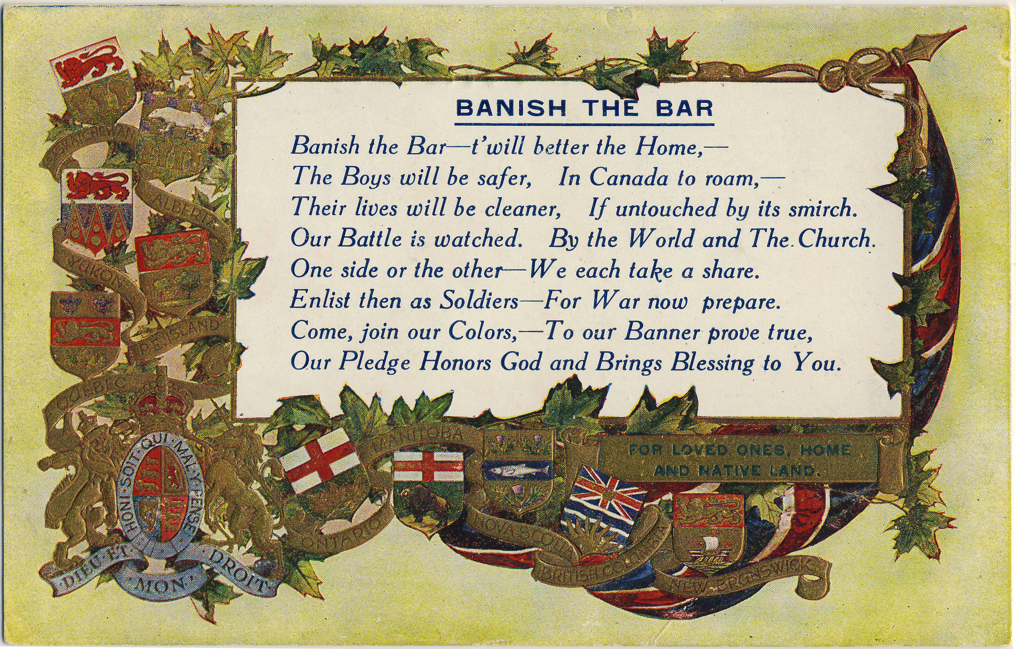
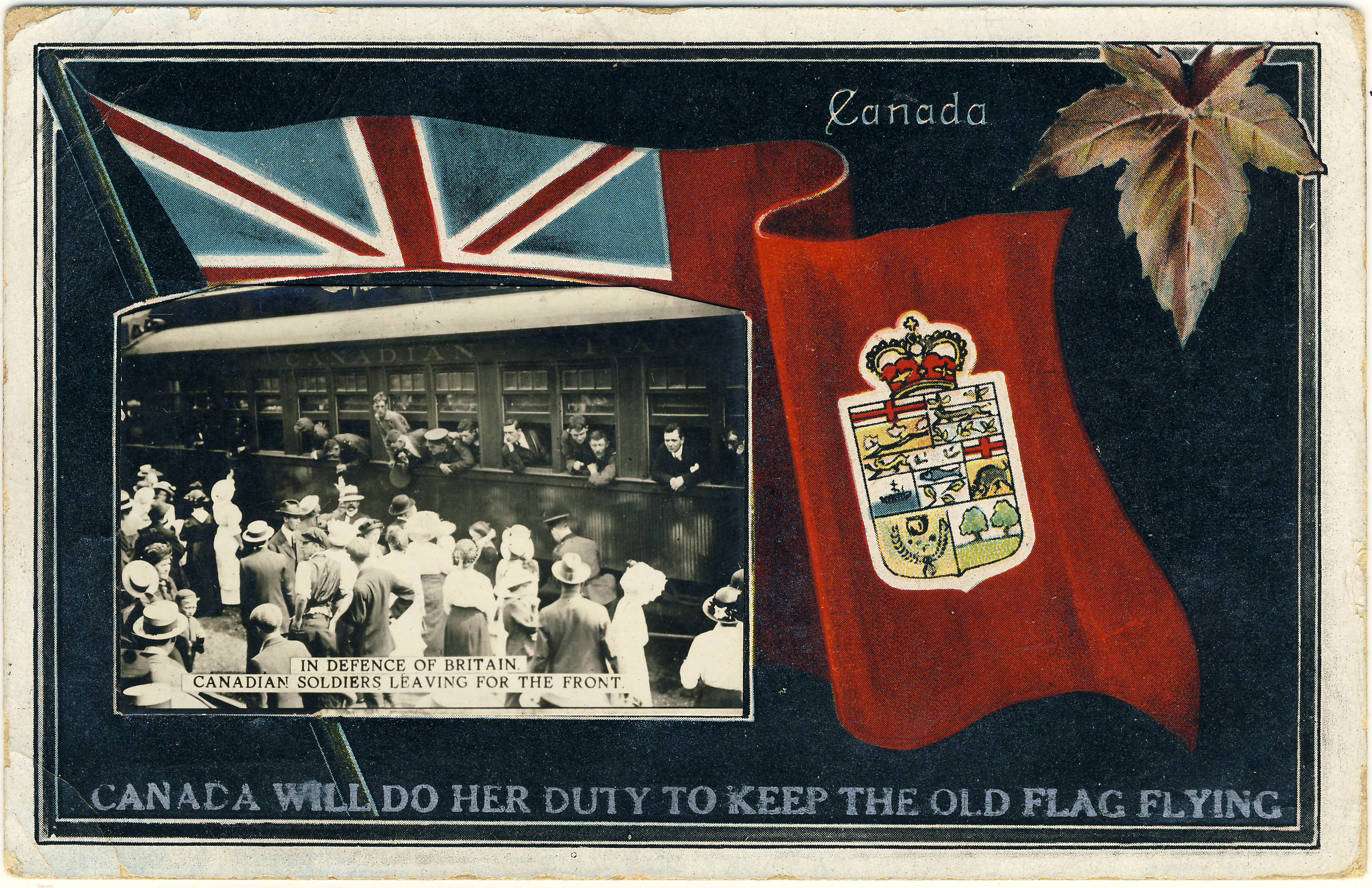
The First World War was among the first to be fought in the era of the popular song, which had been born in the music halls and came of age with the phonograph. Sentimental, romantic, humorous and religious tunes form a significant part of the war’s cultural legacy and are well known to collectors as the themes of countless series of postcards that were sent by and to the soldiers.

Typically, early twentieth-century “song” postcards were produced in series of three or four, with a different verse of a popular tune (or well-known hymn) printed and illustrated on each. The foremost publisher of these cards was Bamforth & Co. of Holmfirth in Yorkshire. This source estimates that 600 sets of song postcards were published by the company between the early 1900s and the end of the war. As the linked article notes, once war was declared, Bamforth reissued some of its song sets with new military-themed illustrations.

In this post we’ll look at four complete song sets.

I Want To See The Dear Old Home Again

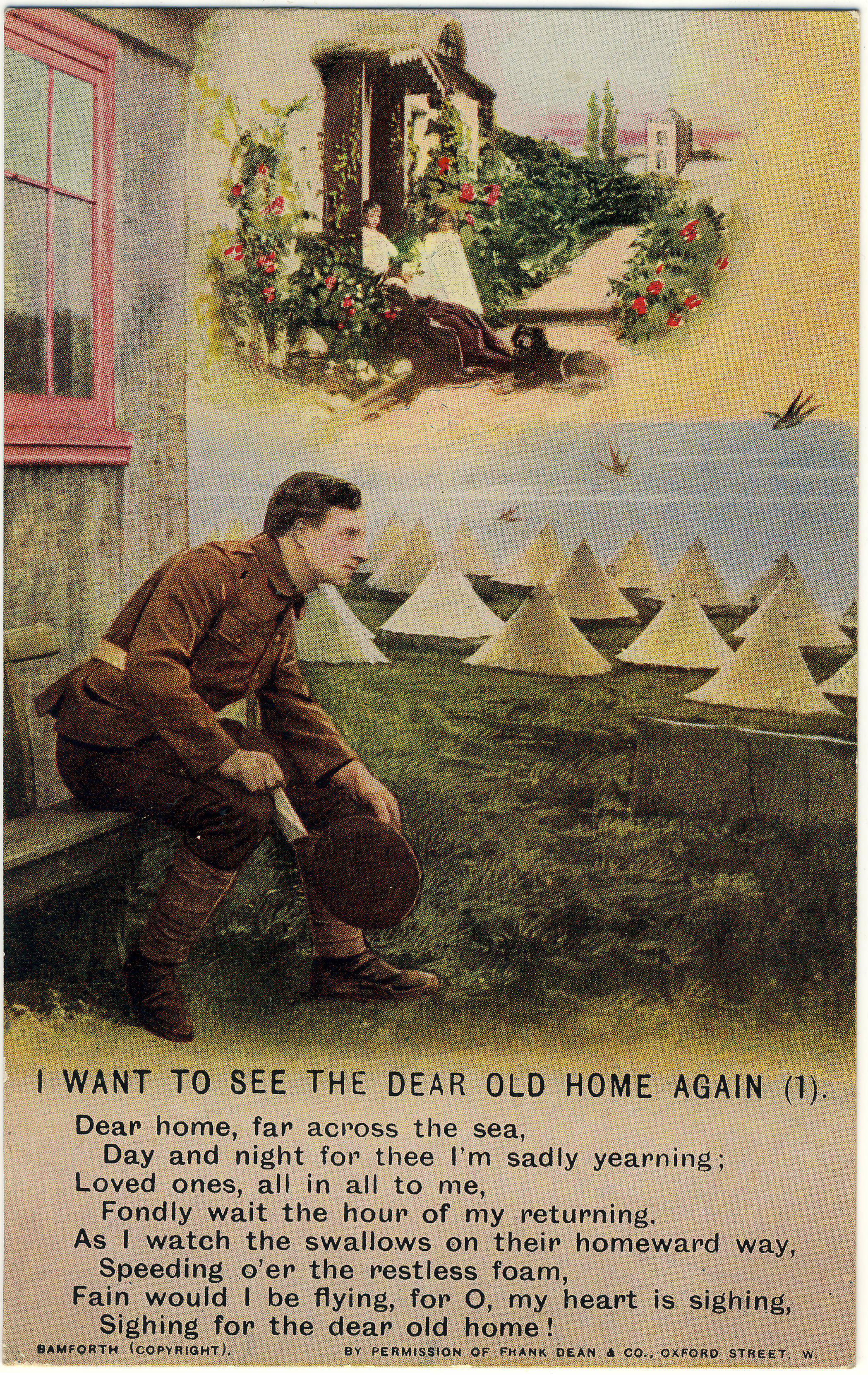
In the first scene, the soldier dreams of his home, his young children and the faithful family dog.

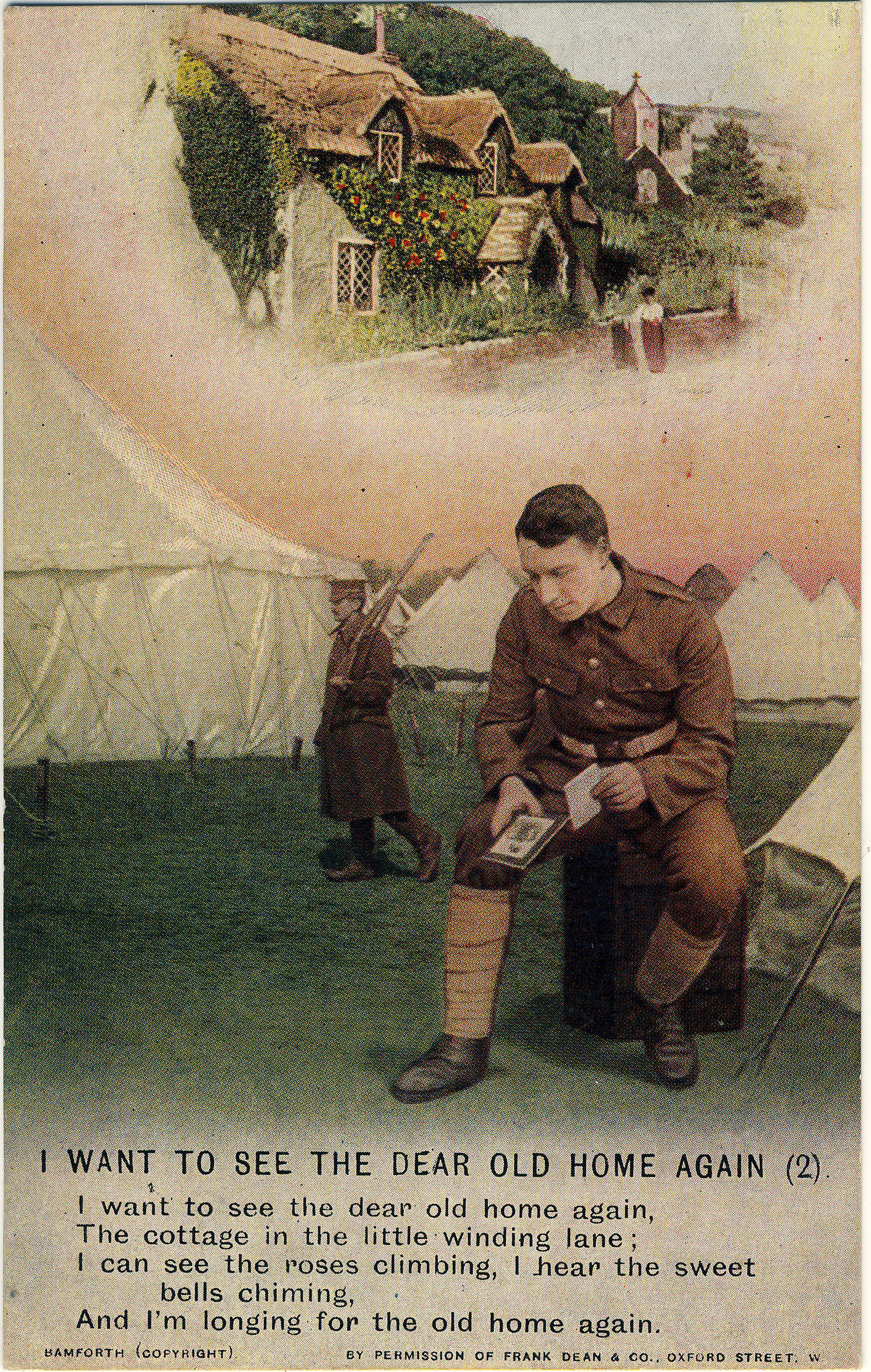
English village life is emphasized in the second stanza, complete with thatched cottage and chiming church bells.

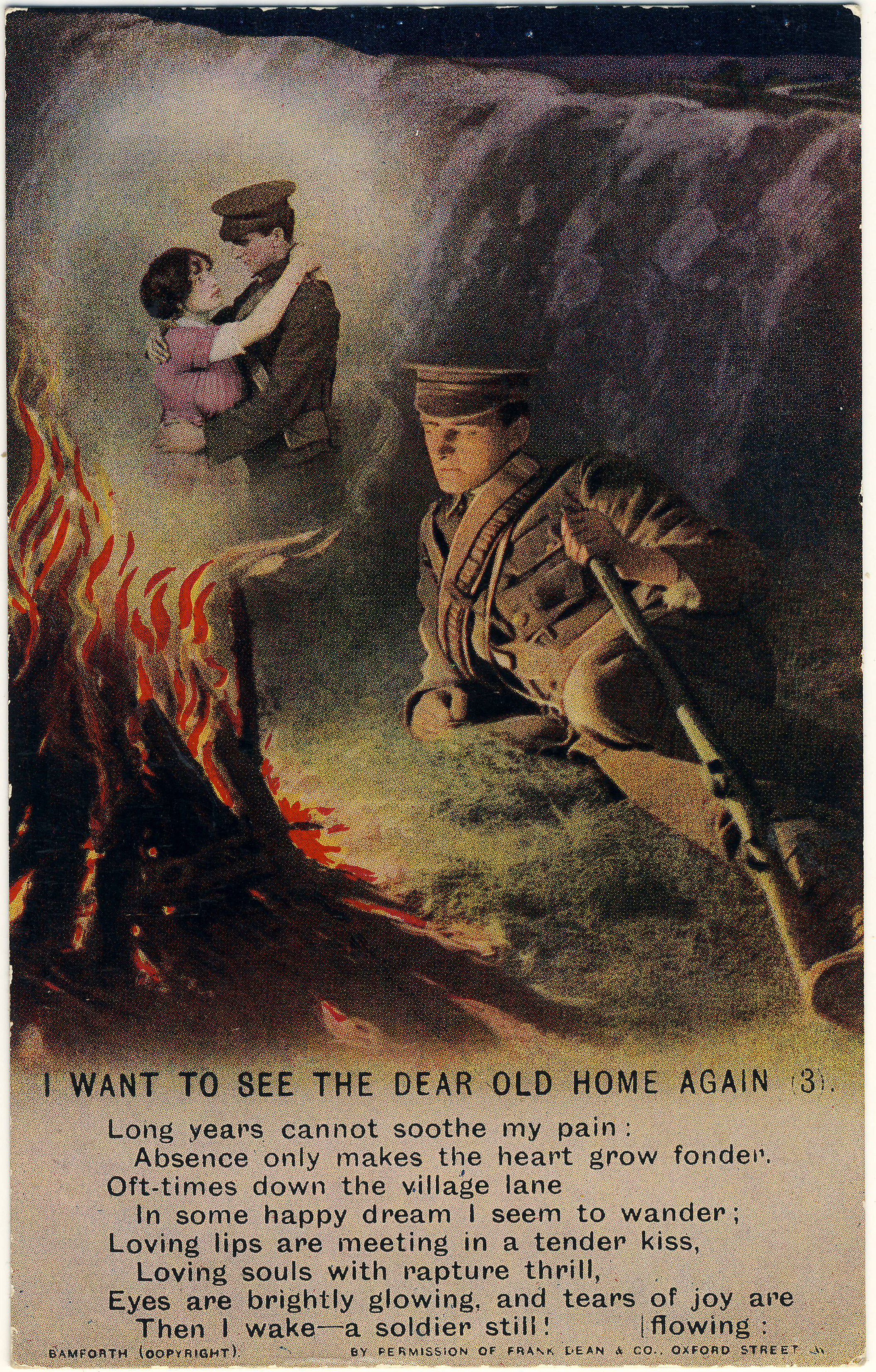
Finally, with all that out of the way, we come in the third postcard to the most heartfelt loss of all, experienced most strongly when he wakes “a soldier still”.

The first song, “I Want To See The Dear Old Home Again”, dates from around the year 1900, although no recordings of it appear to be online. It was written by Frank Dean (1857-1922) under the pen-name “Harry Dacre”. Dean/Dacre is well remembered today for his 1892 composition “Daisy Bell”, one of the most enduring pieces of early popular music, with its famous refrain “But you’ll look sweet / upon the seat / of a bicycle built for two”. For its part, “I Want To See The Dear Old Home Again” is in the voice of a soldier off on some Imperial sojourn, and recounts his dreams of home and postponed love. The final line, “Then I wake — a soldier still”, would have resonated with most of the soldiers in the seemingly interminable conflict.

The three Bamforth postcards are numbered 4800/1, 2, 3 and were produced, as noted, with the permission of Frank Dean & Co. in London.

This set of postcards — like the other sets we will look at — was sent by a soldier, likely a Canadian in France. They are apparently from the First World War period although no specific mention is made of any dates or wartime events. Unfortunately, information about the soldier and his experiences was apparently left for the letters that accompanied the postcards. Without the letters, it hasn’t been possible to identify the sender.

The message the anonymous soldier has written on the backs of the three cards is as follows:

(1) This card for mother — more to follow. This card speaks my sympathy and the set will follow in future letters so be learning and singing this one till more comes; they are very nice if you … set a air at [to?] sing them by. DADIE. (2) Dear Mother, my sentiments are in this card. In my dreams I can see it all — home sweet home, but smile smile all the while — it’s some trial, but the Better will come and I’ll be going to my dear old friends at home. DADIE to MA. (3) For mother. This is the last of this series and I am a soldier still. There is more of these series. I send more for a change. Hope you enjoy my silly ways. But if I stay for years my love is for my dear old home and last of all MOTHER, only mother. From DADIE. Over the mighty deep.*

(*Note: I have added some punctuation and made other minor typographical and wording changes for the sake of clarity in the extracts from this soldier’s letters in this post. The original has virtually no punctuation, as was common in postcard messages of the day, and contains a number of abbreviations and many idiosyncratic spellings.)

Fight the Good Fight

The second Bamforth series includes four postcards, numbered 4870/1, 2, 3, 4, each illustrating a stanza of the Victorian hymn “Fight the Good Fight”, with words by the Rev. John S. B. Monsell (1811-1875), an Anglican clergyman in Ireland. The first card, shown below, depicts soldiers standing before a priest near to the front lines, as a biplane passes above them. There are explosions in the distance, presumably at the front line. These are the evidently the final words of spiritual encouragement that the men will hear before entering the fray. The remaining three cards focus on just one of the soldiers, depicted first in prayer, then in great despair, and at the last (see below), in the arms of Christ — the artist leaving it somewhat unclear whether our subject has been struck and is dying, or whether he is only in need of religious comfort on account of what he has had to endure. 

The same serviceman sent the “Fight the Good Fight” set to his family, but in this case he wrote only the names of his wife and (presumably) children on the backs of the cards: “Ma” (2 cards), “Albert” and “Cecilie”

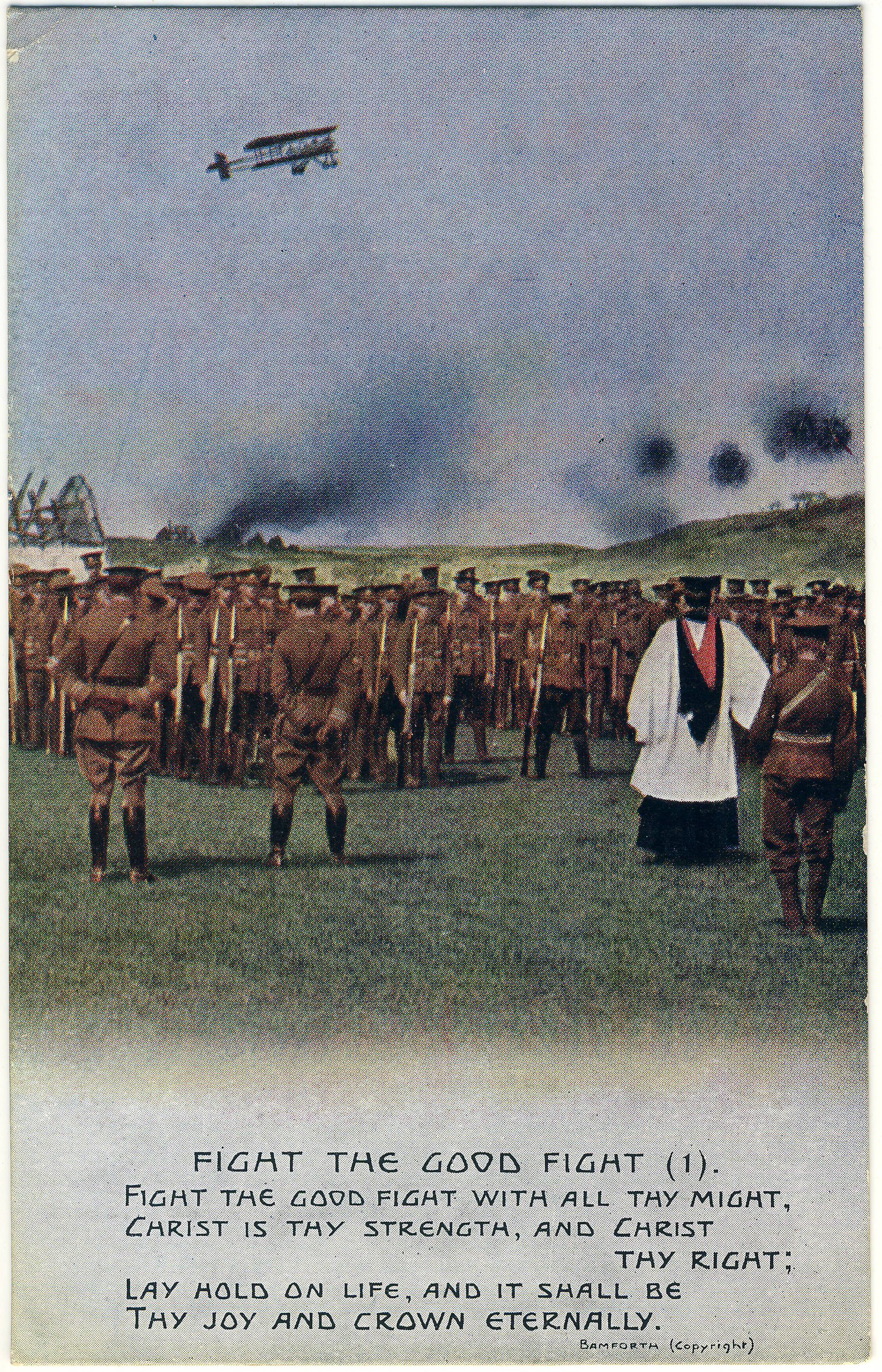
The men at an informal service prior to entering the fight that rages behind them.

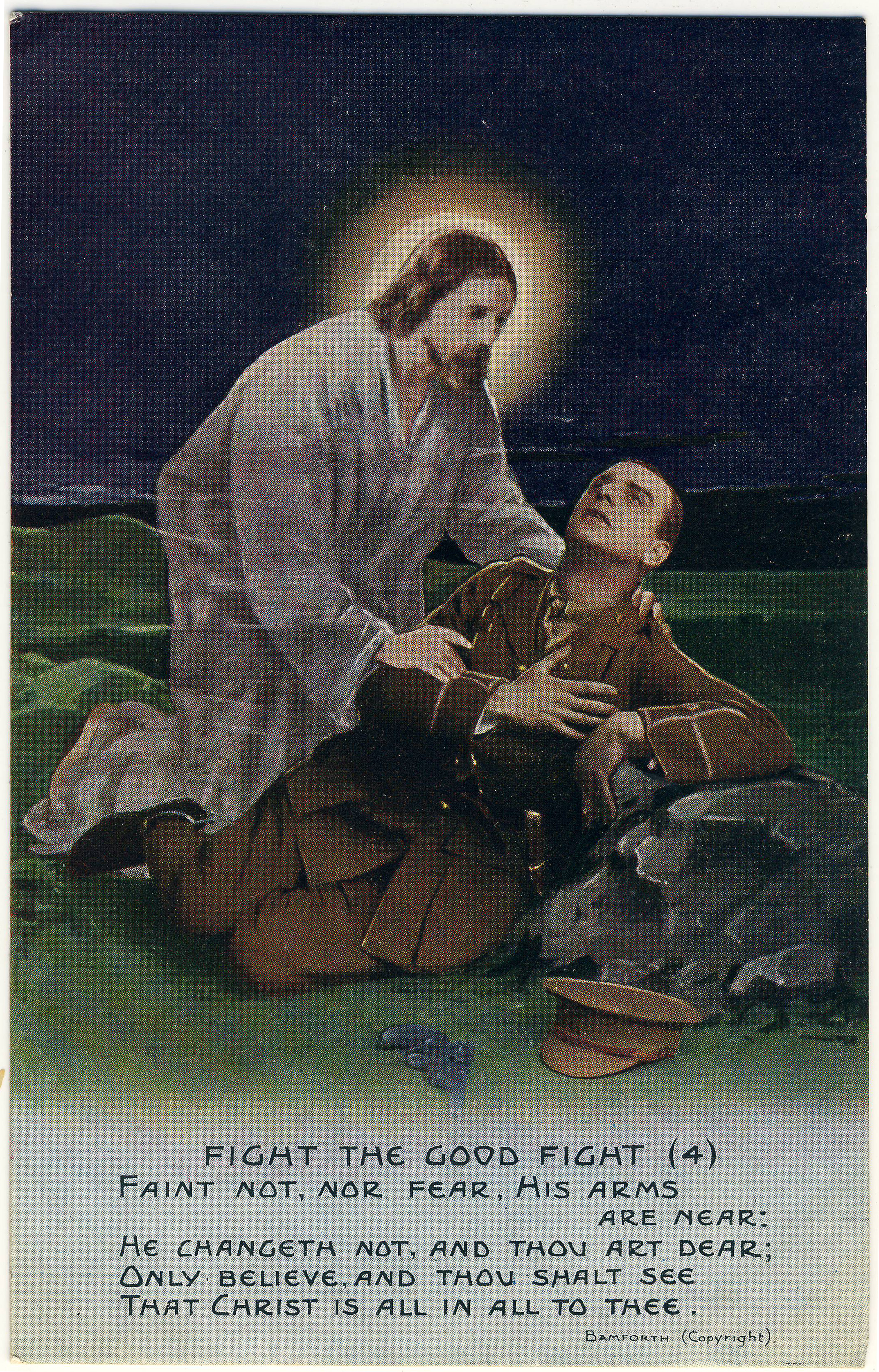
The fourth postcard, interpreting the hymn’s closing lines.

A modern interpretation of the piece, which is set to the tune “Pentecost” (1864) by William Boyd, is provided on YouTube by the choir of Brigham Young University‘s Idaho campus. A simpler version, together with the sheet music, is available via hymnal.net

God Keep You Safe

In contrast with the previous examples, “God Keep You Safe” appears to have been composed during, and with specific reference to, the First World War. Only a little information is available online about this piece, and unfortunately there is nothing to give us an idea of how it sounded. This catalogue entry from Australia’s national archives, which presumably hold a copy of the sheet music, says that it was written by one Kate Hill Salter, with music for piano accompaniment by Edward Cuthbertson. An online catalogue that is selling a copy of the score gives the name as Kate Hitt-Salter (not “Hill”), and a check of ancestry.com does reveal an Alice K. Hitt-Salter being married to a John C. Wood in Dover in 1931. Whether “Alice K.” is Kate or a relative is hard to say, but at least we now know that there was someone with the unusual surname “Hitt-Salter” out there, even if she seems to have made no mark on history other than this half-forgotten composition (half-forgotten but for deltiology, that is!). Nothing at all turned up online for Edward Cuthbertson. 

Unlike the others, this song takes the point of view of the soldier’s wife, left at home to worry about the fate of her “dear heart”, lamenting: “The hours apart from thee / Drag by on leaden, lifeless wings”. This was undoubtedly a sentiment shared by millions of family members across every one of the combatant countries. The three postcards are numbered 4960/1, 2, 3, and sport fancier lettering than is found on the other Bamforth series discussed here. Card 3 is particularly beautiful, with the soldier’s round portrait cleverly placed on the wall by the artist in place of a “thought bubble” (as appears on Card 1, also shown below).

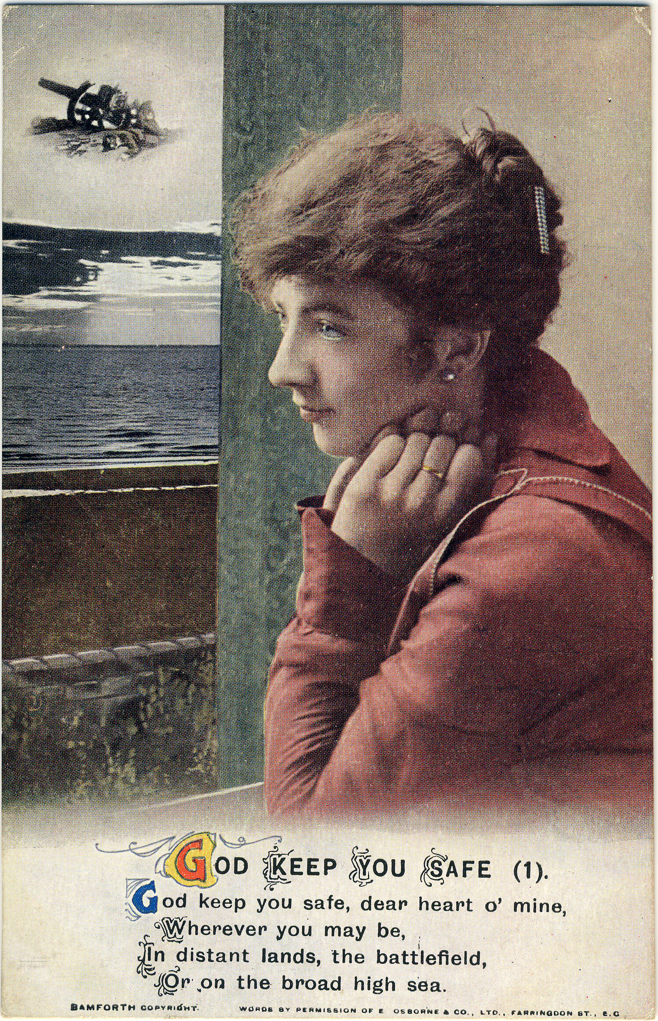
Imagining the battlefield.

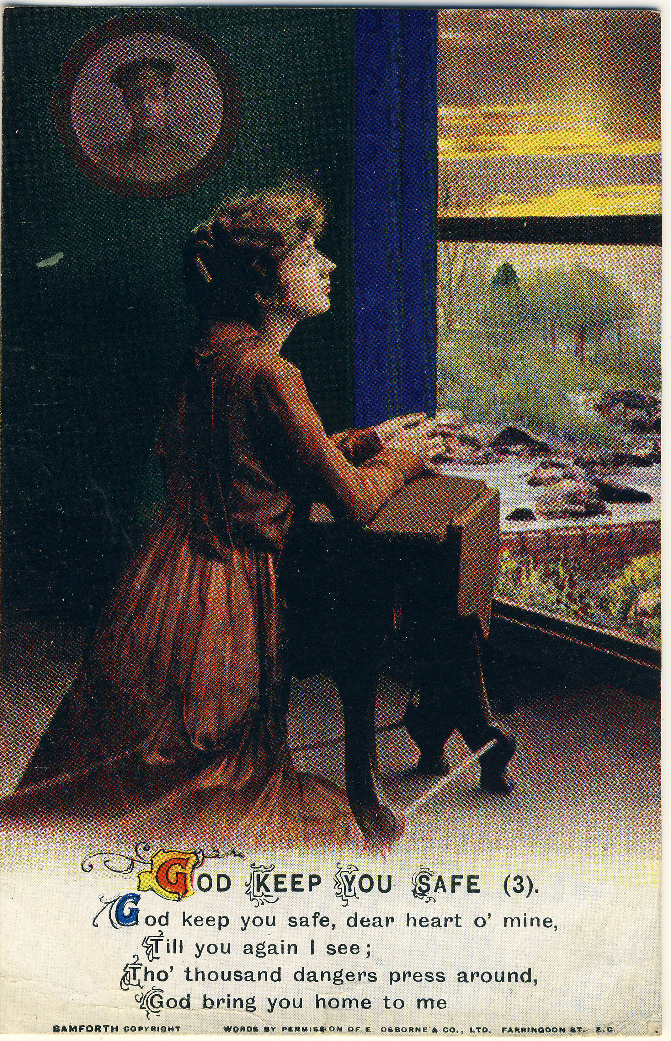
The conclusion of “God Keep You Safe”, by Kate Hitt-Salter.

The sender again writes a long letter across the backs of all three cards, concluding as follows: “This is the last series. Don’t you think it’s nice and very appropriate to its calling? I have about 30 or so of “odds and ends” cards to send anything I write on [i.e. that he can use anytime he needs to write something]. The cards can be raffled off. These cards have come from all across the Dominion — a very large collection.”

Little Grey Home in the West

The final song set consists in four cards illustrating the ballad, “Little Grey Home in the West”. Of the songs presented here, “Little Grey Home” has the most tenuous thematic connection with war. It’s really just a sentimental piece. The lyrics were by one D. Eardley-Wilmot (a member, it appears, of an aristocratic family by that name but about whom little else is known), with the tune by the famous British composer Hermann Lohr (1871-1943). Recorded as early as 1912 by Peter Dawson (and also by John McCormack and others) it appears in newspapers across North America and the U.K. as a massively popular recital piece in 1914 and afterward. The Dawson version as it appears on YouTube uses the four Bamforth postcards as illustrations. Since the song isn’t really about a soldier, the illustrations on the cards simply show the soldier thinking of the sentimental scenes that the song recalls. Much like “I Want To See The Dear Old Home Again”, “Little Grey Home in the West” works its way up to the thing the singer misses most: his true love — or, here, “the two eyes that shine just because they are mine”. 

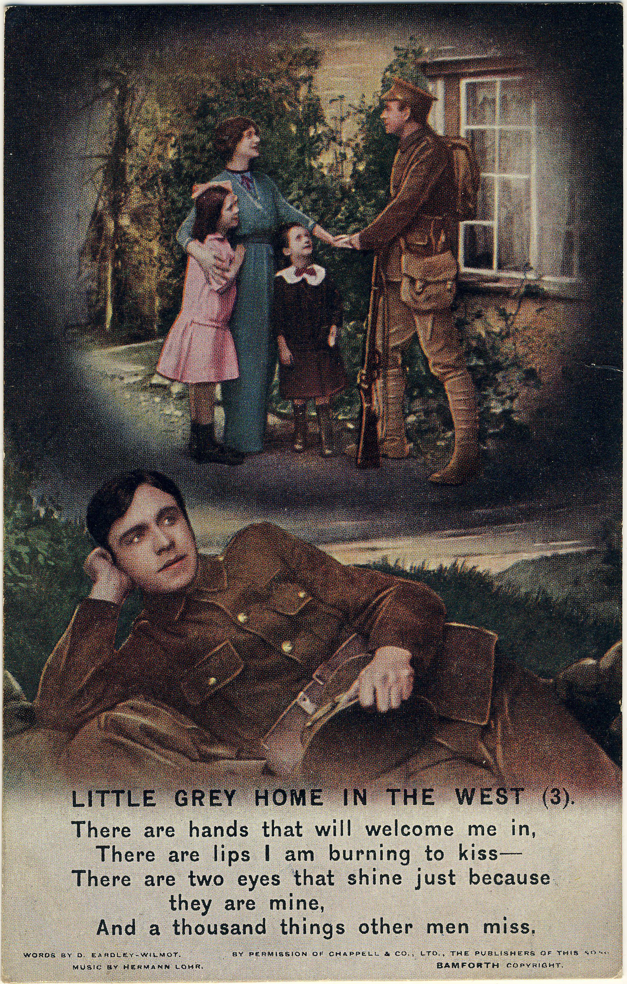
There are lips I am burning to kiss … And a thousand things other men miss.

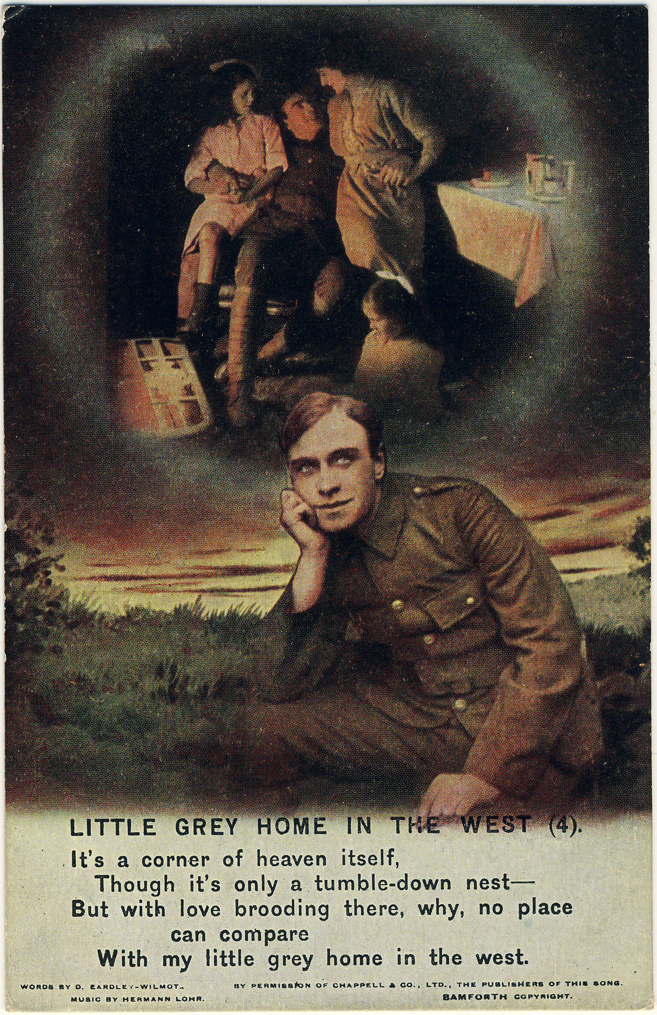
The fourth and final card in Bamforth series 4871.


Card no. 3 seems to have hit home with our anonymous soldier, who writes on the back: “Dear Mother, This shows the mental telephone working between the soldier and the friends at home and the other thousand things he misses, but we must all keep smiling — no coldness out here –, and our wives at home and everybody smile. There is no use getting disordered as it is no use and only makes matters worse, don’t you think so? DAD”

Not all soldiers were quite so enthralled by the sometimes mawkish sensibilities of the songs. Parodic revisions of lyrics were common as the Great War servicemen creatively attempted to “keep everyone smiling”. On 22 April 1915, the Montreal Gazette reported on a version of “Little Grey Home” of which the librettist was a Captain Frost of the 14th Montreal Battalion. In his possibly somewhat more realistic take, the song went as follows:

There’s a little wet home in the trench,
That the rain storms continually drench,
There’s a dead cow close by,
With her heels in the sky,
And she gives off a beautiful stench.
Underneath us in place of a floor,
There’s a mess of cold mud and some straw,
And Jack Johnsons tear,
Through the rain-sodden air,
O’er my little wet home in the trench.

(Andrew Cunningham)


The Canadians Are Coming! Postcards of Our Great War Soldiers

As the hundredth anniversary of 11 November 1918 — the end of the Great War — approaches, we will take a look back at what postcards of the time tell us about the four long years that took such a toll on the people of Canada, Newfoundland and many other countries. Coincidentally, the war years brought down the curtain on the “Golden Age of Postcards”; while the medium continued to be popular, the postcard industry as a whole no longer exhibited the vitality and variety of its pre-war heyday.

Keeping the old flag flying

Postcards mailed in the summer of 1914 can provide us with insights into how ordinary people in the sedate turn-of-the-century world responded to the sudden intrusion of war into every aspect of life. Exhibit 1 is the Stedman Bros. “patriotic” shown below, which depicts departing Canadian soldiers while assertively proclaiming: “Canada Will Do Her Duty To Keep The Old Flag Flying”.

Stedman Bros. no. 2539, with an added photographic image.

On turning the postcard over, we find that it was posted at Toronto on 13 September 1914, barely a month after the state of war officially began. In fact, things had unravelled so quickly that the Canadian National Exhibition had no opportunity to re-think its 1914 theme of “PEACE YEAR”, neatly incorporated into the special CNE “slogan cancel” that we see here.

Verso image of the card as posted to Wimbledon, Surrey on 13 September 1914.

One might wonder how Stedman Bros. managed to print up World War I cards such as this so quickly. The answer is that they didn’t, really — this example, numbered S.B. 2539, was in fact an old Stedman card on which the small photograph of the departing soldiers was pasted (the card originally featured a coloured illustration of an R&O ship). To complete the metamorphosis, the caption about “doing her duty” was overprinted on the image in silver lettering. (Indeed, since Stedman Bros. are thought to have exited the postcard trade in 1914, it is possible that the refurbishment of these cards as World War I souvenirs was someone else’s handiwork.)

The message itself is, of course, another place where we might hope to find  reference to the big news from Europe. However, even though her words were destined for England, the writer didn’t acknowledge that anything out of the ordinary was going on. By the end of her note she had apparently run out of things to say — or so we might surmise, given that she filled the rest of her space in the time-honoured way, with bland observations about the weather!

The 79th Cameron Highlanders

The story of the Queen’s Own Cameron Highlanders of Canada is well told on the regiment’s own website. The Camerons, from Winnipeg, were the first Highland regiment in the West, having been founded on 1 February 1910. It is unlikely that the original members would have anticipated the sacrifices that they and their mates would be required to make within just a few short years. Even at the Decoration Day festivities on 10 May 1914, as depicted in the Maurice Lyall real photo postcard below, it is unlikely that the kilted marchers imagined that before the summer was out, some of them would be halfway across the country, and then halfway around the world, fighting for real.

10 May 1914. The building in the background was the University of Manitoba. The Broadway Armoury stood directly across the street, on the site of what is now the Manitoba Legislature.

We encounter the Camerons again on the Valentine & Sons postcard below (106,330), which may well have based on a photograph taken the same day (and perhaps by the same photographer) as the postcard above. Posted on 22 September 1914 by a Royal Bank of Canada employee to a colleague who had evidently been transferred to the Bank’s Vancouver branch, its message does refer, indirectly, to the War:

To Mr. J. A. Noonan, Royal Bank, Campbell Ave., Vancouver, B.C.:

“Hello Mr. Noonan, Just to remind you we have not quite forgotten you in the exciting times we have been having. Glad to hear you have not much to do but don’t get too fond of doing nothing and forget all about Winnipeg. Every body happy in the R. B. of C.”

Valentine & Sons card showing the soldiers standing on Broadway, looking out from the Drill Hall.

The 79th trained first at Camp Sewell, near Brandon, and were then sent out to Valcartier, Quebec, just outside the city of Quebec. The following “John E. Walsh” postcard was acquired simply as a handsome Quebec “patriotic” but turned out to have some interesting Cameron Highlanders content on the reverse:

Grande Allée, Quebec City. Patriotic postcard published by John E. Walsh, a Quebec stationer.

The first thing to note about the back of the Grande Allée card is that it is cancelled with a slogan cancel for the Quebec Provincial Exhibition (31 August – 5 September 1914). Unlike Toronto’s Canadian National Exhibition, the 1914 theme in Quebec was not “peace” but “health” (“l’année de la santé”).

Back of the card, with a message from “R. M.”, then in training at Valcartier. The message is transcribed below.

As the Camerons’ website notes, only a limited number of the 79th’s members were sent to Valcartier and then on to England in the summer of 1914. At Valcartier, the Camerons were merged with others from across the country as the 16th Battalion of the Canadian Expeditionary Force. While it is brief, the card’s message provides at least some information about the Highlanders’ life at Quebec:

“E Company,
79th Cameron Highlanders
Valcartier Camp, Quebec

Sunday

Having a good time down here up at 5:30 in morning. Drill all day. Getting quite thin. Remember me to Overseas bunch if you see them on Tuesday. R.M.”

As the sender is identified by initials (“R. M.”) only, the only significant clue is the recipient, J[ohn] France Hughes of the Great-West Life Assurance Co. of Winnipeg, who turns out to have been an actuary with Great-West. Hughes was born in England around 1885, had emigrated around the turn of the century, and by the time of the postcard was married and living at 609 Spence Street, a house that still stands at (what is now) the corner of Cumberland Avenue. The “Overseas bunch” sounds as though it might have been an informal weekly gathering of British immigrants — as R. M. probably was (although, given his regimental affiliation, he may have been a Scot rather than an Englishman like Hughes). From the handwriting and the fact that his social circles included a well-paid insurance professional, one might also conclude that R. M. was likely well educated.

In any event, this is a good example of what we can learn from postcard messages about the very earliest days of the Great War.

Canadian soldiers in other countries’ cards

Canadian First World War collections often include postcards from other countries that depict the Canadian war effort. One scarce example is this collotype showing the 48th Highlanders — cousins of Winnipeg’s 79th — as they leave “Torento (Canada)”. One supposes this scene to be somewhere in the vicinity of Union Station, with the departing men parading in the pouring rain. Produced by Le Deley, imprimeur et éditeur (printer and publisher) at 127, boul. Sébastopol in Paris, this particular example was not used.

A rainy day in Torento.
“And very good reason to be” … indeed!

Our final example is a British card celebrating “Canada’s Men”, poetically, as “the Bravest Men — we’ve seen of late / That have crossed the Atlantic Sea”. The quality of some of the verse suggests that the poet may have been working to deadline, but overall the expression of Britain’s appreciation comes through clearly enough and, I’m sure, was much appreciated by its recipients. The card — the British publisher of which is not identified — was posted within the U.K. on 26 December 1916.

Future posts

We’ll try to post some other World War I postcards over the next few weeks, as the hundredth anniversary nears. 

Andrew Cunningham

PHILATELY AND DELTIOLOGY: WHAT DIVIDES US? (THOUGHTS FROM 1903)

Poking around the Internet on a summer’s evening, I came upon a brief book review of All About Post-cards, one of the first postcard guides, published by Walter Scott in Leeds (England) in 1903. Appearing in The London Philatelist 12:140 (August 1903), the anonymous reviewer is of the view that the study of government-issued postcards (of the traditional picture-less type) does constitute a branch of philately. In stark contrast, the collection of privately-produced picture postcards is something else — and, whatever it may be it is not worthy of discussion in the august journal of the Philatelic Society, London!

So there is an early attempt to define the place where philately ends and where the realm of what was then known as “cartophily” (and later as “deltiology”) begins. The key, in the reviewer’s mind, seems to be the “official” nature of both stamps and government-issued postal cards.

As for the book, which sounds pretty interesting, it seems to have gone the way of so many of the guides and magazines that accompanied the postcard boom of the early 1900s. Other than the London Philatelist‘s book review, few traces of All About Post-cards exist online. If anyone has seen the book, we would be interested in hearing about it.

Advertisement for Walter J. Scott’s “All About Post-cards” as published in a popular postcard collectors’ magazine.

The reviewer’s rather snide opening suggestion that the book might be considered more self-promotional than scholarly relates to the fact that its author, Scott, was himself a significant publisher of picture postcards, particularly of scenes from around Yorkshire. He does not appear to have been connected with the Walter Scott who published postcards in Barrie, Ontario, around the same time.

In any event, in case it is of interest to anyone with a foot in both camps (stamps and cards), here is the full review as published by the London Philatelist exactly 115 years ago:

ALL ABOUT POST-CARDS. By J. W. [sic] Scott. Scott and Wilson, 4, Reginald Mount, Leeds.

‘“THERE is nothing like leather,” cried the shoemaker, and it is only natural that Mr. W. J. Scott should sing the praises of the wares that his firm so largely deal in. The book in question, containing some seventy pages devoted to the post card — official and pictorial — and thirty-four pages of the firm’s price catalogue of the same, bears out our opening quotation. None the less, this little volume will be found to afford both interest and information to those who are interested in entires, the author acknowledging his indebtedness to Mr. W. B. Warhurst, the well-known collector and worker on the subject of entires, and to Mr. E. W. Richardson, the editor of The Picture Post Card. The letterpress, divided into nearly twenty chapters, devotes about equal space to both sections of the subject, but there is an obvious leaning on the part of the author to the “fascinating hobby” of pictorial card collecting.

‘This is not an “interesting branch of Philately,” as are termed the regular post cards, and does not call for any comment in our columns. Of its amazing popularity we have had abundant evidence as previously recorded in our pages, and we see no reason why such charming and artistic mementoes, produced at a price that places them within the reach of all, should not have an abiding and brilliant future. As regards officially issued post cards, we should be only too glad if this branch of Philately could be reinvigorated and sustained; it has the merits of straightforwardness in issue, limits in numbers, and relatively small cost, and we should rejoice to see its adherents increased; their bulk is against them, but they are far more easily susceptible of arrangement than are envelopes, and they embrace far less stationery. They have probably been crowded off the philatelic stage by the ever-increasing quantity of new issues of all sorts, and it is to be hoped that by the aid of such excellent advocacy as that of Mr. Scott and others their popularity may be restored.’

(Andrew Cunningham, TPC #1424)

All In A Postcard: Go (North)West, Young Man!

Miss Columbia: “She Certainly is Attracting A Great Deal of Attention, And Though I’m Sorry They’re Leaving Me, I Do Admire My Fair Cousin.” (Government of Canada, 1906)

Entitled “The New Belle”, this postcard was one of 12 that are believed to have been published by the Interior Ministry of Sir Clifford Sifton in 1906. The Canadian Government’s design was to promote immigration — specifically, U.S. immigration — into newly opened agricultural districts of the “Great Northwest”, i.e. the newly formed provinces of Saskatchewan and Alberta.

The message of this particular propaganda campaign (essentially, that it’s time to abandon the U.S. for Canada) had to be delivered in strong and memorable way. But, at the same time, to the extent possible, the Canadian Government needed to minimize any offence that might be taken by its U.S. counterpart, which did not appreciate Canada’s (highly successful) entreaties to Midwestern farmers. The caption on this card represents an attempt to toe this very fine line.

The postcard was mailed at Forest Nook, Ontario (a long-forgotten P.O. on Ahmic Lake in Muskoka) to a man in Meadville, Pa., who had previously forwarded the sender a U.S. newspaper story about the size and potential of Canada’s wheat-growing region. Articles of that nature filled U.S. newspapers at that time, in no small measure as a result of the promotional railway tours that Canadian land companies were running for obliging American newsmen. 

As a final note, some postmaster somewhere along the way has gratuitously postmarked Fair Miss Canada’s noggin. To avoid fanning the flames of Canadian resentment, I can report that close examination shows that this rude strike at our lady’s dignity occurred at Burk’s Falls, Ontario and not south of the border!  — Andrew Cunningham, Toronto Postcard Club

“Many thanks for paper. Article on Canadian wheat fields very interesting.”

ALL IN A POSTCARD: COBALT AND THE ORIGINS OF MINING FINANCE IN CANADA

It is well known that postcards are windows into the social life of the early 20th century, but it’s easy to neglect what they have to tell us about the worlds of commerce, finance and industry. Canada’s mining business, which was developing into its modern form around the turn of the last century, is an example — hopefully the first of several to be featured on our blog.

While everyone knows about the Klondike gold rush of 1898, it is less often remembered that an equally serendipitous discovery in 1903 quickly transformed a remote corner of northeastern Ontario into the world’s largest silver producing region. By 1908, thousands of hopeful “miners” had poured into the suddenly world-famous town of Cobalt, a few miles west of Lake Timiskaming. That Cobalt’s silver boom coincided almost exactly with the worldwide postcard craze means that there is an almost endless supply of postcard views for collectors of ephemera from this fascinating period in Canada’s history. Many of them have messages from miners, visitors and assorted hangers-on that recount personal experiences of boomtown life.

Copp, Clark postcard of Cobalt, Ontario

Figure 1. Cobalt’s Wall Street, c. 1908 (Copp, Clark).

A whole network of commercial infrastructure quickly arose in the Cobalt district, supporting not only 10,000 newly-arrived residents but the mining industry itself. The postcard in Figure 1 nicely captures the commercial aspects of this moment in time. Entitled A view of Cobalt’s Wall Street, where frenzied finance plays in mining stocks, the Copp, Clark Ltd. collotype image shows almost every aspect of the mining finance business in action:

  • The building at the left houses the stock market: Cobalt Open Call Mining Exchange.
  • The building at centre is the equivalent of today’s downtown skyscraper, housing professional services firms: the assayer, the law offices of Browning & Boultbee (“Cobalt – Toronto – North Bay”) and two other law firms. 
  • To the right are the financial services offered by the Imperial Bank of Canada (one of many banks in town).
  • In the rear, at right, is the Queen’s Restaurant, where business deals could undoubtedly be made in quiet comfort (if one had time; otherwise it was the Quick Lunch cart in the foreground — the “food court” of its day).

The reality of the whole situation, for many people, is suggested by the sender’s inscription across the face of the card: “This is where I didn’t go broke”. It was undoubtedly very easy to do so if you weren’t careful. On the reverse, “Jack” engages in a bit of eye-rolling as regards a companion who was apparently a bit more “into it” than he was: “Byron is out speculating in the rain this morning on a broncho”.

Of course, with modern communications, the majority of the mining finance activity that this “Wall Street” card represents would today be performed in Toronto rather than locally. But, at least in microcosm, the various functions of Bay Street (or Wall Street) are encapsulated in this image.

Also shown below, as Figure 2, is a bifold (double) postcard by Warwick Bros. & Rutter of Toronto (no. 4942), posted October 8, 1908, not long before the 1909 fire that destroyed much of the town (click to enlarge).

(Andrew Cunningham, TPC #1424)

Bifold postcard of Cobalt, Ontario

Figure 2. Cobalt, Ontario, c. 1908 (Warwick Bros. & Rutter).


REFLECTIONS ON POSTCARDS: CLUES TO LOCATIONS

One of the great challenges that comes with collecting postcards, particularly the often uncaptioned “real photo” type, is figuring out what exactly you’ve got a postcard of. Like personal photos from family albums, postcards of unidentified people, places and events are common, but inherently less interesting than similar cards whose contexts are known. At the same time, a lot of the fun of collecting — particularly in this information-rich Internet age — lies in solving such mysteries for fun and profit (realistically, 99% for fun).

Of the journalist’s “five W’s” (who, what, when, where, why) the “where” is most often the key that unlocks a postcard’s mysteries. When there is no caption or postmark to tell us anything at all about the location of the image, the first and best clue is often the postcard itself, as a physical object. Is it a Canadian, a U.S. or an English card (or is it from somewhere even farther afield)? With experience, we can learn to tell when a postcard back is Canadian … most of the time. Knowing the country of origin definitely helps.

Another clue that is often lost before we think to take advantage of it is other cards that were associated in some way with the one we’re looking at. Often the seller will have taken our card out of an estate-sale album with similar cards that are captioned — sometimes a helpful dealer will even note likely locations on postcards that, while not identified, are clearly from the same place as others in his or her stock. But it’s pretty rare that we as buyers think to examine (let alone have the time to examine) a dealer’s other cards for clues about one we’re intending to buy. There can also be hints about locations in the card’s message, if there is one. But more often than not, we are reduced to staring, wistfully, into the world of the image itself, hoping that something will tell us where-oh-where this wonderful scene from a hundred-odd years ago could have been.

As an example, take this excellent real photo postcard (RPPC).  

S. C. Parks Fine Shoes, 1224 1/2 Something Street, Somewhere

Here we have no problem with country — it is a “MADE IN CANADA” real photo card of a design that tends to date from about 1915-20. But Canada is a big country, and there is no message, no postmark and no caption to help us. The shot is close-in, so all we get is one shop with one generic name, “S.C. Parks Fine Shoes”. We could try Googling it, but — realistically — the right “Parks” is going to be hard to find, given the inevitable proliferation of “Park” street names, let alone all the “Park” park names. The initials “S.C.” are another blow to our hopes — a given name would have been so much easier to find.

So what else do we have to work with? The products in the window display, for one. On several occasions, the brands of goods in a shop have helped me narrow down a location. For example, the card below, which could in theory have been anywhere in Canada or the U.S., was definitively placed on this side of the border because of the distinctively Canadian brands on offer, e.g. Royal Crown Oatmeal Soap and Squirrel Peanut Butter. A closer consideration of where these products were produced led to the tentative conclusion that the card came from Western Canada, possibly Vancouver (that’s as far as I ever got: if anyone has any thoughts, please tell me — one of the best ways to figure these things out is to join your local postcard club and let your knowledgeable colleagues do the work!)

Squirrel Peanut Butter (remember the peanut on top?) in the big tub at lower right … only in Canada.

However, in the case of the shoe store, the products don’t get us beyond what we already knew — that this is somewhere in Canada. What else do we have? A house number — 1224 1/2 — that could really be just about anywhere, although the “1/2” may come in handy down the road, since there will have been far fewer 1224 1/2’s in Canada than 1224s. 

But here’s where not losing patience, and owning a magnifying glass, can come in handy. One thing about shops is that they had plate-glass windows. And one thing that plate glass does is reflect. More than once, I’ve found an answer, or at least a clue, in the form of something across the street that is faintly reflected (in reverse, of course!) in a shop window. And exactly that turned out to be true of the S.C. Parks Fine Shoes postcard. At the very top of the window, on the left side, is a dark patch which turns out to be the reflection of a sign across the street. With some squinting, we can make out what it says … R-O-S-E-D-A-L-E (space) G-A-R-…! A likely answer is now clear. This has to be Toronto — not all that far from me, in fact. Surely (fingers crossed) it can be nowhere else than the commercial strip of Yonge Street, where that famous road runs past Toronto’s wealthy Rosedale neighbourhood.

With the tentative address “1224 1/2 Yonge Street, Toronto” in hand, we head to the deltiological Batcave and call up the Toronto city directory (known as Might’s). But wait … which year should we start with? Well, we’ve already noted that the card itself is of a type common from 1915-20. But even if we didn’t know that, we have a clue to a second “W” (when?) in the form of the poster at the far left. While partly blocked by the gentleman, enough of it is visible to see that it is advertising a contest sponsored by a shoe manufacturer. Looking more closely and reading what can be read, we can conclude that the contest, whatever exactly it was, had to do with the First World War. So we can surmise that a good year to try would be 1918. Looking at the Might’s Directory for that year, we find 1224 1/2 Yonge, just north of the Summerhill train station on the west side of Yonge (a couple doors up from Alcorn Avenue). And, sure enough, the occupant of that address was one Charles S. Parks, although (unusually) the nature of his business is not identified (it is mentioned in the personal directory listing for his nearby home at 32 Summerhill Avenue). Further investigation shows that Parks was Ontario-born, was 41 in 1918 (and thus is almost certainly the man in the photo), was married to Bertha, with whom he had one child, George, born 1908. The shoe store seems to have been in business from 1914 until about 1920, after which Charles appears in the directory as an insurance agent. Further investigation showed that the Rosedale Hotel stood across the street from the shop at 1145-1151 Yonge. What the G-A-R stood for — “Garden”? “Garage”? — can safely be left for someone fussier about completeness than I am.  

So there you have it. A postcard that seemed to show only one small business with a frustratingly generic and hard-to-search name actually turned out to show more than that when we looked hard enough. Incidentally, the shop at 1224 1/2 Yonge is still standing today, albeit in somewhat altered form and under the new identity of “1224A”. It houses a vintage furniture store — which would probably have seemed like a futuristic furniture store to Charles — called Decorum.

Andrew Cunningham (TPC #1424)